The Stranger Within: Challenging Roma stereotypes in the museum

Lisa Hinkins, MA Curating Collection and Heritage student, Brighton Museum and Gallery Explainer and artist, describes her input into a recent inclusive museum project.

The British Gypsy could be viewed as the stranger within, or as German sociologist Georg Simmel has put it, a ‘stranger in society from elsewhere’.[1] As a people who settled among other inhabitants, they have frequently been treated with suspicion and ignorance as they have been represented an exotic other that was difficult for many to understand.

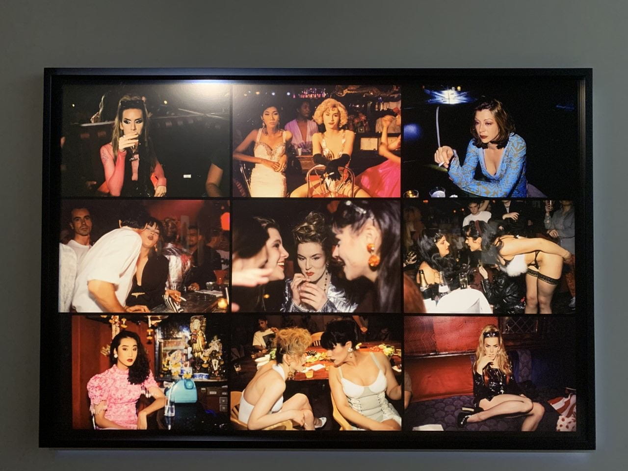
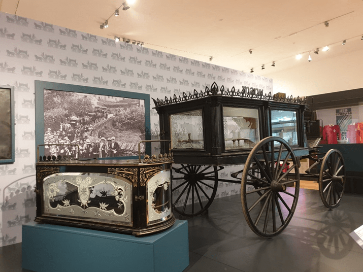
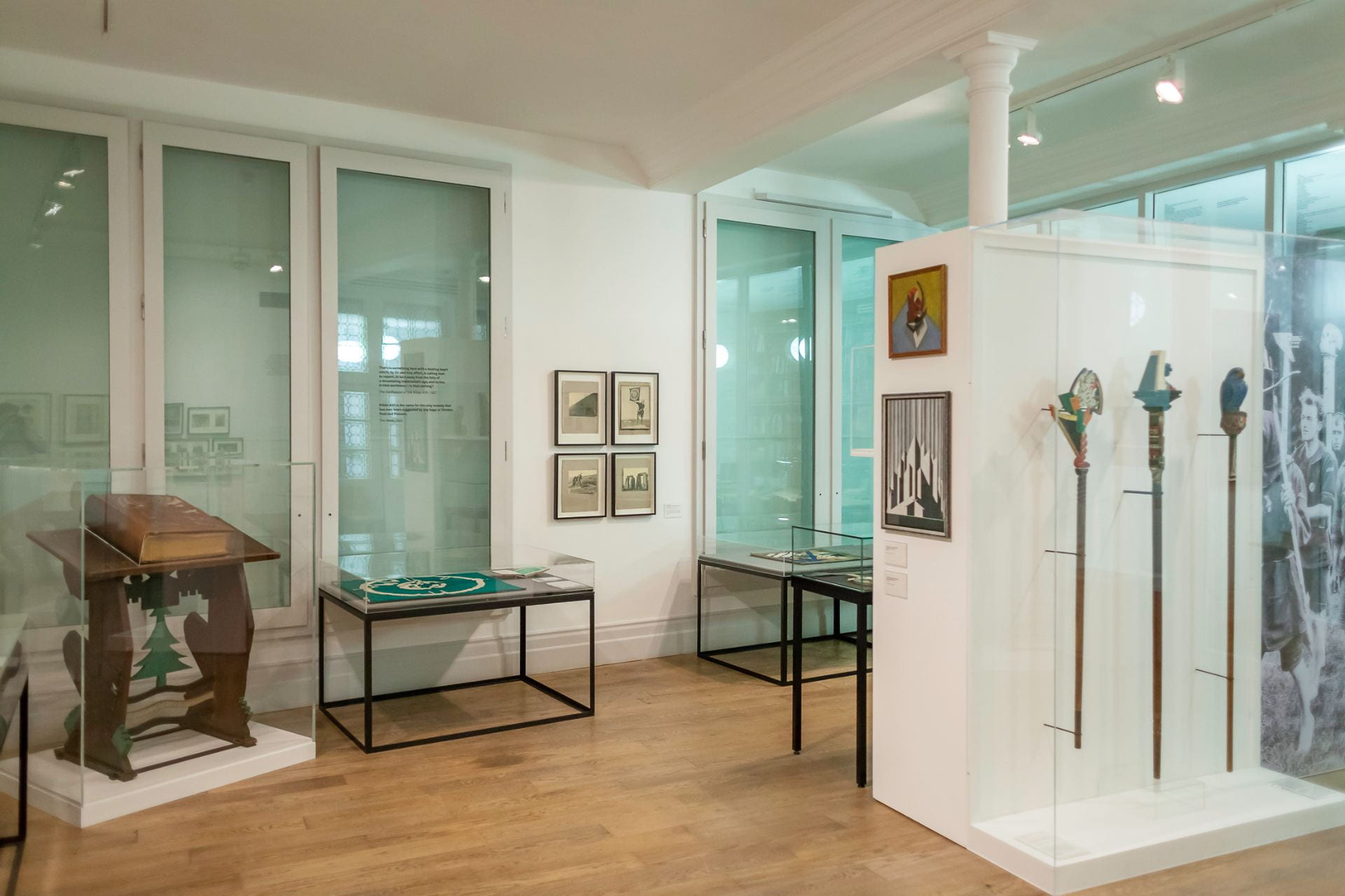
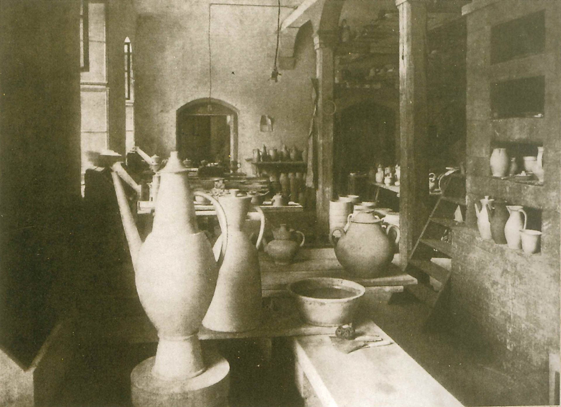
Fig. 1. ‘Gipsy Fortune Telling Machine’, Royal Pavilion & Museums Collection.
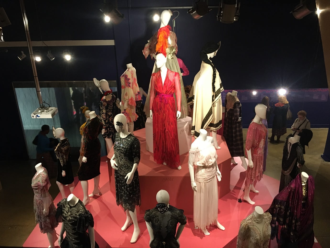
Queer the Pier exhibition, Brighton Museum & Art Gallery. Photograph by Lisa Hinkins.

To address such ignorance the Queer the Pier (QTP) curatorial team wanted to utilise Brighton Museum & Art Gallery’s ‘Gipsy Fortune Telling Machine’ in their 2020 exhibition in the Museum’s Spotlight Gallery. As the Community Curator leading research and content for queer Roma inclusion, I collaborated with internationally-acclaimed Roma artist Delaine Le Bas, academic Dr Lucie Fremlova, LGBTIQ+ artists and workshop participants. Applying the theoretical framework of intersectionality  –  an understanding of the interrelationships between queer, Roma, Gypsy and Traveller communities  –  the participants created responses that challenge stereotypes and discrimination across these interconnected social categories.

I had the privilege to work on this project due to my own Romany heritage. My great-grandmother, Rhoda Wells [1897-1982], was a Romany Gypsy living in the New Forest, Hampshire. She met and eventually married my great-grandfather, Ralph Cuttriss Hinkins [1882-1952], when he and his father, my great-great-grandfather, Francis Robert ‘Frank’ Hinkins [1852-1934] befriended the Gypsy families. They spent many years periodically travelling with the Gypsies across the South of England. Many of the Hinkins clan were appalled by Frank and Ralph. It resulted in a distancing within family circles. Frank was a photographer and illustrator. In 1915, father and son published the book Romany Life: experienced and observed during many years of friendly intercourse with the Gypsies under the nom de plume Frank Cuttris. This book is still available, published by Echo Library. The Keep, Sussex’s historical repository, holds three lantern slides attributed to Frank, all c.1915, of portraits of travelling people.

Decolonisation of objects in museums is imperative to inclusion. The LGBTIQ+ Roma, Gypsy and Traveller workshop collaboration sought to re-interpret the museum’s problematic Victorian ‘Gipsy Fortune Telling Machine’ (Fig.1). The object perpetuated a stereotype of Roma culture through the style of the human figure and through the misspelling of ‘Gipsy’ with an ‘i’ not a ‘y’. Reaching out to a continually-persecuted community, participants were welcomed into a safe space within the museum to produce drawn and written responses to the machine. A theme emerged with colourful images reflecting the Romani flag, the Rainbow flag and the use of positive language. Romani, the Roma language, has filtered through Cockney English and the queer subcultural language of Polari. Familiar words clobber (clothes), minge (vagina) and chavi (child/friend, now used as a derogatory term) originate from Romani, Cant or Argot languages.

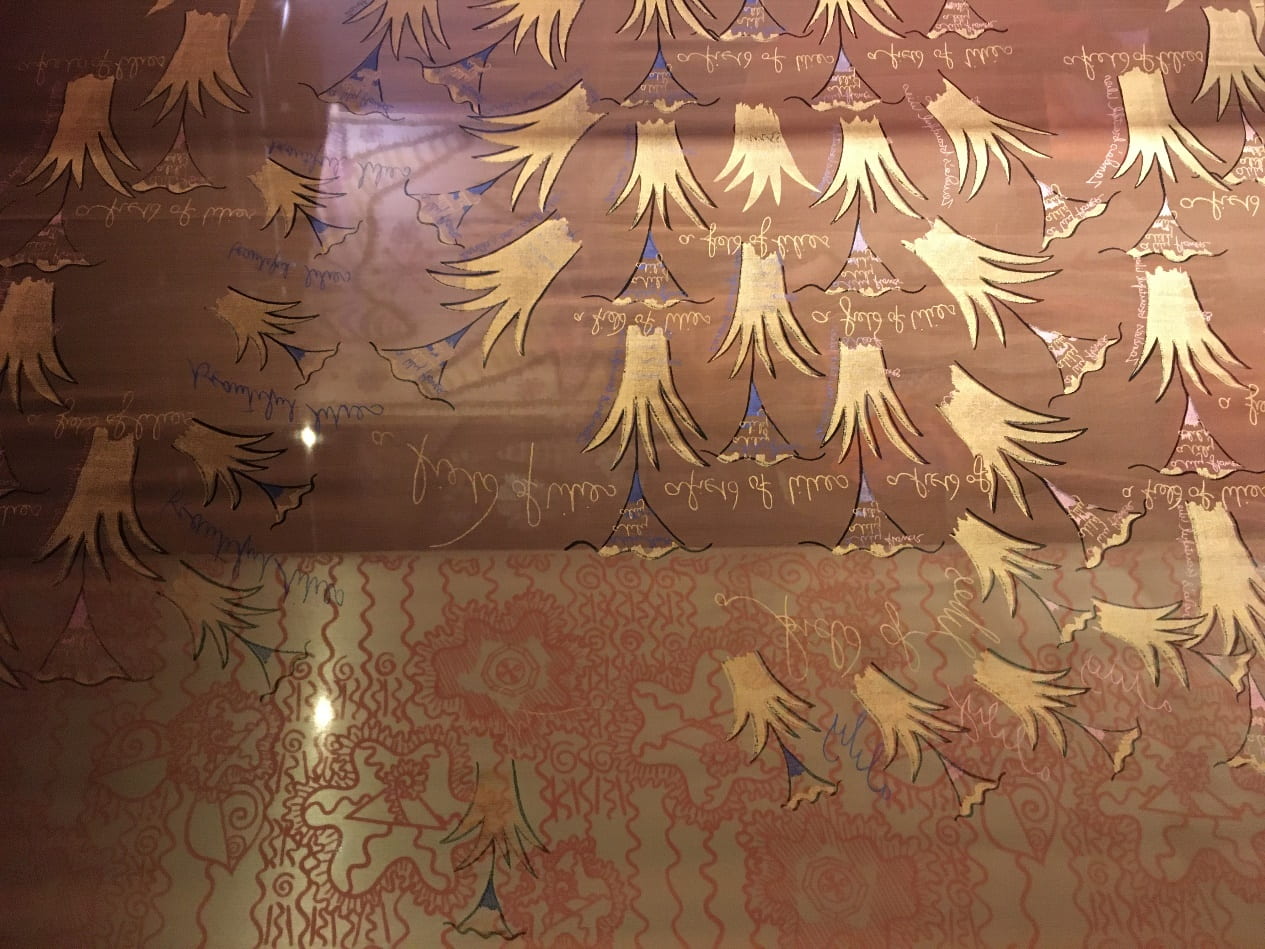
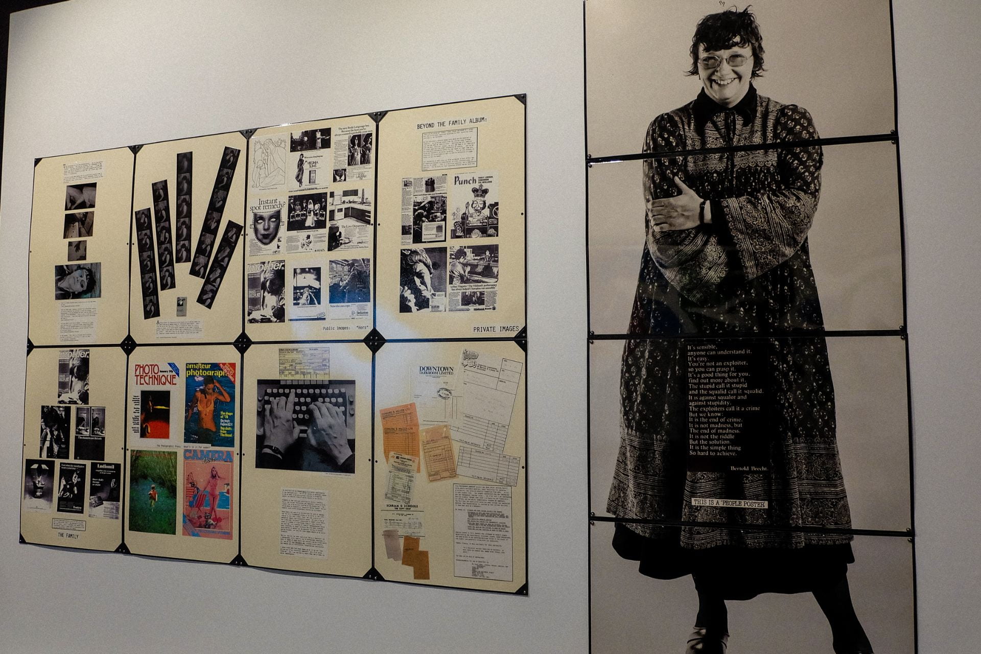
Fig. 2. Fortune Telling Card by Delaine Le Bas. Queer the Pier exhibition. Brighton Museum & Art Gallery.
Photograph by Lisa Hinkins.

Developing ideas from the workshop, Delaine Le Bas (Fig. 2) created beautiful contemporary fortune cards with positive messages (£1 in the slot, a card is yours). In her words, ‘Fortune Telling is an intimate form of communication between people; it requires close contact physically and mentally in its true form.’ She continues, ‘for me in particular coming from such a demonised community I refuse to respond in a negative way.’

I edited the accompanying free zine that addresses stereotypes. It includes the following statement: “Gypsiness” is a term to describe the phenomenon of dissociation where over time Gypsy identity becomes abstracted and separated from the people themselves. Through images and literature, the dominant culture dictates the representation of a marginal group, in this case Gypsies. Stereotypes of Gypsy women have been perpetuated by figures such as Vita Sackville-West, who invented Romany ancestry for herself on her Spanish side of her family to explain her ‘bohemian behaviour’ (lesbian lovers).

Dr Lucie Fremlova’s postdoctoral collaboration with LGBTIQ+ Roma Artists has produced powerful images that break down and challenge the dominant representation of queer Roma people. Photographs created during a one-week workshop in Brighton were printed in the zine. An image of one of the Roma artists by the Palace Pier’s current ‘Zoltar Fortune Telling Machine’ accompanies the text for the Victorian machine. It is a powerful reminder that stereotypes are still interlaced with contemporary arcade amusements.

Delaine Le Bas pays tribute in the zine to her Uncle Eddie who moved to Brighton in the mid-1960s with his partner Peter. She acknowledges that their lives had not been easy being Romani and gay, but Delaine states that Eddie and Peter taught her the importance of being yourself and that love should be unconditional.

City-based organisation Friends, Families and Travellers is a leading national charity that works on behalf of all Gypsies, Roma and Travellers. They provided support and contacts for this project. This led to contact with Roma poet Lois Brookes-Jones who beautifully weaved Romani and English words into a poem expressing lesbian desire especially for the zine.

It is my sincere hope that this project engagement with LGBTIQ+ Roma, Gypsies and Travellers will help counter suspicion and ignorance towards ‘strangers within’. Brighton museum staff were fantastically supportive in encouraging an ignored community through its doors. A final thought: is it not ironic that a people so rich in its own creative arts, music and culture has never been fully appreciated within the institutions that claim to be custodians of our material culture? Perhaps we have an opportunity now to address that.

[1] Kalwant Bhopal and Martin Myers, Insiders, Outsiders and Others: Gypsies and Identity (Hertfordshire: University of Hertfordshire Press, 2008).


Notes from the North East Film Archive: A PhD Placement

Jenna Allsopp, PhD student, describes six months of handling, researching, splicing and digitising archival film.

In 2019, I undertook a 6 month professional development placement at the North East Film Archive, which was funded by Design Star as part of my doctoral training. The aim of the placement was to provide me with an exciting opportunity to experience a completely different, collections-based, environment to an academic, university-based one I am currently situated in as a PhD student. My work on their North East on Film project provided me with invaluable connections with archivists and curators within my chosen field and geographical location, having recently moved back to my hometown of Newcastle-upon-Tyne after 11 years in Brighton.

The North East Film Archive (NEFA), and its sister organisation the Yorkshire Film Archive (YFA), is a charity which aims to preserve and provide access to the moving image heritage of Yorkshire and the North East of England over the last 120 years, much like the south coast’s own regional film archive, Screen Archive South East, held at the University of Brighton. NEFA and YFA cares for the collections housed in both Middlesbrough and York respectively, made up of more than 50,000 titles which provide a rich and engaging record of time. The majority of films are non-fiction or industrial records, made by both amateurs and professionals. Subject matter includes industry such as shipbuilding, mining, steel and textiles, as well as everyday life such as family parties, school trips, holidays and regional events and traditions. They also hold the Yorkshire and Tyne Tees Television news and regional programmes, alongside a wealth of output from local cine clubs, which reflect a fascinating social history over the last century.

Fig.1: Lining up film and sound reels on a Steenbeck flatbed editing suite at the North East Film Archive, Middlesbrough. Photograph by the author. July 2019

During the placement I was trained in more physical aspects of film handling, such as loading the Steenbeck flatbed editing suite (see Fig.1) with 35mm picture and sound film, which I was shown how to sync accurately. The dark film is the picture and the brown film is the sound.

In 1928 Kodak introduced their Kodacolor process which was widely used by amateur filmmakers until the introduction of the much-improved Kodachrome process in 1935. This process underwent a lot of fine-tuning, particularly in the US where the technology was pioneered, which inevitably had a bias towards the capturing of white skin tones. The inherent racism of early colour photography has been widely written about, specifically the Kodak-issued ‘Shirley’ cards which were used as a standard gauge to calibrate colour in photography and film processing quality control. Named after the first model who posed for these cards, Shirley Page, all subsequent models became known as Shirleys; a Caucasian woman usually against a grey background. This image, as visible on the screen of the Steenbeck in Fig.1, was considered the norm for skin tone and was the desired outcome for processing.

Fig.2: Splicing film cells at the North East Film Archive, Middlesbrough. Photograph by the author. July 2019.

Other physical handling training including learning how to ‘splice’ film cells. Often, and particularly with very old film, the cells can break during viewing on the Steenbeck, so it is necessary to glue them back together. This is done by trimming the break to the nearest frame at each end, connecting them on the splicer shown in Fig.2 and joining the cells with a specialised clear tape. Splicing is also carried out if multiple films need to be loaded onto a single reel for storage.

During my placement we were donated a can of multiple reels of nitrate film which the archive is not allowed to store for more than 24 hours due to its flammability. This particular collection was in terrible condition, so sadly could not be viewed before it was shipped to the BFI whose vaults are insured to hold it.

Fig.3: Examining a donation of cellulose nitrate film at the North East Film Archive, Middlesbrough. Photograph by the author. July 2019.

Cellulose nitrate was first used for photographic roll film in 1889 and was used for 35mm motion picture film until the 1950s. Cellulose nitrate is highly flammable, prone to spontaneous combustion and decomposes with age. The decomposition produces a swirling psychedelic effect as a result of the chemical emulsion drying up and peeling away from the nitrate strip. In the present day, these imperfections of decay have inspired the work of contemporary artists such as Bill Morrison who has used decaying nitrate film as a key medium in his practice.

Fig.4: Audience at the ‘Durham on Film’ screening at the Gala Cinema, Durham. Photograph by the author. July 2019.

One of the main ways members of the public have access to the films in the archives is through public screening events. These are held regularly across the North East and Yorkshire and include films specially selected which feature the area in which the screening is held.

Fig.4 is a photograph I took of the 400-capacity sold out show at the Durham Gala cinema in July. My main duty at the archive was to research the social history for contextual publication alongside the films on the website, some of which were read out to the audience in between films at the screenings. It was very meaningful to read the feedback forms after the events and hear how much the local residents enjoyed the additional context to enrich the films and how many memories these films recalled. Some residents even spotted themselves or old friends in the films!

Fig.5: Cleaning the John Scorer collection in preparation for cataloguing and digitisation at the North East Film Archive, Middlesbrough. Photograph by the author. July 2019.

The most rewarding and enjoyable part of my placement was having the opportunity to work on my own donation project. I was handed a box of film that had not yet been viewed, which I watched on the hand winder for the first time. I was given the responsibility to decide if the films were of interest to the North East on Film project and, if so, I cleaned the film (as shown in Fig.5), loaded it onto an archive reel, created a catalogue record, passed the film to the technician for digitisation then researched the social context for publication on the website once the film was live. This project allowed me to experience every aspect of the donation process from acceptance, accession, selection, digitisation to publication.

For anyone interested in this collection, it was all by an amateur filmmaker named John Scorer from Cullercoats on the North East coast, who was a middle school teacher and avid collector and maker of historical costume. All five of his films I selected for digitisation can be viewed here.

In total I contributed 30,000 words for the archive in writing, either in formal ‘in-house’ style text for contextual information for films for the NEFA website, or via an informal 3-part blog post, Part One of which can be read here.

Intimacy and Belonging: Nan Goldin’s new photography show

Annie Jones, BA Fashion and Dress History, enters Nan Goldin’s inner world through her recent exhibition.

Nan Goldin is an American photographer who has intimately chronicled her life and the lives of those closest to her since the early 1980s. Her visual autobiographical style has captured the LGBTQ community, the HIV and Opioid crises alongside the fleeting nature of young love. Goldin’s latest exhibition, Sirens, opened at the Marian Goodman Gallery in November 2019 and is her first solo exhibition in London since 2002. In Sirens, Goldin presents new photographic slideshows as well as unseen video and photography work dating back to the 1970s. As an admirer of Goldin’s previous work, such as The Ballad of Sexual Dependency, a collection of photos and slideshows capturing intimate moments of love and loss, which she suitably described as ‘the diary I let people read’, I was elated to attend an exhibition of hers for the first time.

Figure 1. Goldin photographs from Sirens exhibition. Image author’s own.

Upon arrival, exhibition-goers were greeted by the hum of music from rooms in the distance; these had long red curtains drawn, blocking out the blaring sounds. Entering gave the air of walking into an underground party or club, which was highly fitting for the subject matter Goldin displays. Images of nightlife, as seen in Figure 1, dominated the walls. They were accompanied by images such as the ones in Figure 2, which focused more on the aftermath of a party.

Fig. 2. Photographs from Goldin’s Sirens exhibition. Image author’s own.

Goldin brings the viewer along in her journey of documentation. ‘The major motivation for my work’, she once explained, ‘is an obsession with memory. I became a serious photographer when I started drinking because [the morning after] I wanted to remember all the details of my experiences. I would go to the bars and shoot and have a record of my life.’ This made me, the viewer, feel less like an outside witness and more of an extra companion in her intimate moments.

As I followed the music and went behind the curtains, I was greeted by looped videos on screens arranged in triptych. In the centre was a clip from Metropolis, the 1927 film by Fritz Lang, which included a group of men leering, gurning and dropping their jaws. On the right side was a clip of a showgirl dancing sensually, and on the left a scene of disarray and mayhem as the inside of what seems to be a palace is torn to shreds. The installation appeared to represent the power of female sexuality and the chaos that can ensue as a result of its influence. Female sexual power is seen throughout the exhibition, as women are portrayed as strong social beings as well as admirably vulnerable when alone.

The structural aspects of the exhibition heightened its impact. The building was dark, with the only source of light from the street and the back lighting of the photographs. This brought a specific sense of focus to each frame and highlighted the saturated tones of the 35mm images. The photos had no labels, leaving interpretation completely up to the viewer, a choice that suits Goldin’s documentary style. A description of each photograph would have taken away that sense of personal belonging previously stated. It would have merely cemented the images as photographs by a particular person and of a particular place and time. Additionally, as Gillian Rose observes of labels in Visual Methodologies, these can make the artist the most important aspect of the work of art. The most important part of Goldin’s photography is not the artist. What will be of the greatest significance in each piece remains subjective to its viewer. This corresponds to what the art dealer Karsten Schubert described in his 2000 book, The Curator’s Egg, where, he argued, ‘the museum is now much more involved in a two-way dialogue with its audience. It relies more on interpretation and less on absolute truths.’

What Goldin produced in Sirens was honest and insightful. She captured with her camera the emotions of intimate moments, creating a sense of oneness between her, her photographs and their viewers. ‘For me’, she explained, ‘it is not a detachment to take a picture. It’s a way of touching somebody – it’s a caress’. Goldin’s caress puts her subjects at ease; it also created a powerful sense of belonging and comfort within me as I joined in their moments.

Life is… A Welsh museum worth visiting

Emma Bull, BA Fashion and Dress History, returns to her roots at the Welsh National Museum of History.

Deep in the heart of Cardiff, Wales, lies a museum seemingly frozen in time. St Fagan’s National Museum of History consists of original buildings ranging from the early 16th to the 20th century, excavated from around Wales and reconstructed at the site. St Fagan’s also contains separate galleries focusing on Welsh life, the stories of donated objects and their impact upon Welsh people and culture. Refurbished in a £30million redevelopment, these galleries reopened in late 2018. Being of Welsh origin and having visited the museum many times when growing up, I was intrigued to see how the main galleries had been revamped.

Now named Byw a bod… (Life is…), the main gallery space explores Welsh lives and memories. As the museum describes it, ‘We tell people’s stories through their own words – wherever possible – and through the objects they treasured […]. This gallery takes the ordinary stuff of all our lives and shows it to be extraordinary.’ The space is separated into three sections. The first  focuses on work and heritage, the middle on leisure and the last, rather controversially for a museum targeted at all ages, on death and remembering those lost.

Fig 1. A young boy interacting with the original tractor exhibit overlooking the exterior farm views. St Fagan’s website. Colour Photograph. 2018.

Starting with the exhibit on gweithio (work), it was interesting to see how the curators have decided to show objects from separate walks of life. Upon the first wall are hung agricultural objects such as rakes, hoes and domestic household objects. They are identifiable by numbers, which can then be found on a large sign, interactive screens or information booklets. Having three ways in which to access information allows the visitor to explore the exhibition in the way that best suits them; the speaking screens allow for those with hearing and sight disabilities to also interact with the gallery. There is an original tractor that children can climb on, overlooking the exterior farm. Also featured are Laura Ashley factory woollen threads (Canolbarth, 1960s) and an original fish fryer (Cardiff, 1915). The idea of memory persisting through objects is prominent and the eclectic formation of the gallery feels personal. Being able to read anecdotes from families who donated the items develops visitor appreciation and provides value; the sometimes mundane object is made significant by its story.

Fig 2. Fish Fryer from Cardiff, 1915. Author’s own image. 2 January 2020.

This curatorial method is outlined by Swiss art curator Hans Ulrich Obrist in his 2014 book, Ways of Curating. He writes that when he interviewed Eric Hobsbawm [1917-2012], the historian described curating via memory as a ‘protest against forgetting’. Through this, he argued that recollection is a contact zone between the past, present and future. I believe this kind of memory-based curating was the aim of St Fagan’s, who attempt to bridge the gap between generations.

Fig 3/4. Examples of the Fashion displays with the Byw a bod… gallery. Author’s own images. 2 January 2020.

Continuing to the area about leisure in Wales, I was naturally drawn to the cabinet of clothing, dating from the 1870s to the 1950s. Although the garments on display were exceptionally beautiful, the cabinet itself was sadly lacking. The gallery was lit by strong LED lights that reflected on the cabinet making it difficult to see the true detail of the items. As the cabinet was not lit from the inside it was difficult to read the plastic labels unless at a certain angle. Although it is important to control lighting to not damage or discolour garments, being unable to view the pieces affects visitors’ enjoyment. As noted by conservator Garry Thompson in his 1978 book, The Museum Environment, works of artwill look better in some lighting situations […we should bend our efforts to finding the best possible’.

Fig 4. Examples of the Fashion displays with the Byw a bod… gallery. Author’s own images. 2 January 2020.

In addition to these shortcomings, garment labels were lacklustre. Although they provided some information about the origin of the items, they failed to describe the methods of construction, fabric or further context, making it difficult for somebody who did not know much about fashion history to gain deeper insight. Once again, this area provided a space in which children could interact, this time in the form of a dressing-up zone with recreation garments. There were some swimsuits displayed separately here that were easier to view.

Fig 5. Cast iron and etched glass carriage and premature birth coffin, c. mid-1800s. Author’s own image. 2 January 2020.

The gallery concludes with the idea of marw (death). There is a beautifully displayed carriage from the late 1800s and a premature death coffin made from cast iron and etched glass. The gallery does well in presenting death in a less morbid way than expected; instead its focus is predominantly that of remembrance, which works well to conclude the gallery theme of memory and remembering history.

Overall, despite a few issues with lighting and labels, the gallery presents unique and interesting stories and objects from around Wales. It presents its artefacts in a way that is inclusive of all ages and physical abilities. The galleries are easily accessible, interactive and well worth the visit.

50 Years of Fantasy: A Zandra Rhodes Retrospective

Sarah Carnall, BA Fashion and Dress History, appraises the display successes and shortcomings of a recent Zandra Rhodes exhibition.

The Fashion and Textiles Museum (FTM) in London regularly refreshes their space by changing exhibitions every few months to continuously display a variety of textiles and fashion. From September 2019 to January 2020, they celebrated their founder with an exhibition entitled Zandra Rhodes: 50 Years of Fabulous, featuring a vast selection of Rhodes’ garments. These ranged from her first collection, The Knitted Circle, in 1969, through to her newest Jubilee Collection of Spring 2020. Alongside pieces from these collections, the exhibition also included Rhodes-designed costumes from operas and examples of her printed textiles.

Figure 1: Garments from the Main Gallery. Author’s Own Image.

This exhibition, curated and designed by Dennis Nothdruft and Beth Ojari, is split into two sections. On entry into the main gallery, Rhodes’ vibrant and intricate garments spring out to greet visitors from their tiered circular plinths, assembled together to show Rhodes’ work over the decades (Fig.1). This display style is common to this museum; previous exhibitions like Night and Day: Fashion and Photographs used a similar technique of grouping garments together to create a scene. While this display strategy is effective in showing the evolution of Rhodes’ work, it hinders visitors from being able to fully appreciate everything as some garments can be out of sight, and it makes it difficult to take good quality photographs to cherish after the event, which can be such a key part of contemporary museum visitor experience.

Figure 2: Dress worn by Princess Diana. Author’s Own Image.

One of the displayed garments is a sleeveless chiffon dress, famously worn by Princess Diana for a state banquet in Kyoto (Fig.2). However, without the assistance of the pamphlet provided, it would not be obvious that this is a piece of note; the displays do not have labels giving specific details about each piece, and are instead only accompanied by a date, with full details listed inside the pamphlet.

Writing on the subject of exhibition display, Gillian Rose (2001) has discussed the importance of text labels and their effect in the museum space, arguing, ‘They make some aspects of the objects on display more important than others’. Whilst the pamphlet is helpful and provides detailed information and includes object numbers, these are not clearly displayed in the exhibition so it is not easy for visitors with less knowledge of the museum’s layout to understand. Pamphlets have also been used in previous FTM exhibitions; in their 2019 exhibition Swinging London: A Lifestyle Revolution, featuring the designs of Terence Conran and Mary Quant, they had an exhibition booklet that gave detailed information about the works displayed. However, in that instance, they also included text labels throughout to identify each piece. I feel this should be a consistent feature in FTM exhibitions as it gives some basic information that visitors can follow, especially if they may not have detailed fashion knowledge.

Figure 3: Textiles. Author’s Own Image.

In the first part of the mezzanine area, a selection of Rhodes’ textiles are suspended from the ceiling, with various hand-designed and screen-printed patterns and materials (Fig.3). This was an interesting aspect of the exhibition, making a nice change from seeing just fashion pieces. The design of this section allowed for each textile to have its own display and conveyed the diverse creations that characterise Rhodes’ career.

Textiles were followed by works donated from some of the exhibition’s sponsors, that is, Dallas, San Diego and Seattle Opera Houses. These were costumes designed for performances of The Magic Flute, Pearl Fishers and Aida,  amongst others (Fig.4). The inclusion of these costumes shows how Rhodes has used her talent for theatrical use, an area in the arts that matches her creative textiles and fantasy fashions. Opera costumes were displayed next to some of the most famous stage garments by Rhodes, including an ensemble created for Barbara Streisand for a performance in 2019, as well as a replica blouse for Freddie Mercury that was used for the 2018 film, Bohemian Rhapsody (Fig.5). These were noteworthy garments, however the weak lighting in the mezzanine made them blend into the rest of the display, with visitors only knowing their importance if they read the text labels.

Figure 4: Costume from Aida. Author’s Own Image.

Overall, I feel this exhibition truly celebrates the impressive career of Zandra Rhodes, including stage costumes, fashion collections and fabrics from the past fifty years. It was interesting to see the variety of her designs and how she has taken inspiration from many cultures in an appropriate way. Whilst there were display issues, such as the lack of continuity in using text labels throughout the exhibition, the Rhodes’ retrospective was supported by a comprehensive pamphlet with full details about each item. Rhodes has stuck to her word from 1980, when she claimed, ‘I supply fantasy for people.’

Figure 5: Blouse from Bohemian Rhapsody (2018). Author’s Own Image.

Elizabeth Keckley: Freed Slave, Activist and Dressmaker

Olivia Terry, BA Fashion and Dress History, reflects on the ways that histories are written and rewritten, using a little-remembered African American dressmaker as her case study. 

Grand, structured, and sophisticated: these three words describe a dress made for America’s sixteenth First Lady, Mary Todd Lincoln [1818-1882]. Made from sumptuous royal purple and ultramarine blue velvet, according to the Smithsonian Museum, the dress was quite fashionable for the winter social season of 1861-1862 (see Figure 1).

Fig.1: Elizabeth Keckley. Mary Lincoln’s Dress. c.1861-1862. Purple velvet and satin. 152.4 cm x 121.92 cm. The National Museum of American History.

Consistent with the sloped shoulder fashion trend of the 1860s, the neckline is a subtle scoop, and the accompanying jacket is splendidly decorated with seven square mother-of pearl buttons. It also has an interesting asymmetrical attribute to the sleeves where one is of the purple velvet, while the other is ultramarine with a flounce of the opposite colour attached (see Figure 2). Contrasting white satin piping unifies and enforces clean, structured lines throughout.

Fig. 2: Elizabeth Keckley. Mary Lincoln’ s Dress. c.1861-1862. Purple velvet and satin. 152.4 cm x 121.92 cm. The National Museum of American History.

This dress clearly has value. Of course, the luxuriousness of the material, its fashionable nature, and the status of its original wearer are all indicators of its obvious worth; but perhaps the most significant attribute of this dress is its lesser-known creator. Born into slavery in 1818 and with no formal training, Elizabeth Keckley defied social barriers by stitching this gown (see Figure 3).

I discovered Elizabeth Keckley [1818-1907], when I was asked to write and present on a member of the African Diaspora who made a key contribution to art and design for Elli Michaela Young’s L4 module, Fashion, Identity, and the African Diaspora. I struggled for a while, knowing I wanted to gear my research towards America, but eventually I remembered a book my sewing instructor had mentioned in passing, Mrs. Lincoln’s Dressmaker by Jennifer Chiaverini. After I had done some research, I was surprised that I hadn’t heard more about Keckley. Bold and resilient in character, Keckley was able to cultivate excellent skills in dressmaking and networking, leading to her purchasing her and her son’s freedom in 1855. Not long after, she became one of the most dominant dressmakers in Washington D.C.

Fig. 3: Unknown. Elizabeth Keckley, detail from front-piece of Behind the Scenes, Or, Thirty Years a Slave and Four Years in the White House. 1868. Illustration. Virginia Museum of History and Culture.

As researchers such as Kate J. Armstrong have argued, she shaped American fashion by dressing the times most prominent women, most notably, Mary Todd Lincoln and Confederate First Lady, Varina Davis. In 1862, she used her elevated position with the Lincolns to gain a prominent role among the capital’s free black community by founding and presiding over the Contraband Relief Association. The organization provided housing, clothing, medical care and other necessities to impoverished newly freed slaves in the North. She also wrote an autobiography titled Behind the Scenes in 1868, detailing her early life as a slave, the growth of her business, and her professional life in the White House.

Keckley’s life is obviously significant, yet despite this I found it difficult to find new information about Keckley after I familiarized myself with the basics. Most of the information is only known from her autobiography, and many of the articles I found merely brushed over her difficult early life as a slave, skipping to her famous friendship with Mrs. Lincoln. I was well into my research before I discovered Keckley’s role as an activist and while many sources talked about her career as a modiste, very few academic sources emphasized her contributions to American fashion in the 1860s, or her own personal design style.

What I learned from my research is that while, in the last ten years, scholars, curators and journalists are beginning to pay more attention to Keckley, much of the work still fails to recognise her independent accomplishments. Evidence of this can be seen simply by looking at the title of Jennifer Chiaverini’s novel Mrs. Lincoln’s Dressmaker, where Mary Lincoln’s name supersedes Keckley’s own. If it wasn’t for Keckley’s close relationship with Lincoln, Keckley’s story may have been lost to history forever. This is a testament to the prioritization of white history in media and museums, telling the story of Lincoln, who happened to have a freed slave for a friend, rather than focusing the story solely on Keckley, who accomplished much more outside of her relationship with Mary.

Keckley lived a revolutionary life, hardly recognized for its extraordinary nature. Dressing the time’s most prominent women, and her reputation for fit, made her the premier dressmaker of the day. It also gave her the power to influence American fashion of the 1860s. It is her surviving dresses that are perhaps the truest testament to her character; understated but undeniably smart.

Bibliography

Keckley, Elizabeth. Behind the Scenes or Thirty Years a Slave and Four in the White House. New York: G. W. Carleton & Co. Publishers.1868. Print.

“Mary Lincoln’s Dress.” The National Museum of American History. The Smithsonian. N.d. Web. 22 Mar. 2019. https://americanhistory.si.edu/collections/search/object/nmah_1359703

Williams, J. “A Strong Thread in a Torn Union,” The New York Times, The New York Times Company, 9 Jan. 2013. Web. 4 May 2019. https://www.nytimes.com/2013/01/10/books/its-elizabeth-keckleys-year-in-civil-war-history.html

“We Shall Overcome: Elizabeth Keckley & Harriet Tubman,” The Exploress. Dir. Kate J. Armstrong. The Exploress Podcast, 9 Nov. 2018. Podcast.

Exhibiting Research: Report from a PhD training workshop

Harriet Parry reflects on a training event for PhD students on the subject of turning research into exhibitions.

Head-down and up to your eyeballs in a research project, it is easy to lose focus of a key scholarly requirement. As well as furthering knowledge in your chosen field, it is also important to share that knowledge beyond the academic bubble. Therefore, the Techne / Centre for Design History one day workshop in November 2019 – ‘Displaying your Research: Pitching Exhibitions to Cultural Organisations’ – was a timely and enlightening opportunity to think not only about what and who to exhibit with, but also to think in new ways about how to connect with diverse audiences.

Through presentations made by academics and curators, whose experience of exhibition included formal display as well as active co-creation and ongoing evolution of community access, these always collaborative projects highlighted the pragmatics and the politics of displaying research. What happens to research when it moves from the printed page to the votive power of the display cabinet? Who owns the work that is displayed? Who is it for and how do they know it is for them? Can collaboration through exhibition create connections that would not otherwise be made? And what can an exhibition generate that a thesis on a book case can never achieve?

As organiser Dr. Claire Wintle outlined, working collaboratively with an institution to create an exhibit can be slow and may cause creative conflict. If, in its essence, it is the right piece of research pitched to the right organisation, it can also provide a constellation of benefits. According to the curatorial and research professionals speaking on the day, identifying how your work relates to the organisation selected is the primary requirement before approaching them with an idea. You might have already built a relationship with the collaborating organisation – as PhD researcher and presenter Joseph Long has with the De La Warr Pavilion in Bexhill-on-Sea – or it might be a relationship that you will build from scratch. Senior Research Fellow and Design Archives leader, Sue Breakell, advised that what you want to do must fit with the cultural organisation’s objectives and fill a gap.  Think too about what an exhibition could actually be: could it be a collection of events rather than a singular exhibit? All these questions and more must be considered before making any connections.

Intellectual Barbarians: The Kibbo Kift Kindred, exhibition view, Whitechapel Gallery, October 2015. Photograph by Dan Weill.

As an example of the way an organisation prioritises what they exhibit, Dr Nayia Yiakoumaki, curator of the Archive Gallery at the Whitechapel Gallery in East London, explained that their aim is to unearth histories that have not yet registered in the canon of art. One history that did just that was the work Dr Annebella Pollen brought to their attention when accessing their archive as part of her research. Dr Yiakoumaki explained that this collaboration opened up part of their own history that they had been unaware of. Dr Pollen explained that the ensuing exhibition Intellectual Barbarians: The Kibbo Kift Kindred, took several years to organise and was a steep learning curve in many ways. But the results meant that not only were new connections made within the archive but new and different audiences were attracted to the gallery. The exhibition also created new connections in her own work through audience engagement that she couldn’t have anticipated.

A thought-provoking morning of presentations ended with Dr Louise Purbrick sharing her extensive experience of collaborating with communities through museums and exhibitions. Her work advocates a ‘long-slow-collaborative dialogue’ that emphasises work in collaboration rather than as its output. By conducting this research through exhibition spaces, her aim is to legitimise and provide a platform for the work that these collaborations create. Provocatively she asked: could it be that academic impact is no longer the main impact that we are looking for?

PhD students in the afternoon hands-on workshop.

Full of the ideas and possibilities of how we might exhibit our research, in the afternoon session, Dr Nicola Ashmore, who has worked extensively in arts and museum practices, held a workshop to help us pull together our ideas. With such diverse ways of thinking about the value of research and the ways it might be curated, it was unsurprising that our discussions explored tension and contentions on the purpose and ethics behind exhibitions. In particular, we questioned the role exhibition spaces play in society, what should and shouldn’t be included, and who has the right to curate culture and present it as knowledge.

Although it was daunting to balance pragmatics, ethics and concepts of culture in our minds, the day underlined that the way in which our research might be presented is not a one-size-fits-all endeavour. Importantly, we do not own the objects and subjects of our research, but are part of a moment in their social life that can continue; our research can find further meaning that we may never come to know if we do not share it.

Misbehaving Bodies at the Wellcome Collection

Josie Stewart, BA Fashion and Dress History, reflects on an important exhibition at Wellcome Collection, London.

The Wellcome Collection in London is a space that combines science and art through thought-provoking exhibitions that challenge the discourse on health. A current display, ‘Misbehaving Bodies’, creates a conversation between the artists Jo Spence (1934-1992) and Oreet Ashery (b.1966) concerning the representation and understanding of chronic illness by raising complex questions surrounding how it shapes identity. Through Spence’s photography and Ashery’s films, the artists offer a layered narrative from a patient’s perspective and gives individuals living and dying from illness the reclamation of agency that is so often taken away during periods of ill health.

Fig.1: ‘Misbehaving Bodies’ at the Wellcome Collection. Personal photograph by the author. 16 Oct. 2019.

The exhibition space itself differs from the stark, bleached image of the medical world and it is also a far cry from the more ‘palatable’ public images of illness that tend to not show its full reality, such as scars and bodily functions, particularly when it comes to women’s health.

Spence’s photographs, which cover most of the gallery walls, confront both the physical and mental effects of her breast cancer diagnosis in 1982. Previously a family portrait photographer, Spence observed how her subjects composed façades in front of the camera. She examined these ideas further in ‘Beyond the Family Album’ (1979) (Fig.2) that referenced her mother’s unpaid domestic labour, financial struggles and her parents old age and subsequent failing bodies. Noticing that she had concealed her own unhappy childhood behind a smiling face in early photographs, Spence decided to document her lived experience of cancer treatment in what she termed ‘phototherapy.’

Fig.2: Excerpt from ‘Beyond the Family Album’ (1979.) Personal photograph by the author. 16 Oct. 2019.

Spence’s pre- and post-surgery body feature in a series of self-portraits entitled ‘The Picture of Health?’ (1982-86) (Fig.3). This series addressed her feelings surrounding the trauma of illness and her attempts to reclaim her body, which she felt had been taken over by doctors and western medical intervention. The images are raw, showing Spence at what could be considered her at her most vulnerable. Instead they are powerful and arresting and not without a sense of humour and irony. Spence displays her naked post-op body alongside photos of glamour models, which could also be interpreted as a play between ‘inspiration porn’ and pornography.

Fig.3: Excerpt from ‘A Picture of Health’ (1982-86.) Personal photograph by the author. 16 Oct. 2019.

Feelings of disempowerment and infantilization are also expressed in Spence’s photos. There is an anti-elitist theme to Spence’s work, as the idea that socioeconomics contributed to her illness and that illness in turn exacerbates those existing struggles is suggested. The text accompanying the images was enlarged and laminated in order to make them accessible to the people that Spence believed were also affected by these issues.

Ashery’s film, ‘Revisiting Genesis’ (2016), also explores socioeconomic factors of illness in terms of how capitalism benefits from our fear of death, of being forgotten and our fear of losing creative control. The idea of film and video influencing the memory of the dead is also discussed. The fictional artist ‘Genesis’ is not actually seen but encapsulates elements of Dora Goldine, Amy Winehouse and Ashery herself, all London-based, female artists of Jewish descent. The film features people with life-limiting illnesses themselves, including artist Martin O’Brien who themes his own performance art around living with cystic fibrosis. It blurs fact and fiction, with the script being based on real interviews conducted with palliative care nurses and their patients discussing digital wills, cremation jewellery and augmented tombstones, all of which are currently viable options. The absurdity of even death being inescapable from capitalism is highlighted through the characters names and appearances, making the film seem somewhat surreal.

Fig.4: Still of ‘Revisiting Genesis’ featuring Martin O’Brien showing in ‘Misbehaving Bodies.’ Personal photograph by the author. 16 Oct. 2019.

The viewing space is an important part of the exhibition experience, with visitors sitting on giant teddy bears within an area draped with pink fabric (Fig.4.) Crucially, the shade of pink is a far cry from the sugary sweet hue usually associated with women’s health charities. It instead evokes the inside of a body, which causes discomfort yet at the same time the space feels safe and intimate, intended to allow the viewer to be vulnerable to contemplate subjects such as illness and death. It represents the themes covered in the exhibition, the openness of discussing these topics in an uncompromising way that breaks away from the clichés of ‘courageous battles’ and allows us to be more comfortable with the realities of living and dying with ‘misbehaving bodies.’ The exhibition provides a lot to take in but viewing these issues from an artistic female approach feels more important than ever in the current climate.

‘Misbehaving Bodies’ is on at the Wellcome Collection until 26th January 2020. ‘Revisiting Genesis’ can be viewed online at http://revisitinggenesis.net/.

Designer Christmas Trees at Claridge’s Hotel

BA History of Art and Design student, Sarahlouise Newman, attended the public unveiling of the 2019 Claridge’s Christmas tree, and provides a short history of the festive project.

Since 2009 Claridge’s Hotel based in the wealthy district of Mayfair has been showcasing a designer Christmas tree. The concept was to bring tourists and fashion fans into the well-known hotel which is a favorite of the royal family. It started in 2009 with John Galliano for Dior; Galliano had been in residence at the hotel and came up with the idea of a tree for the Art Deco hallway. His take on the traditional Christmas tree was a magical-realism idea with a nod to the Brothers Grimm. According to Claridge’s, Galliano ‘evoked a frozen twist on tradition with a tropical tree completed with snow leopard, dragonflies and parrots, echoing Claridge’s Art Deco surroundings’.

Claridge’s tree, 2009.

Galliano secured a second year in 2010 with an under-the-sea themed tree, more whimsical in design. The following year Galliano was replaced by Alber Elbaz for Lavin who turned Galliano’s whimsical concept in for something far more playful and childlike, topped with a small figurine of himself.

Claridge’s tree, 2011.


In 2012 Kally Ellis (founder of British floristry designers, McQueens) changed the concept of the tree yet again, naming her creation ‘Forest Murmurs’, giving it a more of a naturalistic, contemporary twist. Claridge’s stated, ‘The Christmas tree featured magnolia branches and lichen moss, studded with crystal and emerald jewel eggs in white, gold and silver.’ This has been rumored to be a memorial tree for fashion designer Alexander McQueen who passed away in 2010 and was also a fan of Claridge’s.

In stark contrast to Ellis’s tree, Dolce and Gabbana took the helm next. With signature Italian flair, theirs was a seven metre high tree with a nostalgic nod to tradition. Claridge’s stated that the tree was adorned with more than 450 hand-blown Italian festive glass baubles and a bespoke ‘luminaire’ framework, with the base of the tree featuring 30 hand-crafted Sicilian marionettes known as Pupi.

Claridge’s tree, 2012.

The 2015 concept was a modern piece by Christopher Bailey for Burberry. Claridge’s explained that the tree ‘featured over 100 umbrellas, each finished in bespoke gold and silver metallic fabric, and thousands of motion-sensor lights, programmed to sparkle and glitter as guests walked by the tree.’ The concept exemplified the breadth of the brief, showcasing something both futuristic and surreal with its hint of Duchamp. It was, in fact, not even a tree at all.

Claridge’s tree, 2013.

2017’s tree turned the concept of a Christmas tree on its head, literally. A personal favourite of mine, the Karl Lagerfeld tree was a sixteen foot inverted tree reminiscent of a silver stalactite, topped with silver gilded roots and a multi-faceted, mirrored star. Underneath, Icelandic sheepskin rugs were positioned to suggest a recent snowfall.

Claridge’s tree, 2017.

This year’s Diane von Furstenberg installation, titled ‘The Tree of Love’ will be in the Art Deco hallway until 1 January 2020.

Sarahlouise would like to thank Orla Hickley, Operations Manager at Claridge’s, for providing information about the tree and permission to use the images.

Criticism of the Bauhaus from Within: The Dornburg Workshop

MA History of Design and Material Culture student, Maria Paganopoulou, reflects on lesser-known aspects of the Bauhaus in its centenary year.

While writing my undergraduate thesis on the Arts and Crafts movement, one of the things I found most frustrating was encountering academic writing that condemned the whole of the movement, considering it a failure in its social purposes, design reform and even in its attempted improvement of women’s rights. Very often those academics regarded the Bauhaus as the successful offspring of Arts and Crafts’, as the place where its ideas fully developed, although these narratives were often coloured by nostalgia. Those academics tended to celebrate Bauhaus’ embrace of the machine and mass production and consider the rejection of them by the Arts and Crafts movement as the ultimate reason behind its failure. Arts and Crafts has tended to be characterized as merely a bourgeois endeavour for the middle and upper-classes.

As a result of these debates and my study of them, I have been  irresistibly drawn to alternative narratives that challenged the authoritative status of the Bauhaus and consider it historically rather than wishing nostalgically for its resurrection. Needless to say, when I discovered an opposition to the turn that Bauhaus had taken towards the machine and machine aesthetics, especially one coming from within the Bauhaus, I was utterly fascinated.

Fig 1. Marcks in the beginning of his position in Dornburg, circa 1920

I made this discovery during my three-month internship at Gerhard-Marcks-Haus in Bremen, Germany, a museum dedicated to Gerhard Marcks, sculptor and also a member of the Bauhaus teaching staff. Gerhard Marcks was in fact one of the first three artists that Walter Gropius invited to teach in his newly merged/ founded institution, along with the infamous Lyonel Feininger and Johannes Itten. Marcks and Gropius knew each other from 1907 through Marcks’ brother Dietrich who, like Gropius, was an architect. The two young artists shared a vision to align art and craft and, according to Marcks, this was why he accepted the position of Professor (Form-Meister) in Bauhaus.

Fig 2. Renate Riedel, Thoma Gräfin Grote, Max Krehan and Marguerite Friedlaender in front of the workshop.

After the news spread about the establishment of the Bauhaus in Weimar, Max Krehan, a local potter who owned a workshop in Thuringia, approached Gropius for a potential collaboration. Gropius and Marcks visited his workshop in Dornburg and came to the conclusion that this was where the ceramics workshop of the Bauhaus should be established. In 1920 the plan was realized and the Dornburg Workshop came to life, 20 miles away from the central Bauhaus premises in Weimar, with Gerhard Marcks as its Form-Meister and Max Krehan as its Werk-Meister (master of technical aspects).

Fig 3. Cup made of burnt clay with a portrait of Johannes Driesch (student), made by Marcks in 1922

The intertwined life and teaching in the workshop were not ideal; on the contrary they were deliberately challenging. In Marcks’ writings, he emphasised the traditional aspects of the work of the workshop, especially in relation to the absence of advanced machinery and the physically demanding nature of the job that its absence caused. The potters’ wheels were operated by foot power rather than electricity. The ovens were wood-fired. However, the use of traditional equipment was perceived in a positive light. As Marcks wrote: “This was the purest nature”.

The learning procedure was long and for the first two years apprentices were allowed to experiment only with their decoration before they were considered ready to experiment “plastically” with the forms. To compensate for the hard work and the restrictions imposed, there were leisure activities, such as swimming and the collective reading of seminal texts. We can see, then, that this autonomous community, developed in the framework of the Bauhaus, functioned a lot more like C. R. Ashbee’s Guild and School of Handicraft in Chipping Camden in Britain, rather than a school dedicated to industrial design. Nature, traditional equipment, common life and the concept of rural escape employed in the Dornburg workshop therefore reflect previous ways of thinking.

Fig 4. Postcard for an exhibition of the Bauhaus, designed by Marcks in 1922

As far as what was happening in the central Bauhaus, Marcks didn’t hesitate to voice his dissatisfaction. In letters to Gropius, Marcks made clear that Bauhaus should be a workshop not a school. He also stressed the need for contact with materials and the making of objects. This differentiated him from other Form-Meisters in the Bauhaus who were more interested in painting or in the intellectual aspects of creation, leaving the teaching of technical skills to the Werk-Meister. Finally, Marcks stood at a clear distance from the mass production shift advocated by Theo van Doesburg. In his words “I cannot identify anymore with Bauhaus. Sooner or later Formalism is taking place. If I was in Weimar I wouldn’t still be in Bauhaus”. The tale of the end of the Dornburg Workshop is a short one. Bauhaus moved to Dessau and Gerhard Marcks wasn’t invited to continue teaching. Max Krehan also died in 1925, around the time of this decision.

Fig. 5. The interior of the workshop

Last year, the Dornburg Workshop opened its gates as a museum as part of the Bauhaus centenary commemorations. Despite this, its story is relatively unknown, even in Germany. The history of the Bauhaus comprises many lesser-known stories that run in parallel with the evolutionary narrative of the heroic modernist school which, it is claimed, came to succeed where previous movements had miserably failed. The dominance of this modernist narrative, it seems to me, is partly informed by the stylistic preferences of those doing the telling. As the case of the Dornburg Workshop shows, however, Bauhaus shared common roots with some earlier Arts and Crafts endeavours instead of overthrowing them entirely.

Fig 6. The interior of the workshop

Kind thanks to Gerhard-Marcks-Haus for providing me with access to their resources and archives.