MA Curating Alumni Jen Grasso reflects on her career working with archives

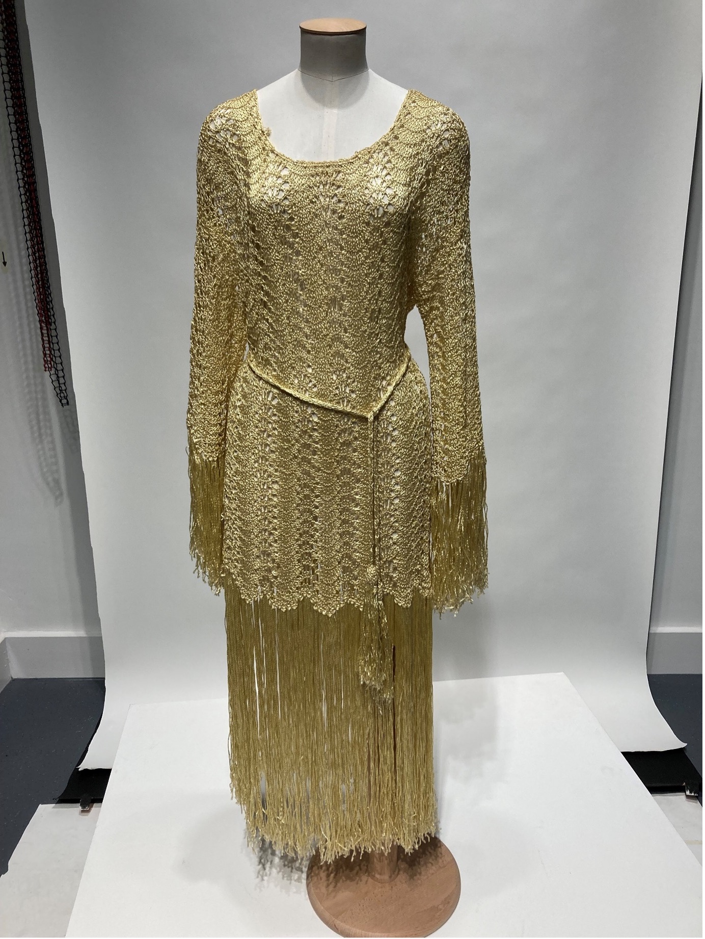
Jen Grasso is the Digital Content and Systems Co-Ordinator at the University of Brighton Design Archives and is also a graduate of the Curating Collections and Heritage master’s programme. In this blog post, she reflects on her career so far, and how the MA Curating informed her practice as a researcher and archives practitioner.

With a practice-based background in photography and over 10 years working in administration and recordkeeping, I enrolled in the MA Curating, Collections and Heritage programme in 2019 to see how I could apply my passion for the arts, culture and heritage with my accrued professional experience. I was interested in the theory and practice that founded modern-day collections and how heritage and culture was developed and supported in the UK. During my course I quickly became passionate about working with archives, an area I was lucky to explore during my student placement assessing the archive of photography non-profit organisation Photoworks.

My placement was unfortunately cut short because of the Covid-19 pandemic and subsequent lockdown, but I continued to build on my passion for archives. I volunteered at the University of Sussex Special Collections on the National Heritage Lottery Funded-project Unlocking Our Sound Heritage (UOSH) that digitized sound recordings for the British Library’s Sound and Moving Image catalogue (SAMI).  My main task was to listen to oral histories to flag sensitivity issues and create a summary for the catalogue. I listened to members of the Windrush generation talk about their first impressions of the UK; people’s experiences living through the Blitz; the recipients of the first social housing development in Southhampton, as well as different union members talk about the effects of industrial action. It was here I gained an appreciation for oral histories and how they can be used to document different communities.

Inspired by the UOSH project and the dissertation research I undertook during my master’s degree, which focused on polyvocal narratives and how they are expressed through photography, I began a community archive project documenting the role of the photobooth technician. This was also inspired by the postgraduate course in Archival Studies at the University of Dundee which I enrolled in following my master’s at Brighton. A technician myself since 2015, the Photobooth Technicians Project is an ongoing project that documents the history of the profession since its inception in 1925, in particular, the grassroots community that has arisen throughout the 21st century. It consists of semi-structured oral and written interviews combined with test strips from each technician, which is the main way to assess the status of one’s photobooth. I’m lucky to be able to share this project at the upcoming Photographic History Research Centre’s Annual Conference, The Photographer’s Assistants, at DeMontfort University in June.

In 2022, I was hired as the Digital Content and Systems Co-Ordinator at the University of Brighton Design Archives. My work and research in the Design Archives focuses on the intersection between analogue and digital technologies and how technology can be used to democratize heritage. Part of this research involves an ongoing project working with Dr Karina Rodriguez Echavarria and colleagues in the School of Architecture, Technology and Engineering looking at how Machine Learning and AI can make collections more accessible.

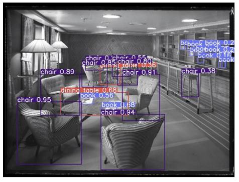
Detail of the results of Santander-funded student placement applying machine learning to the discovery of the Design Archive’s collections. Original image © Design Council Archive, University of Brighton Design Archives.

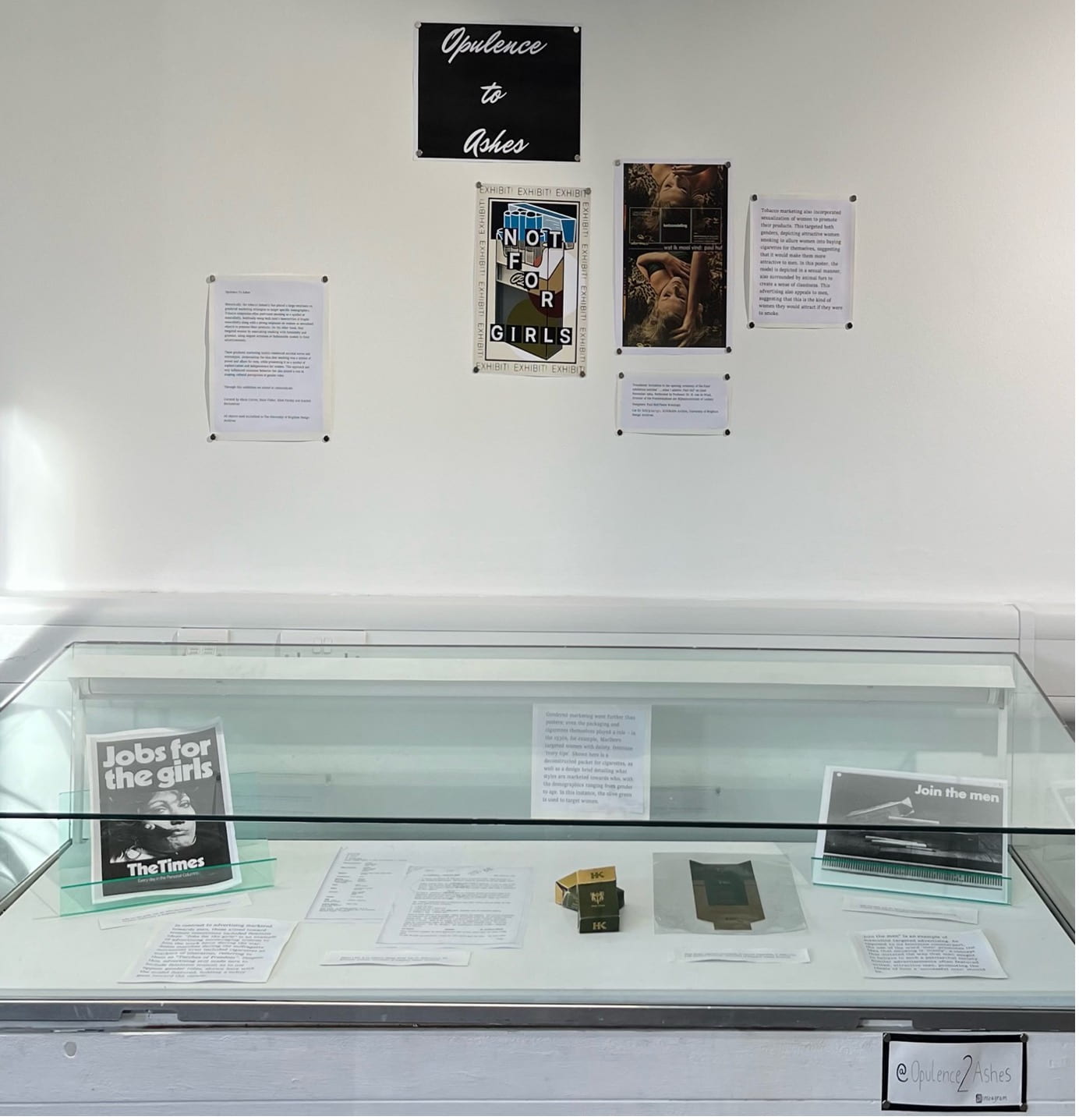
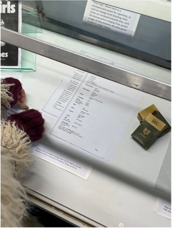
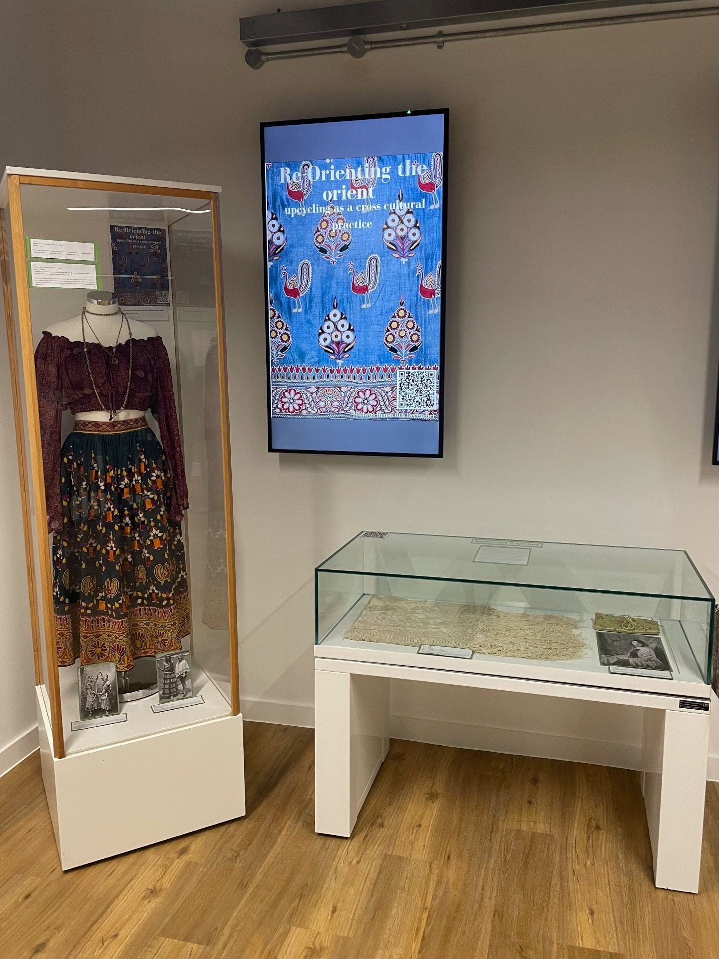
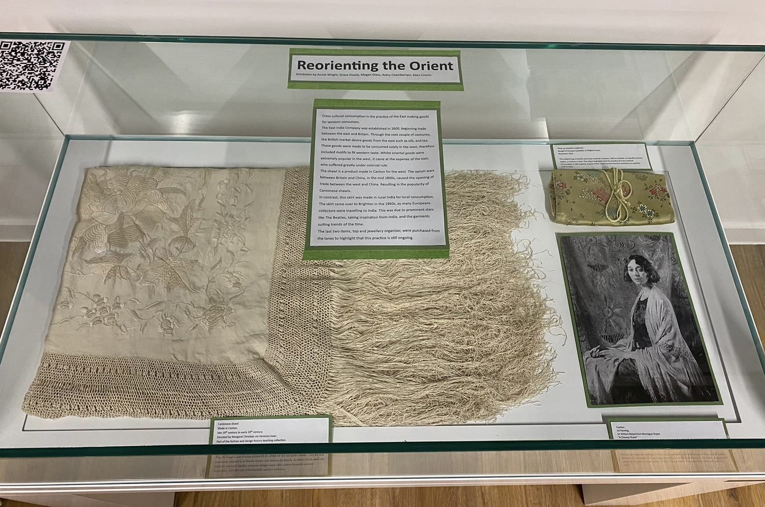
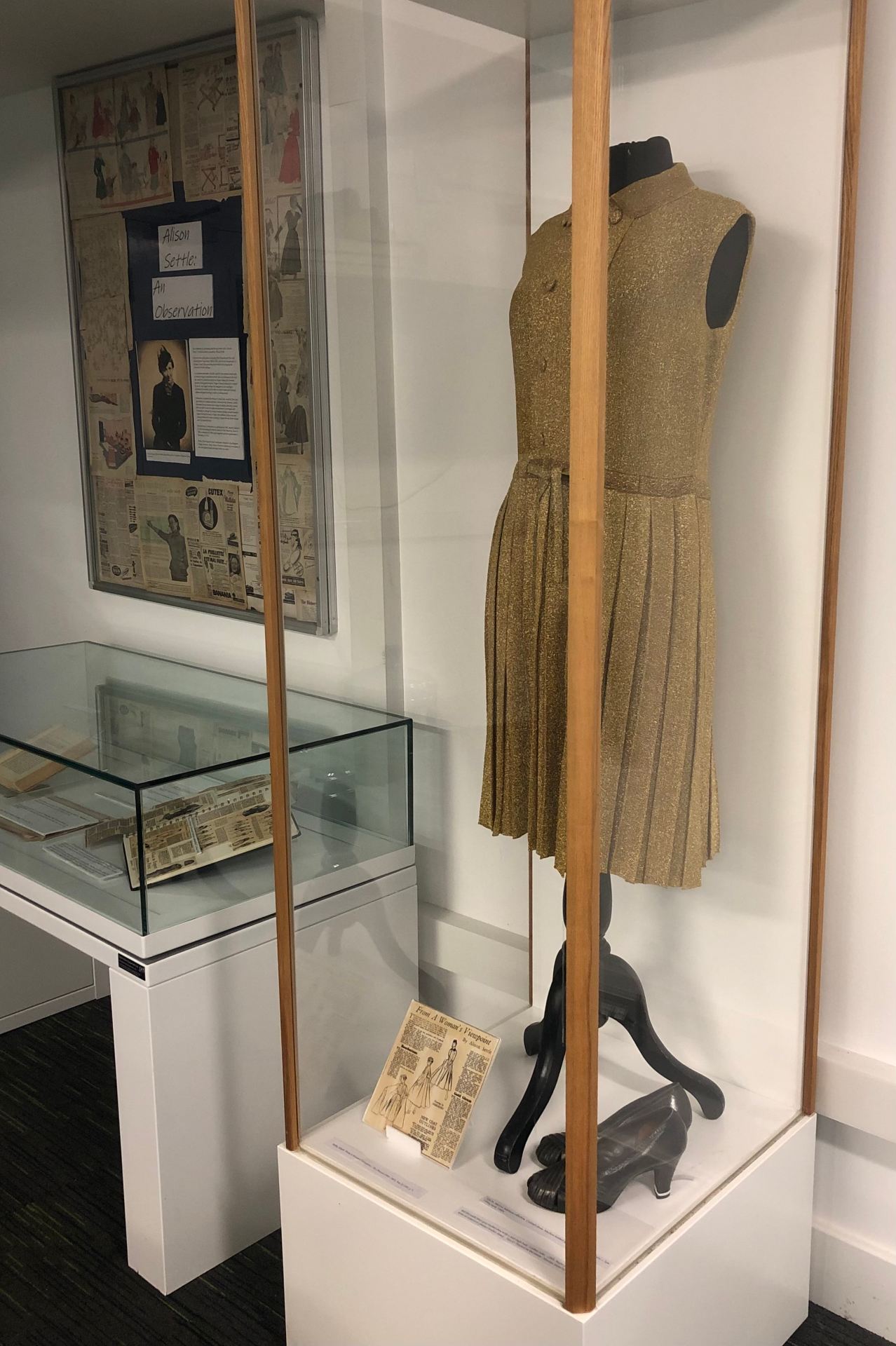
I am also responsible for the digital generation, dissemination, and preservation of records at the Design Archives, and am part of a team that cares for, and makes accessible, records relating to graphic and industrial design from the mid-20th century, a wonderful resource I’m incredibly fortunate to work with. This role allows me to do what I’m passionate about, working directly with collections helping make them accessible, and also brings me back to the University of Brighton, a community that inspired me throughout my master’s degree and one I am now proud to be part of.

Opulence to Ashes: An exploration into the gendered marketing of the tobacco industry

Alicia Curran, Deale Fisher, Eden Parsley and Scarlett Swinnerton have curated an exhibition reflecting on the relationship between gender identity and the marketing of tobacco in their second-year project for the BA History of Art and Design module  ‘Understanding Exhibitions and Creating Displays’.

Opulence to Ashes is an exhibition, recently curated using archived materials from the University of Brighton’s Design Archives, now open in the foyer of St Peter’s House Library. This exhibition delves into the intriguing topic of gendered marketing within the tobacco industry and explores how marketing strategies have targeted specific gender identities and influenced consumer behaviour. Opulence to Ashes examines the utilisation of imagery, colours, and messaging that have traditionally reinforced gender stereotypes. By analysing these aspects, the exhibition prompts visitors to question the underlying messages and consider the broader implications.

The focus of this exhibition is on examining the ways in which the tobacco industry has targeted specific gender identities through their marketing strategies. Delving into the use of imagery, colours, and messaging that have traditionally reinforced gender stereotypes and influenced consumer behaviour. It looks at how cigarettes were initially marketed as symbols of masculinity, often with rugged cowboys and suave gentlemen being used to promote various brands. On the other hand, certain cigarette brands were specifically targeted towards women, employing feminine aesthetics and associations with elegance and sophistication. Opulence to Ashes brings you their own discovered cigarette brand: High Kings.

Seen below is an image of two reconstructed High Kings cigarette packages alongside the gender strategised, and targeted, design brief. The team chose the Olive Green packaging as in the brief this colour is explained as targeted at females and the Opulence to Ashes team want to allow the chance for any attendees to this exhibition to refer to this in the feedback. Boxes of this particular branded cigarette were also enhanced to appear either lighter in colour or more golden than those targeted at men.

As the exhibition progresses, it highlights the impact of gendered marketing on individuals and society. It examines the ways in which these marketing tactics have reinforced harmful gender norms and perpetuated inequality. As well as offering insight through the dissection of advertisement and promotional materials, present amongst the exhibition materials is the High Kings design brief that associates colours with certain age groups and genders. When creating this exhibition, with a target audience of university students and academic professionals in mind, the Opulence to Ashes team approached the advertisement of this exhibition with huge creative intention.

Seen below is a poster created by the team to advertise the exhibition. The playful use of a propaganda style poster is an effective strategy being used here when considered alongside the fact that there is a high likeliness that members of the target audience will be provoked by the look of the poster furthermore intrigued.


Looking at the intended audience and recognising that the ages of many people attending our exhibition would be anywhere from 18 to mid-late twenties, we understood that social media would be one of the most useful tools in advertising our exhibition as well as building our brand aesthetic and continuity to the exhibition pieces. Instagram being our chosen form of representation and advertising for the exhibition allowed for the aesthetic of Opulence to Ashes to be appointed prior to the exhibition.

Something Old, Something New: The Influence of the White Wedding in Popular Culture

Emily Hetherington, Neve Lloyd Owen, Maizie Hegarty-Woods Alexandra Laveglia and Maddison Brathwaite – Richards review the significance of the wedding dress in their second-year exhibition project for the BA History of Art and Design module  ‘Understanding Exhibitions and Creating Displays’.

‘Something Old and Something New’, Exhibition View, 2023

Something Old and Something New is a new exhibition looking at wedding traditions through different pop culture moments and how people have gone against them. What is thought as one of the oldest wedding traditions, the white wedding dress, popularised by Queen Victoria, was promoted through media and magazines that made people believe that wedding dresses were always white. For many, white wedding dresses show a fairy tale ending for them, not unlike the ones seen in Disney’s Cinderella. For some Christians a white wedding dress shows the end of innocence and purity of a child into adulthood as a stepping into a new stage of life. In the Global North the white wedding dresses is so integral to our image of weddings that it has bled into the Global South, with many people opting to having a white dress in some capacity alongside their own traditions. One of the many ways the tradition has leaked into different cultures is through televised royal weddings, such as the 1981 marriage of Prince Charles and Lady Diana Spencer, watched by 750 million people in 74 countries, which was a major pop culture moment of the 1980s. So, the exhibition here starts with a wedding dress from 1984 designed by Patricia Miller that is stylistically inspired by Diana’s own wedding dress, from the University’s own teaching dress collection. This dress is our launching point for looking at how bridal traditions are upheld, subverted or broken within Western pop culture.

Installing a wedding dress (1984) from the University of Brighton Dress History Teaching Collection

The rhyme that gives the name of the exhibition comes from “Something old, something new, something borrowed, something blue” links to wedding traditions. The rhyme dates to about to the 19th century in the British Ilses and has been part of weddings for almost the same amount of time, as it is said to help the wedding go smoothly for the bride. Many pop culture weddings follow this tradition but many don’t. An example of a wedding not following the normal traditions was Bianca and Mick Jagger’s weddings in 1971. Bianca Jagger wore trousers to this wedding which broke standards of what we saw with celebrity weddings and since then there have been examples of women opting for trousers as their bridal dress, especially with the rise of LGBTQIA+ weddings. In this way we can see how something new can become something old in a short amount of time.

Display case, ‘Something Old and Something New’

Ultimately, through this new exhibition we want people leave with an understanding of how tradition is invented, through examining weddings. As the British social scientist and geographer Doreen Massey writes, tradition is seen through nostalgia, something that we need to maintain, or it will be lost. White weddings and all we expect from them comes from our understanding of what we have seen whether that be from pop culture or from our personal experiences of weddings, ideas that can hopefully be seen in this new display on the second floor of Mithras House, next to the Hellerup stairs.

Curated by Emily Hetherington, Neve Lloyd Owen, Maizie Hegarty-Woods Alexandra Laveglia and Maddison Brathwaite – Richards.

Reorienting the Orient

Annie Wright, Grace Dowle, Megan Glass, Avery Chamberlain and Eden Cronin have curated an exhibition reflecting on the connection between objects associated with the idea of ‘the Orient’ and the social construction of cultural difference within British society in their second-year project for the BA History of Art and Design module  ‘Understanding Exhibitions and Creating Displays’.

Reorienting the Orient: Upcycling as a Cross Cultural Practice, Mithras House, 6th Dec 2023

Reorienting the Orient is an exhibition that aims to explore the narratives and aims of cross-cultural consumption and the repurposing of cultural garments for alternative uses in the west. Ideas surrounding where these garments were intended to be worn are contrasted between systems of international export and local trading, which allows for an interesting comparison in the usage of oriental clothing in Britain.

Orientalism, a term coined by Edward W. Said, describes the western construction of ‘the Orient’ as a place of mysticism and exoticism and reflects Britain’s imperial relations with Asia. Britain’s connections to the Orient have influenced popular fashion trends in many ways through the years. Reorienting the Orient documents multiple examples of the dissemination of imported Oriental goods into British society, whilst also providing context behind specific examples.

The exhibition features two main pieces, selected from the Dress History Teaching Collection. The first, a skirt most likely handcrafted by the Rabari, a nomadic tribe indigenous to the Kutch district of Northern India. Despite initially being thought to be from the Rajasthan state of India, research suggests the bright embroidered motifs of peacocks and mango trees to be that of Rabari craft. This skirt would have been created for local consumption within the Kutch district, but was brought to Brighton by John Gillow amidst the British fascination with Indian culture during the 1960’s.

Reorienting the Orient: Upcycling as a Cross Cultural Practice, Mithras House, 6th Dec 2023

The second garment from the same collection is a Cantonese shawl, dating anywhere from the late 19th to early 20th century. Also being known as ‘Manila Shawls’ and ‘Manton de Manila’, these fabrics were most often made of silk and featured the Yue embroidery that is native to the Canton region. Patterns on these shawls often include scenes from nature and mythical creatures. This specific example features embroidered motifs of foliage on cream silk, with a border of fringe encasing the design. In contrast to the Rabari skirt, these Cantonese shawls would have been made specifically for western use. The consumption of these garments in Europe would ultimately lead to the commissioning of western cultural emblems to be embroidered on them, and the chartering of trade companies designed to import these products to various European nations.

Reorienting the Orient: Upcycling as a Cross Cultural Practice, Mithras House, 6th Dec 2023

Although both of these pieces show the significance of orientalist clothing in Britain in both the 19th and 20th centuries, ‘Reorienting the Orient’ also displays evidence of orientalism as an ongoing practice. This is shown through the exhibiting of two recent examples, purchased by the curators locally, in the Brighton lanes. Displayed on a mannequin alongside the Rabari skirt is a long sleeve cropped blouse in a rich maroon colour. The pattern featured on the garment shows clear inspiration from South Asian clothing and shows how cultural items from the Orient may have been understood and worn in a westernised context. Alongside the Cantonese shawl, a small toiletry case is displayed, which features designs and motifs that are heavily east-Asian inspired. Despite a lack of information on this piece, the purpose can be assumed to be that of western consumption, with copies of this very product being found on selling sites such as eBay.

Throughout Reorienting the Orient, the idea of a difference in production and consumption remains constant, with comparisons between the intended purposes, trade routes and the adopting of the exhibited garments into western society.

The exhibition, curated by Annie Wright, Grace Dowle, Megan Glass, Avery Chamberlain and Eden Cronin, is now available for viewing on the second floor of Mithras House (top of the Hellerup stairs).

Students’ work on display at Brighton & Hove Museums

Brighton Museum and Art Gallery have opened a new display that features work from MA Curating Collections and Heritage students

“DO NOT TOUCH!!!!” is a display of student posters that all try to challenge the classic signage in museums that ask visitors not to touch the collections. It is on at Brighton Museum and Art Gallery over the next few months.

Caring for Collections and their Users


Museum visitors often report feeling out of place or self-conscious in museums, and signage and instructions that dictate how visitors should behave are often part of the alienation and embarrassment that prevents some people from enjoying museums.

Classic signage that MA Curating students hope to avoid

Students on the module ‘Caring for Collections and their Users’ try to take a different approach. As part of their assessment they are challenged to present complex conservation information about caring for objects to museum audiences in an accessible and engaging way. Students can choose to produce a poster that encourages visitors to not to touch, or they can opt to design a set of child-friendly instructions for the safe handling of a mixed range of objects in a schools handling box. Their designs are informed the debates around access, learning, collections research, preventative conservation and audience development that are covered on the module.

Working with Brighton & Hove Museums


Each year, students on the MA Curating benefit from conservation workshops run by staff from Brighton & Hove Museums. This year, our long-term relationship with Gaye Conley, Head of Conservation, has led to an invitation to our students to display their posters. Gaye writes

I have wanted to display the students’ work for several years. It’s rewarding to see the outcome of the talks we have undertaken with the students, and it will be fascinating to watch the public engage with the students’ work.

Student posters on display at Brighton Museum & Art Gallery

Student Success


In the space available, Brighton & Hove Museum staff chose three posters produced in recent years. Ellie Bedford designed ‘Museum in a Box!’ to support a school session to help children safely handle objects; Paige Franklin designed ‘Look at Me!’ for an art and design gallery that has fragile objects on open display, and Elliot Thorn produced ‘Vase on a Plinth’ to help people see the consequences of touch, and what might happen if they bring food into the gallery. All of the posters use bold graphics and clear text to encourage visitors to feel welcome in the museum, and informed about how to care for our shared heritage.

Ellie writes,

The poster design was a fun challenge! I enjoyed bringing together all of the curating skills and academic theories that we had learnt, and applying them to a practical task. It’s very rewarding seeing it in print!

‘Museum in a Box!’, Ellie Bedford, 2022


‘Look at Me!’, Paige Franklin, 2023

Elliot writes,

Designing the poster was a fun experience. It was a challenge to figure out how to convey meaning without written language. One of my aims was to make the poster accessible to people whose first language wasn’t English, so clear visual storytelling was important. Overall, I’m happy with the end result!


‘Vase on a Plinth’, Elliot Thorn, 2022


Their university and museum tutors couldn’t be prouder! Congratulations all!


New Student Exhibition – Alison Settle: An Observation

BA Art History and Visual Culture students Lori Bennallick, Ellie-Mae Carter, Romina Valerio Martinez and Holly Owen announce their new exhibition, now on display at Pavilion Parade at the University of Brighton

Alison Settle: An Observation is an exhibition curated to highlight Alison Settle’s importance in fashion journalism and to celebrate her journey as a great influence in the fashion industry. In this exhibition, you will find newspaper cut outs from The Observer, which inform us of Settle’s achievements. There are also digital portraits and a mimic response of one of her potential outfits. Furthermore, the exhibition will include a copy of the famous book “The Clothesline” by Alison Settle, which includes a range of information about her role in the fashion industry and as editor of British Vogue. This curated collection will be a homage to her career as a journalist. Alison Settle became a significant link in fashion between Britain and France. High-end fashion lines such as Schiaparelli and Balmain have described Alison Settle as “The Queen” or “La Reine”.

A dress from the University of Brighton’s dress teaching collection, evoking the type of dress Settle would have recommended to her readers

The “Alison Settle: An Observation” exhibition will showcase from Tuesday 13 December at Pavilion Parade, where all students and members of staff will have access to attend. Pavilion Parade is located in the heart of Brighton, Old Steine. This allows easy access to students and members of staff that live nearby. This exhibition has been organised and curated by four current second-year students, Romina Valerio Martinez, Lori Bennallick, Holly Owen and Ellie-Mae Carter. The artefacts in this exhibition have been carefully picked out and placed to result in an impactful storytelling production of Alison Settle’s career.

Curator Holly Owen is certainly “so pleased with the outcome of this exhibition because women like Alison Settle should be recognised and celebrated for their achievement.” Settle was a female journalist and editor of British Vogue for over a decade, repeatedly encouraging and advising women about fashion and trends. The significance of this exhibition is to shape it as a celebration of how Alison Settle, as a woman, was able to defy gender norms within journalism.

Curator Ellie-Mae Carter sees this exhibition as “perfect for a fan of fashion” and also describes it as a “fashionable take on a prominent female journalist.” The items in the exhibition show that Alison Settle was recognised by the media and took on an important role in the fashion world.

O’Sullivan describes Alison Settle as the “Grande Dame of European Fashion”, which translates to the “Great Lady”. She was seen as a fashion journalist icon whose opinion mattered and influenced many middle-class women. Fashion magazines such Vogue were seen as very elitist and attracted a mainly a middle upper-class audience. One of Settle’s main goals for the fashion industry was to create a platform where British Vogue would become a more practical and affordable concept so that it could impact a much bigger audience.

The images below show clippings from the newspaper The Observer, where Alison Settle’s work was published. Not only was she a great influence for the fashion industry, she also raised many societal issues such as women’s rights with the power she had obtained as a journalist. As stated previously, this exhibition is not only about her celebration as a fashion icon but also as a powerful woman who was able to impact many and use her power to raise many issues and defy gender norms.


New Student Exhibition: HIV Positivity: Work of those Affected

BA Visual Culture students Imre Bitirim, Ruby Cumiskey, Simona Moccetti and Samantha Williams announce their new exhibition, now on display at St Peters House Library at the University of Brighton

HIV Positivity: Work of those Affected is an exhibition curated to inform and celebrate science, society and the people who have fought this horrific disease. On display there are artworks by two artists who have suffered and sadly passed away due to AIDS related illnesses, Mark Leslie and David Robilliard, as well as more pieces from the St Peters House Library Archives. As this is a powerfully emotive subject, the curators have done everything in their power to make this exhibition accessible for all and have appropriate trigger warnings when necessary.

From December 13 2022 students and staff members of Brighton University will be able to visit St Peters House Library, located on Richmond Place, for an intimate exhibition on the HIV and AIDS epidemic. This exhibition has been set up and organised by four second-year students from the Visual Culture course, Simona Moccetti, Imre Bitirim, Samantha Williams and Ruby Cumiskey.

“We felt it important to give back to this cause by raising money for World AIDS Day. To do this we have placed a charity box at Pavilion Parade and have linked relevant sites where people can donate money,” says curator Ruby Cumiskey.

HIV is still a major health issue globally, and it is thought that 38.4 million people are still living with HIV today. But thanks to science, people can live a healthy life with the correct medication, and with experimental drugs and through extensive research, five people have now been cured of HIV. But this wouldn’t be possible without charitable donations.

“Making our display inclusive and accessible was one of our main goals and we worked hard to make this possible.” Simona Moccetti, curator.

The chosen facility to display the exhibition is St Peters House Library, because it is wheelchair friendly, and has a wider range of people passing through. Within the display are QR codes, with instructions on how to use a QR code, the web address for those unable to use QR codes, and a leaflet if the person does not have a phone or access to the internet.

“These artists you see here [in the exhibit] maintained colour in their lives, although an incurable disease attempted to deprived them of such. Therefore, we felt it necessary to have the vitrine visually light and colourful, although the subject matter may be distressing. We wanted to pay homage to these artists the same way they explored their battle.” Imre Bitirim, curator.

A Tumblr page has been created to accompany the exhibition. One of the QR codes on the display will lead the viewer to the page, where they will find more photos and information of the items, film, TV and documentary recommendations that include stories and information on HIV and AIDS. On the site there are also links to pages where people can donate money to relevant causes. There is also a section where the public can post questions and comments either about the display or about personal experiences they’ve gone through.

“We have selected multiple objects from the St Peters House Library archives, as these objects contain personal experiences whist living with HIV/AIDS.” Samantha Williams, curator.

World Aids Day Poster, 1994, from the collection of St Peters House Library

The items that have been carefully chosen to go into this exhibition include a poster from 1991 that shows many different variations of the red ribbon, which is a symbol of support and solidarity for people who suffer with HIV and/or AIDS. There will be a book with personal photographs from an artist called Mark Leslie, who contracted AIDS and recorded his body going through the painful changes with photography. A book and CD by artist and poet David Robilliard, sadly another artist who suffered from the virus and unfortunately passed away, is also included. There will be an extra QR code linked to Robilliad’s spoken poetry in the display. And finally, a modern comic book about a normal person living with HIV and taking the PREP pill, is included. This comic book is informative as well as enjoyable to read and look at.

A Andrews and J Amaro, Just a Pill, 2020, from the collection of St Peters House

This exhibition aims to be a celebration of people, society and science and not a deep dive into the virus itself. It hopes to be educational, enlightening and sentimental as it has affected so many human beings in the past as well as the present. It is not a topic to be forgotten.

Conservation Work Placement: A Patchwork of Skills

Helping to de-install the mannequins used for Dame Vera Lynn: An extraordinary life at Ditchling Museum of Art + Craft

MA Curating Collections and Heritage student Harriet Brown reflects on her work placement in textile conservation with Zenzie Tinker Conservation studio.

For the placement module of the MA Curating Collections and Heritage, I worked at Zenzie Tinker Conservation (ZTC). This was an incredibly varied placement where I supported a wide variety of projects.

Over 150 hours, I helped with condition checks at Smallhythe Place, the actress Ellen Terry’s Kent house which is now owned by the National Trust. I participated in a shoe mounting workshop at Worthing Museum and helped with the surface cleaning and packing of the Gage family coronation robes for Firle House. I also helped to make mounts for curtains for Rudyard Kipling’s house at Bateman’s, another property owned by the National Trust in East Sussex.


Surface cleaning the Viscount Gage’s coronation robes and the coronation robes on display at Firle House

The main project I worked on during my placement was a patchwork quilt from the ZTC study collection. It joined the study collection after Petworth Cottage Museum decided to deaccession the object. In return, ZTC did some vital conservation work on objects in their remaining collection.

 The Petworth Patchwork

This quilt is a nineteenth-century unfinished patchwork quilt, made from a variety of fabrics, each wrapped around a paper template. The quilt was made by someone (most likely a woman) who lived locally in or near Brighton. I discovered this through my close examination of the patches in the quilt as many of the addresses and names of businesses on the patches that were still readable could be traced to locations in Brighton. These were mostly around North Street and Ship Street. The earliest date I found on the papers was the 2nd of August 1859 and the latest date I found was the 30th of October 1870. The large range of dates in the quilt was likely down to the fact that paper was relatively expensive, so scraps would have been saved up over time to be used in a project of this size. Due to the fact this quilt is over 150 years old, several of the papers have naturally started to show wear and tear. Also, the quilt had at one point been stored folded and so there were several large creases running through the fabric and papers. These both provided excellent opportunities for learning about conservation techniques.

Over the course of the 150-hour placement I photographed the patches and carried out research on the patches that were legible and had names and addresses on them. I also researched the practice of quilt making. Some of the patches had more information than others. For example, from one of the patches I was able to find out about a solicitors firm that had been operating in Brighton from 1775 to 2019! (more information can be seen here).

Once this cataloguing was finished, I then surface cleaned the paper side of the quilt. This was done using a vacuum with a brush attachment on the lightest setting and then going over the fabric part of each patch using a makeup sponge. Once I had carried out the surface cleaning, I was taught how to humidify the patches in order to release some of the creases. However, this wasn’t a very effective method, so we moved to using a vacuum table. Using the vacuum table, I was taught how to remove the creases from the papers and the fabrics, as well as how to use Japanese tissue paper to create supports for the paper patch templates to prevent them from becoming further damaged.


Before and after of two of the patches I conserved on the vacuum table using Japanese Tissue Supports

I am incredibly grateful to have worked on such a large variety of projects whilst on my placement at Zenzie Tinker Conservation as it has helped me to better understand the wide variety of conservation techniques that help make it possible for objects to go on display.

The Conflictorium: A radical museum experience

‘The wall of conflicts’ display at the Conflictorium, 2018, image by Shubhsadhwani, licensed under the Creative Commons

MA Curating Collections and Heritage student Preksha Kothari reviews the Conflictorium in Ahmedabad, praising its politically engaged role in Indian political life.

Time and again, conflict and dissent have been viewed through the lens of caution, and commonly, as concepts that are dangerous to society. The museum setting is often uncomfortable in addressing notions of politics and activism. However, a unique museum in Ahmedabad, Gujarat, India has sprung up with these very ideas at its core.

Nestled in an old suburb of Ahmedabad, the Conflictorium is the brainchild of Avni Sethi and is supported by three social organisations, Janvikas, the Centre for Social Justice and Navsarjan. Housed in the Gool Lodge, the museum strives to be a place where one can be introspective and come face to face with conflict in the inner self and their environment. The museum encourages its audiences to engage with and express discord rather than ignore it.

The Conflictorium attempts to trace the violent history of the state of Gujarat, which in popular memory is often perceived as a peace-loving region. The 2002 Gujarat riots, which are considered the bloodiest clash between the Hindu and Muslim communities in India, are seen as an anomaly. However, Sethi aims to bring people into confrontation with the oppressive and brutal past of the state and show how it has been largely ignored in Indian society. The museum sits in the vicinity of places of worship for different religious faiths and is located close to residents of underrepresented communities. One glance at the Gool Lodge and it is clear that the museum team has deliberately not gentrified the space and kept it open to everyone. This is in tandem with the core belief of the Conflictorium. The exhibits are not kept in vitrines and rope barriers are not present either. This allows visitors to touch each object and craft their own conversation with it.

The museum comprises both permanent and temporary displays. The permanent exhibits include the ‘Conflict Timeline’, ‘Empathy Alley’, and ‘Moral Compass’ among others. The Conflict Timeline portrays the history of clashes since the making of Gujarat. The Empathy Alley contains silhouettes of important political and cultural figures in the making of the country, including M.K. Gandhi and B.R. Ambedkar, representing how different ideologies were expressed in pre- and post-independent India. Moral Compass is a room where an authentic copy of the Indian Constitution is placed, openly accessible to any visitor. While the world’s longest-written constitution is often mistaken for a religious text, the museum hopes to make people aware of their rights through Moral Compass and make them conscious citizens.

Apart from these displays, there are poignant community exhibits that invite audiences to participate while visiting the museum. The Memory Lab acts as a path for visitors to leave their deepest feelings inside empty glass jars, offering a safe space where they can write without judgment. The Sorry Tree is a sacred fig, called peepul ka ped in Hindi. It is located in the museum premise and visitors can hang “I am sorry” notes on the branches, based on the belief that forgiveness is a powerful feeling. Recently, the museum has hosted temporary exhibitions such as “Death and Disease,” which explores the issues of the caste system in India with an allegory to the Covid-19 pandemic. Besides exhibitions, the museum invites artists, poets and writers to host talks and workshops on themes ranging from gender binaries to forests and wildlife.

What started as a college project for Avni Sethi has transformed into an internationally recognised institution that is spearheading a movement for society. Sethi was awarded the Jane Lombard Prize for Art and Social Justice 2020-2022 by the Vera List Center for Art and Politics. Also, the Conflictorium recently opened another space in the city of Raipur, serving as a medium for difficult conversations to be had in that city. Here’s to hoping that the many more such Conflictoriums find their inception in different parts of India, and maybe the world.

Caring for Historic Dress Collections at Worthing Museum

MA History of Design and Material Culture student Chelsea Mountney describes how her current work with the historic dress collection at Worthing Museum draws upon the skills and ideas she developed during her MA, including the module ‘Caring for Collections and their Users’.

“Oh, my goodness” I screeched as I leaned in closer to smell this bodice from a woman’s black taffeta outfit from the 1910s, pictured above. “Can you smell that? What do you think that is?” I was informed by the ever-knowledgeable PhD student, Jo Lance, that the unusual smell was probably the scent of wood smoke that was lingering on the cloth, as homes were, of course, commonly heated with open fires.

This was my first afternoon volunteering at Worthing Museum and I had already been reminded of how crucial physical objects are in divulging history. My first task as a new volunteer was, in my eyes, possibly the best job in the entire world, to repack women’s costume for storage in their new dress archive. This kind of work, as many fashion historians will also agree, is a blissful opportunity to access and handle many items.

I had considered throughout my studies how invaluable embodied knowledge can be to the dress historian and leaned on Hilary Davidson’s work, the Embodied Turn during my MA in Design History and Material Culture. These were my first moments of getting to handle delicate or complex pieces, like the scented black outfit, and work out how they needed repacking for their future care. In the first image you can see that the delicate mesh collar needed an acid free tissue paper support. Each different garment supplied a new lesson in handling and packing. What unfortunately isn’t pictured, is that inside the sleeves were arm pit pads, small patches that were often inserted into historic clothing to protect the garment from sweat prior to the invention of deodorant. These were sadly disintegrating.

Look at the beautiful label which was hanging off the skirt section of the outfit, which of course provides another exciting line of enquiry. And as PhD student Jo pointed out, the outfit appeared to have been unpicked and adapted, the stylistic elements lending itself to an outfit from the previous century. It’s exciting details like these which are an utter privilege to witness up close and remind us how Material Culture study is an exhilarating way to decipher the past.

Photograph of 1917 Black Taffeta Day Dress, Label. Worthing Museum 4302 1-2. 11/11/22. Author’s Personal Collection.

This experience made me feel incredibly grateful for the handling workshops I undertook at Brighton Museum as part of the Caring for Collections and their Users Module, a core module for the MA Curating Collections and Heritage. This mixture of both object-based work and practical and theoretical study provided a rounded background in both the academic and the practical. On the module, we read industry-led incentives from the Museums Association and discovered scholarship on museums and heritage that help contextualise this world, like George Hein’s book, Learning in the Museum. We had sessions on Integrated Pest Management, and learnt what on earth accession numbers actually mean! Importantly, handling workshops taught us how to make a simple acid-free tissue paper pouffe, a crucial part of the packing process of course! All these insights allowed me to approach my newfound volunteering position with confidence.

As you can imagine, a fantastic bonus of volunteering with the dress collection at Worthing Museum is how much it has inspired further study, from researching different historical dressmaking techniques (remaking as methodology is one of my areas of special interest), to trying to better understand the varying forms of production during a specific period, or simply looking up other examples in this collection and beyond to better understand clothing cultures of a certain style. But sometimes there is just the simple joy of discovering a garment you have never seen before like the incredible 1920s crochet dress.

Photograph of gold coloured 1920s crochet dress. Worthing Museum 1976/277/1. 11/11/22. Author’s Personal Collection.

I am only a few weeks into this experience, and I already feel so inspired, not only to see what else this position has in store, but it has confirmed how I wish to work further in this environment, and to contribute to research in fashion and dress in this material manner.