“Fashion is not frivolous; it is a part of being alive today”

PhD student Jenny Roberts on working on the V&A’s forthcoming Mary Quant show

Ever since studying dress history for my BA in History of Art and Design at the University of Brighton I have dreamt of working at the V&A in the Fashion and Textile department. Many years later, as a PhD student, I finally achieved this ambition as part of a funded internship courtesy of my AHRC funders, Design Star and University of Brighton. It was everything I had hoped for and more. 

Fig 2

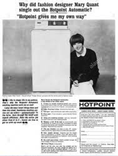
Fig. 1 Daily Mirror – Wednesday 17th March 1965, p.1

For six months I worked exclusively on researching and planning the Mary Quant exhibition, due to open on 6th April 2019. Jenny Lister, one of the exhibition’s curators, has been wanting to hold a Quant retrospective for many years. The previous lack of attention is astonishing considering her market presence from the mid 1960s to the late 1970s. Although the Museum of London held ‘Mary Quant’s London’ in 1973, a full assessment of her work is timely.  The V&A’s exhibition will trace the journey of the Mary Quant brand from her original shop to a worldwide market where her name featured on clothing, hosiery, hats, spectacle frames, umbrellas, jewellery and make-up homeware, home furnishings, carpets, paints and wallpapers, and beds. Mary Quant was even used to promote Hotpoint washing machines!

From the beginning of the exhibition process, the curators wanted to steer away from preconceptions of 1960s psychedelia and to articulate a more measured appraisal of Mary Quant’s work and output. It is this narrative which will surprise and interest visitors to the exhibition when it opens.

Fig 3

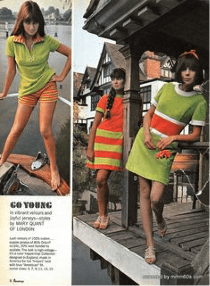
Fig. 2 J. C. Penney’s Catalogue 1966

The Mary Quant business began as a single boutique in Chelsea, London in 1955, which had transformed into a worldwide brand by the mid-sixties. Quant recalled in her autobiography that: ‘It was utterly impossible…to envisage that within seven years the business would go well over the million mark and the clothes I was to design would be in 150 shops in Britain, 320 stores throughout America and also on sale in France, Italy, Switzerland, Kenya, South Africa, Australia, Canada and, in fact, in just about every country in the western world’.[1]

Fig 4.

Fig. 3 Wool Jersey dress V&A T.352-1974

In 1953 Mary Quant graduated with an Art Teacher’s Diploma from Goldsmiths College, where she met her future husband, Alexander Plunkett Greene.[2] Archie McNair, who made up the team, was a qualified lawyer and photographer and owned a café in Chelsea. His legal acumen was used to their advantage when negotiating branding deals. Together they invested £10,000, a substantial amount of money in 1955, opening a boutique shop in the Kings Road. Bazaar, as the shop was named, became renowned for its playful and amusing shop window displays and became a destination shop for a growing affluent younger market. Another Bazaar opened in Knightsbridge in 1957. In 1962 Mary Quant visited America and, as a result of this visit, she began considering mass production techniques in her designs. Her involvement with American department store J.C. Penney’s was marketed to the American audience emphasising Mary Quant’s pivotal role in ‘Swinging London’ at a time when London considered ‘cool’.

Fig 5.

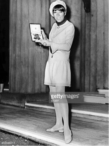
Fig. 4 Mary Quant pictured wearing a jersey dress from her own collection at Buckingham Palace with her OBE award, 1966. © Getty Images

In 1963 Mary Quant launched her more affordable range under the label ‘The Ginger Group’. This range of clothing incorporated some of the mass production techniques she had learnt from her travels to America and was reflected in the design and the fabrics chosen. A film clip reveals Mary Quant’s thoughts on what she considered the time-consuming and expensive nature of haute couture. She felt that “clothes should be made by mass-production when we live in a mass-production age.”[1]There were multiple derivations of a design, like for example her ‘Banana Split’ dress made in a black jersey fabric.

These jersey dresses were easy to wear and care for, available in a rainbow of colours as well as variations of the original design. The success of the Mary Quant brand was equally due to her and Alexander’s imaginative and playful marketing as much as it was due to the circles in which they mixed. For example, before he became the Rolling Stones’ manager Andrew Loog Oldham was employed to dress Bazaar’s windows.[1] Crucially, whenever Mary Quant featured in articles or in public, she was dressed in her own designs. In 1966 Mary Quant received her OBE for services to the British fashion industry at Buckingham Palace. She was pictured in newspaper articles holding her award wearing one of her Ginger label jersey dresses. She implemented this marketing strategy even when advertising her collaborations with other manufacturers. In the advertisement for Mary Quant berets made by Kangol all the models wore jersey dresses from the Ginger Group label. Similarly, when her shoe range Quant Afoot was launched the models all wore her designs.

Fig. 5

Fig. 5 Advert for Mary Quant’s collaboration with Kangol

I started my V&A internship when the museum had just taken delivery of the Plunkett Greene archive, which included private papers, marketing material, Daisy Dolls, Daisy Dolls’ outfits, fashion photographs and garments worn by and designed by Mary Quant. The first few weeks were spent on cold, November days in the Cloth Workers Guild at the V&A’s Blythe House photographing, dating and cataloging the previously unseen contents of the archive. From there we moved on to creating boards documenting the items held by various institutions throughout the world.

These boards were an essential visible aid in the formulation of the story of the exhibition. Thematic boards were then created and once the ‘story’ had been agreed consideration moved onto the restrictions imposed by the physical layout of the exhibition space and the display cases. One of the first problems facing all curators staging an exhibition in the V&A’s fashion galleries, is navigating display cases and available space. Without giving anything away, I feel that what is sometimes considered a problematic space has actually lent itself to the narrative of Mary Quant’s journey, from a single boutique shop to global brand.

Fig 7

Fig. 6 Mary Quant and models at the Quant Afoot footwear collection launch, 1967 (© PA Prints 2008)

The whole process of designing the exhibition was extremely collaborative. The team presented their ideas on the direction of the exhibition’s narrative not only to colleagues within the V&A, but also to external practitioners and academics. These meetings were constructive, with warm exchanges of ideas and knowledge. At the same time, part of the ‘Mary Quant Team’, as we had become known, researched contextual images, advertisements, stockists and articles featuring the designer in the National Arts Library’s magazine collections. Unusually, the curators Jenny Lister and Stephanie Wood decided to announce an earlier than usual call-out for the exhibition as they wanted to include stories of the impact Mary Quant had had on her generation. In particular they wanted to hear from debutantes, who had been some of Mary Quant’s early clients as this market has been overlooked in previous Mary Quant narratives. But crucially the curators wanted to understand the impact of Mary Quant’s design brand whether clothes, make-up, tights, hats or interior furnishings. The range and extent of her designs were far-reaching, and markets opened up in America, Australia, Europe and China.

My experience taught me a great deal about how to plan and carry out exhibitions. The process is similar to the PhD journey in that to begin with there is an enormous amount of what seems disparate material, which needs to be sifted through to assist in the telling of a story. This material is then edited down to form a focused narrative. Unfortunately, my internship ended before I could get heavily involved in the design of the exhibition space. Even so, I am excited to see the finished exhibition, knowing that I played a tiny part in a long over-due appraisal of the work of a designer who was responsible for disseminating the ‘London Look’ around the British Isles and across the world.

The V&A Mary Quant exhibition opens Saturday 6thApril, 2019. The book that accompanies the exhibition, Mary Quant by Jenny Lister (London: V&A), will be published on 25th March 2019.


Bibliography

Beatrice Behlen, A Fashionable History of the King’s Road. London: Unicorn, 2017. Print.

Breward, Christopher, Fashioning London: Clothing and the Modern Metropolis. London: Berg, 2004. Print.

— David Gilbert and Jenny Lister (eds), Swinging Sixties.London: V&A Publications, 2006. Print.

Booker, Christopher, The Neophiliacs: Revolution in English Life in the Fifties and Sixties. London: London: Collins, 1992. Print

Buckley, Cheryl & Hazel Clark, Fashion and everyday life: London and New York. London: Bloomsbury, 2017. Print.

— and Hilary Fawcett, Fashioning the Feminine. Representation and Women’s Fashion from the Fin de Siecle to the Present. London:I.B.Tauris, 2002. Print.

Donnelly, Mark, Sixties Britain. London: Routledge 2005

Fogg, Marnie, Boutique: a ‘60s cultural phenomenon. London: Mitchell Beazley. Print.

Green, Felicity, “The mini-skirt makes its debut at Ascot….and it’s a winner”, Daily Mirror, 15 June 1966.

Kynaston, David, Austerity Britain 1945-51.London: Bloomsbury, 2007. Print.

McRobbie, Angela (ed.), Zoot Suits and Secondhand Dresses: Anthology of Fashion and Music. London: MacMillan. 1989.

Morris, Brian, An Introduction to Mary Quant’s London.London: London Museum, 1973.

O’Neill, Alistair, London – after a fashion. London: Reaktion Books Ltd, 2007. Print.

Quant, Mary. Quant by Quant: The Autobiography of Mary Quant. London: Headline, 2012

Wilson, Elizabeth, Adorned in dreams: fashion and modernity. London: Virago, 1985. Print

https://www.vam.ac.uk/articles/introducing-mary-quant

https://www.dailymail.co.uk/debate/article-2096184/Mary-Quant-swing-60s-gave-iconic-bob-cut–hallelujah–invented-waterproof-mascara.html

https://artsandculture.google.com/exhibit/0QKSHn4SqTdrLw


[1]Donnelly, Mark, Sixties Britain. London: Routledge, 2005. Print. p.92

[1]https://youtu.be/cyLa5WZ8VO4Accessed 10.10.18

[1]Ibid Locations 675-678

[2]Ibid Location 90

Sepia Tint, Sepia Cloth

BA (Hons) Fashion and Dress History student Olivia Terry on the allure of old photographs

Fig 1.

Fig.1: Found photograph that epitomises the mystery observed in old photos. Author’s collection.

There is something wildly intriguing about old photographs. A singular moment, caught by chance, is suddenly trapped in time, and is immortalized by the sepia tint that encases it. The people caught in the photographs go on to live their lives, but eventually fall victim to time like everyone else, and soon a lifetime has passed, and their memory has been forgotten by those around them. Their photograph is put away in a box, and begins to collect dust and soon fades with an aged yellow, and darkness surrounds the image. But suddenly, light and air overwhelm the photograph, and it has been rediscovered. I delight in this rediscovery; I find my inspiration in everyday people from the past, found in these images. 

Fig 2.

Fig.2: Olivia Terry. Young and Marry. C. 2018. Watercolour, pen, and colored pencil. 5.5 x 3.5 in. Brighton.

It all began when I was digging through my grandmother’s collection of books, when I found a dusty scrapbook hidden on the bottom left corner of her bookshelf. Inside was a collection of photos of her and her family dating back to her birth in 1940. A brunette baby girl held by smiling parents on one page, was replaced by a chubby toddler on the next. The further one progressed in the photo album, the older the child got, soon turning into a young woman. But what really held my interest were the tales behind each photograph, and the people that were frozen in them. My grandmother connected each photograph with some fragmented yarn of a story, but other times, when her memory failed her, I made ones up.    

Fig 3.

Fig. 3: Untitled. Author’s collection.

Before I knew it, I was looking beyond my family’s photographs, and discovered the treasures that lie in antiques stores. I was able to spend hours in them sifting through faded photographs of individuals, couples, families, pondering the mystery that lies behind their eyes, and the story they each possess. What were the events that preceded the photograph being taken? Who were they? Where were they headed after the picture was taken? It was these sorts of questions that fed my creative mind in game playing, story writing and art creating. Sepia tinted photographs of woman donning calico and bonnets led me to pretend I was a pioneer woman navigating her way through the vast wilderness by a nearby copper-colored creek. A hint of a smile could inspire an entire story. Their mystery has always been my muse.

Fig 4.

Fig. 4: Olivia Terry. Lost in Deep Thought. C. 2018. Watercolour and pen. 5.5 x 3.5 in. Brighton.

When I attended events at my high school in Boise, Idaho, I made a point to pass the framed senior portraits of 1917, and allow my mind to wander, and consider each person’s place at the school; their social hierarchy, what clubs they may have belonged to, and possible personality traits. I am fascinated by the unknown of each person, and delight in deciphering the hints present in photographs: the expression on their faces, the chosen objects featured, the settings, and most importantly, the clothing they wore.  

High collars, meticulously pleated skirts, and mutton-chop sleeves caught my attention like a snagged thread. I fell in love with the whole aesthetic of women in big skirts in colorless photos, and soon my inspiration in the photographs was found in something more tangible than just my thoughts, when I began to draw them. I loved the way my fingers felt when I drew the creases and folds of fabric, and how my mind produced romanticized thoughts when I gave the women rosy cheeks, bringing life to the original eeriness. I am able to imagine the bright, cheery nature behind silk taffeta evening gowns and I can fathom the darkness found in black silk-crepe mourning dresses. It is expressed through the intensity of my pen strokes, the colors I choose, and the amount of contrast between light and dark. Drawing their clothing inspires a connective feeling in me, and with each mark of my pen, I feel as if some bit of their mystery is solved.  

Fig 5.

Fig. 5: Untitled. Author’s collection.

Clothing is a powerful tool. Something as simple as a shade of black, a cut in style, or the placement of a patch, has the rare capability to communicate a profound amount about a person — their culture, their time period, their social status, their personality and interests, their religious beliefs, their nationality, their occupation — all without really muttering a word. It can bring life back into bygone stories, because it speaks so personally about the people who wore it. Putting the spotlight on clothing from the past, by studying and restoring it, is what I long to do. I get excited thinking about the way a person’s identity shows through their clothing through the choices made: the color palette, the social connotations, and how the materials varied depending on the resources available to that person. A person’s character shows through their clothing, whether they intend it to or not. Each garment has an individual narrative; and to comprehend that story means to consider everything from the inspiration, to the construction, to the context. Each part makes up a story I am dying to read.

Fig 6.

Fig. 6: Olivia Terry. a Change in Season. C. 2018. Acrylic, colored pencil, and ink. 16.75 x 23.25 in. Brighton.

There are so many narratives that go untold. Lifetimes pass by, and words and memories yellow like paper, and soon, not much can be said or remembered about a person. New stories take the spotlight over the old, until they too are replaced and stored away in old hat boxes and photo albums. But when an old photograph re-surfaces, there is nothing that provides greater insight into the lives of the people pictured than their attire. Because that’s the thing; there is a beauty in historical dress that remains true and constant. A beauty that cannot be muted by the dust it may have collected, or the decades that have passed. It says something deeply intimate about an individual. With the help of studying historical fashion, I want to uncover the stories packed away, and bring light to the ordinary people of years gone by, because quite often, their story is not ordinary at all.

Banksy in Mayfair

BA (Hons) History of Art and Design student Sarahlouise Newman on the exhibition Banksy, Greatest Hits 2002-2008

Banksy 1

Figure 1.

In July, I was volunteering in London when I discovered there was a Banksy exhibition nearby at Lazinc Sackville, Mayfair.  The show, entitled Banksy, Greatest Hits 2002-2008 – a sly dig at the music industry and its cult of celebrity from the artist whose true identity is still unknown – showcased his work during that period. Looming overhead on a balcony as I entered the building, stood a mannequin in a tightened hoodie and fishing rod.  Not something you expect to see down a street in Mayfair. Could this be a physical interpretation of reeling people in by someone who is hidden?

Inside, the work was showcased in a formal art gallery setting, quite a contrast to the streets in which you normally find the originals.  The story behind this exhibition is that co-founder Steve Lazarides, met the anonymous artist in 1997 when he took his portrait for Sleaze Nation magazine. Soon after, Steve Lazarides became Banksy’s official photographer and gallerist, they stayed good friends and decided to create an exhibition of the work that they were linked on.

Banksy 2

Figure 2

Banksy is known for satirical street art, which has a dig at everything from politics and the monarchy to pollution and popular culture.  With that in mind, the first thing I noticed when I walked in was a wall-size picture of a child clutching a teddy bear in a war zone, while people film her, instead of helping her.  Everything from the facial expression, to the location, drew the viewer in and made me feel uncomfortable. It appeared to represent how we, as humans, sensationalise war. Something that Banksy has been said to be against.

Next to it was the popular two policeman kissing image. This street art first appeared in Brighton along with another called the ice cream bomb. This stencil has been turned into canvases and paintings, which can now be purchased worldwide, and the original is still on the outside wall of the Prince Albert pub, down by Brighton Station. Banksy was not only mocking the police with this stencil, but also mocking homophobic people. According to the press, the picture represents the fact that being gay was part of society and love is all that mattered.

Banksy 3

Figure 3

In the middle of the room was a statue of the Greek goddess Aphrodite, given a Banksy makeover as Chavphrodite. The statue had been given a blanket, a plaster on her face and a baseball cap; hiding her real beauty with materialistic possessions. Walking through the exhibition, the music of Massive Attack played quietly, perhaps another sly dig as the rumour that Banksy is, in fact, a member of the group has circulated since he became popular in the public sphere. The paintings were neatly hung on walls all on the two floors. There were the two grandmas knitting blankets with the words ‘thug life’ and ‘punk is not dead’ written into them, a popular stencil of the thug throwing flowers, monkeys with placards across their chests saying they will inherit the earth, Monet’s lily pads with a Tesco’s shopping trolley added in to make it look more like a pond in the local park and several Banksy rats.  There were so many good pieces it was hard to choose a few to write about.

The most notable was the girl with the balloon titled ‘There is Hope’.  This piece recently became news, in typical Banksy fashion. It was sold at auction in Sotheby’s for £860,000 and as the painting was removed from the wall, it began to shred itself. Now renamed ‘Love is in the Bin’, its estimated worth is over £1 million. However, Banksy has also admitted the stunt went wrong as the painting was meant to shred the artwork completely, not get three quarters of the way through the painting and stop (follow this link for the full video of the selling of the painting and the making of the “Shred the Love” frame).  This became one of the most memorable art sales ever recorded at Sotheby’s.

The exhibition has now closed its doors, but there is a possibility Banksy is working on something new for the gallery, according to their website.  The majority of the art work on exhibition could be bought and the proceeds went to a homeless charity in Bristol, Banksy’s home town. The exhibition was a very well thought-out retrospective, rather than an art installation like his Dismaland exhibition, which was also a sell-out.  Next time there is a Banksy exhibition or art installation on, I recommend going to it: Banksy creates art that makes you think. And, in his own words, “You may like it, you may hate it, you may not even care about it, but you will always remember it.”