Alicia Curran, Deale Fisher, Eden Parsley and Scarlett Swinnerton have curated an exhibition reflecting on the relationship between gender identity and the marketing of tobacco in their second-year project for the BA History of Art and Design module ‘Understanding Exhibitions and Creating Displays’.
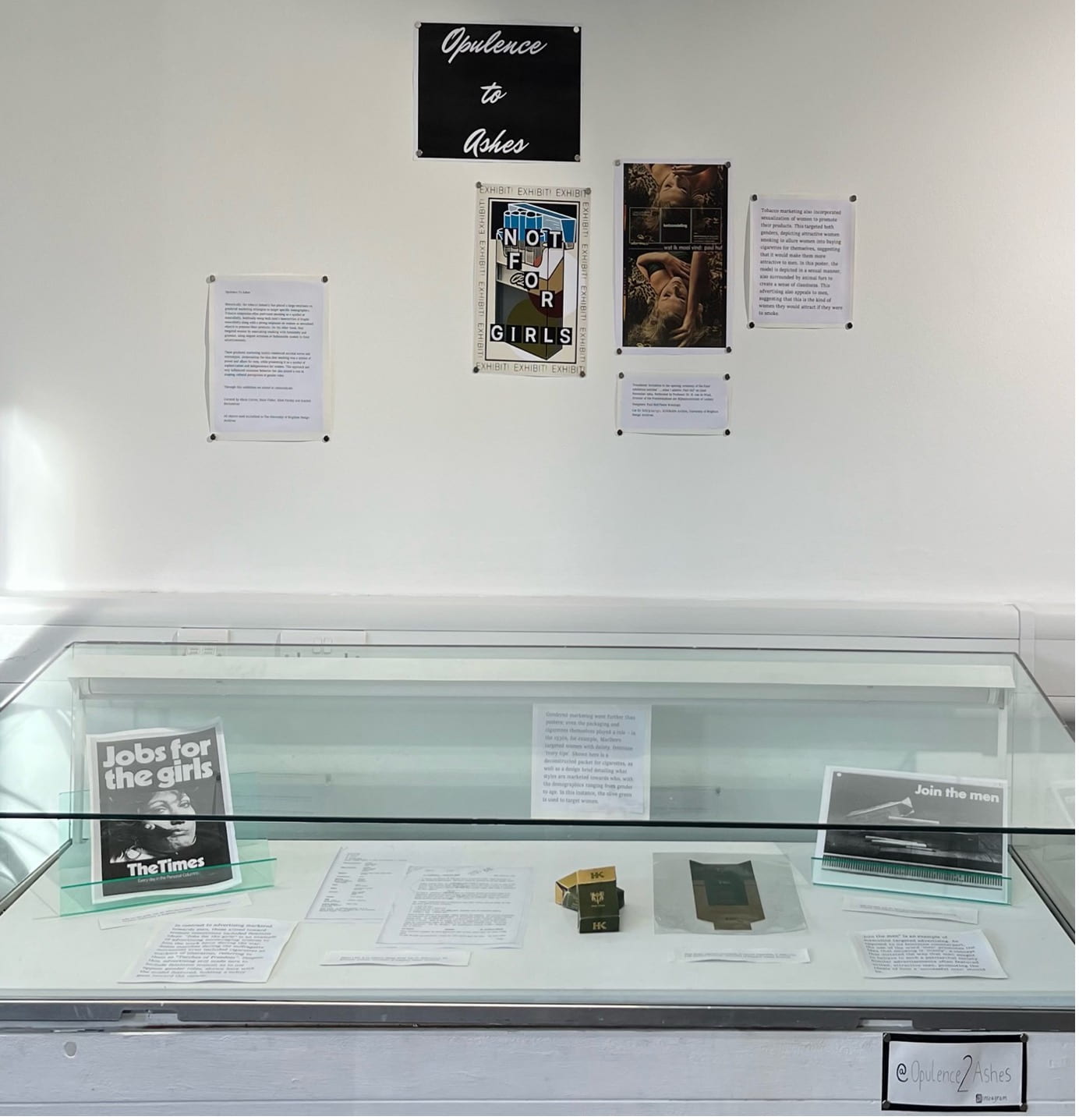
Opulence to Ashes is an exhibition, recently curated using archived materials from the University of Brighton’s Design Archives, now open in the foyer of St Peter’s House Library. This exhibition delves into the intriguing topic of gendered marketing within the tobacco industry and explores how marketing strategies have targeted specific gender identities and influenced consumer behaviour. Opulence to Ashes examines the utilisation of imagery, colours, and messaging that have traditionally reinforced gender stereotypes. By analysing these aspects, the exhibition prompts visitors to question the underlying messages and consider the broader implications.
The focus of this exhibition is on examining the ways in which the tobacco industry has targeted specific gender identities through their marketing strategies. Delving into the use of imagery, colours, and messaging that have traditionally reinforced gender stereotypes and influenced consumer behaviour. It looks at how cigarettes were initially marketed as symbols of masculinity, often with rugged cowboys and suave gentlemen being used to promote various brands. On the other hand, certain cigarette brands were specifically targeted towards women, employing feminine aesthetics and associations with elegance and sophistication. Opulence to Ashes brings you their own discovered cigarette brand: High Kings.
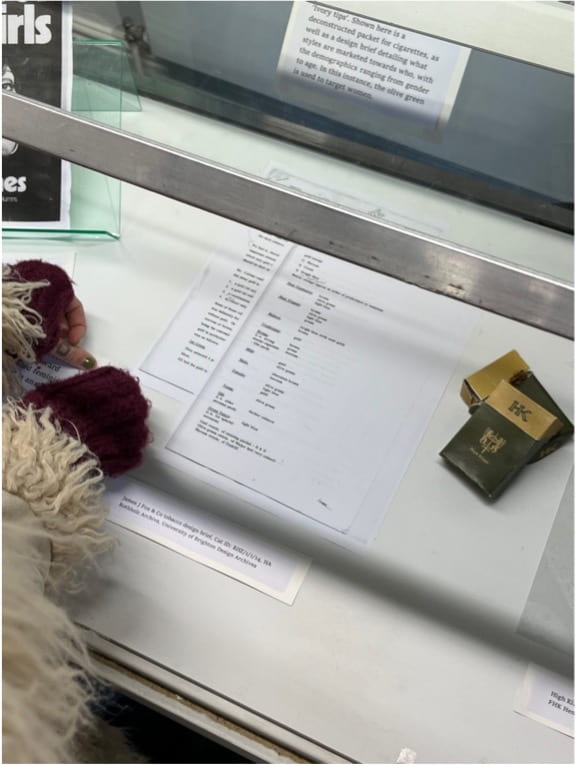
Seen below is an image of two reconstructed High Kings cigarette packages alongside the gender strategised, and targeted, design brief. The team chose the Olive Green packaging as in the brief this colour is explained as targeted at females and the Opulence to Ashes team want to allow the chance for any attendees to this exhibition to refer to this in the feedback. Boxes of this particular branded cigarette were also enhanced to appear either lighter in colour or more golden than those targeted at men.
As the exhibition progresses, it highlights the impact of gendered marketing on individuals and society. It examines the ways in which these marketing tactics have reinforced harmful gender norms and perpetuated inequality. As well as offering insight through the dissection of advertisement and promotional materials, present amongst the exhibition materials is the High Kings design brief that associates colours with certain age groups and genders. When creating this exhibition, with a target audience of university students and academic professionals in mind, the Opulence to Ashes team approached the advertisement of this exhibition with huge creative intention.
Seen below is a poster created by the team to advertise the exhibition. The playful use of a propaganda style poster is an effective strategy being used here when considered alongside the fact that there is a high likeliness that members of the target audience will be provoked by the look of the poster furthermore intrigued.

Looking at the intended audience and recognising that the ages of many people attending our exhibition would be anywhere from 18 to mid-late twenties, we understood that social media would be one of the most useful tools in advertising our exhibition as well as building our brand aesthetic and continuity to the exhibition pieces. Instagram being our chosen form of representation and advertising for the exhibition allowed for the aesthetic of Opulence to Ashes to be appointed prior to the exhibition.