Year 1
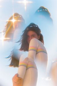
Photography experimentation _ Underwear
Lookbook
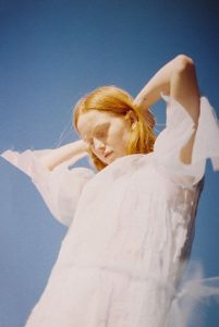
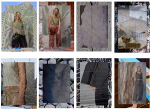 These images are the final edits for my look book. Each image was taken my myself using a variety of materials. I used a model for 5 images where i styled reflecting each sub trend from my group; nature,decay/rust,architecture and fluidity. I was originally going to use all clothing to portray my campaign however i decided to incorporate non fashion related objects such as for architecture in used an image of an animal skull i had taken to represent both structure and also ethical and sustainable fashion. I wanted to use basic photography; no over the top poses so it can portray the campaign clearly.
In post production, i edited the photographs so they were bit brighter on photoshop where i added the overlay of plants or buildings to support the main image. I set the opacity on all of the overlays to 40% so you were able to see both images clearly. I simply selected a back image to contrast with the others ( there was no editing done on these)
Noah Sheldon
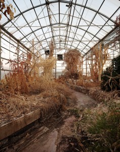
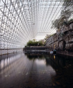
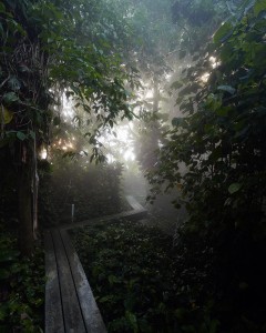
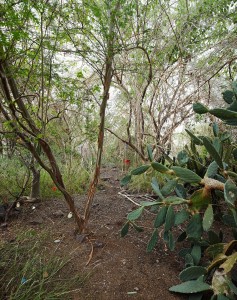
Noah Sheldon is an american photographer who has captured nature in its purest form. The images were taken in Biosphere 2; a research facility in Arizona owned by the university that had been abandoned. These images show the state in which these plants have grown due to no maintenance at all. I liked these images as they captured my trend/theme perfectly,and that you are able to see a variety of tone and texture in the plants; capturing the beauty of its original form.
Gifs
When creating a zine, a gif makes the content you include more interactive and fun and I wanted to create gifs that had a minimal approach. I found the GIF process difficult at first however i enjoyed learning how to create them as it also taught me more about photoshop. I created 4 gifs; the majority of the images coming from the content of my zine. ( all gifs need to be clicked on)
Life Drawing
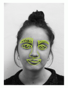
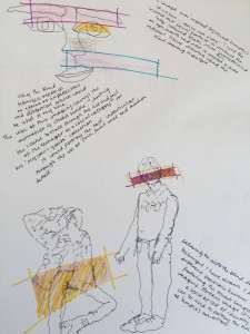
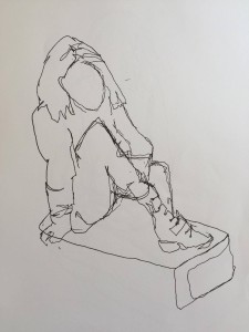
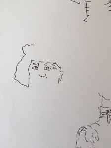
For this project, when focusing on illustration life drawing was a good session to be in as it taught you about proportion and the ability to draw what is actually infant of you rather than from what you know. I’m not a strong drawer so i was sceptical about these sessions; although i have done life drawing before i was not taught the technical skills with drawing. I found it difficult at the beginning when having to draw blind as i found myself just staring at the page however further on into the sessions it became my favourite method of drawing. Therefore i decided to transfer these skills into my zine sketchbook where i produced some illustrations that were a reflection of aspects of Stuart Semple’s ( the artist i’m looking at) work.
Denim Denim Denim Denim
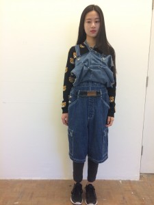
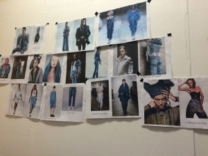
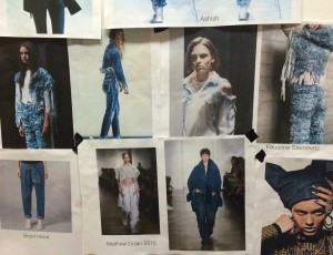
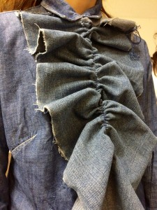
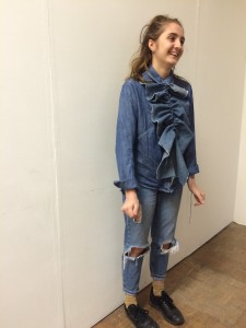
I love denim, denim is a ‘trend’ that will never go out of fashion- there are new ways of wearing denim created all the time and i like that its a timeless fabric. Distressing denim adds a new dimension to it however i found that it is quite difficult to re shape. I found looking at the inspiration board interesting as you were able to see how designers had completely deconstructed the fabric and garments to create different pieces of clothing and silhouettes from unrecognisable pieces.
Viviane Sassen- Floral inspiration (Part 2)
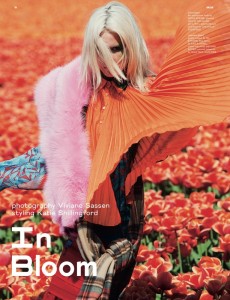
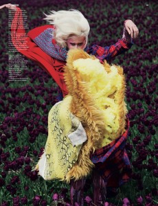
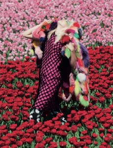
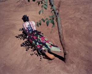
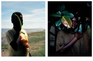
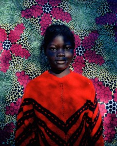
Vivianne Sassen was a main inspiration for my photography. Along with the ‘Flamboya’ series i also looked at her ‘In bloom’ series which has incorporated bright florals and vibrant clothing to create flamboyant imagery. I liked the mix the styling aspect the most as they have used a variation of garments that contrast with the flowers for example the second image enraptures a grunge style however it works well due to the bright colouring. I also thought that the movements in the images were interesting as although it distorts the models face it shows interesting movement in both the clothing and the models hair.
Viviane Sassen – Floral inspiration ( Part 1 )
As part of the concept my partner and i decided to look at flowers and their representation however i wanted to look at the more subtle view and exploration of how photographers incorporate florals into their work. I chose to look at Viviane Sassen as i liked the way she used florals but did not make them the initial focal point. I also like the used of shadowing and how it was used to distort the image by covering up features of the body – the distortion was also created with the flower/plant.
Photography Tests
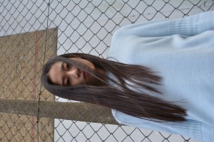
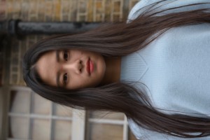
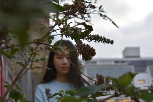
For my current project, we’ve been looking at photography and styling. These images are tests for my final shoot as i wanted to experiment with backgrounds and positioning of both the model and myself.
I found that the angle that best suited the concept we had and that captured the image in the most detail was if i were to take it from below; so the model was facing downwards. At that point in time the wind was quite strong which created a positive impact to the image as it added an aspect of distortion to the face which could be a possible idea to incorporate into the project.
