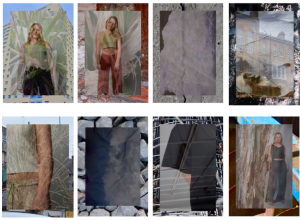
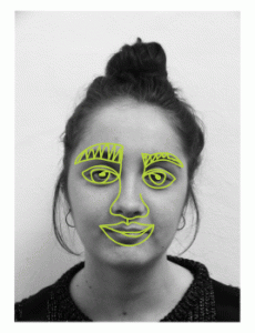
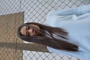
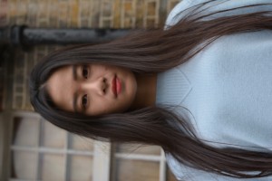
These are the layouts of my website and social media. I have kept them both meeting a minimalistic style so it doesn’t overcomplicate the content whilst keeping to a consistent visual identity. I have used a white background for the website with accents of green in the text to tie in with the logo on my instagram as well as other aspects on my business cards and cv. I found the manipulation of Square Space quite difficult, although it visually suited what i wanted, the accessibility to different themes was lacking so found choosing the right theme for my work a long process. I’m pleased with the outcome of both of these and am continuing to add to my social media with new content.


