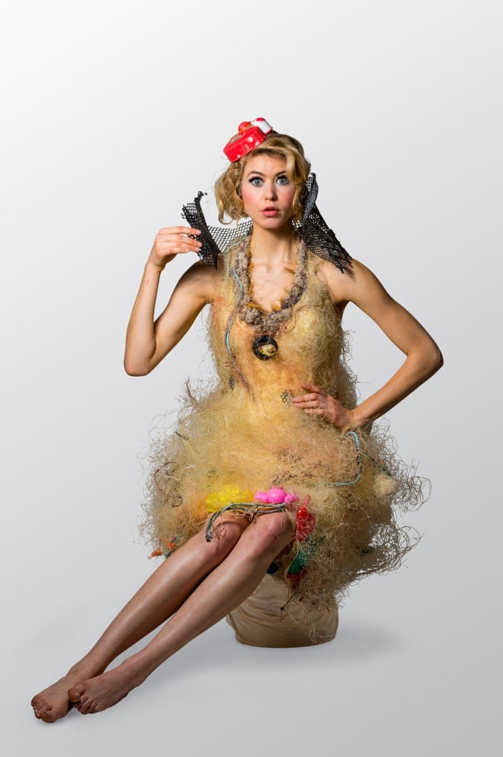
Magazine Research :: Visual Identity

Rouge Fashion Book


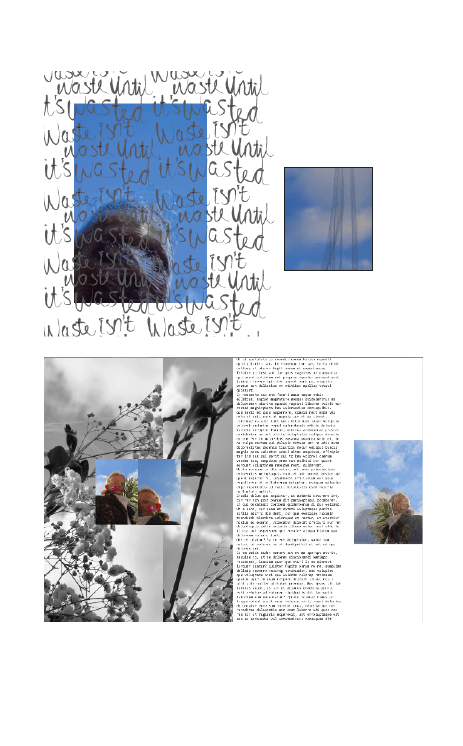
Rouge magazine is a biannual fashion book; first of its kind found in china. They showcase topics on fashion and art culture supported by highly established designers and artists to coincide with their modern photography styles and fashion forward content. The fashion photography conveyed in the Chinese fashion book is has a similar aesthetic to Off Black; using definitive fashion styles such as portraiture images and style shots, but the combination of this alongside captivating layout styles creating a more intriguing feel to their magazine. Figure 32 is part of a series of images combining fashion photography and graphic design, creating a dynamic image that creates an individualisation to the accompanying content. This sort of imagery is something that I am interested in including in my magazine which expand upon static journalism. 

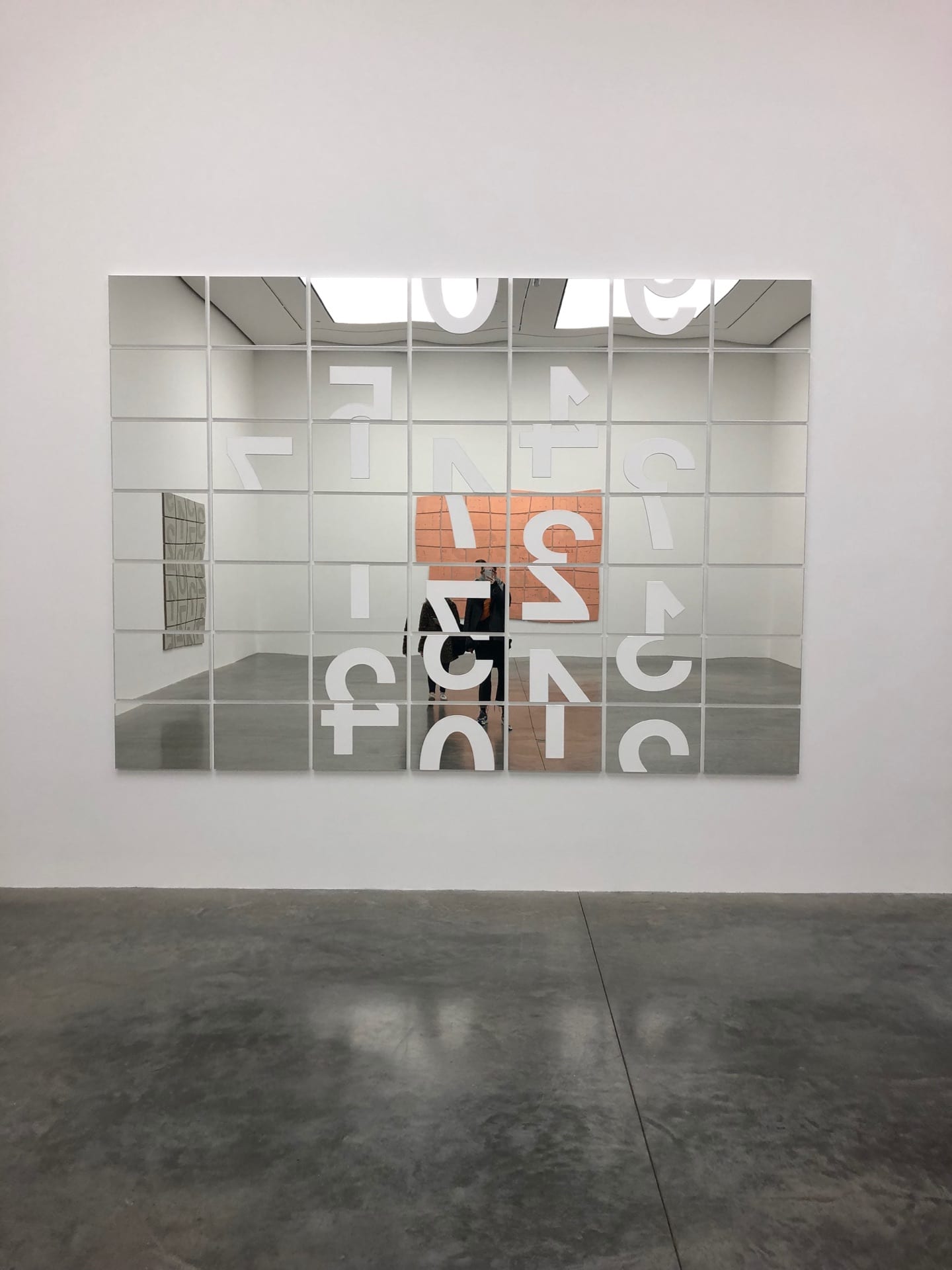
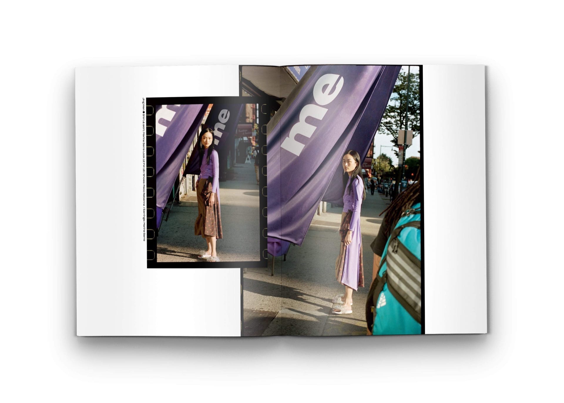
Figure 30 is another representation of interesting layout possibility that I want to fuel my publications visual identity. The spread in Figure 30 combines 3 images from the same shoot, using these images to show diversity through the narrative which allows the reader to fully engage with this through one spread in the magazine.  When comparing this magazine to other fashion books like Off Black, there is a strong presence in regard to vibrancy and vividness; this being conveyed through the bright colour pallets that run through each image. This is also made more prominent with by the support of black and white imagery which I think is effective way of incorporating the reader. Rouge is a hard-back book which sets itself apart from other magazines, using hardback as part of its identity follows the idea that it will be a publication of longevity, unlike other magazines which are read a number of times then discarded. This is something to consider for my publication as it a definite design feature that I want to include, however, the costing of this will impact on the magazine’s marketability.

The September Issues

The September Issues are a feminist magazine, printed independently showcasing artists and creatives to establish fashion as a feminist issue whilst also allowing for new talent to publish themselves into the industry in a engaging and diverse format. The aim for their publication is to engage with an audience that have an interest in fashion and the arts whilst also including political and social topics which can help educate and inform; creating a visual impact on their reader. This ethos I want to project into my upcoming publication; creating content that is visually engaging and captivating whilst also impacting on the readers though process, questioning what they are looking at which I feel this magazine is doing effectively.  In comparison to Rouge, Chaos and Off Black, this magazine has a more definitive identity with their imagery, with the others exuding high fashion photography incorporating desirable designers, 
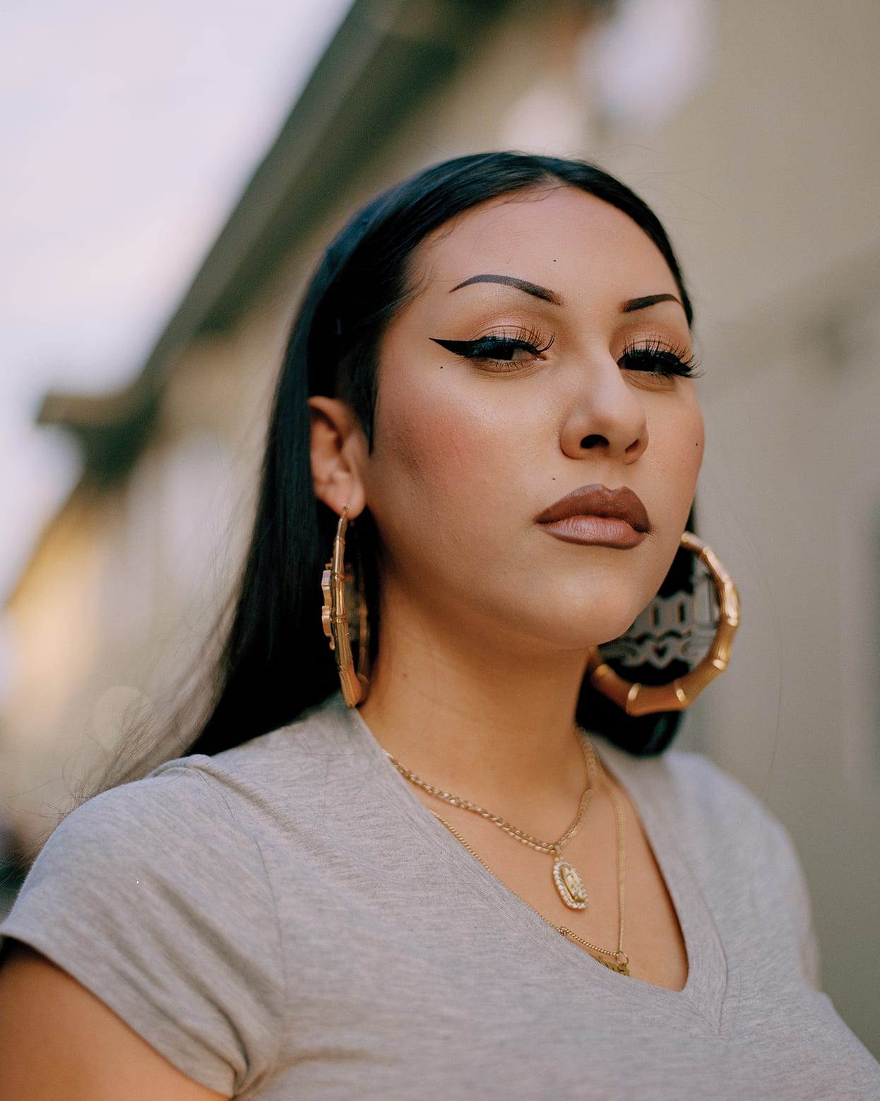
The September Issues’ aesthetic is more relatable, using softer tones and lighter accents of colour to attract their target audience with subtly and compassion. Figure 38 is an example of photography that helps the reader with relativity with a static publication like a magazine. The use of portraiture photography like this one assists with the association to the content they are reading; putting a face to the name. This is something that will be made prominent through my magazine, using realistic and modern beauty standards if this type of content was included, to show diversity and inclusion. The September Issues is a similar size to Off Black, using this to also convey their relatability in their ethos. The use of bright colours helps with identification; having a strong front cover shown in Figure 35 is a viable design decision with the publication being independently published, which I something I will need to consider further.


Week 2 :: Magazine Research :: Visual Identity

Chaos Sixety Nine


Chaos Sixty-Nine is a luxury poster book produced by the well-known accessories brand Chaos. This large fashion book is a series of graphics/illustrations and photographical imagery that combines fashion and other materialistic items to create engaging and vibrant content.

Each issue contains over 100 pages, exploring tactility through the ability take out each page and use to it the readers disposal. Each issue has featured a number of famous faces from Kendall Jenner to Adoah Adwoa using this to keep an aspect of high fashion alongside conceptual. One image photographed by Alexander Kent has been used to represent the development in innovations for fashion; looking specifically at citric waste. Each of the images showcased in this book are supported by the large format of the overall publication. Using A2 has meant that the complexity of the imagery can be expressed through the accompaniment of simple layout which I want to use as a possibility in my publication.

I particularly like the composition of the imagery as they have manipulated an object to resume a different narrative. Both of these would work well in my publication with the idea of waste being portrayed through consumer waste including food and plastic. The selection of images I have collected from this magazine are to showcase the variety of muted and vibrant tones that run throughout that I want to translate with my magazine.

Off Black Magazine


Off Black magazine is a biannual magazine which is brought together through public contributions which showcases new and upcoming talent in the creative industry such as styling, journalism and photography. They cover a various topic including fashion, beauty and art culture. In comparison to Chaos, Off Blacks visual identity is topically fashion conveyed through high definition portrait photography accompanied by engaging articles. 

These images represent examples of photography and layout that I would like to represent in my publication as is conveys ambiguity and modernism using unrelated objects such as fruit and close up photography. I feel like this would work well as an aspect in the publication as it allows the reader to assume and become captivated through the unknowing message, whilst also effectively representing the topic of sustainability. Much like Chaos, Off Black also use muted tones throughout their magazine with accents of colour, creating a clean and high fashion aesthetic; with several viable representation of this. The photography used in these images allow for the styling to be the body of the image, using interesting makeup and hair to control the focal point of the photography. 

Off Black is a smaller magazine, running at just over A4 keeps the magazine at a average size for ease to the reader, this size is smaller than visualised for my publication however, depending on the content this could be a possibility.

Tate Modern :: Saatchi Gallery

Tate Modern


Christine Ay Tjoe is another featured Artist that was presenting their work at the White Cube. Work under ‘Black, kcalB, Black, kcalB’ were created using multimedia presented on large scale and smaller scale canvas, similar to Almonds. Tjoe’s pieces are a representation of the possibility of living with darkness inside an individual’s sub conscious. Using oil paintings and aluminium plates, Tjoe creates conceptual imagery that captivates the audience through provoking intensive thought and consideration. The installations explore the integration of darkness into human nature, which I feel is relative to the idea in which I will manifest my publication from. Sustainability and consumption, specifically waste is considered as second nature in modern society.

Saatchi Gallery


Roman Stanczak, a polish artist has created several standout pieces that are presented in the Saatchi gallery, exploring materialistic transformation and the demise of their natural state. Seen in Figure 12 and 13, these pieces are noted to be a representation of life of souls that the object that he is presenting. He uses distortion to convey the harshness of complex mental states, using materials such as wood and metal to express the rigid embodiment of and individuals psych. These elusive symbolisations of objects have helped develop conceptual techniques into representing possible objects or materials for engaging photography that will feature in my publication.  Using objects and materials allows the viewer/reader to observe and integrate their own view or opinion into the work to add further meaning and conceptualisation to these installations. 

Week 1 :: FMP Primary Research :: White Cube

The White cube showcased Darren Almonds abstract collection named Time Will Tell featuring various pieces displaying the idea of time. Almond uses different media including concrete based mineral paint, acrylic gel on mirror, and conductive metal leaf to depict how the number featured throughout his pieces are a common factor in human culture. The distortion of these pieces to represent the disruption each piece natural setting. Each piece features a minimal aesthetic covering a large canvas which displayed the concept of each image effectively and made the overall presence of his exhibition engaging and approachable. Using multi- media and large-scale canvas can be carried through onto my own pieces in regard to the multi-faceted content that is put in my FMP magazine.

Christine Ay Tjoe is another featured Artist that was presenting their work at the White Cube. Work under ‘Black, kcalB, Black, kcalB’ were created using multimedia presented on large scale and smaller scale canvas, similar to Almonds. Tjoe’s pieces are a representation of the possibility of living with darkness inside an individual’s sub conscious. Using oil paintings and aluminium plates, Tjoe creates conceptual imagery that captivates the audience through provoking intensive thought and consideration. The installations explore the integration of darkness into human nature, which I feel is relative to the idea in which I will manifest my publication from. Sustainability and consumption, specifically waste is considered as second nature in modern society.

Media Pack


For outcome 1 I created a working media pack that features the reader looking at personas, the visual identity of the magazine examining how what the layout of the magazine will resemble whilst also looking at the fashion direction of how the photography and imagery will be conveyed.

Final Outcomes


For my outcomes I created 2 editions, one which featured more graphic based images with the second one having a more minimal layout. I feel like they both work well however the first outcome has a more coherent style throughout.

This outcome has a minimal approach using smaller scale images with large white space. The text and images are set out so they reflect each other keeping the design consistent throughout. This outcome has worked out the most successful incorporating influences from many areas of my research, looking at plastic waste specifically.

This outcome has a more graphic approach with large scale images covering majority of pages. The typography for this was more stylised as I feel It fit well with the rest of the content. Like the first outcome, there is a mixture of colour to ensure it is consistent, however there is a definitive exploration of font style and stylised layout.

Artist Research // Sarah Wallace


Sarah Wallace Scott is an America artist who creates minimal sculptures looking a nature. Figure 143 named ‘Turf 2014’ is a suspended installation piece that has been sculpted from cast handmade recycled paper, water colour and thread. Figure 144 ‘The Rescue 2011’ was constructed using cast handmade recycled paper, watercolour, handmade Kozo paper and pastel. I found these pieces the most relevant as they related well to the environmental aspect of my research in addition to how throughout her work Scott uses handmade and  recycled paper which I feel I can further into my research, looking how recycled items can be utilised into something new.

Artist Research// Marina DeBris


Marina DeBris is an Australian artist who creates ‘trashion’ pices using ocean pollution and beach debris that as been washed up to create eccentric pieces that further the discussion of our consumption of waste products. Figure 156 ‘Takeaway Queen’ was made from takeaway containers sourced from various oceans and beaches, whilst Figure 157 ‘Cuicdado’ which translates in ‘Be careful’ in Spanish was made from caution tape that was washed up on an LA beach.

Artist Research // Aurora Robson

Aurora Robson
The Great Indoors
18 September – 26 October 2008


Aurora Robson is an American artist that creates large scale installations using recycled plastic.  Figure 159 ‘Jetsam’ is made from plastic debris accompanied by other materials such as tinted polyacrylic and mica powder. Figure 161 ‘Accumulus’ 2010 was installed in a building in NY which was made utilising 5000 plastic bin bags that the building throws away. Although these pieces are too complex for me to adapt on in my own work, they are very intriguing with the use of scale whilst also looking at the diversity throughout each installation Robson creates.