Chaos Sixety Nine


Chaos Sixty-Nine is a luxury poster book produced by the well-known accessories brand Chaos. This large fashion book is a series of graphics/illustrations and photographical imagery that combines fashion and other materialistic items to create engaging and vibrant content.
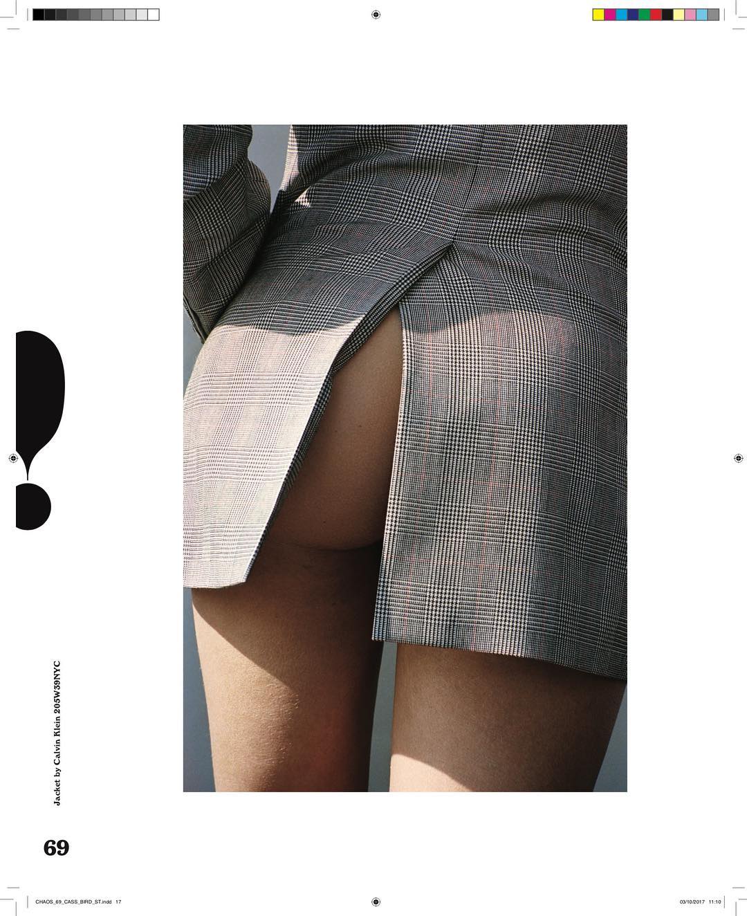
Each issue contains over 100 pages, exploring tactility through the ability take out each page and use to it the readers disposal. Each issue has featured a number of famous faces from Kendall Jenner to Adoah Adwoa using this to keep an aspect of high fashion alongside conceptual. One image photographed by Alexander Kent has been used to represent the development in innovations for fashion; looking specifically at citric waste. Each of the images showcased in this book are supported by the large format of the overall publication. Using A2 has meant that the complexity of the imagery can be expressed through the accompaniment of simple layout which I want to use as a possibility in my publication.
I particularly like the composition of the imagery as they have manipulated an object to resume a different narrative. Both of these would work well in my publication with the idea of waste being portrayed through consumer waste including food and plastic. The selection of images I have collected from this magazine are to showcase the variety of muted and vibrant tones that run throughout that I want to translate with my magazine.
Off Black Magazine


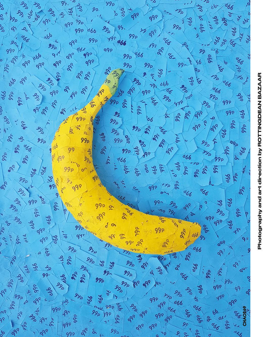
Off Black magazine is a biannual magazine which is brought together through public contributions which showcases new and upcoming talent in the creative industry such as styling, journalism and photography. They cover a various topic including fashion, beauty and art culture. In comparison to Chaos, Off Blacks visual identity is topically fashion conveyed through high definition portrait photography accompanied by engaging articles.
These images represent examples of photography and layout that I would like to represent in my publication as is conveys ambiguity and modernism using unrelated objects such as fruit and close up photography. I feel like this would work well as an aspect in the publication as it allows the reader to assume and become captivated through the unknowing message, whilst also effectively representing the topic of sustainability. Much like Chaos, Off Black also use muted tones throughout their magazine with accents of colour, creating a clean and high fashion aesthetic; with several viable representation of this. The photography used in these images allow for the styling to be the body of the image, using interesting makeup and hair to control the focal point of the photography.
Off Black is a smaller magazine, running at just over A4 keeps the magazine at a average size for ease to the reader, this size is smaller than visualised for my publication however, depending on the content this could be a possibility.