What I Learnt About Street Style in Japan

Second year student Eleanor Medhurst on visiting Tokyo’s Harajuku district to research street style

Fig. 1. Streets of Harajuku

Fig. 1. Me in the back streets of Harajuku. Personal photograph from the author. 30th March 2018.

Since starting on the Fashion and Dress History course at Brighton in 2016, I’ve done a fair amount of research into street style and subcultures, their fashions and their theories. My primary interest in this topic has always been the clothing from the streets of Harajuku in Tokyo, though I’ve focused on other areas in much of my research. I’ve written about street style and vintage clothing on the streets of Brighton; I’ve looked at subcultural theory by the likes of Stuart Hall and Dick Hebdige in relation to Colin MacInnes’ book Absolute Beginners; I’ve also just finished an essay about cartoon imagery in Harajuku “kawaii.”

This background interest, as well as an overall appreciation for the culture of Harajuku, meant that when I visited Tokyo over the Easter break I had an incredible experience. I had the chance to see the source of so many styles that I have admired and partaken in, and appreciate the culture and the streets from which they grew.

Many people, when visiting Harajuku, believe that it only consists of the main street, Takeshita Dori. These same people, when confronted with the tourist-heavy inauthenticity of the main drag, often leave disappointed. Harajuku street style appears to be a thing of the past, overtaken by the curious lenses of tourist cameras and the entrepreneuring efforts of the Disney store and McDonalds, both of which have locations on Takeshita Dori. However, move away from the crowds and Harajuku is still very much alive.

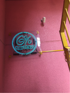
Doki Doki

Fig 2. 6% Doki Doki in Harajuku. Personal photograph by author. April 2018.

Wandering the back streets of Harajuku was my favourite part of my entire trip to Japan. Quieter than so many parts of Tokyo, and yet buzzing with energy, I felt comfortable in my own sartorial expression as well as in the appreciation of others’. I remember standing by one of Japan’s many infamous vending machines (shopping bags in one hand, google maps open on my phone in the other) and feeling comfortable in myself in a way that is hard to find in too many places outside of, of course, Brighton. This is a feeling that the young people who spend time in Harajuku have cultivated themselves, with their subcultural communities and the shops that have emerged with them. Much like in subcultural London in the ‘60s and ‘70s, the shops that provide the clothing with which subcultural style builds its outfits are the bread and butter of subcultural fashion communities. Where shops such as Vivienne Westwood’s SEX and Granny Takes a Trip on the King’s Road might have defined the street style shopping landscape in London, in Harajuku and wider Tokyo the scene is ruled by stores that are much cuter in nature. Kawaii giant 6% Doki Doki is a hub for “Decora” style – a fashion that involves as many bright colours, accessories, hair clips and cute motifs as possible. It is the epitome of “J-fashion” in the eyes of many, and climbing up its pink-and-yellow staircase to the shop on the second floor was the sure sign that I was in Harajuku.

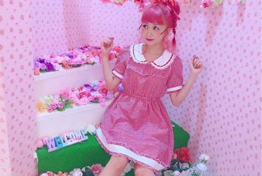
Hikapu Dayo

Fig 3. Hikapu Dayo in Swankiss, Shibuya 109. @Hikapudayo on Instagram. 5th March 2018. Web. 29th May 2018.

Other prominent shops include shops for the Lolita subculture (a style that takes inspiration from French Rococo fashions and Victorian dolls, and despite the name, is unrelated to Nabokov’s novel): Baby the Stars Shine Bright, Angelic Pretty and Metamorphose. These shops do not allow photography, to avoid the novelty that is often made of the style by tourists. Notably, there’s also the shopping centre just south of Harajuku itself and right next to the famously busy Shibuya Crossing, Shibuya 109. Shibuya 109 is renowned for being home to key influencers in Tokyo subcultures, whether those be the shops within it or the shopgirls that work there. The culture of shopgirls-as-style-icons in J-fashion is also often seen as a thing of the past – and yet, models and kawaii icons such as Hikapu Dayo still work within the building.

Harajuku and surrounding areas in Tokyo still have a strong subcultural presence. This continues even in the face of its commodification by the tourist industry and big-name brands. The backstreets belong to the people who walk them – and as long as the outsiders stick to the main drag of Takeshita Dori, then the culture continues to thrive.

For me, seeing such a specific subcultural location has solidified the subcultural theories that I have researched. It has let them be realised in the reflection of real people and real clothes rather than in histories, photographs, and pages of books. I intend to take this experience with me in my studies – possibly even in my dissertation, which will explore, to an extent, the subversion of the feminine in subcultures such as those mentioned here.
A prize-winning return to university study


Thinking of studying as a mature student? Wendy Fraser, a finalist studying BA (hons) History of Art and Design shares her experiences and celebrates her recent success.

Wendy Fraser and Andrew Davidson, Celebration Event

Figure 1 Wendy Fraser and Andrew Davidson, Celebration Event, University of Brighton Grand Parade. Photograph: Philanthropy Department.

In December, I was honoured to receive the Khadija Saye Visual Culture Breakthrough Award 2016/17 for my performance in the second year of my History of Art and Design degree. Khadija Saye, in whose name the award is presented, was a young photographer from London whose work was included in the Diaspora Pavilion at the 57th Venice Biennale in 2017. Tragically, Saye died along with her mother in the Grenfell Tower fire, in the twentieth-floor flat that she also used as her photographic studio.

I am thrilled to have received the award, which is validation for the decision I made to come back to university as a mature student. I wrestled with different ideas of what to embark on next in my life, flip-flopping between a business plan or further education. My first experience at university was embarking on a degree in English Literature and History of Art at Edinburgh University when I was 19. At the time, I regretted the choice of Edinburgh as a University and English Lit as my subject but rather than make changes I left at the end of the first year. Retail jobs led to a career in fashion and giftware wholesale as an Account Manager with trade shows and twice-yearly travel to the Far East, which was creative and fun but ultimately intellectually unfulfilling. After the births of my daughters I juggled lots of part-time jobs to fit in with them – selling on Ebay, baking cakes for cafés, a sales role for a Childrenswear brand and supper club hostess.

I knew that I had not reached my academic potential and it would become a regret if I did not act upon it. The degree programme has exceeded my expectations and I have really appreciated learning about so many different aspects of visual and material culture. It has been a joy to have a legitimate reason to visit so many galleries and museums, rather than just as entertainment. My confidence in my subject has grown incrementally, helped in part by my volunteering roles at Charleston and at the Brighton Museum and Art Gallery, which we were encouraged to do in first year. Amazingly being a ‘mature’ student hasn’t made me feel awkward and my fellow students have been really inspiring – I have learned a lot from them and really enjoy their company.

The Khadija Saye Visual Culture Breakthrough Award was given at a ceremony in the Sallis Benney Theatre where students from across the University received Breakthrough Awards, Merit Awards, International Scholarships, Sports Scholarships, Enterprise and Employability Grants and Santander-funded awards. The donor of my award is Andrew Davidson (pictured with me above), a University of Brighton Alumnus who studied Visual Culture and is now an Education and Communications Consultant. I was awarded £500, which I plan to use towards a trip to the 2019 Venice Biennale, inspired by Khadija Saye’s achievement. This will be my first experience of an international biennial and further my understanding of contemporary art exhibitions. I haven’t been to Venice since I went on a three-week trip to look at as many examples of Titian’s work as I could before enrolling at university first time around, so this will be a memorable and beneficial use of the award money, representing my circuitous journey back to the History of Art.


Mass Observation: Objects in Everyday Life


How can historians investigate what people wore in everyday life and what it meant to them? Hannah Smith (MA History of Design and Material Culture) explores some of the many micro-histories contained in the Mass Observation archive…

For my MA dissertation I have researched practices of dress in everyday life as presented within the Mass Observation Project Spring 1992 and Spring 2006 ‘One Day Diary’ directive responses. Housed within the University of Sussex Special Collections at The Keep near the South Downs in Sussex, it is made up of handwritten letters, typed emails, photographs and drawings, produced at the hands of the hundreds that make up the panel of writers known as ‘Mass Observers’. This material is divided into the Mass Observation Archive (1937 – early 1950s) and the Mass Observation Project (1981 – present). It is the latter Mass Observation Project (MOP) that I have been using in my research.

The MOP defines itself as a ‘national life writing project’. Former director of the project, Dorothy Sheridan described it as, “…ordinary people observing and reflecting on everyday life…” (Sheridan, 2000:10). The intent of both the Mass Observation Archive and Project was to give voice to the ‘ordinary’ everyday person, giving them “the authority over knowledge” (Sheridan, 2000:10). Mass Observers are sent up to three sets of ‘directives’ a year with the invitation to write about a wide range of themes and events. Examples have included “Gardening”, “The Refugee Crisis” and “Your Home”.

Figure 1. Responses to the Spring 2005 ‘Charles and Camilla’ Directive. Image courtesy of Mass Observation.

Figure 1. Responses to the Spring 2005 ‘Charles and Camilla’ Directive. Image courtesy of Mass Observation.

My interest in the MOP came about during my first year on the MA History of Design and Material Culture at the University of Brighton. We were encouraged to use the MOP as a primary resource for a group project entitled ‘Interior Lifestyles’. Using the directives ‘Objects about the House’ and ‘Collecting Things’ we explored the relationships between the Mass Observers and the objects they decorated their homes with. Aside from the aforementioned project, the ‘New Years Eve’ and ‘One Day Diary’ directives that I had had the opportunity to look through particularly inspired me. As a researcher of dress and fashion in everyday life, here was access to narratives of real experiences of living, breathing people interacting with dress and fashion, rather than a constructed representation or media ideal. I therefore initially assessed these diary-format directives and developed my own methodology for using the MOP within a material culture study, ultimately leading to my dissertation research in practices of dress.

As well as being able to track the Mass Observer’s use of dress as they weave amongst different contexts throughout the narrative of their day, it has given me rare insight into the ‘wardrobe’ moment – the moment when which the bricolage of the visual self we see in more public spaces is created. Through using Mass Observation, I have been allowed the opportunity to explore not only how people use dress in more public spaces, but also in move private spaces – whether that be their dressing gowns, pyjamas or nothing!

Figure 2. Examples of additional personal papers (including diaries and letters) donated to the project. Image courtesy of Mass Observation.

Figure 2. Examples of additional personal papers (including diaries and letters) donated to the project. Image courtesy of Mass Observation.

Initially, I was overwhelmed due to the vast amount of material and its seemingly limitless capability for endless threads and tangents of research. By reading as much as possible about how other researchers had used the material, I was able to see that every Mass Observation researcher has shared the same struggles and frustrations. Through learning from their problem solving, I was able to tailor their theories to my research interest and develop my own methodology for using the material as well as providing a structure for sampling.

With its interdisciplinary appeal the material transcends boundaries, making it an exciting resource that can always be further explored. Whilst students, academics, media researchers and the public have taken advantage of the unique collection – it is ultimately a treasure trove for anyone with an interest in everyday life. For a researcher of design history and material culture, it provides a rare platform to witness the reality of objects interacting in everyday life. Since I’ve been working with the material, the Mass Observation staff, and the staff at The Keep, have been incredibly helpful and approachable. There is an openness towards anyone that is interested in engaging with the material.

As much as it may seem intimidating during an initial encounter, this should never prevent anyone that is interested from engaging with the material. Now more than ever Mass Observation provides an important platform for recording the reality of lived experience, giving voice to the micro-histories that grand-narratives have tendency to silence. It is inspiring to know as an individual in society, as well as a researcher, that there is a space for your voice to be heard and a space that seriously considers what you have to say. Working with a collection such as this is incredibly important if we are to understand the reality of how we negotiate lived experience and exist as a society and as individuals.


Perspectives on Fashion Curation


What does it mean to exhibit fashion today? Student Jade Bailey-Dowling (BA (hons) Fashion and Dress History) visited the London College of Fashion event Perspectives on Fashion Curation to find out.

For a two week period, London College of Fashion (LCF) took over House of Vans in Waterloo with an exhibition and programme of events called Found In Translation, showcasing work from the School of Media and Communication postgraduate courses at LCF.  These include Master’s courses of interest to Brighton’s History of Art and Design BA programme students including Costume for Performance, Fashion Cultures, and perhaps most relevant for those studying Fashion and Dress History, Fashion Curation.

On Friday 17 February, I attended Perspectives on Fashion Curationa series of presentations by some of the leading figures who teach on LCF postgraduate programmes in Fashion and Dress History and Fashion Curation. The event was chaired by Ben Whyman, the manager for Centre of Fashion Curation, and began with presentations from several experts in the field talking about different areas of fashion curation and exhibition making.

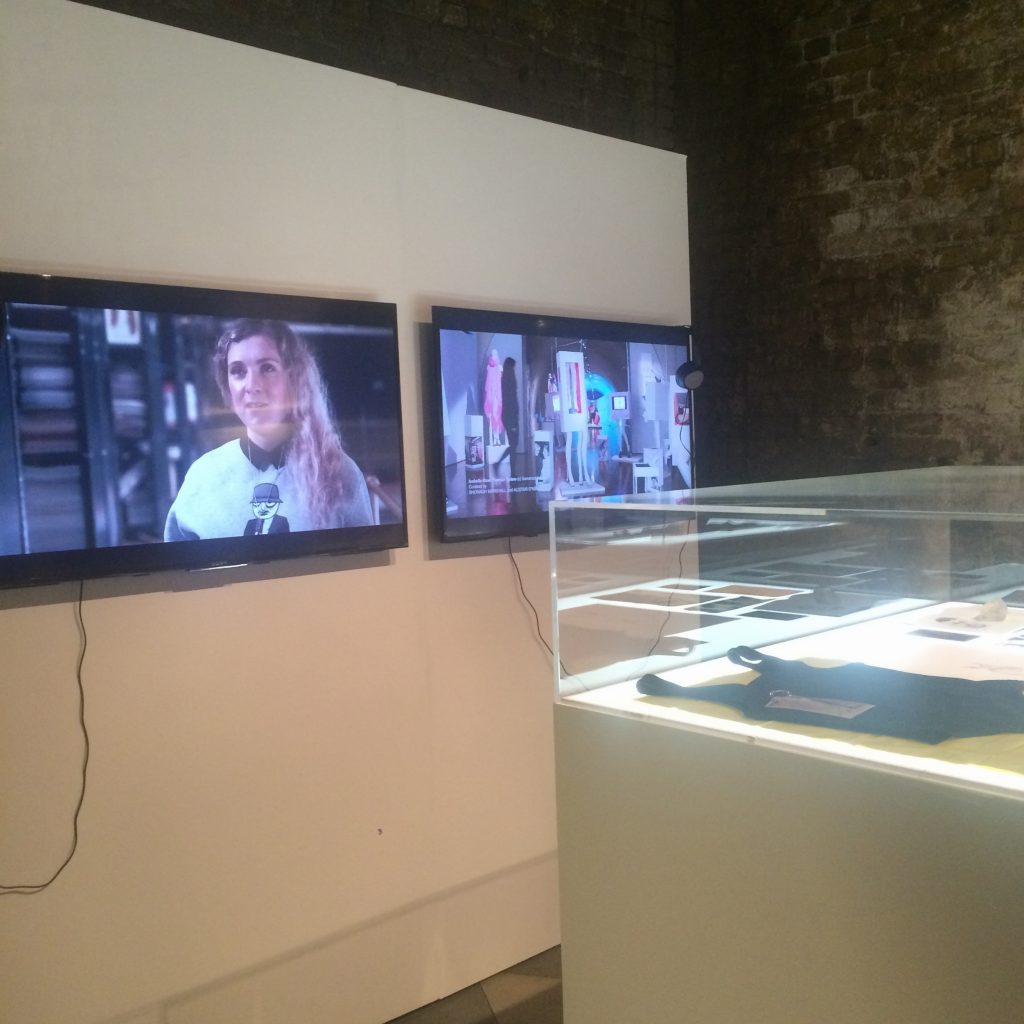
Perspectives on Fashion Curation. Photo by Jade Bailey-Dowling, 17 February 2017

Perspectives on Fashion Curation. Photo by Jade Bailey-Dowling, 17 February 2017

Susanna Cordner introduced the London College of Fashion Archive which is open by appointment only and has a vast array of fashion objects, literature and other artefacts. The collection includes 650 shoes from the Cordwainer College Archive dating back to the 18th century. Cordner has worked hard to create an immersive experience from the archive and organises events such as the Object Reading Group, where an object is presented and attendees discuss them, and Sartorial Stories, when a guest speaker from the industry, from designers to editors, bring in an object and discusses it in relation to their career and the fashion industry.

Jeff Horsley explored concepts of exhibition making, and spoke in great detail about the fashion displays in Antwerp that he has been researching for his PhD. Themes of his talk included the importance of exhibition entrances, concepts of what ‘objects’ are within a museum context and the use of mannequins for historical dress vs. contemporary haute couture that could be displayed on a live model. This is something Claire Wilcox  – curator of the exhibition Alexander McQueen: Savage Beauty – has explored with Fashion in Motion at the V&A by presenting contemporary fashion on live models around the museum rather than confined to a glass cabinet. Wilcox, who began working at the V&A in 1979, also spoke about changes in fashion collecting and the shifting attitudes towards fashion exhibitions and contemporary designers in a museum collection.

The penultimate presentation was an overview of the Fashion Space Gallery that is at the campus just off Oxford Circus. The space relaunched in 2014 and was described by Ligaya Salazar, the gallery director, as an ‘interdisciplinary incubator of ideas about fashion” and a “think tank for curatorial ideas and experimentation.” Although it is a small space, there is arguably more freedom than at a larger establishment, leading to innovative use of space and creative curatorial decisions. The current exhibition, Museum of Transology, curated by E-J Scott, documents objects of importance to members of the trans community and runs until 22 April 2017.

Their work also goes outside of the gallery with the travelling Polyphonic Playground. This off-site project is a kind of playground apparatus that can be used to make sound art as all of the surfaces use touch technology or electrical conducting thread to create sound.  Similarly, Alison Moloney spoke about a traveling exhibition she worked on called Cabinet Stories in which 7 curators would use the small cabinet space to display objects in different venues, including a women’s prison, an NHS hospital ward for people with suffering with personality disorders, a charity shop in Poplar and an old peoples home. At all the venues, people were encouraged to then display objects that meant a lot to them. This meant that people could get involved from the community in curation, showing the diversity of fashion outside of the museum. Moloney also introduced the project 1914 – Now, a series of films and essays summarising the themes of this event, which was displayed in the exhibition space at House of Vans and also available on SHOWstudio. Fashion films explore initiative ways to present fashion using film, visuals and sound, much in line with the inovations presented at this talk related to new ways to exhibit fashion and dress.

MA Fashion Curation final show at LCF. Photo by Jade Bailey-Dowling, 17 February 2017.

MA Fashion Curation final show at LCF. Photo by Jade Bailey-Dowling, 17 February 2017.

The final portion of the event was a panel discussion with Amy de la Haye, Alison Moloney, Jeffrey Horsely, Ligaya Salazar, and Claire Wilcox, where they discussed what curation meant for them, motivations when creating an exhibition and generally what it is like to curate a fashion exhibition. It was fascinating to hear differing approaches on the subject of fashion curation and to learn more about how experimental the field is.


From kitsch to Frankfurt Kitchen: Berlin’s Museum der Dinge


Student Wendy Fraser (BA (hons) History of Art and Design) opened the cupboards in a real-life Frankfurt Kitchen whilst learning how ‘good design’ was promoted in Germany

In November, second year students on the History of Art and Design trip to Berlin visited the Werkbundarchiv-Museum der Dinge (Museum of Things) in the creative Kreuzberg district. The museum houses a collection of 40,000 German objects manufactured in the 20th and 21st centuries in addition to 35,000 documents in the archive of the Deutscher Werkbund (German Association of Craftsmen). The Werkbund, an association of designers, architects, industrialists, publishers and teachers founded in Munich in 1907, shared similar concerns to William Morris’ earlier Arts and Crafts Movement in Britain. However, although they advocated aesthetic education, sensitivity to materials, quality and durability, their interests diverged from Morris’s ideals in their promotion of modern design and excellence in mass production, aiming to create a cultural utopia.

Figure 1: The museum's main dispaly area with contrasting exhibits displayed in glass-frontedcabinets. Photograph by Armin Hermann. Image courtesy of Museum der Dinge. Figure 1: The museum’s main display area with contrasting exhibits displayed in cabinets. Photograph by Armin Hermann. Image courtesy of Museum der Dinge.

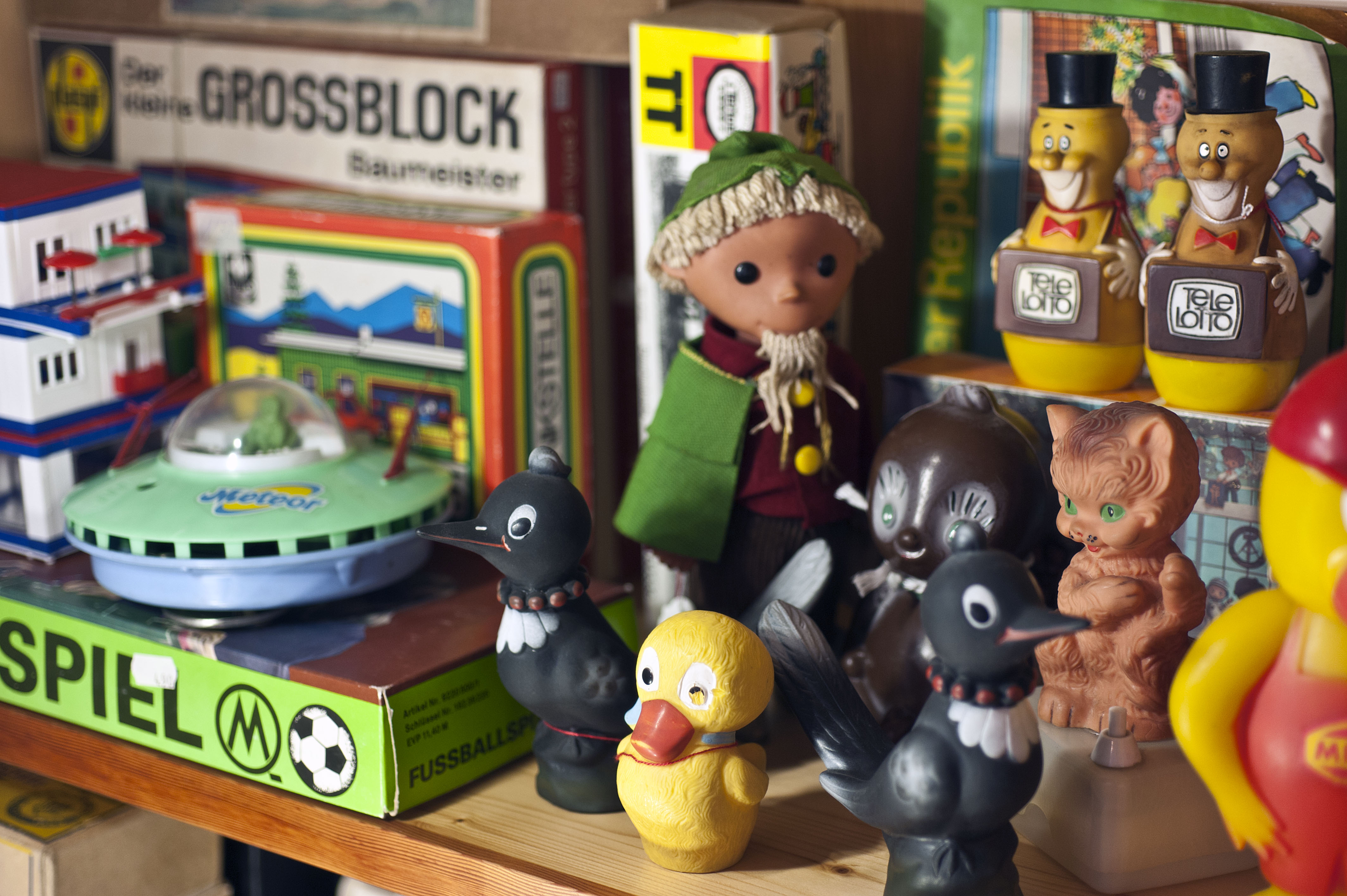
The Museum der Dinge is located at 25 Oranienstraße and its compact space on the third floor of the building houses a shop, the main display area with glass-fronted shelved cabinets and a separate room with an example of the modernist Frankfurt Kitchen. The cabinets contain an astounding array of exhibits including crockery, kettles, toys, lamps, clocks, shoes, typewriters, tools, telephones, technology, glassware, furniture, and tins. The objects displayed exemplify the concerns of the Werkbund to preserve the quality of manufactured goods during the industrialisation of Germany and their aim to create a cultural utopia via excellence in German factory production. Handcrafted objects are shown with those that are mass produced by machine, named designers alongside anonymous makers, professionally made next to inexpertly produced items, articles made in West Germany compared with those made in the DDR (East Germany) and genuine products displayed alongside counterfeits.

Figure 2: Selection of items made in the DDR. Photograph by Armin Hermann. Image courtesy of Museum der Dinge.

Figure 2: Selection of items made in the DDR. Photograph by Armin Hermann. Image courtesy of Museum der Dinge.

The Werkbund also aimed to educate in matters of taste. The Department of Aesthetic Aberrations was created at the Stuttgart State Crafts Museum in 1909: 900 ‘bad taste’ articles chosen to demonstrate to the public what not to buy. Conversely, the publication of the ‘Deutches Warenbuch’ from 1915-1927 showed 1600 approved everyday objects as a guide for retail buyers and a pattern book for designers. While all of this may sound a little dry, the museum’s display concept invites the visitor to compare the contrasting qualities of the exhibits. The Werkbund viewpoint of appropriate design is juxtaposed with objects of opposing values. Accordingly, examples of ‘good design’ are shown with the kitsch holiday souvenirs they abhorred, licensed character merchandise and some chilling Third Reich goods such as SS figurines and Swastika mugs.

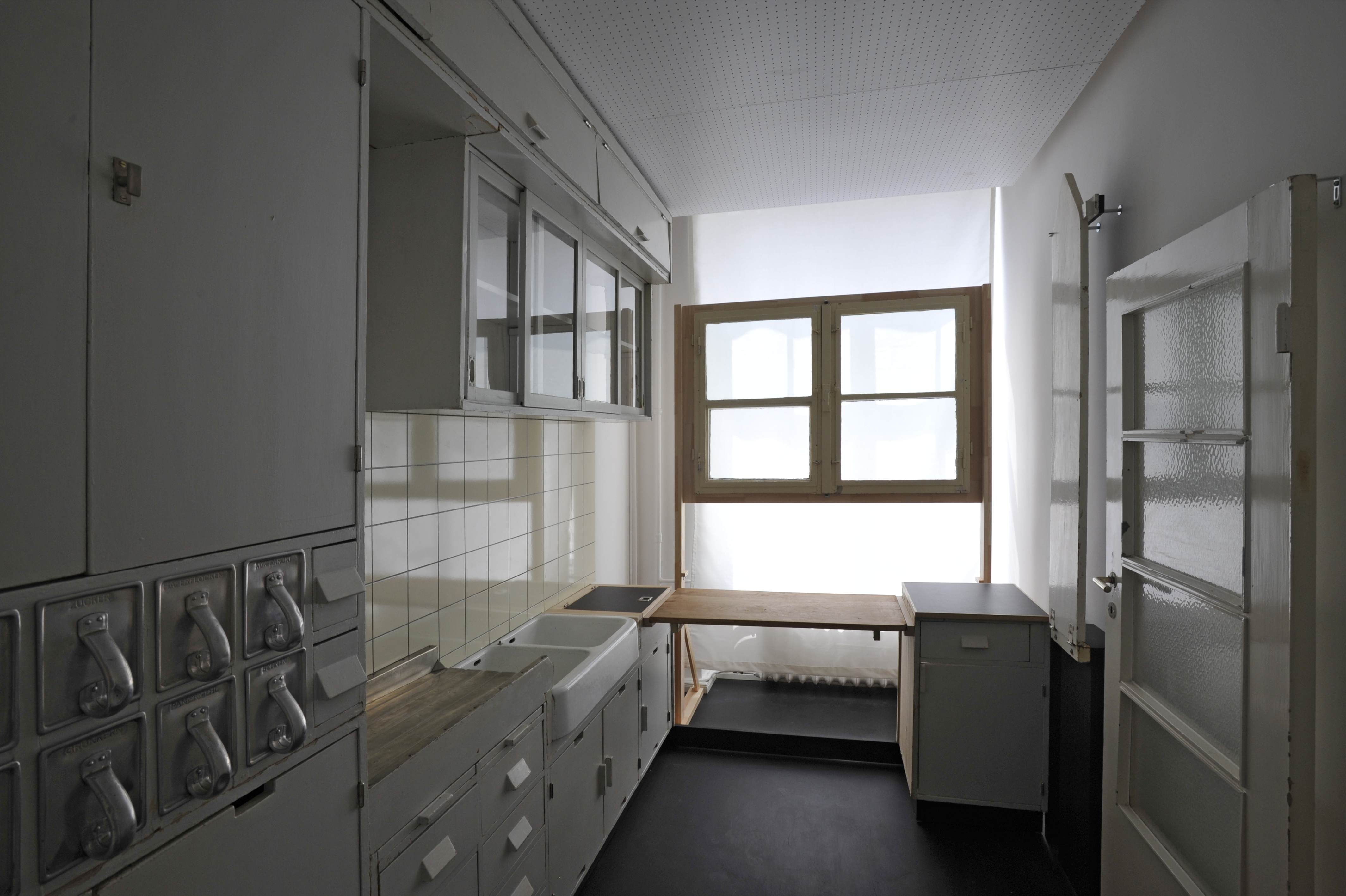
My favourite exhibit was the room containing the Frankfurt Kitchen: visitors can walk into the room, open the cupboards, pull out the aluminium storage containers and chopping board and really feel what it would be like to use the space. As it was the topic of my forthcoming seminar presentation, it was really valuable to experience the kitchen I had previously been studying only in books.

Figure 3: View of the Frankfurt Kitchen from the doorway. Photograph by Armin Hermann. Photograph courtesy of Museum der Dinge.

Figure 3: View of the Frankfurt Kitchen from the doorway. Photograph by Armin Hermann. Photograph courtesy of Museum der Dinge.

Ultimately, the Museum der Dinge is an account of the Werkbund’s achievements as an association and with the exception of the Frankfurt Kitchen installation, what is missing for me is the human element. Although a large number of the exhibits are everyday possessions rather than the elite items that we are most used to seeing in museums, it is not the stories of the makers and the owners that are being prized in this museum. That is not to say that there are not fascinating things to see – despite the rather academic narrative, the museum is full of wondrous objects and is worth a visit. It is a trip through the mind boggling factory output of the 20th century and the ‘bad taste’ items are as pleasurable to view as the ‘good design’ products are inspiring and informative.

Living with art and design: a trip to Charleston


Wendy Fraser, a second year studying BA (hons) History of Art and Design  at the University of Brighton, delves into the lives of the Bloomsbury Group on a visit to their idiosyncratic and highly decorated home, Charleston.

On Thursday the 29th of September a group of second year students enjoyed a trip to Charleston, a 17th century farmhouse set on the Firle Estate deep in the Sussex countryside. The artist Vanessa Bell (1879-1961) moved into Charleston in 1916 with her two sons, her lover the painter and designer Duncan Grant (1885-1978) and his lover, the writer Bunny Garnett. The house was perfectly located nearby to Vanessa Bell’s novelist sister Virginia Woolf’s Sussex home and the neighbouring farm provided Grant and Garnett with essential war work thus releasing them from conscription during WWI.

Bell and Woolf were original members of ‘The Friday Club’, a group of writers, thinkers and artists who met weekly from 1905 onwards to discuss ideas in their home at 46 Gordon Square, London. After the artists exhibited at the ‘Post-Impressionism Exhibition’ in 1912 they became known as ‘The Bloomsbury Group‘. Charleston was to remain their home, studio, and hub of Bloomsbury activity for over 60 years until Duncan Grant’s death. Many key figures from the period’s literary and artistic worlds visited the house including Lytton Strachey, Dora Carrington, E.M. Forster and Roger Fry (who had established the Omega Workshops for which both Bell and Grant designed textiles and ceramics). The stories and interpersonal relationships behind the inhabitants of Charleston are almost as interesting as their artistic endeavours. There are eyebrow-raising tales of the sexual shenanigans within the group, unrequited love and personal tragedy.

On our guided tour we viewed 10 rooms: Clive Bell’s study (Clive Bell was an art critic, Vanessa Bell’s husband and father to her sons), the Dining Room, Library, Garden room, the bedrooms of Clive Bell, Vanessa Bell, Duncan Grant and their friend, the economist Maynard Keynes, the spare room and the pièce de résistance – the studio shared by Grant and Bell. Charleston was always rented from the so the interior decoration of the house was always an organic process with nothing intended to be particularly permanent or durable. The dining room walls were stencilled by Duncan Grant in a geometric design with the paint drips clearly visible, there are numerous examples of hand-painted furniture with headboards, chimney boards, wardrobes and tables decorated with either artist’s work and a peak behind the doors reveals some beautiful paintings. A number of the window embrasures have been painted and touchingly around Vanessa Bell’s bedroom window Grant painted Henry, their pet lurcher to watch over her while she slept and a cockerel above the window to wake her up in the morning.

Photo of students and staff in the garden at Charleston

History of Art and Design Year 2 Welcome Week study visit to Charleston Farm House. From the left, Wendy Fraser, Harriet Dakin, Dr. Anna Vaughan Kett, and Lisa Hinkins in the garden of Charleston. Photo by Dr. Yunah Lee.

Charleston’s furniture and decorative items are an eclectic mix of heirlooms and contemporary pieces – a 1960’s chintz bed throw from Habitat, beds from Heals, psychedelic fabric Grant brought back from Morocco displayed with 17th century carved and painted Venetian chairs, Julia Stephen’s dressing table (Vanessa Bell and Virginia Woolf’s mother), an 18th century square piano, an ornate north Italian console table, kitsch Staffordshire pottery figures and a rush-seated Sussex settle. The paintings on display are a combination of Vanessa Bell and Duncan Grant’s works augmented with paintings, etchings and prints of artists whose work they admired- Delacroix, Sickert, Toulouse Lautrec, Picasso, George Bergen, Segonzac and Pierre Roy. Some of the paintings Grant swapped his pieces with fellow artists for and there are a few works inscribed to Clive Bell from French artists of his acquaintance through his role as an art critic.

Charleston does still feel very much like a family home where it is easy to imagine the daily life of both domesticity – meals be cooked and eaten, children being educated and weekend visitors being entertained in the beautiful gardens coupled with a prodigious amount of creativity – sketching, painting canvases and furniture, writing, sewing and knitting in a harmonious and productive artistic life. It is a truly fascinating place to visit.

A Visit to Berlin


In March 2016, nine second-year students and two tutors from the BA (hons) History of Art and Design programme visited Berlin for five days to study the city’s museums, material heritage and art collections in relation to the city’s distinctive history and cultures. Here are some of the students’ highlights from the trip:

Rachel Blyth: The Berlin Jewish Holocaust memorial was designed by architect Peter Eisenman and completed in 2004. Walking into the memorial the sun was shining; however, walking deeper into the labyrinth of concrete it became very cold and isolated. The modern architecture encapsulated the notion that Berlin is a modern city yet still holds the past close to its design.

East Side Gallery, Berlin

East Side Gallery, Berlin

Charlotte Brown: On review of our trip to Berlin, my favourite part would have to be our visit to the East Side Gallery, a surviving 1.3km stretch of the Berlin wall. Famously graffitied in the ’90s after the fall of the Wall in 1989, the works of various artists can be seen along the whole length. Due to tagging over the past years, the wall is now protected by a metal fence which did however inhibit our view and photographs, but the overall experience and art work has influenced me to base my further studies on the remainder of the wall.

Ruby Helms: Visiting the Jewish Museum – A Different Kind of Museum Space. Without visiting, it was difficult to understand the full impact of architect Daniel Libeskind’s ‘Between the Lines’ structure. The museum showed me that it is possible to present history in such a way that it emotionally involves the visitor, through the curation of objects and construction of the museum space.

Elina Ivanov: Out of the places we visited there were two that I felt made the history of Berlin most tangible; Clärchen’s Ballhaus gave a taste of Berlin nightlife of yesteryear, while the Jewish Museum was a powerful reminder of the great extent of the history of Jewish émigrés, as the discourse typically seems to be centred strictly around the Holocaust years.

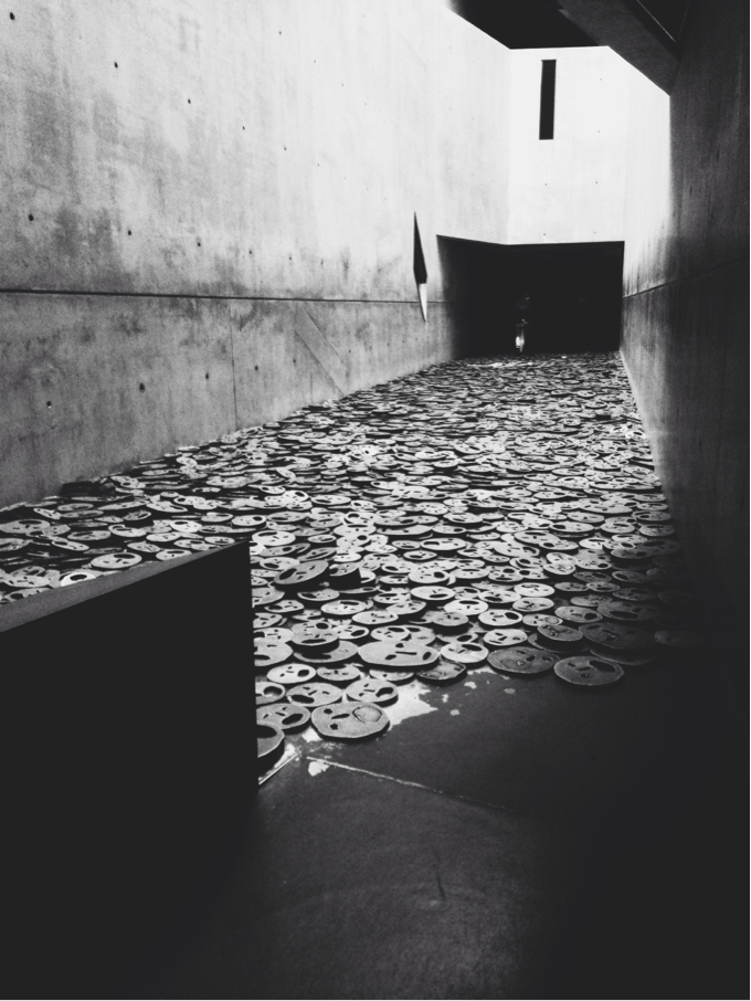
Shalekhet (Fallen Leaves) in the Memory Void, one of the empty spaces of the Jewish Museum

Shalekhet (Fallen Leaves) in the Memory Void, one of the empty spaces of the Jewish Museum

Emilie Kristiansen: Berlin offered copious sights worthy of recollection, but the installation Shalekhet (Fallen Leaves) by Menashe Kadishman at the Jewish Museum stands out as especially significant. The monumental view of thousands of distraught faces cut out of iron plates is a poignant reminder of the countless innocent Jews whose lives were taken, and the void they left behind.

Sarah Mason: I had never been to Berlin before this trip and I have to say Berlin lived up to all my expectations and more. My highlight and what I chose for my presentation and essay subject was a place called Clärchens Ballhaus. Clärchens Ballhaus is a dance hall built in 1895. This Ballhaus was one of many, 900 in Berlin alone in the early 1900s. Berliners loved to dance and the Tango was already more popular in Berlin than in Paris or London at this time. What is unique about the Ballhaus is it is still used today and is as popular now as it was 100 years ago with the local community. In décor, fixtures and fittings it has changed little apart from some slight bomb damage to the grand mirror hall upstairs. If you get a chance to sneak upstairs and take a peek, it’s a must: you really feel you have been transported back in time. Every aspect of Clärchens Ballhaus is steeped in social history for example the original cloakrooms with over 800 iron coat and hat hooks (the Ballhaus would have between 600-800 guests per night in its heyday). The bar and even the majority of tables and chairs are all today as they were  when Clärchens’ famous owners Fritz and Clara Buhler took on the premises in 1913. I fell in love with this place so much I went back and visited it eight weeks later, so definitely the highlight of my trip and definitely a place I recommend to visit.

Love, Luxury and Revolution: Paris in art and design


Iona Farrell, a second year student in BA (hons) Fashion and Dress History, explored Paris on a recent study visit…

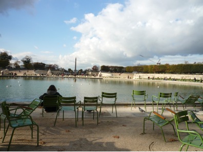
Tuileries Garden

View from the lake in the Tuileries Garden, looking towards the Place de la Concorde. Personal photograph by the author.

On the 4th to 8th of November this year, ten of us from the seminar group ‘A Trip to Paris’ visited the City of Lights. We were graced with beautiful blue skies and sunshine which was the perfect accompaniment to the elegant boulevards of Paris on this highly enjoyable visit.

Before the trip we split into three groups and each group was given a theme, either Love, Luxury or Revolution in Paris, with the task of planning a complete day in the city. Key readings were given to inspire our plans, from Walter Benjamin’s account of the historical passages of Paris to the student riots of the 1960’s. My group’s theme was Love and the book we based our day on was the fascinating novel The Hare with the Amber Eyes by the ceramicist Edmund de Waal. The book traces the provenance of an inherited collection of Japanese netsuke (small hand carved ivory figurines) back to a certain Charles Ephrussi, an art critic and collector in Belle Époque Paris.

Study in the Musée Nissim de Camondo.

Study in the Musée Nissim de Camondo. Built in 1911, with 18th century furniture and decoration. Musée Nissim de Camondo, Paris. Personal photograph by the author.

Inspired by the book, we decided to base our day on different forms of love, starting from the love of collecting, as seen by Charles Ephrussi and also the sensual side of love seen through the sculptor Rodin’s evocative works. Our first visit was to Musée Nissim de Camondo, which houses a collection of 18th century French furniture and decorative arts collected by Moïse de Camondo. The house is located on the distinguished Rue de Monceau, the same street Charles Ephrussi had lived on. Charles and Moïse were both passionate collectors and stepping into the Nissim de Camondo felt more like a home than a museum. It was filled with the most opulent rooms including a room solely dedicated to displaying porcelain dinner sets and tea services!

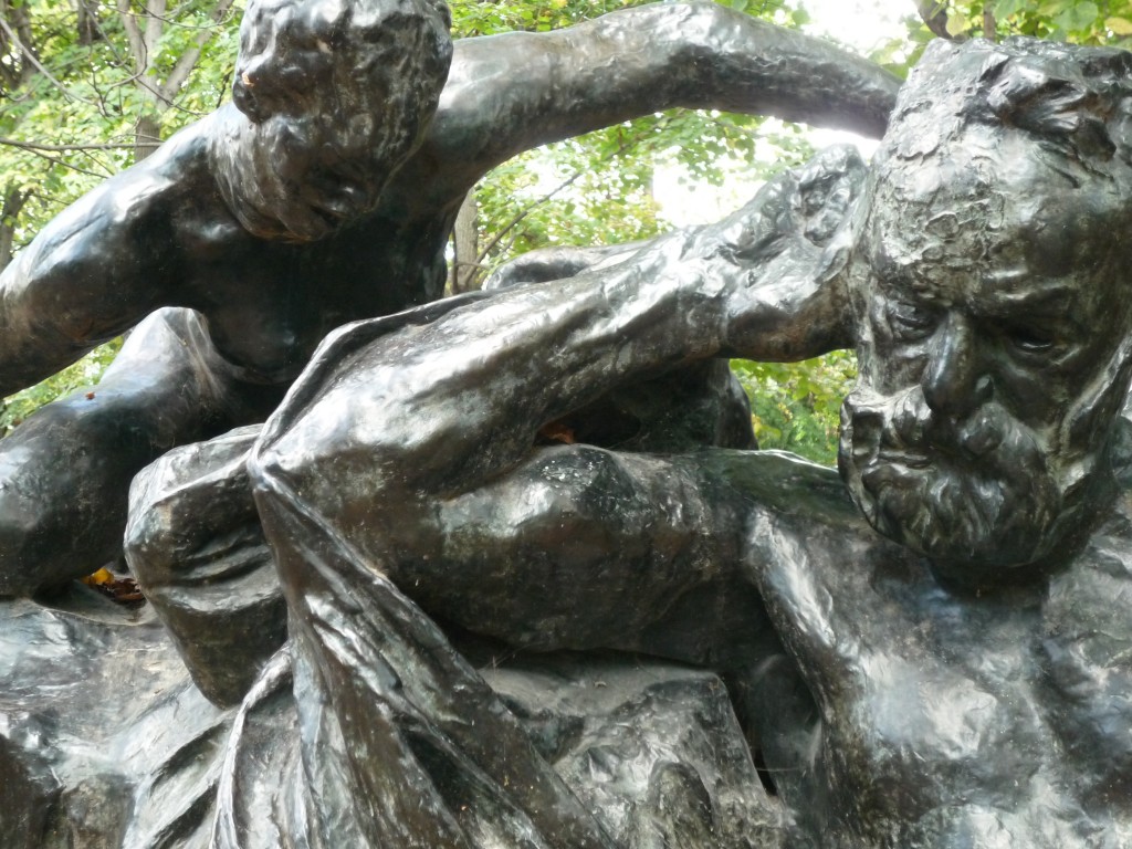
Auguste Rodin. Monument to Victor Hugo. 1890. Bronze. (Musée Rodin, Paris. Personal photograph by the author.)

Auguste Rodin. Monument to Victor Hugo. 1890. Bronze. Musée Rodin, Paris. Personal photograph by the author.

From there we went to the Musée Rodin, in which sculptures were interspersed amongst the grounds. I really enjoyed how they were placed outside: you could come close to the sculptures and see the expressive way Rodin rendered figures. We ended the day in the Musée d’Orsay, the grand converted railway station, which houses an extensive collection of Impressionist works. It was amazing to walk through the museum and recognise so many paintings that we had looked at in our lectures.

View of the interior of the Panthéon, Paris.

View of the interior of the Panthéon, Paris. Built between 1757-1791. Personal photograph by the author.

The diverse themes meant that each day was a completely different experience. Days were not just spent wandering around museums but actively exploring the city and its many facades. The Revolution day was spent walking around the Sorbonne area in Paris, the ‘University’ district where the 1968 student riots had taken place. During the tour we came across the Panthéon and made an unplanned but extremely worthwhile visit, exploring the endless labyrinth of underground tombs that house France’s leading citizens. Afterwards we crossed over the Seine and visited the Centre Pompidou. Built in the aftermath of the Student Riots, it houses a permanent collection of Modern art as well as a public library and music centre. We all had differing opinions on the museum, its industrial design was a real anomaly amongst the uniformity of the boulevards. Although I think its unconventional appearance was suited to its interior, housing challenging and experimental Modern artworks.

View of the Galerie Vivienne , Paris.

View of the Galerie Vivienne , Paris. Built in 1823. Personal photograph by the author.

For the Luxury themed day we traversed through Paris from our hotel in Montmartre, in the North, down to the Seine and the beautiful Tuileries Garden. The route took us through the historic passages of Paris, beautiful arcades dating back to the 18th century, dedicated to the luxurious pastime of shopping. The most elegant passage was the Galerie Vivienne, with mosaic floors and a glass ceiling, it was filled with quirky boutiques and fashion stores. The French designer Jean Paul Gaultier also has his flagship store here, and we peeped through the window at his eclectic designs. From there we walked along the Seine to the Musée d’Art Moderne and visited the Sonia Delaunay exhibition, which was bursting with endless samples of her bold, colourful textiles, as well as her earlier portraits which I admired.

Visiting Paris really brought the History of Art and Design course to life. Walking through the arcades where fashionable 19th century Parisians had browsed boutiques, or strolling through the streets which had seen numerous Revolutions; the streets all seemed to have their own narrative and I can’t wait to return and discover even more.

Mirrors and rainbows: Andrew Logan’s Glasshouse Studio


MA History of Design and Material Culture
student E-J Scott was spellbound on a field trip to Andrew Logan’s Glasshouse Studio in London.

“The idea was to have a window on the world.” Andrew Logan.

Entering Andrew Logan’s Glasshouse Studio, one is literally tripping the light fantastic.  As our MA group climbed the stairs to his crystal palace of creativity, we were visually bombarded by a menagerie of flying horses, queer medusa statues and warped, plastic toy landscapes.  We had stepped inside a diorama of his imagination, where the kaleidoscopic colours crashed and banged loudly enough to make audible our group’s shared delight.

Sally Reynolds smiles in Logan’s sunlit studio. Photograph by E-J Scott.

Out trip to Logan’s studio followed our morning at Zhandra Rhodes’ Fashion and Textile Museum.  A six foot high photograph of him in a dress designed by Rhodes depicted the friendship they have shared since the early seventies. Rhodes still designs half his frocks (the dresses are split down the middle, representing transformation) for his Alternative Miss World appearances, the outrageous drag pageant he launched in all its fabulousness in 1972.  The sculpture he made of her is housed in the National Portrait Gallery.  Zandra describes herself and Logan as “blood brothers”.

Logan (pink t-shirt) explains his curiosities to the curious! Photograph by Professor Lou Taylor.

A sculptor, painter, performance artist, jeweller, qualified architect and flamboyant London queen, Logan is the only living artist in Europe to have a museum dedicated to his work (The Andrew Logan Museum of Sculpture, Berriew, Mid Wales, est. 1991).  His work has been shown everywhere from the Hayward Gallery and the Victoria and Albert Museum, to Somerset House and the Royal Academy of Arts.

Louisa Carpenter next to a mannequin dressed in Logan accessories. Logan’s jewellery has been used for catwalk shows by designers ranging from Zhandra Rhodes to Ungaro to Comme des Garcons. Photograph by E-J Scott.

Logan’s studio was cluttered with portraits of Britain’s most eccentric queer characters. They are devotedly pieced together from smashed up mirrors, plastic toys, beads and the odd Swarovski crystal.  Derek Jarman is there, and as Logan ran through the artistic career he formed in London’s underground scene, he nonchalantly contextualised the portrait, divulging that he introduced Jarman to Super8 film-making at his Butler’s Wharf studios in the ‘70’s.   His sprightly, sexy and curious creations are steeped in personal history.  The noticeably rough finish on many works- splotches of glue here, drips of colour there- are left over touches indicative of an artist having fun at play.

Surreal sculpture by Andrew Logan. Photograph by E-J Scott.

Logan’s public art projects litter the UK landscape, reflecting his belief that art can be found everywhere and in everything. His Millennium Pegasus on Scots Green Island – a larger-than-life bronze horse with gold and silver glass inlaid wings and a bejewelled mane – depicts hope for a new era.  Logan says, ‘It is about where we come from, and where we are going to’.  Legend has it that wherever the hoof of Pegasus struck the ground, an eternal spring appeared.  Like Pegasus, when describing his artistic vision, Logan himself can appear to be bred from the love of Poseidon, and the carrier of Zeus’ thunderbolts.

E-J Scott in front of a winged Pegasus (a signature piece of Logan’s). Photograph by Professor Lou Taylor.

Little rainbows refract throughout the studio, as if they somehow shone straight from the glimmer in the craftsman’s eye.  As energetic as it is inventive, Logan’s works reflect his dreamy optimism, his colourful nature and his extraordinary warmth.  He not only welcomed our MA History of Design and Material Culture group into his creative space, he welcomed us into his world. My guess is Dr Annebella Pollen did not want to leave… at least, not without the  frog brooch in his Emporium gripped tightly in her clutches.  Speaking for myself, the visit to Logan’s studio – a self-created space, funded by the success of his lifelong dedication to his artistic pursuits – was a source of unequivocal inspiration.  Believing it is possible to live another kind of life – an enchanted life of art, whimsy and make-believe – is one thing; being brave and clever enough to make it happen is altogether another.   Just as Logan’s work resides in a boisterous space somewhere between fine art on the one side, and craft on the other, so too, Logan’s faery-like attitude toward the art of living is protected and crystallized in his castle: a chrysalis that dangles on the increasingly dirty, corporate, capitalist London skyline, home to a rare butterfly of a man.  This visit made the value of my study ring true, and I caught the train back to Brighton full of shiny ambition.

A pilgrimage to the Vitra Campus


BA (hons) History of Design, Culture and Society
student Stan Portus takes a trip to Germany and considers the relationship between a Modernist heritage and a Postmodern present

This year marks the 20th anniversary of architect Zaha Hadid’s first commission, the Fire Station at the Vitra Campus, located just outside Basel in Will-am-Rhein, Germany.  A new installation outside the building, entitled Prima, was commissioned from Hadid by Swarovski to mark the anniversary. Her original drawings for the Fire Station were used to create the five angular components of the sculpture, embodying ideas of action and speed. Hadid believes buildings should float: observing the juxtaposition of these structures, it is difficult to deny that this had been achieved.

Vitra is a company with quality and ‘good design’ at the forefront of its ethos. Entering the Campus as an architecture and furniture fan, it was hard to be disappointed. Since the site largely burnt down in 1981, Rolf Fehlbaum, son of Willi Fehlbaum the founder of Vitra, has transformed the site into a ‘playing field’ committed to ‘experimentation and artistic excellence’. The architect Philip Johnson described Vitra Campus as the first place since Weissenhofsiedlung in Stuttgart in 1927 to bring together the most distinguished architects in the western world.

VitraHaus, Herzog & de Meuron, Vitra Campus, Will-am-Rhein, 2010.

VitraHaus, Herzog & de Meuron, Vitra Campus, Will-am-Rhein, 2010. Personal photograph by Stan Portus (August 2013)

Rolf Fehlbaum’s personal collection of furniture forms the basis of the Vitra Design Museum, housed on the Campus in the building of another Pritzker winning architect, Frank Gehry. Opened in 1989, the same year as London’s Design Museum, Gehry’s first building outside America took a radically different approach to its British counterpart. Unlike the London structure, a re-clad warehouse on Shad Thames that harks back to the Modernist style of Le Corbusier, Gehry’s building represents the contemporary Postmodern deconstructivist style he would explore further in his later work, notably the Guggenheim museums. Ron Arad, when asked what the best and worst things of 1989 were by Design magazine (December, 1989), praised Vitra’s Museum and complained that at the ‘safe’ London building ‘visitors don’t see anything they haven’t seen before’.

The pedigree of the architecture and design represented at Vitra sustain the company’s image as the home of ’design classics’. Vitra recently acquired Artek, the Finnish design company co-founded by Alvar Aalto in 1935. At its core Artek is comprised of Aalto’s work, including his Armchair 41 and birch wood furniture. This acquisition is an example of Vitra ensuring their position as holders of a strong canon of 20th century designers. Vitra arguably became synonymous with the Eames since acquiring the rights to manufacture their work in 1957; in another 60 or so years they will likely be synonymous with Aalto and Artek as well. However, there are arguably some issues relating to Vitra in regards to their ideas on what constitutes classic design, what they choose to manufacture and their outlook on what design should be.

In his book Project Vitra, Luis Fernández-Galiano, explains how Rolf Fehlbaum wrote a doctoral thesis on Saint-Simon before taking over the family business. The interest in a utopian socialist from Napoleonic times, who believed in the new religion of industry, left a lasting impact on Vitra’s design canon. Industrial production of furniture was the aim of designers such as Charles and Ray Eames and Aalto, which was seen as a means to supply many with ‘good design’.

The Campus contains other buildings from architectural history such as Jean Prouvé’s petrol station from 1953 (acquired in 2003) and a Buckminster Fuller geodesic dome (1975), formerly used as a car showroom in America and brought to the campus in 2000. Fuller’s dome adheres to Modernist ideas of utopianism and Prouvé’s Petrol Station is also a strong example of rationalised design, a fundamental tenet of Modernism. It was one of the first serially manufactured petrol stations and could be assembled easily by two people, thus reducing labour time.

Petrol Station, Jean Prouvé, Vitra Campus, built ca. 1953 and brought to Vitra Campus in 2003

Petrol Station, Jean Prouvé, Vitra Campus, Will-am-Rhein, built ca. 1953 and brought to Vitra Campus in 2003. Personal photograph by Stan Portus (August 2013)

It is strange to see Modernist ideas of ‘good design’ so strongly expressed at Vitra, a company also engaged with contemporary designers and architects. Postmodernism acted as a reactionary movement against such ideas. How we understand the role of the designer and material culture has changed dramatically since 1950s Modernism, where the designer was seen as able to dictate taste and often had societal aims at the centre of their work. Revealed is a complex relationship between the heritage and the contemporary work of Vitra. Walking around Vitra Haus, Vitra’s onsite show room and shop designed by Jacques Herzog and Pierre de Meuron, one is left with the feeling that the Modernist history of design Vitra represents and manufactures will always be present, regardless of how dated the ideas of ‘good design’ apparent in some of the products are. Yet one also has to consider that Vitra has always provided a space for the new and exciting and continues to do so.

Eames wire chair seating outside factory building on Vitra Campus

Eames wire chair seating outside factory building on Vitra Campus. Personal photograph by Stan Portus (August 2013)

 http://www.vitra.com/en-gb/campus