My textile conservation journey

BA Fashion and Dress History student, Katy Crawford, details how she built a profile in volunteer textile conservation to support her career plans.

After stumbling across some painting conservation videos and being completely mesmerised by the process of conserving, preserving and sometimes restoring objects, I wondered if this career path might align with my own interest in fashion and dress, and that is when I discovered textile conservation.

After researching how I could pursue this journey in March 2019, I discovered the only dedicated Textile Conservation qualification is at the University of Glasgow. I knew instantly that this is where I wanted to be after my finishing my BA, but the entry requirements were tough and after speaking to previous and current students, I knew I had my work cut out. There is no doubt that the experience and contacts I gained through volunteering helped me gain a place on my dream master’s degree.

Figure 1: Using an ergo hoover and nylon mesh (to avoid direct contact with the textile) to clean the Acanthus bedspread of a year’s worth of dust. Standen National Trust. Personal photograph of the author. 17th July 2019.

I first contacted the National Trust properties, Nymans and Standen House and Garden, who were delighted to help me in preparation for my master’s application. Through volunteering I gained an introduction to conservation and was able to build my skillset in an environment where there was very little pressure and I had the luxury to simply learn from others. I completed morning cleans, deep cleans and aided in the general upkeep of the house. I also learnt about pests, how to handle and condition check specific objects, and how to talk to visitors about conservation and all the work that goes on behind the scenes.

Volunteering not only expands your skills but also provides you with access to an experience that the general public don’t get. At Standen I carried out an extensive project where I condition reported and pest checked over forty textile items. This included the Acanthus bedspread made by Morris & Co. in 1890, making it conceivable that May Morris herself supervised the work completed on it! At Standen, I was able to view and handle their wonderful Arts and Crafts textile collection, a luxury I earned through gaining the trust of the conservation team.

In addition, I have gained a tremendous amount of contacts by volunteering. Through Nymans I was lucky enough to visit Zenzie Tinker’s conservation studio in Brighton, where I gained invaluable advice from Zenzie and members of her staff who had also completed the Glasgow master’s qualification. I later completed a course with Zenzie on the conservation of electra beetle wing, an insect element sometimes used in fashion and textiles. This in turn put me in touch with further conservators and students. During the Professional Paths module in the final year of my Fashion and Dress History degree, I focused on textile conservation as a career. I was able to interview Zenzie for my final essay, which not only helped me improve my grade but strengthened my relationship with a professional contact.
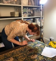
Figure 2: Inspecting one of the Tulip hangings for pests and signs of new damage. Standen National Trust. Personal photograph of the author. 31st July 2019.

For many, the ultimate goal of volunteering is for it to lead to paid work, and it is possible! After a few months volunteering with Standen, a member of their conservation team handed in their notice and I was offered some paid work while they interviewed for a replacement. This was an incredible opportunity which I would not have received had I not already shown my capabilities through volunteering. I was even encouraged to apply for the full-time role, which I would have been delighted to do had it not clashed with university commitments.

I wholeheartedly encourage students to talk to your university tutors about your career plans. Through my course tutor, Dr Veronica Isaac, I was able to visit the V&A textile conservation studio. This was something I had attempted to do myself with no luck, highlighting how you should make the most of your tutors’ contacts. While visiting, I asked if I could volunteer and the answer was yes! This is an ideal example of ‘if you don’t ask, you don’t get!’ Putting yourself forward demonstrates your commitment and may lead to other opportunities. My experience at the V&A was sadly cut short due to coronavirus but I was able to help with the current decant project, making new storage supports and improving old supports for women’s sixteenth-century hats.

If I could summarise my journey, I would say that volunteering will never be a waste of time. You get the opportunity to expand your skillset, gain hands-on experience and contacts, and maybe even gain paid work. Everywhere I have volunteered I have met someone new, which has led to more places to visit and even more people to meet. Through contacts at the National Trust, I have visited Knole conservation studio, where I did my first interventive conservation work (assessing collections damage), and later this year I will be visiting the National Trust’s dedicated textile conservation studio for a week-long placement. Through contacts at the V&A, I will be visiting the textile conservation studio at the Museum of London. All of these visits and opportunities were made possible through volunteering and being able to name-drop the contacts I have gained over the past year.

Breaking through: From History of Art and Design studies to History teaching

BA History of Art and Design student, Hannah Kempster, reflects on the value that a breakthrough prize has had for her confidence and career development.

I was very excited to find out that I had won the Anne Clements Breakthrough Award for my grades during the second year of my History of Art and Design degree. I hadn’t been aware of the award in advance, so I was extremely surprised to find out that I had won it. I loved the second year of the course and had wonderful experiences such as a trip to the Tate Modern, and a voluntary placement at Volk’s Electric Railway. Winning this prize felt like a fantastic end to a great year.

Breakthrough awards are given to second year undergraduate students to support and encourage them through what can be a challenging phase of their studies. The university also holds an annual celebration event for students and donors to celebrate the awards that are given in all subject areas. This is also an opportunity for donors to meet the winners of their prizes, and to see the impact that the awards can make in students’ lives. During the speeches, we were regaled with stories of the many ways the funds had been used. It was amazing to hear how students had used the awards for diverse projects including trips abroad and business start-ups. I left the evening feeling inspired and in awe of the amazing work that students are undertaking alongside their studies.

Hannah with other University of Brighton student award-winners, and the Vice Chancellor, at the annual celebration event, 18 February 2020.

Anne was sadly unable to come to the celebration evening, so I didn’t get a chance to thank her personally. However, her daughter Fiona was attendance. Fiona told me that Anne had had a career in design history and as a result wanted to support scholars in the same field. I am extremely grateful to Anne for this support. Winning an award represents not only financial backing, but a huge boost to my confidence. It gave me renewed enthusiasm and encouragement going into the final year of my studies.

Like many of my peers, I have had to work alongside my degree to support myself financially. The funds have allowed me to have some much needed time off work while I completed my final assignments and dissertation. While I had originally planned to also use the time to gain more work experience to enhance my employability, lockdown hasn’t allowed for this. This has been a blessing in disguise however, as I reflected on my career options and have decided to train to become a teacher. I am very pleased to say that I have accepted a place for next year to train to teach secondary school history. I am hugely grateful to Anne for the award, and the financial support that has allowed me the space and time to work on my studies. It has also given me the confidence and encouragement to pursue a career I know I will love.

Liberty fabrics in Country and Western wear: Historical research and creative practice

Janet Aspley, who recently completed her PhD, was interviewed by the fashion company Liberty about her love for their fabrics, and how her design company Dandy & Rose, where she makes bespoke Liberty print western shirts, links with her interests in the history of fashion.

WHERE ARE YOU BASED, AND WHEN DID YOU FIRST START MAKING SHIRTS?

I am based in Lewes, East Sussex, where I’ve lived for 25 years. I started experimenting with making western wear in the late 1980s when I first became a big fan of country music and started writing for Country Music People magazine. A couple of years ago, I was interviewing the Grammy-winning singer-songwriter Jim Lauderdale and plucked up the courage to show him a shirt I had made from a 1940s western shirt pattern. He loved it and started wearing my stuff onstage – and Dandy & Rose was born.

DO YOU HAVE A FAMILY HISTORY OF SEWING?

My mum Iris was an avid home sewing enthusiast – when I was growing up, she made all my clothes. She had learned her skills from my dad’s mum, who would make extra pennies by taking in sewing after she married my grandad, a coalminer. Sometimes when I see one of my shirts on stage or on TV, I wonder what she would have made of it. I bet she would have loved to have a workroom full of Liberty fabrics!

CONGRATULATIONS ON GETTING YOUR PHD – COULD YOU TELL US SOMETHING ABOUT YOUR STUDIES?

Thank you! About 10 years ago, I interviewed the tailor Manuel Cuevas, the ‘Rhinestone Rembrandt’, and realised his work would be a great basis for an academic study. ‘Nudie suits’ are made using incredible finesse of cutting and construction – but instead of the understated details that usually go with bespoke menswear, they are made in bright colours, embroidered with pictures and embellished with sparkling rhinestones. Walking into Manuel’s showroom is like entering a jewel box. In its 1950s heyday, the Nudie suit was a working-class version of luxury, an expression of rags-to-riches stardom. Since then it has come to be seen as traditional, and country singers wear their Nudie suits to show that they are the ‘real deal’.

HOW DID WORKING ON YOUR THESIS INSPIRE YOU TO START MAKING YOUR SHIRTS?

Studying dress means you need to understand how something’s made – for me, that means having a go at doing it myself wherever possible. The research and the making are an exchange, with each feeding the other. I did a lot of research at the Country Music Hall of Fame and Museum in Nashville, so it was a thrill when they included me in their ‘Featured Western Wear Designer’ exhibit a couple of years ago.

WHY DO YOU THINK AMERICAN COUNTRY SINGERS HAVE SUCH AN AFFINITY FOR LIBERTY FABRICS?

Gram Parsons, who is an inspirational figure to many modern musicians, had a Nudie suit made in 1968 embroidered with pictures of leaves, pills and poppies – a real product of 1960s counterculture. Parsons spent time in London and loved the iconic Kings Road boutique Granny Takes a Trip, which made the famous psychedelic William Morris print jackets worn by George Harrison and Jimi Hendrix. My Liberty print western shirts evoke this important ‘60s music moment – I’d love to find a photograph of Parsons in a Liberty shirt, because I’m sure he must have had one!

Musicians love Liberty prints because they’re beautiful. These are creative people, and they can appreciate the work of an artist in a different medium – which is what your print designers are. Tana Lawn™ is a great fabric for a touring musician. It’s very soft and light, and it doesn’t crease as much as most other cotton fabrics either. They can pull it out of their bag, put it on to go onstage and make an impact.

HOW DO YOU CHOOSE LIBERTY PRINTS FOR DIFFERENT MUSICIANS?

I try to help my customers pick out a print that expresses their personality. Sturgill Simpson chose the print Gustav and Otto – he had a song out called ‘Turtles All the Way Down’, so I cut the shirt so that the tiny turtles in the design ran all the way down the button band. Danny George Wilson is highly tattooed, so he loved the tattoo-inspired Wild at Heart print. I love connecting my customers with the stories Liberty can tell about each print.

Sometimes it’s Liberty itself that is the connection. A couple of years ago, I made a shirt for the actor and comedian Tina Fey. Her brother Peter bought the shirt for her as a Christmas gift, because he knew she had special memories of visiting Liberty when she came to London as a young backpacker. He chose the print Queen Bee, which I suspect was a family in-joke!

WHICH MUSICIANS HAVE YOU BEEN ESPECIALLY EXCITED TO SEE WEARING YOUR WORK?

Aaron Lee Tasjan has all the flamboyance of the ‘60s and ‘70s menswear moment, so I loved it when he got a ruffled Dandy & Rose shirt in a psychedelic print called Amelia Star. When Jim Lauderdale wore one of my Liberty shirts on the TV soap opera Nashville, I had a viewing party with all my friends. And I’ll never forget sitting backstage in the bleachers at the Grand Ole Opry, a historic Nashville venue for country music, and looking up to see Jim wearing a shirt I had made on the huge screen – it filled me with awe to think it had come all the way from my little workroom in Lewes.

There are still some musicians I would love to make for, so Lyle Lovett, Elvis Costello – if you’re reading this…

WHAT DRAWS YOU TO LIBERTY PRINTS?

The colours and details are amazing. I made a shirt in the print Wild Flowers, and was working to a deadline to get it ready for a show. Because I do a lot of pattern matching, I examine the prints very closely, but even so, I was right at the end of the make before I noticed that the designer had inserted the word ‘Strawberry’ into the print. I love that level of attention to detail.

An earlier version of this blog post originally appeared on the Liberty London website.

Selling Wallpaper: An archival history of interwar home decoration

Lucy Ellis, MA History of Design and Material Culture, provides a fascinating insight into the history of wallpaper. 
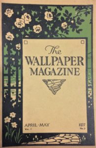
I have always had an interest in the history of wallpaper, and I also have a background in retail. When I started my MA in the History of Design and Material Culture at the University of Brighton  in 2017, I was keen to bring these two things together.  So I was delighted to find a publication called The Wallpaper Magazine in the Museum of Domestic Design and Architecture (MODA) collections at Middlesex University. MODA proved to be a fascinating resource for research into wallpaper salesmanship between the wars.

My research made me realise just how much rich history is contained within trade journals and magazines: all the voices of the trade are there, from management through to decorators. We see them at work and at play through the advice features, technical instruction, sports and social reports, jokes and cartoons, all wrapped up in these wonderful ephemeral objects.

Wallpaper Magazine, April-May 1927

Wallpaper Magazine, April-May 1927, Museum of Domestic Design and Architecture collections, Middlesex University.

The Wallpaper Magazine was published in Britain from 1920-1939 by The Wallpaper Manufacturers Ltd (WPM), the dominant wallpaper company of the first half of the twentieth century.  The magazine was an in-house journal that sought to unite the industry. It was a conduit for enthusiastic (and at times intensely didactic) advice on how to maximise wallpaper sales.

When the magazine was launched in 1920 the wallpaper industry was recovering from a slump brought about by war and shortages of raw materials. The wallpaper industry also faced a hostile design climate in which critics, enthused by modernism, advocated abandoning wallpaper for plain painted walls.

In response, WPM used The Wallpaper Magazine to inform, educate and motivate the wallpaper salesman to ‘better business’. It was a means of conveying the new USA-led science of salesmanship to the independent decorator on the high street in order to revive the trade.

The magazines chart the growing importance of branding as a means of selling.  I was intrigued by the changing cover designs and how the tone of the magazine altered over the 1920s and 1930s.  In the 1920s the salesman was encouraged to see his (mainly female) customers as ‘unbelievers’. It was thought that they needed to be ‘educated’ into buying wallpaper. By the 1930s, there was a more moderate and sophisticated assessment of the client based on psychological profiling, a change reflected in the tone and content of these magazines.

I am very grateful to the Wallpaper History Society for awarding me the Merryl Huxtable Prize to support my research into inter-war wallpaper salesmanship.

For more information about Lucy’s research, watch this film made by Middlesex University TV Production students. With thanks to the Museum of Domestic Design and Architecture for permission to reblog this content. 

http://vimeo.com/375708265

Curating The Ladies’ Paradise: A Hidden History

PhD student Jo Lance offers a view of her exhibition on early twentieth century fashion illustration for department stores at Worthing Museum and Art Gallery.

The Ladies’ Paradise is a fashion exhibition in the Norwood Gallery at Worthing Museum and Art Gallery, September 2019- June 2020, which I created with support from the Museum’s curatorial team. Its core is a collection of Edwardian fashion drawings c.1905-1914 by an illustrator named Ida Pritchard [1889-1948].

Figure 1. Ida Prichard. Illustration showing evening cloak, c.1910. Worthing Museum and Art Gallery.

I first came across Pritchard’s fashion drawings while volunteering at Worthing Museum and Art Gallery, prior to commencing my PhD studies. I was immediately intrigued by the drawings, as it seemed unusual for a young woman to have had a career as a fashion illustrator in the period before the First World War. We know from her relatives, who donated her drawings to the Museum in 1993, that Pritchard was raised and educated in London and that she worked as a commercial illustrator for Peter Robinson department store producing images for advertisements in fashionable publications such as The Queen, Country Life and The Ladies’ Field before she left work upon marriage in 1914. We do not know how common her career path was; little is known about female graphic artists in this era.

Traditionally, histories of early twentieth-century fashion illustration have looked at fashion plates by celebrated avant-garde artists to emphasise the relationship between fine art and Parisian couture. Such accounts focus on elite fashion and do not include the many artists like Ida Pritchard who worked in the rapidly expanding advertising and magazine industry. This exhibition was an exciting opportunity to show the work of one of those unknown artists, and to frame her work within the context of the department store phenomenon and ideals of femininity at the time. Pritchard had an amazing eye for detail and her work captures the sumptuous textures of the clothing and stylised, staged femininity of the Edwardian period.

Figure 2. Ida Pritchard. Illustration of day ensemble with hat and feather stole, c.1905. Pencil / gouache on card. Worthing Museum and Art Gallery.

Pritchard’s drawings provide a valuable glimpse into the working life of a female commercial artist just before the First World War, in the heyday of the West End department store. She and her colleagues sketched from live models, who often posed in the large shop windows, wearing the latest fashions. The illustrators sat in the windows and sketched them. This was a clever publicity stunt that drew large crowds on the busy pavements outside.

Pritchard’s drawings skilfully capture the exaggerated characteristics of the feminine ideal of the 1900s and early 1910s, from the dramatically corseted “S” bend silhouette to the high-waist Empire line that replaced the hourglass style. The opulence of the Edwardian era, the layers of lace, feathers and furs are delicately modelled in a largely monochrome palette of pencil and gouache. A selection of dress from the museum collection, c.1900-1914, including pieces from Peter Robinson, is displayed in the exhibition alongside the fashion plates. A monochrome colour scheme, relieved by touches of pink and gold, reflects the colours Ida Pritchard used in many of her drawings. Where possible, outfits that echoed the silhouettes and textures of Pritchard’s work were juxtaposed.

The Edwardian period saw the commercial peak of the major London department stores, which were at the forefront of fashion retail for the rising middle classes in the early 1900s. Like many department stores, Peter Robinson’s had begun as a modest draper’s shop in the 1830s and expanded to become “Black Peter Robinson’s” mourning warehouse, capitalising on the Victorian cult of grief. The enterprise expanded rapidly in the late Victorian consumer boom and by the 1890s Peter Robinson was a prosperous business, with premises on Oxford St, Regent St, Great Portland St and Argyll St. A purpose-built flagship store was completed on Oxford Circus in 1912, which still stands, occupied today by Topshop.

Figure 3. Ida Pritchard. Illustration of three female figures showing lace blouses, c.1905. Pencil / gouache on card. Worthing Museum and Art Gallery.

The nineteenth century department store offered a new cultural space for women. Consumption was integral to the identity of the New Woman and shopping was seen as a form of liberation. During the Victorian period there were few public spaces which a respectable woman could enter unchaperoned or without the company of a male relative. Modern department stores such as John Lewis and Selfridge’s made use of new building technologies such as cast iron and plate glass to create open galleried spaces and large inviting windows filled with innovative displays, including fashionably dressed mannequins. Customers were encouraged to browse, try items on, relax and socialise in refreshment rooms. Shopping was a leisure activity and the new department store a place to see and to be seen.

Department stores offered a vast array of haberdashery goods and a comprehensive dressmaking service. They were also at the vanguard of ready-to-wear fashion production. Throughout the Victorian period clothing was made to measure but as the nineteenth century progressed, technological innovation moved the garment industry towards mass-production. Mantles and capes, gloves and hats were among the first types of women’s clothing to be ready-made and retailed in luxurious surroundings. Examples of capes, including an extravagant Poiret-influenced c.1910 opera cloak in gold and pale blue satin with Oriental motifs and embroidered silk tassels, made by Peter Robinson, were included in the exhibition alongside complementary fashion plates by Pritchard.

Department stores had large dressmaking departments with seamstresses producing outfits to order. Peter Robinson pioneered ready-made costumes with a seam left open at the back so that clothes could be adjusted to fit at home. Peter Robinson was also among the first fashion retailers to advertise in the press, taking out advertisements in the Illustrated London News for mantles and waterproofs as early as the 1860s. The second half of the nineteenth century saw an explosion in print culture and many new periodicals were aimed at a female audience, featuring columns of style and etiquette advice and, latterly, engraved fashion plates. By the early twentieth century, when Pritchard produced her drawings, the company were producing beautifully illustrated full-page advertisements. Worthing Museum is fortunate to have Pritchard’s original drawing, c.1908, of a satin petticoat, a copy of the magazine in which the advertisement was published and a near-identical example of a pink petticoat and camisole from the period, meaning that they could all be exhibited in conversation together.

Pritchard’s drawings, although they indicate subtle variations, adhere to a specific feminine type until c.1910. The fashions of the turn of the century were characterised by a dramatic hyper-femininity. Images of modish women in newspapers and advertising were shown swathed in luxurious fabrics and dripping furs. Hats were huge with ostrich plumes atop hair rolled around pads and augmented with hairpieces to increase height and volume. The increasing availability of commercially produced cosmetics and perfumes added to the general mode of theatrical artifice and exoticism, all of which is reflected in Pritchard’s drawings for a mass audience.

Ida Pritchard’s work had never been exhibited before in its own right. The Ladies’ Paradise was designed to complement the Female Voices exhibition, representing women through the collections, in the main Museum gallery. It shone a spotlight not only on an unknown female artist but also upon the subject she depicted, the fashionable woman on the eve of the First World War. Framing Pritchard’s work within department store culture of the period reveals how women were linked with modernity through the consumption of fashionable goods, and how shopping was linked to leisure and liberation (for those who could afford it). As the Suffragette banner on display in the Female Voices gallery reminds us, the period of unprecedented consumer temptations was the era of the struggle for female emancipation. This offers pause for reflection on the nature of choice, freedom and progress.

Update: As this exhibition has had to close as a result of Covid-19, a dedicated webpage including further images and exhibition texts has been provided by Worthing Museum.

Cyanotyping the Family Snaps

Jayne Knight, doctoral candidate in the history of photography, offers inspirational tips on how to keep researching while staying at home.

As a PhD student researching popular photography at the National Science and Media Museum, I have been finding ways to stay connected to my research from home while the collections I am researching are closed. Seeking the silver lining during the enforced lockdown, I have been making the most of the glorious sunshine in the garden by cyanotyping. This has involved digging out the family snaps to give them a new lease of life.

Fig.1. Members of my famiy in indigo blue. Photograph by Jayne Knight, images taken from family negatives.

Cyanotyping has always been a hobby of mine. As a process discovered by scientist and astronomer Sir John Herschel in 1842, I have been continually inspired by the beautifully detailed indigo blue prints of Anna Atkins. Using light to impress botanical specimens and negatives on chemically treated paper retains its charm, time after time. Inspired by my current research into the history of the snapshot photograph, I decided to dig out the cyanotype chemicals and do something with a box of negatives.

Some time ago I gasped in horror at the prospect of a precious box of old photographic negatives being disposed of. My Grandad claimed they had “no further use.” While he has done a wonderful job preserving the family snaps – aged 96 he can still recall the story behind many of them – as a photo historian, I wanted to breathe new life into the negatives.

Fig.2. The box of negatives. Photograph by Jayne Knight.

Assorted in age, size and condition, the negatives are indiscriminately kept in their original processing envelopes, still revealing many details of their material history (Fig.2). Some negatives were printed and ended up in the family photo albums but others seem never to have been printed at all despite being designed for reproduction. One box, containing thousands of negatives, presents bountiful opportunities for cyanotype printing.

Many of the negatives were from the interwar period, when industry giants such as Kodak successfully put cameras in the hands of many. Typical Kodak customers, my Nan’s family took their ‘Brownie’ camera to the seaside, on family holidays, and captured weddings, fun in the garden and wartime farewells. It was a selection of these interwar negatives that I chose to print.

Fig.3. The negatives exposing on chemically sensitised paper. Photograph by Jayne Knight.

Assembling my negatives on chemically-prepared paper, I secured them in a frame. Placing them out in the sun, I watched them expose (Fig.3). Rinsing off the prints in a tray, the emergence of the positive image filled me with joy. Hanging them to dry, the image strengthens in colour, becoming fixed for permanence (Fig.4).

Fig.4. Just exposed and hung to dry. A selection of snaps of my Nan, Grandad, Aunt and my Dad as a child. Photography by Jayne Knight, images taken from family negatives.

In many cases it is the first time that the images have been seen as a positive print. Details unnoticed in the negative come to light. Tonal qualities, in shades of indigo, give the print depth . Printing the positive image brings me closer to the moment captured by the photographer. Fashions, seaside locations and long lost relatives come to life. This will not be the last of the negatives’ revival. When lockdown is lifted, I will take the cyanotype prints to my Grandad to find out the stories behind them and to remind him that an old negative will always have a use.

I am fortunate that my area of research, popular photography, is embedded into everyday life. Photography exists in the home, from family photo albums and shoe boxes of prints and negatives to thousands of digital files and social media inputs. Inspiration is plentiful.

The Importance of Being Serious?* A Stevengraph of William Ewart Gladstone

Maria Paganopoulou, MA History of Design and Material Culture, shares her research on a Victorian textile political portrait.

As a part of the MA module, Exploring Objects, students are required to select an item from the Dress and Textile History Teaching Collection at the University of Brighton. The task is to uncover its original history and to provide further interpretation. Since my knowledge of dress theory was still scarce at the point I undertook the module, I went for an object for which my background studies in the history of arts and crafts had already prepared me. This object was a framed silk image, a Stevengraph, depicting the British Prime Minister from 1868-1994, William Ewart Gladstone (fig.1)

1. The front of the Stevengraph (left) and its reverse (right). Stevens Company, Right Hn. W. E. Gladstone, Silk Picture, The Dress and Textile History Teaching Collection, University of Brighton, Photograph by Maria Paganopoulou, October 2019.

For the uninitiated, Stevengraphs were popular mid-nineteenth-century silk images, produced on a Jacquard loom which enabled multiple reproduction. Their name derives from their inventor, Thomas Stevens. Due to their mass production, I was able to locate a sibling to the Dress Collection example in Herbert Art Gallery and Museum in Coventry.

The Stevengraph was extremely visually interesting to me as it seemed to combine contradictory elements of seriousness and playfulness. Gladstone’s sombre expression, woven in black and white, was combined with sparkling threads and colourful flowers. These seemed incongruous, even comic.

My mystery object became less mysterious when I explored existing scholarship, such as that of Geoffrey Godden, who has comprehensively investigated the original contexts for Stevengraphs as a specific Victorian category of decorative objects. Stevengraphs were also used as a case study by anthropologist Michael Thompson in his 1979 book, Rubbish Theory: The Creation and Destruction of Value. Thompson amusingly thanks Godden for relieving him ‘of the tedious task of having to collect most of the historical data before analyzing them’.

2. J. Russell & Sons, The Right Hon. William Ewart Gladstone, c. 1880, albumen cabinet card, National Portrait Gallery: Photographs Collection Database, April 2020 © National Portrait Gallery

My first step in Stevengraph data gathering and analysis was to locate my object in space and time. Stevens’ company was based in Coventry and according to Godden’s rigorous dating method, based on fonts and frames, the birth of my object took place in that town between 1889-1891. As the image prepared for the loom was most likely not drawn from life, my next step was to search for its visual source.

After lengthy research in the digitised collections of the National Portrait Gallery (NPG), I was able to locate the original image, a nineteenth-century photographic cabinet card (fig.2). The striking similarity between the photograph and the Stevengraph did not leave much room for doubt and the interplay between the two nineteenth-century technologies, photography and mechanical loom, prompted me to find out more connections between them.

3. William Thomas Brande, Antoine Claudet and Michael Faraday, half plate daguerreotype, c. 1846, National Portrait Gallery: Photographs Collection Database, April 2020 © National Portrait Gallery

After examining previous types of photography in the online catalogue of the NPG and various books dedicated to the subject, I discovered many similarities in the way that photographs and silk images were framed. The bell shape of the frame can be found supporting various kinds of early photographs, including Daguerreotypes and Ambrotypes (fig. 3) and also later cabinet cards.

Furthermore, the way that Stevengraphs were framed has affinities to cabinet cards kept in albums (fig. 4), suggesting a similar use and display. It is evident then, that although made in silk, a luxurious material often associated with fashions to be worn on the body, Stevengraphs were produced and framed to be visually consumed, as with parallel display patterns in photography.

4. Framed Cabinet Cards, Four Reproduction in Asa Briggs, A Victorian Portrait: Victorian Life and Values as seen through the Eyes of the Work of Studio Photographers, London, Cassell, 1989, pp. 18-19 (upper), 82-83 (down). Print

The time had come to investigate my initial excitement about the Stevengraph’s apparent contradictions. I learned that seriousness in the sitter was not surprising in the period. Indeed, it is not usual to find smiles in Victorian photographs. Smiling in photographs is a cultural convention established in the twentieth century due to the popularisation of informal photography by Kodak.

In addition, although politicians today brand themselves as approachable and even light-hearted, in nineteenth-century England seriousness was expected in the political arena. Nevertheless, humour had a distinct place in Victorian politics, with a special class-specific aspect especially reserved for mocking those of a non-aristocratic descent. Gladstone, having mercantile origins, was frequently lampooned by fellow politicians and cartoonists (fig. 5). It has been argued that his political persona was based on being consistent and serious as a way of refuting such attacks. This seriousness was also reflected to the way he styled himself when being photographed.

5. Harry Furniss, William Ewart Gladstone, pen and ink, 1880s-1900s, National Portrait Gallery: Primary Collection Database, April 2020 © National Portrait Gallery

As far as the other side of my seeming paradox is concerned, namely the colorful flowers of the image, they lost some of their playfulness when I learned that they are the official symbols of England (rose) and Scotland (thistle) respectively. Gladstone was half Scottish and had run a successful campaign in the Scottish province of Midlothian. It may even have been that this campaign gave rise to the production of objects depicting Gladstone in the first place.

This brought me to the matter of the object’s consumption. Stevens’ marketing strategy for his silk pictures promoted technological innovation as their main selling point. No explicit reference was made in advertisements to their visual subject matter. As a result, I had to turn to other sources. What emerged from further research was Gladstone’s carefully cultivated popularity, especially in the context of the Midlothian campaign which is considered to be one of the first modern political campaigns.

Popular admiration for Gladstone resulted in the production of an abundance of objects carrying his likeness, from figurines to printed plates (fig. 6). His popularity has been described as equivalent to a cult. This provides a framework for understanding why the Stevengraph might have been purchased and how it might have been used. It may have been bought to express admiration, and may have been placed in a photographic or souvenir album amidst other beloved political and public figures, whose likenesses were also issued.

6. Gladstone Plate, porcelain, in Asa Briggs, “Victorian Images of Gladstone”, in Peter J. Jagger (ed.), Gladstone London, Hambledon Press, 1998, pp. 3. Print

To conclude, the range of research directions that a single object can open up was far more than I had first anticipated. The variety is what made the research fascinating. Stevengraphs existed in a wide network of objects and people, the study of which opened new windows for me into Victorian visual culture, design and politics.

*My title refers to the article by Joseph S. Meisel (1999), ‘The importance of being serious: The unexplored connection between Gladstone and humour’, History 84:274, pp.278-300.

For more information about Stevengraphs, see Herbert  Art Gallery and Museum: https://www.theherbert.org/collections/social_and_industrial_history/18/stevengraphs

Website featuring ‘all known silk bookmarks, silk pictures and silk postcards manufactured since 1862’: http://www.stevengraph-silks.com/

Notes from the North East Film Archive: A PhD Placement

Jenna Allsopp, PhD student, describes six months of handling, researching, splicing and digitising archival film.

In 2019, I undertook a 6 month professional development placement at the North East Film Archive, which was funded by Design Star as part of my doctoral training. The aim of the placement was to provide me with an exciting opportunity to experience a completely different, collections-based, environment to an academic, university-based one I am currently situated in as a PhD student. My work on their North East on Film project provided me with invaluable connections with archivists and curators within my chosen field and geographical location, having recently moved back to my hometown of Newcastle-upon-Tyne after 11 years in Brighton.

The North East Film Archive (NEFA), and its sister organisation the Yorkshire Film Archive (YFA), is a charity which aims to preserve and provide access to the moving image heritage of Yorkshire and the North East of England over the last 120 years, much like the south coast’s own regional film archive, Screen Archive South East, held at the University of Brighton. NEFA and YFA cares for the collections housed in both Middlesbrough and York respectively, made up of more than 50,000 titles which provide a rich and engaging record of time. The majority of films are non-fiction or industrial records, made by both amateurs and professionals. Subject matter includes industry such as shipbuilding, mining, steel and textiles, as well as everyday life such as family parties, school trips, holidays and regional events and traditions. They also hold the Yorkshire and Tyne Tees Television news and regional programmes, alongside a wealth of output from local cine clubs, which reflect a fascinating social history over the last century.

Fig.1: Lining up film and sound reels on a Steenbeck flatbed editing suite at the North East Film Archive, Middlesbrough. Photograph by the author. July 2019

During the placement I was trained in more physical aspects of film handling, such as loading the Steenbeck flatbed editing suite (see Fig.1) with 35mm picture and sound film, which I was shown how to sync accurately. The dark film is the picture and the brown film is the sound.

In 1928 Kodak introduced their Kodacolor process which was widely used by amateur filmmakers until the introduction of the much-improved Kodachrome process in 1935. This process underwent a lot of fine-tuning, particularly in the US where the technology was pioneered, which inevitably had a bias towards the capturing of white skin tones. The inherent racism of early colour photography has been widely written about, specifically the Kodak-issued ‘Shirley’ cards which were used as a standard gauge to calibrate colour in photography and film processing quality control. Named after the first model who posed for these cards, Shirley Page, all subsequent models became known as Shirleys; a Caucasian woman usually against a grey background. This image, as visible on the screen of the Steenbeck in Fig.1, was considered the norm for skin tone and was the desired outcome for processing.

Fig.2: Splicing film cells at the North East Film Archive, Middlesbrough. Photograph by the author. July 2019.

Other physical handling training including learning how to ‘splice’ film cells. Often, and particularly with very old film, the cells can break during viewing on the Steenbeck, so it is necessary to glue them back together. This is done by trimming the break to the nearest frame at each end, connecting them on the splicer shown in Fig.2 and joining the cells with a specialised clear tape. Splicing is also carried out if multiple films need to be loaded onto a single reel for storage.

During my placement we were donated a can of multiple reels of nitrate film which the archive is not allowed to store for more than 24 hours due to its flammability. This particular collection was in terrible condition, so sadly could not be viewed before it was shipped to the BFI whose vaults are insured to hold it.

Fig.3: Examining a donation of cellulose nitrate film at the North East Film Archive, Middlesbrough. Photograph by the author. July 2019.

Cellulose nitrate was first used for photographic roll film in 1889 and was used for 35mm motion picture film until the 1950s. Cellulose nitrate is highly flammable, prone to spontaneous combustion and decomposes with age. The decomposition produces a swirling psychedelic effect as a result of the chemical emulsion drying up and peeling away from the nitrate strip. In the present day, these imperfections of decay have inspired the work of contemporary artists such as Bill Morrison who has used decaying nitrate film as a key medium in his practice.

Fig.4: Audience at the ‘Durham on Film’ screening at the Gala Cinema, Durham. Photograph by the author. July 2019.

One of the main ways members of the public have access to the films in the archives is through public screening events. These are held regularly across the North East and Yorkshire and include films specially selected which feature the area in which the screening is held.

Fig.4 is a photograph I took of the 400-capacity sold out show at the Durham Gala cinema in July. My main duty at the archive was to research the social history for contextual publication alongside the films on the website, some of which were read out to the audience in between films at the screenings. It was very meaningful to read the feedback forms after the events and hear how much the local residents enjoyed the additional context to enrich the films and how many memories these films recalled. Some residents even spotted themselves or old friends in the films!

Fig.5: Cleaning the John Scorer collection in preparation for cataloguing and digitisation at the North East Film Archive, Middlesbrough. Photograph by the author. July 2019.

The most rewarding and enjoyable part of my placement was having the opportunity to work on my own donation project. I was handed a box of film that had not yet been viewed, which I watched on the hand winder for the first time. I was given the responsibility to decide if the films were of interest to the North East on Film project and, if so, I cleaned the film (as shown in Fig.5), loaded it onto an archive reel, created a catalogue record, passed the film to the technician for digitisation then researched the social context for publication on the website once the film was live. This project allowed me to experience every aspect of the donation process from acceptance, accession, selection, digitisation to publication.

For anyone interested in this collection, it was all by an amateur filmmaker named John Scorer from Cullercoats on the North East coast, who was a middle school teacher and avid collector and maker of historical costume. All five of his films I selected for digitisation can be viewed here.

In total I contributed 30,000 words for the archive in writing, either in formal ‘in-house’ style text for contextual information for films for the NEFA website, or via an informal 3-part blog post, Part One of which can be read here.

Intimacy and Belonging: Nan Goldin’s new photography show

Annie Jones, BA Fashion and Dress History, enters Nan Goldin’s inner world through her recent exhibition.

Nan Goldin is an American photographer who has intimately chronicled her life and the lives of those closest to her since the early 1980s. Her visual autobiographical style has captured the LGBTQ community, the HIV and Opioid crises alongside the fleeting nature of young love. Goldin’s latest exhibition, Sirens, opened at the Marian Goodman Gallery in November 2019 and is her first solo exhibition in London since 2002. In Sirens, Goldin presents new photographic slideshows as well as unseen video and photography work dating back to the 1970s. As an admirer of Goldin’s previous work, such as The Ballad of Sexual Dependency, a collection of photos and slideshows capturing intimate moments of love and loss, which she suitably described as ‘the diary I let people read’, I was elated to attend an exhibition of hers for the first time.

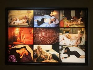
Figure 1. Goldin photographs from Sirens exhibition. Image author’s own.

Upon arrival, exhibition-goers were greeted by the hum of music from rooms in the distance; these had long red curtains drawn, blocking out the blaring sounds. Entering gave the air of walking into an underground party or club, which was highly fitting for the subject matter Goldin displays. Images of nightlife, as seen in Figure 1, dominated the walls. They were accompanied by images such as the ones in Figure 2, which focused more on the aftermath of a party.

Fig. 2. Photographs from Goldin’s Sirens exhibition. Image author’s own.

Goldin brings the viewer along in her journey of documentation. ‘The major motivation for my work’, she once explained, ‘is an obsession with memory. I became a serious photographer when I started drinking because [the morning after] I wanted to remember all the details of my experiences. I would go to the bars and shoot and have a record of my life.’ This made me, the viewer, feel less like an outside witness and more of an extra companion in her intimate moments.

As I followed the music and went behind the curtains, I was greeted by looped videos on screens arranged in triptych. In the centre was a clip from Metropolis, the 1927 film by Fritz Lang, which included a group of men leering, gurning and dropping their jaws. On the right side was a clip of a showgirl dancing sensually, and on the left a scene of disarray and mayhem as the inside of what seems to be a palace is torn to shreds. The installation appeared to represent the power of female sexuality and the chaos that can ensue as a result of its influence. Female sexual power is seen throughout the exhibition, as women are portrayed as strong social beings as well as admirably vulnerable when alone.

The structural aspects of the exhibition heightened its impact. The building was dark, with the only source of light from the street and the back lighting of the photographs. This brought a specific sense of focus to each frame and highlighted the saturated tones of the 35mm images. The photos had no labels, leaving interpretation completely up to the viewer, a choice that suits Goldin’s documentary style. A description of each photograph would have taken away that sense of personal belonging previously stated. It would have merely cemented the images as photographs by a particular person and of a particular place and time. Additionally, as Gillian Rose observes of labels in Visual Methodologies, these can make the artist the most important aspect of the work of art. The most important part of Goldin’s photography is not the artist. What will be of the greatest significance in each piece remains subjective to its viewer. This corresponds to what the art dealer Karsten Schubert described in his 2000 book, The Curator’s Egg, where, he argued, ‘the museum is now much more involved in a two-way dialogue with its audience. It relies more on interpretation and less on absolute truths.’

What Goldin produced in Sirens was honest and insightful. She captured with her camera the emotions of intimate moments, creating a sense of oneness between her, her photographs and their viewers. ‘For me’, she explained, ‘it is not a detachment to take a picture. It’s a way of touching somebody – it’s a caress’. Goldin’s caress puts her subjects at ease; it also created a powerful sense of belonging and comfort within me as I joined in their moments.

Life is… A Welsh museum worth visiting

Emma Bull, BA Fashion and Dress History, returns to her roots at the Welsh National Museum of History.

Deep in the heart of Cardiff, Wales, lies a museum seemingly frozen in time. St Fagan’s National Museum of History consists of original buildings ranging from the early 16th to the 20th century, excavated from around Wales and reconstructed at the site. St Fagan’s also contains separate galleries focusing on Welsh life, the stories of donated objects and their impact upon Welsh people and culture. Refurbished in a £30million redevelopment, these galleries reopened in late 2018. Being of Welsh origin and having visited the museum many times when growing up, I was intrigued to see how the main galleries had been revamped.

Now named Byw a bod… (Life is…), the main gallery space explores Welsh lives and memories. As the museum describes it, ‘We tell people’s stories through their own words – wherever possible – and through the objects they treasured […]. This gallery takes the ordinary stuff of all our lives and shows it to be extraordinary.’ The space is separated into three sections. The first  focuses on work and heritage, the middle on leisure and the last, rather controversially for a museum targeted at all ages, on death and remembering those lost.

Fig 1. A young boy interacting with the original tractor exhibit overlooking the exterior farm views. St Fagan’s website. Colour Photograph. 2018.

Starting with the exhibit on gweithio (work), it was interesting to see how the curators have decided to show objects from separate walks of life. Upon the first wall are hung agricultural objects such as rakes, hoes and domestic household objects. They are identifiable by numbers, which can then be found on a large sign, interactive screens or information booklets. Having three ways in which to access information allows the visitor to explore the exhibition in the way that best suits them; the speaking screens allow for those with hearing and sight disabilities to also interact with the gallery. There is an original tractor that children can climb on, overlooking the exterior farm. Also featured are Laura Ashley factory woollen threads (Canolbarth, 1960s) and an original fish fryer (Cardiff, 1915). The idea of memory persisting through objects is prominent and the eclectic formation of the gallery feels personal. Being able to read anecdotes from families who donated the items develops visitor appreciation and provides value; the sometimes mundane object is made significant by its story.

Fig 2. Fish Fryer from Cardiff, 1915. Author’s own image. 2 January 2020.

This curatorial method is outlined by Swiss art curator Hans Ulrich Obrist in his 2014 book, Ways of Curating. He writes that when he interviewed Eric Hobsbawm [1917-2012], the historian described curating via memory as a ‘protest against forgetting’. Through this, he argued that recollection is a contact zone between the past, present and future. I believe this kind of memory-based curating was the aim of St Fagan’s, who attempt to bridge the gap between generations.

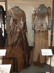
Fig 3/4. Examples of the Fashion displays with the Byw a bod… gallery. Author’s own images. 2 January 2020.

Continuing to the area about leisure in Wales, I was naturally drawn to the cabinet of clothing, dating from the 1870s to the 1950s. Although the garments on display were exceptionally beautiful, the cabinet itself was sadly lacking. The gallery was lit by strong LED lights that reflected on the cabinet making it difficult to see the true detail of the items. As the cabinet was not lit from the inside it was difficult to read the plastic labels unless at a certain angle. Although it is important to control lighting to not damage or discolour garments, being unable to view the pieces affects visitors’ enjoyment. As noted by conservator Garry Thompson in his 1978 book, The Museum Environment, works of artwill look better in some lighting situations […we should bend our efforts to finding the best possible’.

Fig 4. Examples of the Fashion displays with the Byw a bod… gallery. Author’s own images. 2 January 2020.

In addition to these shortcomings, garment labels were lacklustre. Although they provided some information about the origin of the items, they failed to describe the methods of construction, fabric or further context, making it difficult for somebody who did not know much about fashion history to gain deeper insight. Once again, this area provided a space in which children could interact, this time in the form of a dressing-up zone with recreation garments. There were some swimsuits displayed separately here that were easier to view.

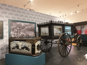
Fig 5. Cast iron and etched glass carriage and premature birth coffin, c. mid-1800s. Author’s own image. 2 January 2020.

The gallery concludes with the idea of marw (death). There is a beautifully displayed carriage from the late 1800s and a premature death coffin made from cast iron and etched glass. The gallery does well in presenting death in a less morbid way than expected; instead its focus is predominantly that of remembrance, which works well to conclude the gallery theme of memory and remembering history.

Overall, despite a few issues with lighting and labels, the gallery presents unique and interesting stories and objects from around Wales. It presents its artefacts in a way that is inclusive of all ages and physical abilities. The galleries are easily accessible, interactive and well worth the visit.