Criticism of the Bauhaus from Within: The Dornburg Workshop

MA History of Design and Material Culture student, Maria Paganopoulou, reflects on lesser-known aspects of the Bauhaus in its centenary year.

While writing my undergraduate thesis on the Arts and Crafts movement, one of the things I found most frustrating was encountering academic writing that condemned the whole of the movement, considering it a failure in its social purposes, design reform and even in its attempted improvement of women’s rights. Very often those academics regarded the Bauhaus as the successful offspring of Arts and Crafts’, as the place where its ideas fully developed, although these narratives were often coloured by nostalgia. Those academics tended to celebrate Bauhaus’ embrace of the machine and mass production and consider the rejection of them by the Arts and Crafts movement as the ultimate reason behind its failure. Arts and Crafts has tended to be characterized as merely a bourgeois endeavour for the middle and upper-classes.

As a result of these debates and my study of them, I have been  irresistibly drawn to alternative narratives that challenged the authoritative status of the Bauhaus and consider it historically rather than wishing nostalgically for its resurrection. Needless to say, when I discovered an opposition to the turn that Bauhaus had taken towards the machine and machine aesthetics, especially one coming from within the Bauhaus, I was utterly fascinated.

Fig 1. Marcks in the beginning of his position in Dornburg, circa 1920

I made this discovery during my three-month internship at Gerhard-Marcks-Haus in Bremen, Germany, a museum dedicated to Gerhard Marcks, sculptor and also a member of the Bauhaus teaching staff. Gerhard Marcks was in fact one of the first three artists that Walter Gropius invited to teach in his newly merged/ founded institution, along with the infamous Lyonel Feininger and Johannes Itten. Marcks and Gropius knew each other from 1907 through Marcks’ brother Dietrich who, like Gropius, was an architect. The two young artists shared a vision to align art and craft and, according to Marcks, this was why he accepted the position of Professor (Form-Meister) in Bauhaus.

Fig 2. Renate Riedel, Thoma Gräfin Grote, Max Krehan and Marguerite Friedlaender in front of the workshop.

After the news spread about the establishment of the Bauhaus in Weimar, Max Krehan, a local potter who owned a workshop in Thuringia, approached Gropius for a potential collaboration. Gropius and Marcks visited his workshop in Dornburg and came to the conclusion that this was where the ceramics workshop of the Bauhaus should be established. In 1920 the plan was realized and the Dornburg Workshop came to life, 20 miles away from the central Bauhaus premises in Weimar, with Gerhard Marcks as its Form-Meister and Max Krehan as its Werk-Meister (master of technical aspects).

Fig 3. Cup made of burnt clay with a portrait of Johannes Driesch (student), made by Marcks in 1922

The intertwined life and teaching in the workshop were not ideal; on the contrary they were deliberately challenging. In Marcks’ writings, he emphasised the traditional aspects of the work of the workshop, especially in relation to the absence of advanced machinery and the physically demanding nature of the job that its absence caused. The potters’ wheels were operated by foot power rather than electricity. The ovens were wood-fired. However, the use of traditional equipment was perceived in a positive light. As Marcks wrote: “This was the purest nature”.

The learning procedure was long and for the first two years apprentices were allowed to experiment only with their decoration before they were considered ready to experiment “plastically” with the forms. To compensate for the hard work and the restrictions imposed, there were leisure activities, such as swimming and the collective reading of seminal texts. We can see, then, that this autonomous community, developed in the framework of the Bauhaus, functioned a lot more like C. R. Ashbee’s Guild and School of Handicraft in Chipping Camden in Britain, rather than a school dedicated to industrial design. Nature, traditional equipment, common life and the concept of rural escape employed in the Dornburg workshop therefore reflect previous ways of thinking.

Fig 4. Postcard for an exhibition of the Bauhaus, designed by Marcks in 1922

As far as what was happening in the central Bauhaus, Marcks didn’t hesitate to voice his dissatisfaction. In letters to Gropius, Marcks made clear that Bauhaus should be a workshop not a school. He also stressed the need for contact with materials and the making of objects. This differentiated him from other Form-Meisters in the Bauhaus who were more interested in painting or in the intellectual aspects of creation, leaving the teaching of technical skills to the Werk-Meister. Finally, Marcks stood at a clear distance from the mass production shift advocated by Theo van Doesburg. In his words “I cannot identify anymore with Bauhaus. Sooner or later Formalism is taking place. If I was in Weimar I wouldn’t still be in Bauhaus”. The tale of the end of the Dornburg Workshop is a short one. Bauhaus moved to Dessau and Gerhard Marcks wasn’t invited to continue teaching. Max Krehan also died in 1925, around the time of this decision.

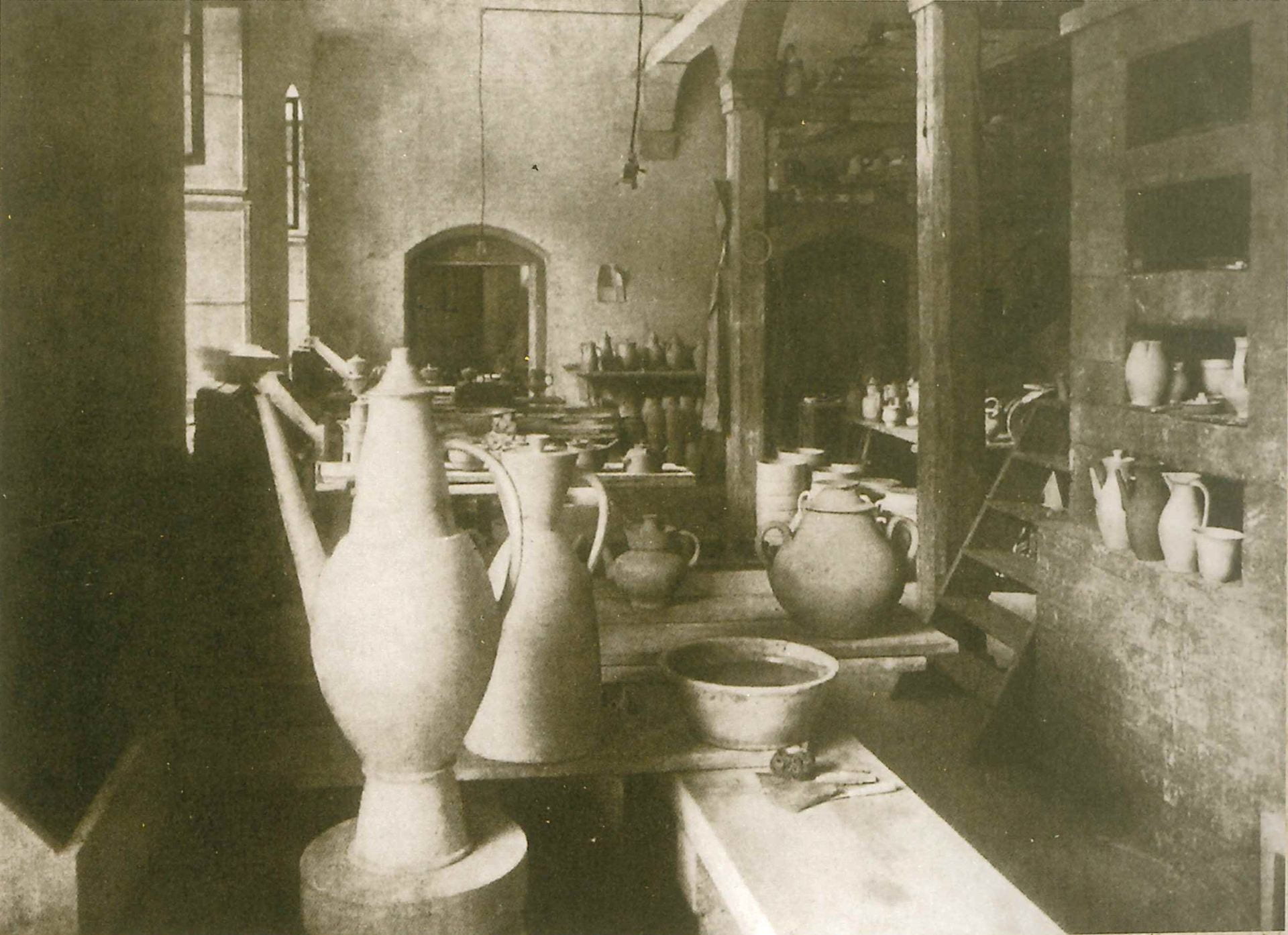
Fig. 5. The interior of the workshop

Last year, the Dornburg Workshop opened its gates as a museum as part of the Bauhaus centenary commemorations. Despite this, its story is relatively unknown, even in Germany. The history of the Bauhaus comprises many lesser-known stories that run in parallel with the evolutionary narrative of the heroic modernist school which, it is claimed, came to succeed where previous movements had miserably failed. The dominance of this modernist narrative, it seems to me, is partly informed by the stylistic preferences of those doing the telling. As the case of the Dornburg Workshop shows, however, Bauhaus shared common roots with some earlier Arts and Crafts endeavours instead of overthrowing them entirely.

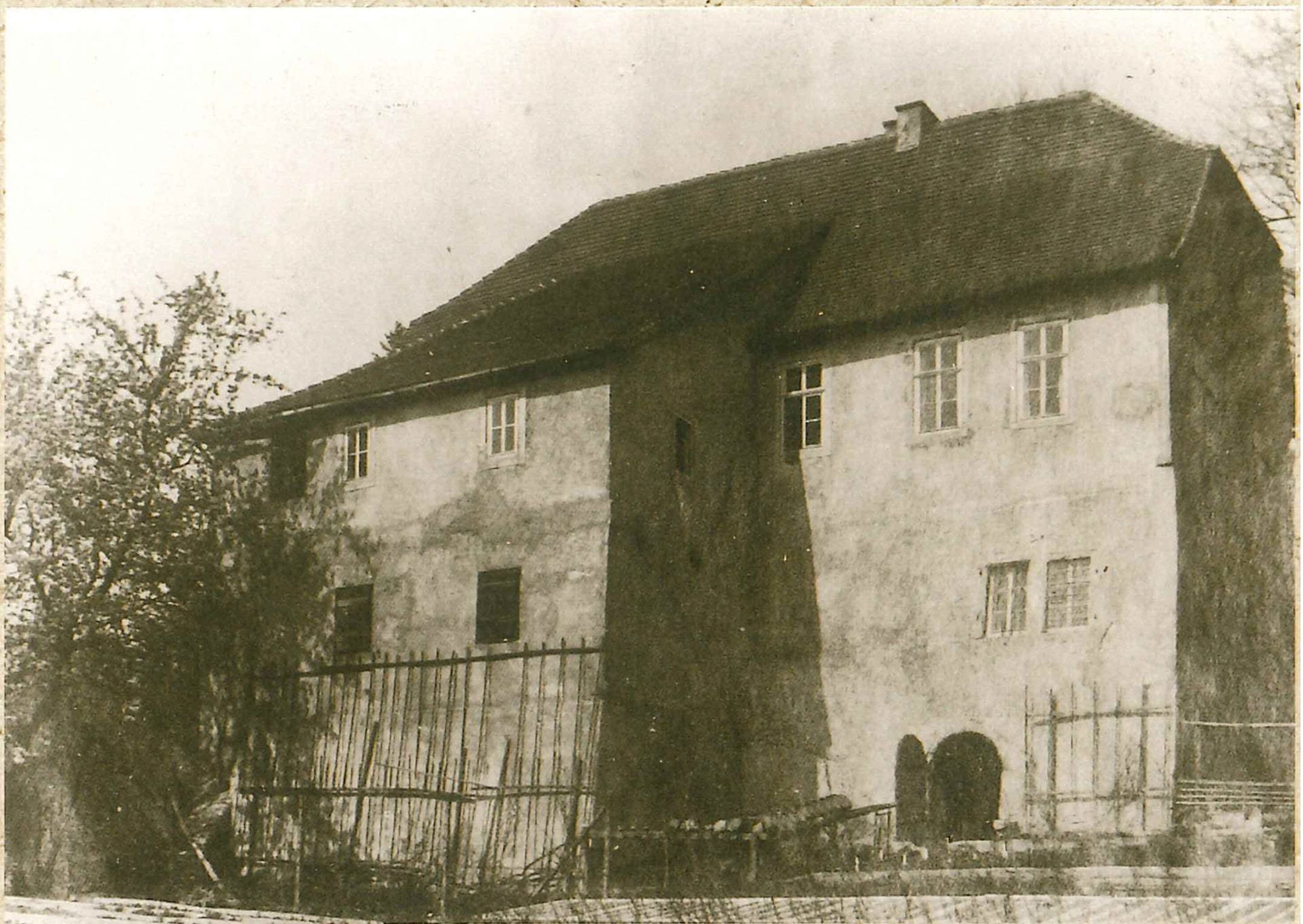
Fig 6. The interior of the workshop

Kind thanks to Gerhard-Marcks-Haus for providing me with access to their resources and archives.


Irving Penn at the Grand Palais, Paris


Second year Fashion and Dress History student Hon Yan Lau discusses visiting a retrospective of the work of photographer Irving Penn

Irving Penn

Irving Penn on a shoot

Nine covers

Nine of the covers Penn did for Vogue during his 66 years working with the magazine

Over the Christmas break, I visited the best exhibition I have ever seen. This was the touring work of famed American fashion photographer, Irving Penn (1917-2009). The exhibition, held at Paris’s Grand Palais, was organized by The Réunion des musées nationaux in France- Grand Palais with The Metropolitan Museum of Art in New York, in conjunction with the Irving Penn Foundation. It was the first major retrospective of Penn’s seventy year career since his death in 2009 and the 235 photographic prints provided insights into his vision, work and life.

picasso

Pablo Picasso, Cannes, 1957 by Irving Penn

In the exhibition, the curators focused on eleven aspects of his career: ‘still life and early street photography’, ‘existential portraits’ (1947-1948), ‘In Vogue’ (1947-1951), ‘Cuzco’ (1948), ‘Small Trades’ (1950-1951), ‘Classic Portraits’ (1948-1962), ‘Nudes’ (1949-1950), ‘Worlds in a Small Room’, ‘Cigarettes’, ‘Late Still Life’ and ‘Time Capsules’. Penn’s works left a significant impact both on the fashion world and on photography and the exhibition highlighted his methods of working. Before he shot his sitters, for example, he would have a long conversation with them in order to put them at ease and to get the best out of them. He said: “Sensitive people faced with the prospect of a camera portrait put on a face they think is one they would like to show the world […] Very often what lies behind the facade is rare and more wonderful than the subject knows or dares to believe”.

Yves Saint Laurent

Yves Saint Laurent, Paris, 1957

The existential portraits section – my favourite part of the exhibition – included many familiar faces such as boxing legend Joe Louis, Audrey Hepburn, Yves Saint Laurent, Pablo Picasso and Salvador Dali.  Penn converted colour photos to black and white in order to bring out the sitters’ emotion and expression, saying: “A good photograph is one that communicates a fact, touches the heart, and leaves the viewer a changed person for having seen it; it is, in one word, effective.”

Irving Penn was shown at the Grand Palais from 21 September 2017 to 29 January 2018

Visiting Berlin: art, politics and national identity

Second year BA (Hons) Visual Culture student Ella Winning on an eye-opening course trip to Germany

Figure 1: Interior of Hamburger Bahnhof

Figure 1: Interior of Hamburger Bahnhof

Back in November, twelve of my course mates and I spent five days in Berlin as part of the second-year Trip to Europe module. During this time, we visited many of the famous tourist sights such as the Reichstag, Berlin Wall and the Bauhaus Archive, as well as galleries and museums in the city.

One place that particularly caught my attention was the Hamburger Bahnhof; a contemporary art museum situated in the west of Berlin. Hosting a collection of modern art works by the likes of Andy Warhol, Roy Lichtenstein and Anselm Kiefer, the exhibition I was most drawn to was the Preis der Nationalgalerie (29 September 2017 – 14 January 2018). This is a biennial opportunity for four artists under the age of 30 who live and work in Berlin to exhibit their work in a group exhibition at the Museum. Additionally, one of them is chosen to be the focus of a solo show and publication. The most recent shortlisters were Sol Calero, Iman Issa, Jumana Manna, and Angieska Polska.

Figure 2: Entrance to Amazonas Shopping Centre

Figure 2: Entrance to Amazonas Shopping Centre

As part of the show, Venezuelan-born multidisciplinary artist Sol Calero exhibited her interactive installation, Amazonas Shopping Center; a brightly coloured amalgamation of a selection of her works from the past five years. Throughout her work, the artist explores themes of national identity and ethnicity, especially in terms of her own, Latino background. Calero does this through her incorporation of various features of Latin culture; her installation includes a hairdressing salon (background of figure 2), travel bureau, consisting of a currency exchange kiosk and travel agency desk (mid and foreground of figure 2), cybercafé, school, and a salsa dance studio and cinema where her telenovela, Desde el Jardin, plays (figure 3).

While Calero is frequently labelled as a ‘Latin’ artist, the artist and her fellow prize entrants reject the practice of describing of them and their work in terms of their ethnicity. In a statement released to Artnet News, the artists

Figure 3: Amazonas Shopping Center Installation views

Figure 3: Amazonas Shopping Center Installation views

explained that they felt their minority backgrounds as immigrants and as women were ‘emphasized much more heavily than the content of their work’ during promotions and advertising for the exhibition.[1] I found this particularly interesting; at a time of changing attitudes towards race in terms of politics (and therefore society), is it even relevant for the nationalities of the artists to be highlighted? Is exercising of nationality allowing pride in ‘otherness’, or is it a tool of isolation which discourages inclusion?

Some might argue that the Museum was simply highlighting diversity in the selection of artists, showing the all-encompassing attitudes towards art, while others (agreeing with the artists themselves) may perhaps argue that the Museum’s focus on the ‘otherness’ of the four women was perhaps a ‘self-congratulatory use of diversity as a public relations tool’[2] for the Hamburger Bahnhof, prohibiting the artists from fully integrating into the German art world.

It can be assumed that the Museum, along with many other organisations across Germany, wish to reject the racist politics that made a resurgence at the start of the twenty-first century, along with far-right intolerance emerging around the globe in the modern day. The renunciation of these politics can clearly be seen in modern German culture; one example being Angela Merkel’s pioneering and controversial open border policy introduced in 2015. [3] It could be argued that, with similar intentions to Merkel, the Museum has consciously tried to denounce intolerance by highlighting or celebrating the differences of the entrants to those of the past. Others might find it patronising and a form of discouraging inclusion to the ‘German’ art world.

Figure 4: Amazonas Shopping Center Installation views

Figure 4: Amazonas Shopping Center Installation views

I found this trip interesting because it opened my eyes to this issue of nationality and its relevance in the culture not only of Berlin, but of the contemporary world; a topic which will continue to be particularly important in the years to come.

[1] Kate Brown, “These Four Artists Were Nominated for Germany’s Foremost Art Prize—and Now They’re Denouncing It” ArtNet News.

[2] Brown, “These Four Artists Were Nominated for Germany’s Foremost Art Prize—and Now They’re Denouncing It”

[3] Reuters in Berlin “Merkel: no regrets over refugee policy despite political cost” Guardian. Web. 27 Aug, 2017.

Gluck: Art and Identity


Final year BA (Hons) History of Art and Design student An Nguyen Ngoc reviews a current exhibition at Brighton Museum

Image 1: Daily Sketch, You Wouldn't Guess, 1926

Image 1: Daily Sketch, You Wouldn’t Guess, 1926

In November, Brighton Museum opened a new exhibition exploring the life and work of twentieth century artist Gluck (1895-1978), who is now recognised as a trailblazer of gender fluidity. I first learned about the exhibition soon before its opening, when I was taken on a volunteers’ tour of the Museum store and shown a photograph of Gluck in a tailored suit (Image 1), a copy of Radclyffe Hall’s The Well of Loneliness from Virago Classics, and clothing belonging to Gluck and lovers. The objects were sufficient to demonstrate that the curator – Martin Pel – would not simply be creating a narrative of Gluck’s life. Instead, that the exhibition would encompass the complexities and diversity of the artist’s life and works, presenting not only artworks but also personal artefacts, press materials and an impressive display of Gluck’s clothing.

Gluck, born Hannah Gluckstein, was a member of a wealthy Jewish family in London, where the artist had attended art school to train as a painter. The identity, established with ‘no prefix, suffix or quotes’ was accompanied by Gluck’s appearance, often sporting tailored menswear, masculine barber-cut short hair and mannish demeanour. Much like their unwillingness to adopt a gendered title, the artist displayed no association with any group or movements, despite mixing with circles of artists and having run away to Cornwall with fellow art students during World War I. Displayed only in solo shows and seldom exhibited, Gluck’s artworks have gained cult status among collectors for their technical mastery and the extent to which biographical elements permeate through the canvas’s surface. A pioneering creative in queer history, it is not surprising that Gluck’s personal history has become relevant in contemporary investigation of attitudes towards queer expression of gender, as well as the social forces which cultivated the presentation of the artist’s identity. Hence the diversity of artefacts on display in ‘Gluck: Art and Identity’.

Image 2: Gluck, Lords and Ladies, detail, 1936 (private collection).

Image 2: Gluck, Lords and Ladies, detail, 1936, oil on canvas (private collection).

In the exhibition the first of two galleries displays earlier paintings (Image 2), mostly dating from before the artist’s first solo show, and some personal artefacts. These include meticulous documentation of the artist’s lovers, accompanied by notes and letters from the artist. It is also through this display that viewers are introduced to the forensic nature of ‘Art and Identity’. The curators do not hesitate to portray Gluck’s love life, albeit passionate, as turbulent too. Yet the artist’s queer expression – and the fact that Gluck’s homosexual affairs may not have been the happiest – can be assessed by viewers against contemporary attitudes, such as those expressed in articles which question the artist’s gender expression and sexuality, displayed nearby. In none of these instances, however, is Gluck’s contribution to twentieth century British painting diminished: portraits and landscapes from the interwar period are displayed with paintings of Constance Spry’s floral arrangements, reminding viewers of Gluck’s accomplishment as a painter.

Image 3: smock from Gluck's collection (Royal Pavilion & Museums, Brighton & Hove)

Image 3: smock from Gluck’s collection (Royal Pavilion & Museums, Brighton & Hove)

An even more rewarding display is that of Gluck’s clothing in the second room. Here, material constituents of gender and Gluck’s ‘queer’ aesthetics become even more prominent. Two painter’s smocks (Image 3), constructed to be utilitarian – or seemingly so – stimulate speculations about Gluck’s public and private personas: one is of an iridescent, silken material, while the other is made of linen or toile. Also displayed is a group of black evening gowns (Image 4), one which seems to have a pleated skirt but, upon further inspection, turns out to be a jumpsuit. Others display a variety of silhouettes with intricate laces, embroideries and embellishments. The display of these unattributed items appears, at first, to mystify the character of Gluck. But they turn out to embody the artist’s lived experience, encapsulating the diversity and richness of the queer experience in the mid-twentieth century.

Image 4: Dress from Gluck's collection (Royal Pavilion & Museums, Brighton & Hove)

Image 4: Dress from Gluck’s collection (Royal Pavilion & Museums, Brighton & Hove)

Gluck: Art and Identity – curated by Martin Pel and Amy de la Haye – is on at Brighton Museum until 11 March 2018.

Gluck: Art and Identity Symposium will be held on 7 February 2018 at London College of Fashion.

Living with art and design: a trip to Charleston


Wendy Fraser, a second year studying BA (hons) History of Art and Design  at the University of Brighton, delves into the lives of the Bloomsbury Group on a visit to their idiosyncratic and highly decorated home, Charleston.

On Thursday the 29th of September a group of second year students enjoyed a trip to Charleston, a 17th century farmhouse set on the Firle Estate deep in the Sussex countryside. The artist Vanessa Bell (1879-1961) moved into Charleston in 1916 with her two sons, her lover the painter and designer Duncan Grant (1885-1978) and his lover, the writer Bunny Garnett. The house was perfectly located nearby to Vanessa Bell’s novelist sister Virginia Woolf’s Sussex home and the neighbouring farm provided Grant and Garnett with essential war work thus releasing them from conscription during WWI.

Bell and Woolf were original members of ‘The Friday Club’, a group of writers, thinkers and artists who met weekly from 1905 onwards to discuss ideas in their home at 46 Gordon Square, London. After the artists exhibited at the ‘Post-Impressionism Exhibition’ in 1912 they became known as ‘The Bloomsbury Group‘. Charleston was to remain their home, studio, and hub of Bloomsbury activity for over 60 years until Duncan Grant’s death. Many key figures from the period’s literary and artistic worlds visited the house including Lytton Strachey, Dora Carrington, E.M. Forster and Roger Fry (who had established the Omega Workshops for which both Bell and Grant designed textiles and ceramics). The stories and interpersonal relationships behind the inhabitants of Charleston are almost as interesting as their artistic endeavours. There are eyebrow-raising tales of the sexual shenanigans within the group, unrequited love and personal tragedy.

On our guided tour we viewed 10 rooms: Clive Bell’s study (Clive Bell was an art critic, Vanessa Bell’s husband and father to her sons), the Dining Room, Library, Garden room, the bedrooms of Clive Bell, Vanessa Bell, Duncan Grant and their friend, the economist Maynard Keynes, the spare room and the pièce de résistance – the studio shared by Grant and Bell. Charleston was always rented from the so the interior decoration of the house was always an organic process with nothing intended to be particularly permanent or durable. The dining room walls were stencilled by Duncan Grant in a geometric design with the paint drips clearly visible, there are numerous examples of hand-painted furniture with headboards, chimney boards, wardrobes and tables decorated with either artist’s work and a peak behind the doors reveals some beautiful paintings. A number of the window embrasures have been painted and touchingly around Vanessa Bell’s bedroom window Grant painted Henry, their pet lurcher to watch over her while she slept and a cockerel above the window to wake her up in the morning.

Photo of students and staff in the garden at Charleston

History of Art and Design Year 2 Welcome Week study visit to Charleston Farm House. From the left, Wendy Fraser, Harriet Dakin, Dr. Anna Vaughan Kett, and Lisa Hinkins in the garden of Charleston. Photo by Dr. Yunah Lee.

Charleston’s furniture and decorative items are an eclectic mix of heirlooms and contemporary pieces – a 1960’s chintz bed throw from Habitat, beds from Heals, psychedelic fabric Grant brought back from Morocco displayed with 17th century carved and painted Venetian chairs, Julia Stephen’s dressing table (Vanessa Bell and Virginia Woolf’s mother), an 18th century square piano, an ornate north Italian console table, kitsch Staffordshire pottery figures and a rush-seated Sussex settle. The paintings on display are a combination of Vanessa Bell and Duncan Grant’s works augmented with paintings, etchings and prints of artists whose work they admired- Delacroix, Sickert, Toulouse Lautrec, Picasso, George Bergen, Segonzac and Pierre Roy. Some of the paintings Grant swapped his pieces with fellow artists for and there are a few works inscribed to Clive Bell from French artists of his acquaintance through his role as an art critic.

Charleston does still feel very much like a family home where it is easy to imagine the daily life of both domesticity – meals be cooked and eaten, children being educated and weekend visitors being entertained in the beautiful gardens coupled with a prodigious amount of creativity – sketching, painting canvases and furniture, writing, sewing and knitting in a harmonious and productive artistic life. It is a truly fascinating place to visit.

Learning from Volunteering: making it happen at Brighton Museum


University life opens up opportunities to make a difference in the community and learn new skills in the process. Lisa Hinkins, a first year BA (hons) History of Art & Design student, describes the enriching experience of volunteering for the Photoworks ‘Making it Happen’ project.

I knew I had made the right decision to study at the University of Brighton after we had a few lectures regarding managing wellbeing and employability. Having left the world of work at the end of September, after twenty-three years of 9 to 5, some reassuring words that the university took student wellbeing and life during and after studying seriously were important to me, especially as I was taking tentative steps towards a new career in an area I have always been passionate about.

In my former employment, the Waste & Recycling section of a local authority, the emphasis on volunteering was important for conveying the message of sustainability and recycling. My manager enjoyed bring university students into our hub, teaching and directing them, while also learning from them too. I picked up on this ‘positive feedback loop’ with how I managed and taught my volunteers for the scrap store I ran from our building. The volunteers not only gave valuable time to the store, but I was greatly enriched learning new art and craft ideas from them, while also discovering how interesting these people were.

So, as a new student I embarked upon seeking out volunteering opportunities. My first step was meeting with Kat Tucker, Volunteering Project Officer for Active Student Volunteering Services. Kat has given me excellent support over the past 5 months, providing help and advice with applications for volunteering opportunities. My first placement was with Photoworks and was a month-long position in January under the banner ‘Making it Happen 2016’. This was an open day to the University of Brighton’s Photography department for 16-18 year olds who may have not considered the possibility of university study before.

With five other students, we learned from photographer/artist Annis Joslin, how to plan and deliver photography based workshops with school students aged 16-18. I participated in a series of three hour training sessions led by Annis, which allowed me to learn skills needed to lead workshops. The requirements of the role were to have an open-mind and hands on approach to art and design and wanting to gain practical work experience in arts education.

Photoworks Making it Happen workshop, February 2016 Photo © Giovanni Estrella

Photoworks Making it Happen workshop, February 2016
Photo © Giovanni Estrella

The group divided into pairs. Myself and a fellow volunteer researched, planned and prepared workshops based at the Brighton Museum, around the photography exhibition ‘Pierdom’ by Simon Roberts. I learnt to work ideas up very quickly, get to understand new ways of working for community arts education and develop trust with other volunteers that I had only just met. We all had to lead one workshop three times during the day, with up to fifteen school students in each session.

Photoworks Making it Happen workshop, February 2016 Photo © Giovanni Estrella

Photoworks Making it Happen workshop, February 2016
Photo © Giovanni Estrella

My workshop was titled ‘The Art of Looking’. I wanted the school students to spend time looking at the exhibition images and form individual ideas about them, working in teams discussing ideas together. This helped them to become confident in expressing thoughts from looking and reacting to the images and be able to articulate those thoughts by talking in front of other people. I used techniques such as word cards they had to blindly select from to stimulate ideas.

Photoworks Making it Happen workshop, February 2016 Photo © Giovanni Estrella

Photoworks Making it Happen workshop, February 2016
Photo © Giovanni Estrella

Being able to deliver ideas and education to younger people was exhilarating, extremely satisfying and I enjoyed listening to them react to the exhibition, with their own ideas and thoughts. The students enjoyed it, too: positive feedback included, ‘Enjoyed looking closer at the images and relating them to words. Made me look at them more and appreciate the detail in them.’

I am now looking forward to receiving an interview date for my next volunteering opportunity. It isn’t just about what looks good on your CV, but how these experience can nurture your own thirst for learning, being creative and boosting your confidence.


Volunteering at Fabrica: contemporary visual arts in Brighton


Fancy volunteering in the visual arts? Student Rosie Clarke (BA (hons) History of Design, Culture and Society) gives a taste of her experiences a
t Brighton’s Fabrica.

Over the last year or so I’ve been involved with some of the events and exhibitions which happen behind closed doors in the cool, quiet atmosphere of an old church on Duke Street. You may have been inside Fabrica, or you may have walked straight past like I had countless times before, but now I urge you to stop and have a look.

It’s a wonderful building, with walls so thick that even the busiest Saturday Brighton tourists are muffled, and a roof that vaults high into shafts of sunlight. Fabrica hosts contemporary visual art exhibitions and holds all manner of events, from films to workshops to talks. It’s an organisation which commissions art works in relation to the building itself, creating a feeling that is unique to Fabrica.

My role as a volunteer means helping out during exhibitions: I talk to the public about the current artists on display and the work that Fabrica does elsewhere. So far I’ve been involved with The Blue Route (by Kaarina Kaikkonen), Resonance (Susie Macmurray), and A Cold Hand on a Cold Day (Jordan Baseman). When I applied to become a volunteer at Fabrica I wanted to learn how a gallery functions, meet some new people, and perhaps be inspired in my own creativity. However there is so much more to being a Fabrica volunteer than just standing in a gallery.

One great opportunity was being able to contribute to The Response, a magazine put together by Fabrica volunteers alongside each exhibition, featuring our own artwork or writing. It was great to be a part of the editing team and have the chance to get my work read by hundreds of visitors. We responded to Kaarina Kaikkonen’s The Blue Route, which used reclaimed shirts to project ideas about loss and longing. You may have seen some of Kaarina’s work wrapped around the clock tower in Churchill Square. We used the shirt as a starting point, and the magazine content grew from there.

During the set-up of Resonance I found out how to put together an installation, by spending a few days stitching reams of sheet-music into cones for the final piece – getting to know many interesting people along the way. It felt like time had stopped, if not for the fact that every time I glanced up there would be another huge new limb of the paper sculpture suspended above, the product of our labour. This photo was taken halfway through…

Installation of Resonance by Susie Macmurray. Fabrica, 2013. Photograph by Rosie Clarke.

There are also plenty of evening events that are held in conjunction with the current exhibitions, such as panel discussions and film screenings. In October I invigilated for “Nothing Lasts Forever (Nor Should It)”, a frank and heartening discussion about death and dying to compliment A Cold Hand on a Cold Day. The series looked at ways of dying (inevitable as it is) and raised the question, why are we so averse to talking about death? I remember one of the speakers describing pain, as “a vessel of grief.” Its moments such as this that I appreciate the depth and essence of Fabrica’s work, which goes so much further than the visual arts.

So within all these experiences, I’ve learnt that by engaging with unfamiliar things there’s a lot to be discovered. The best aspect of Fabrica is their willingness to encourage new ideas, and allow volunteers such as myself to take on more responsibility. If you’d like to get involved too, you can download an application form from Fabrica’s website, or come along to one of their events to find out more. Fabrica’s next exhibition features Jacob Dahlgren’s On Balance and it runs from 5 April to 26 May 2014.

Mirrors and rainbows: Andrew Logan’s Glasshouse Studio


MA History of Design and Material Culture
student E-J Scott was spellbound on a field trip to Andrew Logan’s Glasshouse Studio in London.

“The idea was to have a window on the world.” Andrew Logan.

Entering Andrew Logan’s Glasshouse Studio, one is literally tripping the light fantastic.  As our MA group climbed the stairs to his crystal palace of creativity, we were visually bombarded by a menagerie of flying horses, queer medusa statues and warped, plastic toy landscapes.  We had stepped inside a diorama of his imagination, where the kaleidoscopic colours crashed and banged loudly enough to make audible our group’s shared delight.

Sally Reynolds smiles in Logan’s sunlit studio. Photograph by E-J Scott.

Out trip to Logan’s studio followed our morning at Zhandra Rhodes’ Fashion and Textile Museum.  A six foot high photograph of him in a dress designed by Rhodes depicted the friendship they have shared since the early seventies. Rhodes still designs half his frocks (the dresses are split down the middle, representing transformation) for his Alternative Miss World appearances, the outrageous drag pageant he launched in all its fabulousness in 1972.  The sculpture he made of her is housed in the National Portrait Gallery.  Zandra describes herself and Logan as “blood brothers”.

Logan (pink t-shirt) explains his curiosities to the curious! Photograph by Professor Lou Taylor.

A sculptor, painter, performance artist, jeweller, qualified architect and flamboyant London queen, Logan is the only living artist in Europe to have a museum dedicated to his work (The Andrew Logan Museum of Sculpture, Berriew, Mid Wales, est. 1991).  His work has been shown everywhere from the Hayward Gallery and the Victoria and Albert Museum, to Somerset House and the Royal Academy of Arts.

Louisa Carpenter next to a mannequin dressed in Logan accessories. Logan’s jewellery has been used for catwalk shows by designers ranging from Zhandra Rhodes to Ungaro to Comme des Garcons. Photograph by E-J Scott.

Logan’s studio was cluttered with portraits of Britain’s most eccentric queer characters. They are devotedly pieced together from smashed up mirrors, plastic toys, beads and the odd Swarovski crystal.  Derek Jarman is there, and as Logan ran through the artistic career he formed in London’s underground scene, he nonchalantly contextualised the portrait, divulging that he introduced Jarman to Super8 film-making at his Butler’s Wharf studios in the ‘70’s.   His sprightly, sexy and curious creations are steeped in personal history.  The noticeably rough finish on many works- splotches of glue here, drips of colour there- are left over touches indicative of an artist having fun at play.

Surreal sculpture by Andrew Logan. Photograph by E-J Scott.

Logan’s public art projects litter the UK landscape, reflecting his belief that art can be found everywhere and in everything. His Millennium Pegasus on Scots Green Island – a larger-than-life bronze horse with gold and silver glass inlaid wings and a bejewelled mane – depicts hope for a new era.  Logan says, ‘It is about where we come from, and where we are going to’.  Legend has it that wherever the hoof of Pegasus struck the ground, an eternal spring appeared.  Like Pegasus, when describing his artistic vision, Logan himself can appear to be bred from the love of Poseidon, and the carrier of Zeus’ thunderbolts.

E-J Scott in front of a winged Pegasus (a signature piece of Logan’s). Photograph by Professor Lou Taylor.

Little rainbows refract throughout the studio, as if they somehow shone straight from the glimmer in the craftsman’s eye.  As energetic as it is inventive, Logan’s works reflect his dreamy optimism, his colourful nature and his extraordinary warmth.  He not only welcomed our MA History of Design and Material Culture group into his creative space, he welcomed us into his world. My guess is Dr Annebella Pollen did not want to leave… at least, not without the  frog brooch in his Emporium gripped tightly in her clutches.  Speaking for myself, the visit to Logan’s studio – a self-created space, funded by the success of his lifelong dedication to his artistic pursuits – was a source of unequivocal inspiration.  Believing it is possible to live another kind of life – an enchanted life of art, whimsy and make-believe – is one thing; being brave and clever enough to make it happen is altogether another.   Just as Logan’s work resides in a boisterous space somewhere between fine art on the one side, and craft on the other, so too, Logan’s faery-like attitude toward the art of living is protected and crystallized in his castle: a chrysalis that dangles on the increasingly dirty, corporate, capitalist London skyline, home to a rare butterfly of a man.  This visit made the value of my study ring true, and I caught the train back to Brighton full of shiny ambition.

The Universal Addressability of Dumb Things: Writing the gallery guide


Second year BA (hons) Museum and Heritage Studies student, Sandy Jones, explains the process by which she came to assist on a show described as a ‘mash-up menagerie’.

Installation view of the Universal Addressability of Dumb Things. 2013. Photography courtesy of the De la Warr Pavilion.

What do a ten metre high inflatable Felix the cat, William Blake’s Ghost of a Flea, a replica Sputnik satellite and a singing gargoyle have in common? They are all part of The Universal Addressability of Dumb Things, an exhibition at Bexhill’s De la Warr Pavilion curated by Turner Prize-winning artist Mark Leckey. The exhibition is part of the Hayward Touring programme that brings exhibitions to over 100 museums and publicly funded venues in Britain every year. This summer, I was fortunate to work with the DLWP on the gallery guide for this thought provoking exhibition.

The De la Warr Pavilion is a contemporary art gallery and live performance venue situated on the seafront at Bexhill. Designed in 1935 by architects Erich Mendelsohn and Serge Chermayeff, the Grade One listed historical building remains an icon of Modernist architecture and a celebration of the International Style. Described by Mendelsohn as a ‘horizontal skyscraper’, the building was restored and redeveloped between 2003-2005 with funding from the Arts Council Lottery Fund. Rather than house a permanent collection, the DLWP flexes its spaces to support a dynamic programme of art and performance, showcasing experimental and inter-disciplinary works from emerging artists and big names like Andy Warhol and Antony Gormley.

The gallery guide project came about after I wrote to the DLWP to ask whether they had any volunteering opportunities over the summer. They wrote back saying they needed some support with the guide and as I’d worked in design before, they thought my experience would be helpful. Before I met their curator, David Rhodes, I carried out some research and discovered that the exhibition was inspired by the concept of techno-animism, the idea that everything that is in (and of) this earth is being animated from within. The show is an exploration of how technology is changing our relationship with everyday objects and is creating an ambient environment around us where non-living things are brought to life. Paradoxically, these advances in technology reconnect us with our ancient past where objects and environments were thought to possess magical and divine powers. This was quite a concept to get my head around and it took a fair bit of reading to understand it. The method of curation was also alternative, approached by Leckey as ‘an aggregation of things’ and ‘a network of objects’, rather than a display of personal taste. Using the internet as a digital archive to research and select works over a period of two years, Leckey meticulously sourced and filed words, images, sounds and video into a conceptual matrix of humans, animals and machines to create a hybrid; an exhibition where the objects are – as he describes it – ‘in the physical realm but come from the digital realm’. His concept for the show can be seen on You Tube, in his trailer-like film, Proposal for a Show. Watch it and think about the challenge that faced the curator, finding all those things for what critic Erik Davies has described as ‘a post modern cabinet of curiosities’.

Leckey is often described as a pop cultural anthropologist, and I can see why; he samples across cultures, eras and media. Fortunately, David (the DLWP curator) and Chelsea Pettit (the curator from the South Bank) brought clarity to my task by advising on the most important themes. We agreed that I would research and write about 12 selected works and that the design would be simple because the subject matter was so complex. David also suggested that I join the team on a visit to the Nottingham Contemporary (another great gallery, by the way) to see the exhibition before it arrived at Bexhill. This helped enormously although when it came to writing the copy it was challenging because there was so much I wanted to say, but no space for it.

I visited the DLWP during the installation process and observed the curators as they worked with the artist to agree where and how the works would be displayed. One highlight was watching the courier, responsible for transporting an ancient Egyptian canopic jar and mummified cat, unpack and examine each one closely with a torch, checking that they conformed to their condition report and testing the environmental conditions. Another highlight was watching the team inflate Felix’s giant head and position it within the stairwell at the front of the building. For a gallery that last summer had rigged a bus to be half on and half off the roof, in homage to the closing scene in cult film, The Italian Job, this was a breeze.

The team at DLWP were extremely generous with their time and were great to work with; I enjoyed every minute. Catch the exhibition if you can: it’s on until 20 October 2013. www.dlwp.com

Felix the Cat at the De la Warr Pavilion, Bexhill. Personal photograph by Sandy Jones. 13 July 2013.