Kay Lawrance, Third Year BA Fashion and Dress History student, shares her research into a charity shop find.

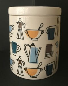
Marks and Spencer Biscuit Barrel. c2004-2014. Stoneware. 18cms x 15cms diameter. Personal photograph.
As part of our Third Year module The Past in the Present: Retro, Vintage and Revival, we were asked to choose and research an item directly related to the themes of the module. I chose this stoneware biscuit barrel produced for Marks and Spencer. The exact date of production is unclear, but from the style of the backstamp, it was produced sometime between 2004 and 2014. I bought it from a charity shop a few years ago so I am unable to date it any more precisely than that.
At the time this was produced there was a trend in homeware and home furnishings which is commonly called Mid-century Modern. Interiors were heavily influenced by the 1950s, with Ercol furniture becoming desirable, and the sludgy browns, dark teals and mustards of this biscuit barrel reflect that. The Pantone colour of the year 2009 was Mimosa, a sludgy yellow, and 2010s was Turquoise – slightly lighter than the mugs on the biscuit barrel but a similar shade. In 2009, Sanderson, manufacturers of furnishing fabrics and wallpapers, released a design by Fiona Howard called Dandelion Clocks which they describe as ‘a fun and funky 50s retro design‘, available in similar colours.
The underglaze design on the biscuit barrel is printed with a black outline and colour infills that are deliberately mis-aligned. This captures the style of the scourer pot in the image below, which, coincidentally, I also bought in the same charity shop as the biscuit barrel, but at a different time. This small scourer pot by the Toni Raymond Pottery in Devon was produced somewhere between 1956 and the mid-seventies. However, unlike the M&S biscuit barrel, the designs were all hand painted and the “approximate” painted infills were part of the style.

Toni Raymond Pottery Pot Scourer Holder. c1956-1976. Ceramic. 7cms x 9cms diameter. Personal photograph.
In Retro: The Culture of Revival Elizabeth E. Guffey suggests that the term retro ‘serves as shorthand for a period style situated in the immediate post-war years’ or ‘material culture at mid-century’ and that is exactly the feel of this design (2006: 9-10). She describes how ‘retro does not seek out proud examples of the past; it shuffles instead through history’s unopened closets and unlit corners.’ (2006: 14) Although the pottery produced by studios such as Toni Raymond was hugely popular, it was domestic and reasonably cheap and not what I would describe as a “proud example of the past”. Many homes had a piece, or something similar, but it was usually something as useful and at the same time as unconsidered as this scourer pot. Items that were used and seen have become an almost half-forgotten memory. I was struck by what Guffey wrote about the word nostalgia originally being used to describe a kind of homesickness, but that it has now come to mean a ‘bittersweet yearning for things […] of the past’ (2006: 19), a kind of time sickness, and it seems to me that this is captured in the feeling of this design. And yet, the retro design is just slightly too good. The misaligned print is too precisely done. The edges of the infill are too sharp to be hand painted. It is a knowing copy designed to be read by knowing consumers.