Multi-sensory display and inclusive practice at the Horniman Museum

Shannon Wilson, MA Curating Cultures and Heritage, reflects on good practice in the museums sector. 

A group of MA Curating Collections and Heritage students was recently given the opportunity to visit the Horniman Museum and Gardens in Forest Hill. This trip allowed us to consider how issues relating to access and learning in museums might be addressed in practice. While the wet weather prevented us from enjoying the gardens, we were able to explore many other areas inside the museum. Below, I discuss my impressions of the Natural History Gallery, the World Gallery and the Hands on Base Gallery.

The Horniman Museum attracts a large number of both new and returning visitors, with many families who enjoyed visiting the museum when they were younger coming back with their own children. Upon entering the bright, airy entrance to the Horniman, you are immediately hit by the noise from the World Gallery, which seems to rise up and spill over onto the mezzanine level above it. The gallery that houses the museum’s natural history collection can be found here, although once inside, the atmosphere changes completely as you are met with quiet tranquility and a soothing pastel colour scheme (not to mention the famous Horniman walrus). The pared-down, traditional displays contain many of the founding objects in the museum’s collection and seem to have been virtually unchanged in the past 100 years. The familiarity of these displays and the peaceful environment in which they are situated may be one reasons why so many visitors are drawn back to the museum.

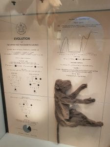
Figure 1: The Crochetdermy® display. Photograph by author.

Alongside these well-worn, well-loved exhibits, there is also a relatively new display at the entrance of the gallery about a form of art called Crochetdermy® by the artist Shauna Richardson [Fig. 1]. The small installation includes examples of the artist’s work alongside a collection of graphs and diagrams illustrating the ‘Evolution of the Artist and the Exhibited Works’. While the influence of the museum’s taxidermy displays on the artist’s work is clear, this section’s modern aesthetic stands in stark contrast to the rest of the gallery. This may have been an intentional decision on the part of the curator, perhaps representing the ‘evolution’ of the museum’s display practices as a whole, especially when compared to the contemporary styling of the World Gallery below [Fig. 2].

Figure 2: An interactive activity in the World Gallery. Photograph by author.

Containing a dizzying 3,000+ objects, as well as a range of video clips and interactive features, the World Gallery is loosely divided into four spaces: an Introductory area, Encounters, Perspectives and Horniman’s Vision. The Encounters section houses collections which represent different ways of living and are further divided by continent: Africa, the Americas, Asia, Oceania and Europe. Although the noise in the World Gallery as a whole can make it quite difficult to concentrate on the displays, this part of the gallery is without a doubt the strongest, most thoughtfully curated and well presented (if a little visually busy).

Conversations with museum staff revealed that many of the display cabinets have underlying themes running through them that determined how each object has been selected and arranged. The Perspectives area is tucked into the very back of the gallery and is designed to encourage visitors to reflect on how and why objects are categorised, and how this contributes to our understanding of the world. This section of the gallery also contains a display about disability and mental illness that was co-curated by the museum’s Access Advisory Group (AAG). It is clear after speaking to members of staff that this display was the product of much hard work and collaboration. The museum adapted certain aspects of its practice to better accommodate the needs of the AAG, such as allowing one member of the group to draw objects using their preferred medium of felt tip pens (which would usually not be possible). However, in practice this display feels almost lost amongst the vast assortment of objects around it, demonstrating some of the difficulties that can arise when translating collaborative community engagement into gallery-based exhibitions.

Figure 3: The cloutie tree in the World Gallery. Photograph by author.

On our MA, Curating Collections and Heritage, we have considered the benefits of multi-sensory display to inclusive learning practice, and the World Gallery at the Horniman makes great use of multi-sensory display techniques. There are things to see, hear, touch and smell, as well as many activities that encourage audience participation, such as the cloutie tree, which is covered in brightly coloured tags bearing messages of well-being and thanks written by visitors {Fig. 3].

There are also opportunities to interact with objects in the Hands on Base gallery. This is a fantastic space, full of objects which can be touched and even worn. During the week this gallery is booked out for school and community sessions, but at weekends and during school holidays there are some free drop-in sessions available for all visitors. The star attraction in this gallery is undoubtedly the discovery boxes. These boxes were developed with a number of groups within the community and respond to a range of themes. For example, ReWrite, a large refugee focused organisation, created ‘a survival kit for landing on a new planet’. While there are certainly some inconsistencies in the Horniman’s public-facing practice which it would benefit from addressing in the future, these discovery boxes successfully celebrate the range of collaborative work that is taking place at the museum [Fig. 4].

Figure 4: A discovery box created by ReWrite. Photograph by author.

Overall the Horniman Museum is a joy to visit and sets a great example for the museums sector. Although the museum does need to be mindful of the potential for sensory overload for some visitors, the bright, stimulating displays are clearly very popular. The museum as a whole is very accessible and there are many different ways to engage with the collections.

From Medici art to modern jewellery: Two new staff books

Second year BA History of Art and Design student, Jess Kellow, reviews a recent book launch that introduced new publications by University of Brighton staff.

In February 2019, the Centre for Design History held a book launch for two newly published works, which was attended by staff, students and visitors. The books that were presented to us were Angelica Groom’s book Exotic Animals in the Art and Culture of the Medici Court in Florence [Figure 1] and Simon Bliss’s book Jewellery in the Age of Modernism 1918-1940: Adornment and Beyond  [Figure 2]. Refreshments were provided and it was a friendly atmosphere to talk to members of the staff and student body, and a great place to meet wider members of the University of Brighton community. Both authors gave us a fascinating introduction to their books, their inspirations and the challenging but rewarding journeys which led them to the finished products.

Figure 1: Angelica Groom, Exotic Animals in the Art and Culture of the Medici Court in Florence (Brill: Leiden; Boston, 2019)

The Medici family was a powerful Italian family during the Renaissance, who gained political power through banking and commerce. Their immense wealth allowed them to be patrons of the arts and sciences as well as to amass the collection of animals which is the subject of Angelica’s book. Her book covers the Medici family’s period of power between 1532-1737 and looks at their collecting and keeping of animals as well as the use of animals in the art they commissioned.[1] The book begins with an introduction to the themes, case studies and research it covers as well as information on the global collecting of animals so that the reader will understand the climate in which the Medici family created their own menageries. The rest of the book is divided into two parts (which themselves contain separate chapters), the Cultural Uses of Animals at the Medici Court and the Exotic Animals in the Art of the Medici Court. The second part covers many incredible pieces of art that show us scenes such as hunting processions and the gifting of animals. Some of these incredible pieces of art Angelica showed us in her presentation, including Bartolomeo Bimbi’s Three Views of a Chinese Golden Pheasant, 1708. This oil on canvas painting shows three different views of the golden pheasant as well as figure in the background in oriental costume. In it we can see the bird’s beautiful plumage and see the artists attention to detail.[2] Here Angelica tells us of Bartolomeo Bimbi’s (1648-1729) still life paintings and how this approach to painting can be seen in his depictions of animals for Medici family. The detail in the study of the bird and the angles with which it is shown allow the viewer to see an atomically accurate depiction of the bird from all sides. This was important at a time when interest in scientific thinking was high. [3]

Figure 2: Simon Bliss, Jewellery in the Age of Modernism 1918-1940: Adornment and Beyond (Bloomsbury: London, 2019)

Simon’s book also begins with an introduction to his research and the themes that will be covered, including gender, identity and materiality looked at through jewellery in Europe and America during Modernism. Over five chapters the book covers changing attitudes to jewellery in the 1920s, the marginalization of ornament and the display of jewellery as it addresses how jewellery is often overlooked. In the book the example of the Bauhaus is given, notably chapter 3 and chapter 4, “Modernism and Modernity” and “Representing Jewellery: Photography and Film” respectively. Here the case study of the metal workshop in the Bauhaus is looked at, specifically Self-portrait with jewellery for the metal party, Bauhaus Dessau by Marianne Brandt (1893-1983), which Simon also showed in his presentation.[4] Marianne Brandt was a German designer who became the head of the metal department at the Bauhaus Dessau in 1927.[5] The metal party was one of the Bauhaus’ famous themed parties that was held in the February of 1929.[6] The photo was one in a series of self-portraits she made in the 1920s in which she experimented with the presentation of her own image. In it Brandt can be seen wearing the jewellery she made for the party, including an earring made of metal gears, plexiglass and a bell. The unconventional angle with which the headpiece seems to force Brandt to hold herself in the photo, her short hair and simple clothing seems to reach for a representation of strong and Modern femininity.[7] Simon points out that Brandt never quite reached this aim, failing to promote herself and own her own work in the male-dominated world of the metal workshop.[8]

The event was an enjoyable way to hear about the research that members of our teaching team have conducted and as a student to be inspired for future endeavours. It was organised to be an informal event and a good amount of time was given to the authors’ presentations as well as to audience questions. Both books present an incredible amount of research and were passionately presented to us during the book launch. They are both available at university libraries and beyond.

[1] Angelica Groom, Exotic Animals in the Art and Culture of the Medici Court in Florence (Brill: Leiden; Boston, 2019) 5.

[2] Groom, Exotic Animals in the Art and Culture of the Medici Court in Florence, 237-238.

[3] Groom, Exotic Animals in the Art and Culture of the Medici Court in Florence, 236-237.

[4] Simon Bliss, Jewellery in the Age of Modernism 1918-1940: Adornment and Beyond (Bloomsbury: London, 2019) 131-132.

[5] “Marianne Brandt,” Art and Artists, The Museum of Modern Art website, [n.d].

[6] Bliss, Jewellery in the Age of Modernism 1918-1940: Adornment and Beyond, 108.

[7] Bliss, Jewellery in the Age of Modernism 1918-1940: Adornment and Beyond, 131.

[8] Bliss, Jewellery in the Age of Modernism 1918-1940: Adornment and Beyond, 132.

The Chinese Visual Arts Project: Graduate work in records and archives

Freja Howat, a BA Visual Culture graduate, reflects on her recent employment in the digital preservation of a university collection of Chinese Visual Arts.

Working over a period of five months in 2018-19, I joined the Records and Archives team at the University of Westminster to help implement the digitisation and digital preservation of its collections. Founded as the UK’s first polytechnic institution, the University has collections spanning over 170 years. My role was, needless to say, varied.

When I told people that I worked in an archive, most people imagined me sat among a load of boxes in a dark, dusty strongroom. This was partly true, but popular visions of archives are based on myths that do not do service to the active labour that goes into providing access to collections via outreach and digitisation. Archives are not static repositories – the work around the University’s Chinese Visual Arts Project exemplifies this point.

Founded in 1977 by the writer and journalist John Gittings, then Senior Lecturer in Chinese at the Polytechnic of Central London (predecessor to the University of Westminster), the collection comprises a staggering 843 posters acquired from Hong Kong and mainland China, dating from the 1940s to the 1980s, alongside a wealth of books, objects and ephemera. The collection was used and built upon as a teaching aid for the University’s classes in Chinese language and politics and is still used today for similar purposes by Senior Archivist Anna McNally for a range of courses at Westminster engaging with visual and material cultures. I worked with Anna to deliver outreach sessions designed to offer students a deeper understanding of the ways in which archives are constructed, and how collections are attributed with meaning and value.

Figure 1: Item CPC/1/E/39 – Unknown Artist, Smash the old world & build a new one, 1967, 270mm x 376mm, Records and Archives, University of Westminster

These sessions often engaged with the propaganda posters, which encompass a wide range of styles, responding to the frequent changes in the political climate. Created in the red and black graphic woodblock style that has become so synonymous with the Cultural Revolution, posters such as “Smash the old world and build a new one” (1967) [Fig. 1] portray the elimination of China’s old traditions under the Communist regime. By the mid-1970s, these posters begin to shift in style. More posters tend to promote healthcare, education and industry such as “Put birth control into practice for the revolution” (1974) [Fig. 2], a message that takes on new significance following China’s one child policy (1979-2015). This poster also struck me as particularly relevant to today’s political climate as it features Uighur Muslims, an oppressed minority currently facing ethnic cleansing in Xinjiang.

Figure 2: Item CPC/1/H/8 – Unknown Artist, Put birth control into practice for the revolution, 1974, 776mm x 542mm, Records and Archives, University of Westminster.

Accompanying these posters are a number of propagandist toys such as a puzzle cube of Vietnamese children planting a bomb for American soldiers [Fig. 3] and a pair of dolls that depict the Red Guards, a mass paramilitary social movement mobilised and guided by Mao in 1966 and 1967, during the first phase of the Cultural Revolution [Fig. 4]. There are also objects that detail the everyday, such as bus tickets and receipts; pins featuring Mao; matchbooks depicting Chinese monuments and lingerie [Fig. 5]. These materials have received less interest than the posters, yet resonated with me as I felt they had just as much to say about the culture and politics of China during this period, as well as Westminster as an institution.


Figure 3: Puzzle cube, c.1970, Records and Archives, University of Westminster

Whilst considering the transformation of political narratives overtime, students also reflected on the wider context by which the collection was formed and how it portrayed China through a particular Western paradigm. It is for this reason I became involved with digitising this aspect of the collection; to increase the visibility of the collection as a whole, which when seen in its wider context as a teaching aid also raises questions about Westminster. It is a legacy that continues to grow and evolve in the ways it is catalogued, distributed and engaged with.

Figure 4: Red Guards, c.1967, Records and Archives, University of Westminster

I set to work photographing these objects and also played around with 3D modelling (a work in progress). Whilst this has its own issues – not everyone has access to a machine that is powerful enough to view 3D models – we thought it could be an interesting way for researchers overseas to get an idea of the materiality of an object [Fig. 6]. Alternative, low tech solutions also led me to think about .gif making; accessible to anyone with a mobile phone. In addition to this, Westminster has recently implemented a new online catalogue which enables users the choice between English and Chinese. Whilst this is of course open to continuous improvement, it is a positive development that will fundamentally alter the ways in which audiences engage with the collection and how it is managed.

Figure 5: Bra, c.1966-1976, Records and Archives, University of Westminster

By considering the ways which this collection has been acquired and the channels by which it continues to be distributed, audiences are offered a newer context for viewing the collection. It allows us to think critically about the appropriation of the word ‘archive’, about differences between digital and physical objects, and also about the accessibility of material and the impacts of digitisation on non-European collections that have been attributed Westernised standards of archival value.

Figure 6: Work in progress 3D Model of Red Guard Doll, Records and Archives, University of Westminster.

Read Senior Archivist Anna McNally’s article here.

For personal insights and reflections on the collection, read Westminster alumni Cassie Lin’s work here.

Browse the catalogue here.

All images courtesy of University of Westminster Archive.

Outlandish millinery fit for a king in Brighton’s pleasure palace

Wendy Fraser, volunteer at Brighton Museum and Art Gallery and MA History of Design and Material Culture student, shares her insider insights on an innovative new display at the Royal Pavilion.

Stephen Jones Hats, the exhibition at the Royal Pavilion that opened on 7 February 2019 and runs until 9 June 2019, celebrates over 150 hat creations designed by the milliner Stephen Jones OBE. After studying millinery at Central St Martins (and being taught dress history by University of Brighton’s Professor Lou Taylor), Jones opened his first shop in Covent Garden in 1980 and just two years later one of his hats was bought by the V&A for their collection. He has designed hats for celebrities and royalty and has collaborated with fashion houses and couturiers including Dior, Thom Browne and Giles Deacon. The hats in the exhibition have been garnered from private lenders, designers and Jones’s own archive.

Figure 1 3D printed bust of Stephen Jones wearing a specially made top hat in the Octagon Hall of the Pavilion. Photograph by Tessa Hallman, 2019. Image courtesy of Brighton Museum.

Co-curated by Stephen Jones and Martin Pel, the curator of Fashion and Textiles at Brighton Museum and Art Gallery, the exhibition has been designed as a tour through the Royal Pavilion with the hats, grouped by theme, ‘peopling’ the rooms. The visitor is greeted in the Octagon Hall by two gilded busts of George IV and Stephen Jones commissioned especially for the exhibition and wearing oversized hats: a velvet bicorne hat from Galliano’s Spring/Summer 2009 show for the Prince Regent and a crimson velvet top hat upon Jones’s head (Figure 1). Jones has made headwear for George IV before: his statue in Trafalgar Square was adorned with a gold hat in the shape of one of the Pavilion’s domes and topped with a rounded minaret (the hat is displayed on the bed in the Yellow Bow Room) while the horse he sat astride sported a smaller version. Both hats were designed for  the millinery showcase Hatwalk when some of London’s most famous statues were behatted as part of the celebrations for the London Olympics in 2012.

The Pavilion provides a fitting background for Jones’s hats which are as dramatic and fantastical as the opulent interiors of the royal palace.  Jones has links to Brighton; his Spring/Summer 2012 collection Chinoiserie-on-Sea was inspired by the Pavilion and he has carried out research for his work in the costume store at Brighton Museum which is where the idea for this exhibition was first proposed. It is this collection of Brighton-themed hats, connecting to the architecture and seaside location of the city, which visitors first encounter in the entrance hall.

Figure 2 Stephen Jones’s hats on display in the Great Kitchen, Brighton Pavilion. Photograph by Tessa Hallman, 2019. Image courtesy of Brighton Museum.

In the banqueting room the table is set for 26 hats worn by some of Jones’s most famous clients including Lady Gaga, Mick Jagger, Kylie Minogue and Boy George. The two wider, most prestigious chairs at the star-studded dinner party are reserved for a top hat from the 1920s which belonged to Jones’s grandfather and a hat that he has replicated for George IV from a portrait painted in 1782, demonstrating that hats have always been ‘an important social and historical item of dress.’ [1] The great kitchen has a whimsical display of hats themed around food, the underwater world and birds (Figure 2). A seagull hat designed for the New York brand, Thom Browne, is displayed high up in the kitchen as though ready to sweep down and steal chips – a witty nod to Brighton’s beach menaces.

I have been volunteering at the museum with Martin Pel since Autumn 2017 and have been involved in the behind-the-scenes preparation for the show. It’s been a fascinating experience, and has included visiting the studio of Zenzie Tinker Textile Conservation (where individual mounts have been made for each hat to enable their display on metal stands) and helping to measuring the heights for the hat stands in their different display configurations. I assisted on a shoot where each hat was individually photographed for the guide panels, I met the artist who has gilded the 3D printed busts in her studio, and when it came to the installation of the exhibition, I helped to put hats into their locations. There are entire outfits by Giles Deacon, Thom Browne, John Galliano for Dior and Maria Grazia Chiuri for Dior on display, with the hats that Jones made to accessorise them.  During the installation a team from Dior came to the Pavilion to dress the Dior mannequins but I was able to assist by dressing some of the mannequins with the Giles Deacon outfits and moving them into position with Martin (Figure 3). This was thrilling but also quite nerve-wracking!

Figure 3 Giles Deacon outfits with Stephen Jones runway headpieces. Photograph by Tessa Hallman, 2019. Image courtesy of Brighton Museum.

During his speech at the private view, Jones spoke about the exhibition and observed that ‘hats tell a story’. The hats worn by the glitterati of our times exhibited in the Royal Pavilion help to remind the visitor that the Pavilion was a pleasure palace – a venue for lively parties attended by glamorous aristocratic guests. The interaction between the hats and the architecture and furnishings of the Pavilion allows the hats to transcend their function as headwear. Depending on where they are positioned, they appear as sculptural objects of art in their own right, at times complimenting the colours and style of the sumptuous interiors, at others arresting the eye with their incongruous shapes and materials. Clair Hughes describes the wild nature of millinery in a way that surely the hedonistic George IV would approve of: ‘a hat has the license to be what it wants’, she writes, ‘it can take off in any direction in almost any material and much can happen as it leaps into the void. Hats, like the best pleasures, are risky.’ [2]

[1] Oriole Cullen, Hats: An Anthology by Stephen Jones, (London: V&A Publishing, 2009) 11.

[2] Clair Hughes, Hats (London: Bloomsbury, 2017) 14.