Object of the Month: February 2018

What do a cigarette packet and a rubber duck have in common? MA History of Design and Material Culture student Sarah-Mary Geissler explains

1: FLOAT: Atlas of the World by Andrew Ward, 1997

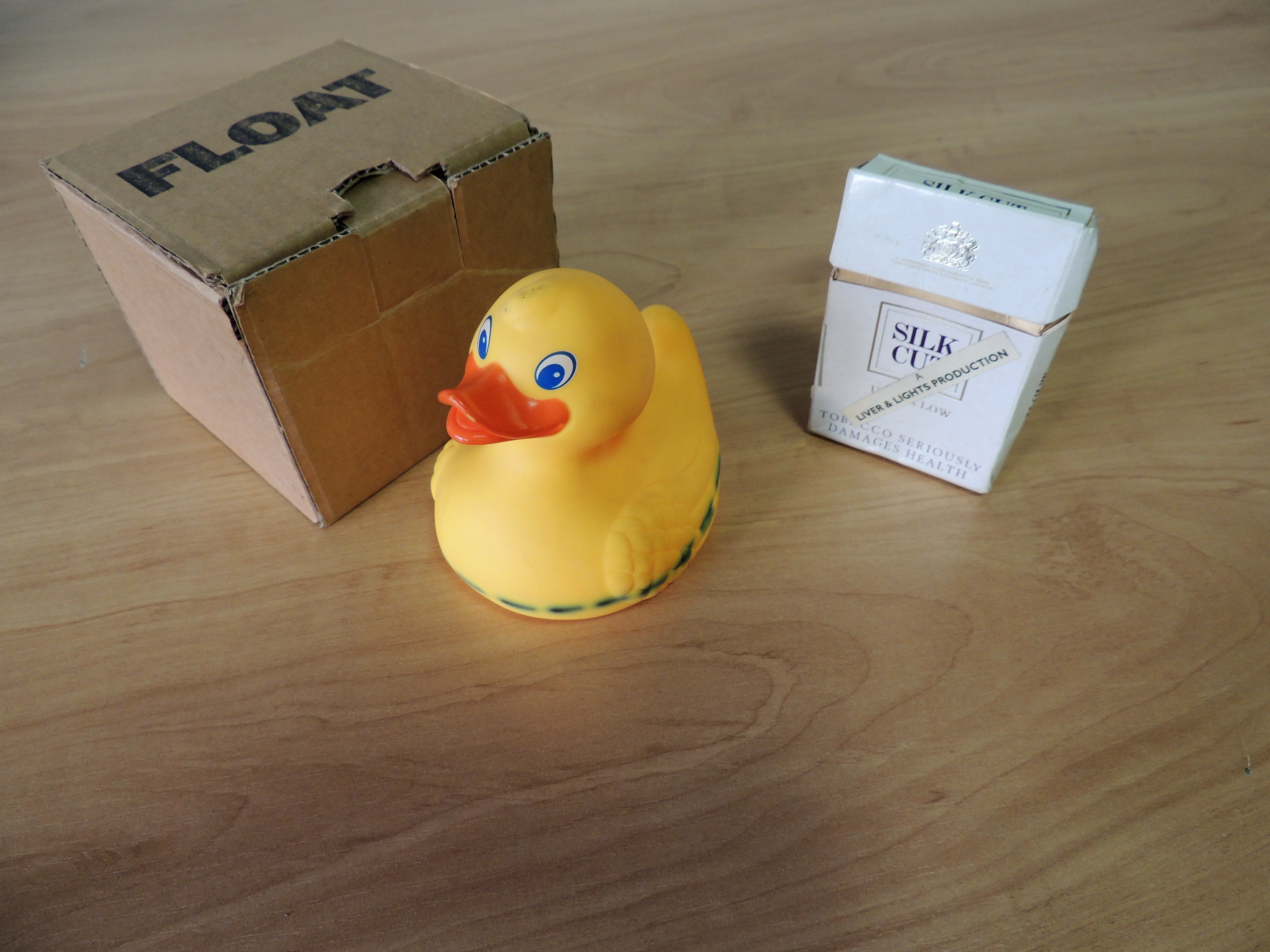
1: FLOAT: Atlas of the World by Andrew Ward, 1997, and This is to announce the publication of Liver & Lights nos. 16, 17 & 18 to be collectively known as Triptych by Liver & Lights, 1994.
St. Peter’s House Library Special Collection, University of Brighton.

One is an innocent bath-time toy, the other a monument to vice. One has a sleek, smart design, the other cartoonish and animated. One is juvenile, the other adult… I could go on. The point is that they’re just not very similar at all. So how could they possibly be connected? Not only are they both objects but, technically, they are both books! The two may be the last thing you expect to find in a library, though both indeed have shelf marks and can be found in the University’s library catalogue.

2

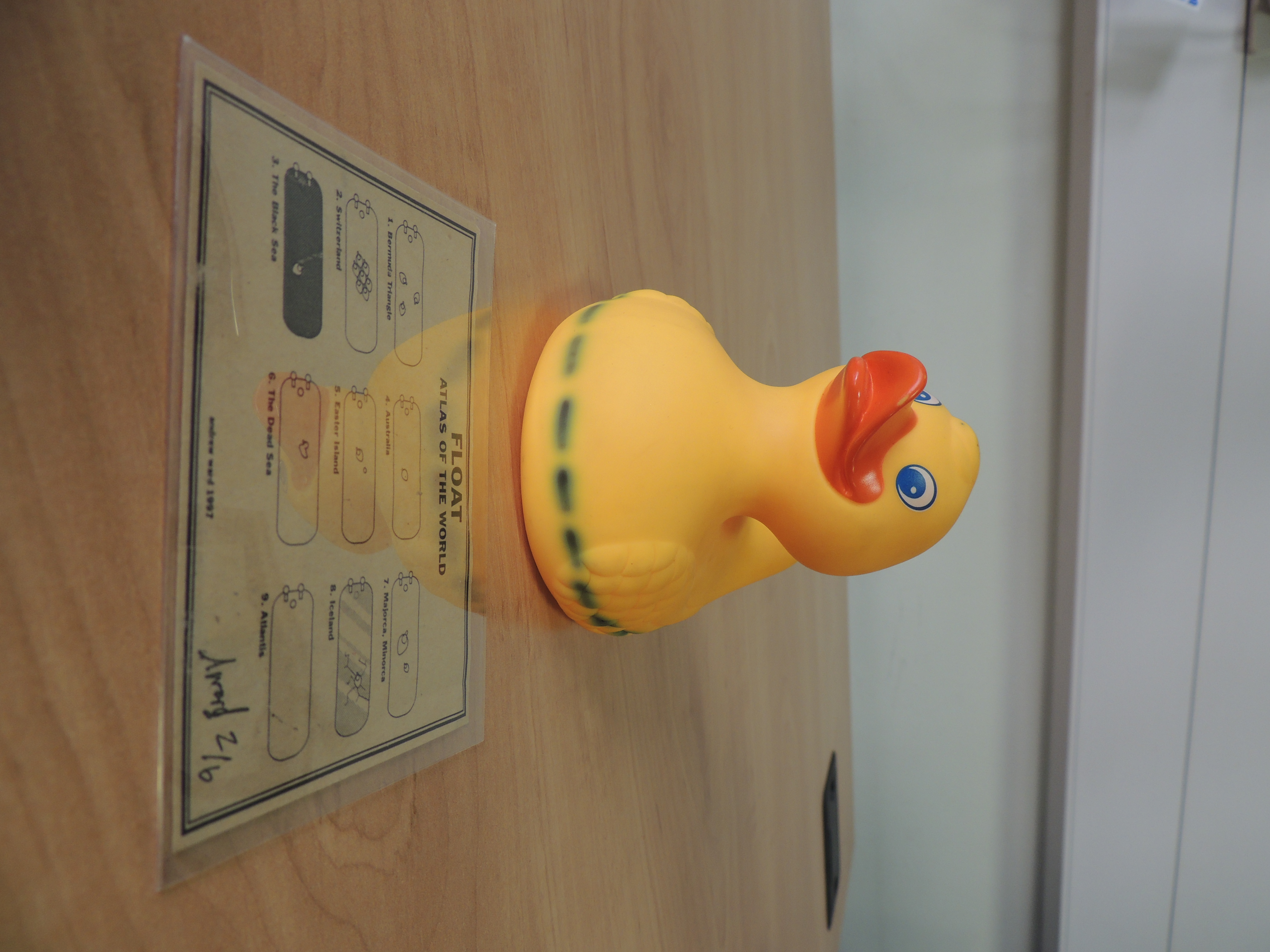
2. FLOAT: Atlas of the World, duck and map key.

The duck is an artist’s multiple; objects commissioned in limited editions but often with a subverted meaning. As well as the duck, the box includes a card containing diagrams showing how to arrange the duck (or several) within a bathtub to indicate different countries. Hence the title, FLOAT: Atlas of the World. Andrew Ward created these in 1997, at a time where Young British Artists such as Tracey Emin and Damien Hirst were selling their own customised everyday items as accessible works of art.

The cigarette packet was produced in 1994 by the artistic collective Liver and Lights, and contains a rolled-up scroll. This ‘book’ is a catalogue for upcoming magazines complete with prices, postage details and a cut-out subscription form. The magazines were No.16-18, the Triptych, and the ‘bookworks’ were published in a shoebox.

3.

3. This is to announce the publication of Liver & Lights nos. 16, 17 & 18 to be collectively known as Triptych, cigarette box and scroll.

The classification of ‘book’ encourages the viewer to read the object and consider what visual cues the artist intended. Should information be confined to pages? Does a book require a cover? How involved can a reader be? Design is a creative answer to everyday problems, and these objects question how we understand the everyday.

Neither object was designed explicitly for their current purposes – they were repurposed by the artist. The reader cannot help but imagine Andrew Ward bulk rubber duck shopping, and wonder whether chain smoking each box empty counts as artistic intervention?

S.Geissler1@uni.brighton.ac.uk

Diana’s dresses


First year Visual Culture student Sarahlouise Newman reviews Diana: Her Fashion Story, currently on at Kensington Palace

1

Fig.1 Tweed day outfit by Bill Pashley

At the end of January, I had the opportunity to see an exhibition of Princess Diana’s dresses. Situated in the gallery at her former home of Kensington Palace, the exhibition Diana: Her Fashion Story documents the evolution of one of British history’s most iconic princesses.

Set in the beautiful front building of Kensington Palace, we were guided through an atrium to plainly-decorated rooms, adorned with sketches of dresses immortalised by the media during Diana’s life. One of these is the well-documented tweed day outfit (Fig.1), designed by Bill Pashley, which she wore on her honeymoon at Balmoral in 1981, in front of the world’s press. The outfit is noted for its lack of structure as it hid her slim frame, which then caused the media to speculate, wrongly, that she was already pregnant.

2

Fig. 2 ‘The horse blanket’ by David Emanuel


Following on a little further is a long, green, checked coat (Fig.2) that was nick-named ‘the horse blanket’ by the press, which Diana wore when she was she was in Venice in 1981. This was made by her future wedding-gown designer, David Emanuel. The caption beneath the coat states that this was one of her fashion mistakes: it drowned her figure, hiding her slim silhouette with a boxy coat.

3

Fig.3 The ‘Travolta dress’ by Victor Edelstein


Moving into the second room, the style evolves into an elegant black gown nick-named the ‘Travolta dress’. The off-the-shoulder midnight blue velvet gown by Victor Edelstein was immortalised in a photo when Diana danced with John Travolta at the gala dinner at the White House in 1985. The dress was so iconic that it is the most expensive auctioned dress in the world and even has its own Wikipedia page. Reverting back to the more delicate colouring is the typical Disney-esque style dress, which she wore to the Royal Ballet at the Berlin Opera house in 1987 (Fig.4). The satin off-the-shoulder garment has a hint of true 1980s fashion, but still holds to the feminine image of a princess, with a full skirt and neat cuffs. This dress is a light pink, satin-buttoned, off-the-shoulder, floor-length gown designed by Catherine Walker.

4

Fig.4 Dress for the Royal Ballet by Catherine Walker, with Zandra Rhodes design of 1986 in background

Still using the light pink colouring, the dress in the background (Fig.4) is a Zandra Rhodes light pink, chiffon gown adorned with pearls and a satin waist-tie. Diana wore this outfit in 1986. She was, by then, mother to William and Harry and increasingly in the public eye, not just for her position in the royal family but also as charity patron. The main thing I noticed was the length of the gowns. The media never showed the height and build of the Princess of Wales, but it is notable from the length of the gowns how tall and slim she must have been.

5

Fig.5 Sketches by Catherine Walker

As I moved from room to room, I noticed many sketches by Catherine Walker who was one of Princess Diana’s favourite designers, and helped her to develop her sense of style (Fig.5). Diana commissioned Walker to make suits for charity events including the well-known hospital visit to an AIDS ward, where Diana famously refused to wear surgical gloves and hugged terminally-ill patients.

6

Fig.6 Dresses worn for Mario Testino shoot

The final room was my favourite, having a centrepiece of dresses Diana wore on the Mario Testino photoshoot, which became known as her last (Fig.6). Photographs are placed on walls around the garments, along with quotes from Diana and the designers who worked with her.

The exhibition is an intimate view of the evolution of her fashion style from a young princess to international fashion icon. It shows Diana’s elegance and, at times, her fashion faux pas. But mainly it is an exhibition for all, from art and fashion students, to people who were admirers of Diana. It is definitely worth a visit.

Note: The exhibition continues until April 2018, with NUS discounts available. Booking in advance is advised: I went on a Sunday afternoon and it was not too busy, but Saturdays are usually sold out. Catalogues are on sale and photography is allowed, but can be difficult due to lighting.

Working with Queer Looks


Second year Fashion and Dress History student Eleanor Medhurst discusses her work with Brighton Museum’s Queer Looks Project

The Queer Looks Young Project Team discussing themes

The Queer Looks Young Project Team discussing themes for the exhibition

I found out about Queer Looks by a sponsored post on Facebook, which is a strange way to encounter something that has had such a positive impact on my life. As a Fashion and Dress History student, and as someone in the LGBT+ community, I was instantly drawn to the project. Queer Looks at Brighton Museum is a display opening this summer featuring outfits and stories from members of the LGBT+ community in Brighton and Sussex. I’ve been part of the Young Project Team, meaning that I have helped to reach out to members of the community, conduct oral history interviews with them, and consider which outfits might be best to put on display. Dress is, in my eyes at least, the most personalised aspect of design history. Through looking at dress we can read individual histories; the stories that we can discover through the outfits of Queer Looks tell us of the struggles facing individual people within the LGBT+ community, the struggles of the community as a whole, and – as I think it is most important to look at the positives – the pride, creativity, and resistance that can be expressed through clothing.

Jason, an interviewee for the project

Jason, an interviewee for Queer Looks

There’s been something so validating about creating this space for queer history and queer fashion to exist within the Museum. It’s been even more important that it’s been through the lens of our team, a group of young queer people, and through direct oral history interviews where members of the community have told their story, on their own terms. Often when queer history is told it is as a side note. This project, however, celebrates queer fashion not as fashion that happens to be worn or designed by a queer person, but as fashion and style that exists in its queerness. I exist as a hyper-feminine gay woman and that is told through my clothing. Jason, an interviewee, owned his pink velvet hotpants-and-waistcoat set specifically to wear to gay clubs in the ‘90s. The stories that our clothes tell are intrinsically linked with our identities and our place as members of the LGBT+ community reacting to a heteronormative society. They are a vitally important part of fashion and design history as a mass reaction to its heterosexual canon.

Deciding which stories to tell in Queer Looks has been a difficult issue. The display will only be able to hold around 20 outfits, but of course there are far more than 20 unique looks and stories that want to be seen and heard. The key was to think as inclusively as possible – a true history and representation of queer people’s looks would not be possible without a varied representation.

The Queer Looks Young Project Team deciding who to include

The Queer Looks Young Project Team deciding who to include in the display

Many people perceive fashion and the LGBT+ community to be something that is flamboyant, or fabulous. Whilst this is often true, we are also a community of real people living real lives and it was important to present a history that is tangible, as queer fashion is something that exists all around us. We have tried our utmost to interview people with amazing style, but who also are a true reflection of the LGBT+ community. Amazing clothes are not all that is worthy of being kept in museums – they also need an accurate representation of the diversity of the people who the clothes belonged to.

Queer Looks is opening this summer, along with an additional microsite (to exhibit the outfits and stories unable to fit in the fashion gallery), but we’ll be putting on events celebrating queer fashion at the museum in the run-up to the opening of the display. One of these is on Saturday 3rd March for International Women’s Day. Keep an eye on the Brighton Museum Blog and the Instagram if you want to stay up to date.

Pre-Raphaelites, hippies and historical revivalism


Fashion and Dress History BA (Hons) graduate (2017) Elina Ivanov reports on being shortlisted for the prestigious Association for Art History essay prize

1. Dante Gabriel Rossetti. A Sea-Spell, 1875-77. Oil on canvas. 111.5 x 93 cm. Fogg Museum /Harvard Art Museums, Massachusetts, USA. Courtesy of www.harvardartmuseums.org

1. Dante Gabriel Rossetti. A Sea-Spell, 1875-77. Oil on canvas. 111.5 x 93 cm. Fogg Museum /Harvard Art Museums, Massachusetts, USA. Courtesy of www.harvardartmuseums.org

When the second year of my studies came to its end, I did not immediately have a clear idea for my final year dissertation topic. I did know that, ideally, I would want to incorporate aspects of art history into a topic centred on fashion, in the same way that in studying Fashion and Dress History we had extensively studied its relationship with broader culture and the history of art and design. Throughout my studies, I had held a particularly keen interest in the dress practices of women in artistic circles and subcultural groups from the nineteenth century onwards. The women associated with the Pre-Raphaelite movement were something I was curious to look into for a long time. At the same time I wanted to draw my research closer to the modern day, and to look at the much discussed subject of Pre-Raphaelite women from a fresher angle. I soon had the idea of doing this by basing my research in the historical revivalism typical to the fashion imagery of the late 1960s and early 1970s, noting its visual correlations to Pre-Raphaelite images of women a century earlier (see images 1-2 and 3-4).

2. Nicky Samuel wearing a dress by Ossie Clark and Celia Birtwell

2. Nicky Samuel wearing a dress by Ossie Clark and Celia Birtwell for British Vogue, September 1971. Photographed by Norman Parkinson. Courtesy of theredlist.com

Additionally, I wanted to bring in the influence of the Pre-Raphaelite aesthetic and spirit over wider hippie culture, which was heavily represented throughout popular culture of the time, particularly in popular music. The same kind of lyrical and visual evocations of women seemed to accompany hippie culture as had been typical to the Pre-Raphaelites a century earlier. In my dissertation I delved into this particular fabled feminine stereotype which, while drawing from history and its conventional images of soft and submissive femininity, seemed regularly to emerge in tandem with seemingly progressive, bohemian cultural movements. Throughout the course of my research process I kept encountering one theme after another, the discussion of which seemed to be crucial in order to present a thoroughly informed analysis of this ‘Pre-Raphaelite femininity’, which could so often be found pictured in Western visual culture since at least the mid-nineteenth century. There was the matter of femininity, feminism, fashion, art, historical revivalism, hippie culture, popular music, etc., etc.… I confess that at times it was difficult even for me to keep track of what I was actually arguing.

3. John William Waterhouse. Windswept, 1903. Oil on canvas. 114.3 x 78.7 cm.

3. John William Waterhouse. Windswept, 1903. Oil on canvas. 114.3 x 78.7 cm. Private collection. Courtesy of Wikimedia Commons

Ultimately, however, the general theme which rang out from all the different parts of my research was the idea of myth, in two ways. Firstly, in the sense of this mythical idea of feminine beauty, taking shape in images of women as sprites, enchantresses and medieval maidens, and secondly, in the sense of the very concept of femininity being a cultural myth itself; an idea recurrently discussed within works of feminist gender theory. At the core of my dissertation were female musicians of the 1960s and 70s who often seemed to encapsulate this timeless image of women as mythical creatures, especially insofar as this was evident in the style, songs and persona of musician Stevie Nicks. As a highly successful woman in a field which has historically favoured men and the male perspective, Nicks functioned as the perfect way to prove, pinpoint and bring together the larger themes discussed in my dissertation.

4. Model in an Ossie Clark dress, reclining on a settee covered in the original William Morris’ Bird Design. Photographed by John Kelly at Wightwick Manor for Vanity Fair, May 1970. Scanned by Miss Peelpants.

4. Model in an Ossie Clark dress, reclining on a settee covered in the original William Morris’ Bird Design. Photographed by John Kelly at Wightwick Manor for Vanity Fair, May 1970. Scanned by Miss Peelpants.

While my dissertation largely discussed fashion, dress and style, it turned out to be a broader examination of visual culture and popular representations of gender. Having at times seemed like a dauntingly difficult task, handing in the finished dissertation felt fantastic and I was ultimately very happy with the end result. Furthermore, my dissertation supervisor, Annebella Pollen, who had been a tremendous help throughout the process of writing and editing it, offered to nominate my work for the annual dissertation prize held by the Association for Art History, an organisation dedicated to advocating the study of the subject. I was delighted to learn recently that my work had been selected as the runner-up for the 2017 prize. It felt especially rewarding to receive recognition from a renowned body such as the AAH, whose annual conference will be held at the University of Brighton in 2019.

Having received such positive feedback for my dissertation from my tutors as well as the AAH has been encouraging in terms of applying for further study, with the aim of building a career in fashion curation. Since graduating from the University of Brighton, I have done volunteer work at the Fashion and Textile Museum in London, alongside working in fashion retail. While I have opted for a break from academia for the present year, I am applying for a number of Master’s degrees for the coming autumn. Hopefully, having been shortlisted for the AAH dissertation prize will be helpful in terms of applying for further study as well as, eventually, in securing future employment.

Read Elina Ivanov’s dissertation: ‘“West Coast Ophelia”: Stevie Nicks and Representations of Pre-Raphaelite Femininity in Fashion and Rock Music of the 1960-70s’ here.

The 2019 Association for Art Historians Annual Conference will be held at University of Brighton. The Call for Sessions is here.

Visiting Berlin: art, politics and national identity

Second year BA (Hons) Visual Culture student Ella Winning on an eye-opening course trip to Germany

Figure 1: Interior of Hamburger Bahnhof

Figure 1: Interior of Hamburger Bahnhof

Back in November, twelve of my course mates and I spent five days in Berlin as part of the second-year Trip to Europe module. During this time, we visited many of the famous tourist sights such as the Reichstag, Berlin Wall and the Bauhaus Archive, as well as galleries and museums in the city.

One place that particularly caught my attention was the Hamburger Bahnhof; a contemporary art museum situated in the west of Berlin. Hosting a collection of modern art works by the likes of Andy Warhol, Roy Lichtenstein and Anselm Kiefer, the exhibition I was most drawn to was the Preis der Nationalgalerie (29 September 2017 – 14 January 2018). This is a biennial opportunity for four artists under the age of 30 who live and work in Berlin to exhibit their work in a group exhibition at the Museum. Additionally, one of them is chosen to be the focus of a solo show and publication. The most recent shortlisters were Sol Calero, Iman Issa, Jumana Manna, and Angieska Polska.

Figure 2: Entrance to Amazonas Shopping Centre

Figure 2: Entrance to Amazonas Shopping Centre

As part of the show, Venezuelan-born multidisciplinary artist Sol Calero exhibited her interactive installation, Amazonas Shopping Center; a brightly coloured amalgamation of a selection of her works from the past five years. Throughout her work, the artist explores themes of national identity and ethnicity, especially in terms of her own, Latino background. Calero does this through her incorporation of various features of Latin culture; her installation includes a hairdressing salon (background of figure 2), travel bureau, consisting of a currency exchange kiosk and travel agency desk (mid and foreground of figure 2), cybercafé, school, and a salsa dance studio and cinema where her telenovela, Desde el Jardin, plays (figure 3).

While Calero is frequently labelled as a ‘Latin’ artist, the artist and her fellow prize entrants reject the practice of describing of them and their work in terms of their ethnicity. In a statement released to Artnet News, the artists

Figure 3: Amazonas Shopping Center Installation views

Figure 3: Amazonas Shopping Center Installation views

explained that they felt their minority backgrounds as immigrants and as women were ‘emphasized much more heavily than the content of their work’ during promotions and advertising for the exhibition.[1] I found this particularly interesting; at a time of changing attitudes towards race in terms of politics (and therefore society), is it even relevant for the nationalities of the artists to be highlighted? Is exercising of nationality allowing pride in ‘otherness’, or is it a tool of isolation which discourages inclusion?

Some might argue that the Museum was simply highlighting diversity in the selection of artists, showing the all-encompassing attitudes towards art, while others (agreeing with the artists themselves) may perhaps argue that the Museum’s focus on the ‘otherness’ of the four women was perhaps a ‘self-congratulatory use of diversity as a public relations tool’[2] for the Hamburger Bahnhof, prohibiting the artists from fully integrating into the German art world.

It can be assumed that the Museum, along with many other organisations across Germany, wish to reject the racist politics that made a resurgence at the start of the twenty-first century, along with far-right intolerance emerging around the globe in the modern day. The renunciation of these politics can clearly be seen in modern German culture; one example being Angela Merkel’s pioneering and controversial open border policy introduced in 2015. [3] It could be argued that, with similar intentions to Merkel, the Museum has consciously tried to denounce intolerance by highlighting or celebrating the differences of the entrants to those of the past. Others might find it patronising and a form of discouraging inclusion to the ‘German’ art world.

Figure 4: Amazonas Shopping Center Installation views

Figure 4: Amazonas Shopping Center Installation views

I found this trip interesting because it opened my eyes to this issue of nationality and its relevance in the culture not only of Berlin, but of the contemporary world; a topic which will continue to be particularly important in the years to come.

[1] Kate Brown, “These Four Artists Were Nominated for Germany’s Foremost Art Prize—and Now They’re Denouncing It” ArtNet News.

[2] Brown, “These Four Artists Were Nominated for Germany’s Foremost Art Prize—and Now They’re Denouncing It”

[3] Reuters in Berlin “Merkel: no regrets over refugee policy despite political cost” Guardian. Web. 27 Aug, 2017.

Research networking


Bridget Millmore (PhD, 2015) recalls how the University of Brighton’s Postgraduate Design History Society helped her find her feet as a researcher

Poster PDHS Symposium 2017

Poster from the PDHS Symposium 2017

Ten years ago I was a student on the MA in Design History and Material Culture. Having worked for many years, the process of returning to study as a mature student was a bit like travelling to a new place without recognising the language or terrain. Things had changed since my undergraduate days. As a result I was unfamiliar with what was expected; unsure whether postgrad study was for me and uncertain about how to use the scholastic resources that were offered. Should I be reading all the books on a reading list? Could I fathom the details of the required referencing system? How did I hunt down a particular journal article or discover which online sources might be most useful for my research? Of course, these feelings of uncertainty waned as the course progressed and my confidence in researching and writing grew. However, the questions related to my course and research continued; questions that did not always lead to answers but to ambiguity and complexity. As well as encouragement from fellow students and the course tutors, one of the most significant support networks for me was the University of Brighton’s Postgraduate Design History Society (PDHS).


Sandy Jones presenting at PDHS Symposium, 2017

Sandy Jones presenting at PDHS Symposium, 2017

The Society was a lifeline when I had questions and quandaries, needed suggestions for my research or just reassurance that others were facing similar challenges. It is a student run group of postgraduates, all at different stages of their studies, from novice MA students to experienced PhD scholars and early career academics. The Society (that was set up in 2005) offers a friendly and encouraging network – a place to go to with your questions, for example, what to include in a word count, how to deal with an apparent ‘dead end’ in your research. Straight away when I joined, I made friends, met with others interested in similar aspects of material culture and design history and was amazed by the diversity of our collective interests. We discussed our research and talked about future opportunities. A few of us met, for example, to read and share feedback on our draft conference abstracts. We went as a group to exhibitions and the theatre. The PDHS provides a network to share information and advice, to welcome newcomers to the postgraduate world of Material Culture and Design History and to join together in academic and social settings.

E-J Scott presenting at PDHS Symposium, 2017

E-J Scott presenting at PDHS Symposium, 2017

Sarah-Mary Geissler presenting at PDHS Symposium 2017

Sarah-Mary Geissler presenting at PDHS Symposium, 2017

The glue that holds the Society together is the annual History of Design and Material Culture Postgraduate Symposium. A summer event organised and delivered by students, it offers participants the chance to try out their conference skills and repertoire within a supportive environment. In 2008 I delivered my first conference paper on eighteenth century thread buttons following a rather unscripted set of notes, unaware that most people ‘read’ their presentations. Every year after that I got involved in different aspects of the Symposium, giving papers, taking email bookings, organising rooms, negotiating financial support, updating the website and chairing sessions. For me the MA in Design History and Material Culture led to a funded PhD at Brighton University that I completed in 2015. Many of those I met through the PDHS have become close friends, pursuing similar academic journeys or moving off in new paths. I hope that the group will continue to evolve and grow and provide the kind of support that I found invaluable during my postgrad years.

This year’s PDHS Symposium will be held on Friday 15th June 2018, 10:30-17:00: G4, Grand Parade, University of Brighton

Working for the National Trust

Final year BA (Hons) Fashion and Dress History student Maria Purnell on working at the National Trust property, Standen House and Gardens.

Fig 1. Standen House (image by author)

Fig 1. Standen House (image by author)

Normally, balancing a degree with work is hard. However, having the opportunity to work for the National Trust as customer service assistant has allowed me to earn money, learn new skills and provided me with valuable knowledge, not only about the Trust’s purpose, but about the property itself.

Standen House was owned by the Beale family, who lived in London but built Standen as a holiday home, for the much-appreciated clean country air away from the city. What makes this house so special to the Trust is that it is a perfect case study of the Arts and Crafts movement, designed by Philip Webb in collaboration with William Morris. Working at Standen however, isn’t your ‘average’ student job. Upon arrival before the visitors, it is astounding how peaceful and tranquil the gardens can be. The scenery is breathtaking; on a clear day on top of the hill you can see for miles around, overlooking the countless fields and trees. One of the best aspects of working at a country house is how close to nature one can be; on a quiet day one tends to see an abundance of wildlife such as rabbits, squirrels and robins, which are not particularly afraid of humans.

Fig 2. Standen House (image by author)

Fig 2. Standen House (image by author)

The majority of the time I work either in reception, scanning the memberships and helping provide information to visitors or, when particularly busy, down in the car park, helping everyone park sensibly and giving people information and directions. This Christmas 2017, however, I got given the opportunity and responsibility to oversee ‘Woodland Santa’, our property’s Christmas grotto. It was an incredible experience and a privilege to be able to take part in such an event. Management put their faith in my abilities to organise elves and make sure Santa had enough presents for the children. Luckily the event was a huge success, and the children and their parents were thrilled with the property and the organisation.

Fig 3. Standen House (image by author)

Fig 3. Standen House (image by author)

The knowledge I have gained so far during my time working with the National Trust has helped greatly towards my degree, when understanding art, design, domestic and social history of the period which Standen dates from. Studying a degree in fashion and dress, one has to take into account the significant events within a period that can influence art and design. Standen House and the National Trust have provided me with much knowledge about the creation of this country house and allowed me to pass this on to visitors. Although the job has helped contribute to my degree, I also think the degree has helped me to do my job. Fashion and Dress History has allowed me to gain confidence when talking and explaining theories and historical concepts to fellow students. I have adapted this skill to my job at Standen, by having the confidence to talk to the general public about the history of Standen and the social and cultural histories that it reflects.

Standen House and Garden is at West Hoathly Road, East Grinstead, West Sussex, RH19 4NE

Fig 4. View over the chimneys, Standen House (image by author)

Fig 4. View over the chimneys, Standen House (image by author)

Fig 5. View from the house (image by the author)

Fig 5. View over the countryside from Standen House (image by the author)

Seminar Style! February 2018


In the first of our new monthly series Seminar Style: sartorial snapshots from University of Brighton we report on trends spotted on the University’s campuses

Billy at Grand Parade

Billy at Grand Parade

Name: Billy

Course: Fashion Design with Business

What: Vintage millennial pink jacquard-weave dress, new-ish black Fila trainers, oversized gold glittery polo neck jumper dress from H&M, fuchsia granny bucket hat from a charity shop and new chunky hoop earrings which cost £1 from Peckham.

Style influences: “wacky older ladies”

Instagram: @btempestradical

Gluck: Art and Identity


Final year BA (Hons) History of Art and Design student An Nguyen Ngoc reviews a current exhibition at Brighton Museum

Image 1: Daily Sketch, You Wouldn't Guess, 1926

Image 1: Daily Sketch, You Wouldn’t Guess, 1926

In November, Brighton Museum opened a new exhibition exploring the life and work of twentieth century artist Gluck (1895-1978), who is now recognised as a trailblazer of gender fluidity. I first learned about the exhibition soon before its opening, when I was taken on a volunteers’ tour of the Museum store and shown a photograph of Gluck in a tailored suit (Image 1), a copy of Radclyffe Hall’s The Well of Loneliness from Virago Classics, and clothing belonging to Gluck and lovers. The objects were sufficient to demonstrate that the curator – Martin Pel – would not simply be creating a narrative of Gluck’s life. Instead, that the exhibition would encompass the complexities and diversity of the artist’s life and works, presenting not only artworks but also personal artefacts, press materials and an impressive display of Gluck’s clothing.

Gluck, born Hannah Gluckstein, was a member of a wealthy Jewish family in London, where the artist had attended art school to train as a painter. The identity, established with ‘no prefix, suffix or quotes’ was accompanied by Gluck’s appearance, often sporting tailored menswear, masculine barber-cut short hair and mannish demeanour. Much like their unwillingness to adopt a gendered title, the artist displayed no association with any group or movements, despite mixing with circles of artists and having run away to Cornwall with fellow art students during World War I. Displayed only in solo shows and seldom exhibited, Gluck’s artworks have gained cult status among collectors for their technical mastery and the extent to which biographical elements permeate through the canvas’s surface. A pioneering creative in queer history, it is not surprising that Gluck’s personal history has become relevant in contemporary investigation of attitudes towards queer expression of gender, as well as the social forces which cultivated the presentation of the artist’s identity. Hence the diversity of artefacts on display in ‘Gluck: Art and Identity’.

Image 2: Gluck, Lords and Ladies, detail, 1936 (private collection).

Image 2: Gluck, Lords and Ladies, detail, 1936, oil on canvas (private collection).

In the exhibition the first of two galleries displays earlier paintings (Image 2), mostly dating from before the artist’s first solo show, and some personal artefacts. These include meticulous documentation of the artist’s lovers, accompanied by notes and letters from the artist. It is also through this display that viewers are introduced to the forensic nature of ‘Art and Identity’. The curators do not hesitate to portray Gluck’s love life, albeit passionate, as turbulent too. Yet the artist’s queer expression – and the fact that Gluck’s homosexual affairs may not have been the happiest – can be assessed by viewers against contemporary attitudes, such as those expressed in articles which question the artist’s gender expression and sexuality, displayed nearby. In none of these instances, however, is Gluck’s contribution to twentieth century British painting diminished: portraits and landscapes from the interwar period are displayed with paintings of Constance Spry’s floral arrangements, reminding viewers of Gluck’s accomplishment as a painter.

Image 3: smock from Gluck's collection (Royal Pavilion & Museums, Brighton & Hove)

Image 3: smock from Gluck’s collection (Royal Pavilion & Museums, Brighton & Hove)

An even more rewarding display is that of Gluck’s clothing in the second room. Here, material constituents of gender and Gluck’s ‘queer’ aesthetics become even more prominent. Two painter’s smocks (Image 3), constructed to be utilitarian – or seemingly so – stimulate speculations about Gluck’s public and private personas: one is of an iridescent, silken material, while the other is made of linen or toile. Also displayed is a group of black evening gowns (Image 4), one which seems to have a pleated skirt but, upon further inspection, turns out to be a jumpsuit. Others display a variety of silhouettes with intricate laces, embroideries and embellishments. The display of these unattributed items appears, at first, to mystify the character of Gluck. But they turn out to embody the artist’s lived experience, encapsulating the diversity and richness of the queer experience in the mid-twentieth century.

Image 4: Dress from Gluck's collection (Royal Pavilion & Museums, Brighton & Hove)

Image 4: Dress from Gluck’s collection (Royal Pavilion & Museums, Brighton & Hove)

Gluck: Art and Identity – curated by Martin Pel and Amy de la Haye – is on at Brighton Museum until 11 March 2018.

Gluck: Art and Identity Symposium will be held on 7 February 2018 at London College of Fashion.