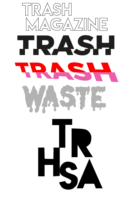

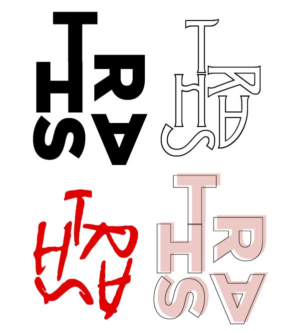
Figures 254 and 255 see a series of experiments made with font using Photoshop and illustrator. I used a variety of fonts and colour, whilst also using simple fonts and illustrative ideas. I found that the typography in Figure 254 were more successful than the other as they look more powerful than the ones created on illustrator.
For typography experimentation, I looked at using various fonts that reflected sustainability. I used more handwritten styles as a contradiction of the ferocity¬ that the topic areas project. I used block colours as well as layering to make them look 3D. I experimented with different names looking at how the variation of letters sits differently depending on the typeface. Overall, i prefer the look of the bold text as it projects its self clearer.