Final Outcomes


For my outcomes I created 2 editions, one which featured more graphic based images with the second one having a more minimal layout. I feel like they both work well however the first outcome has a more coherent style throughout.

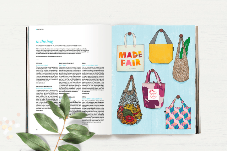
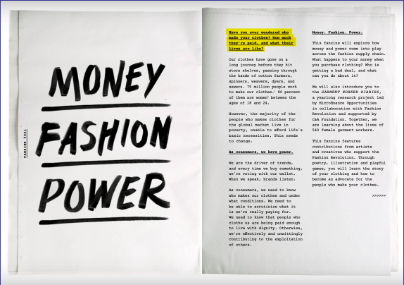
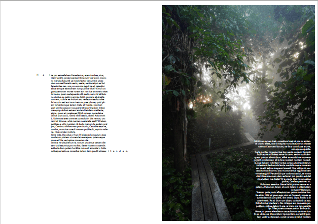
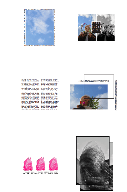
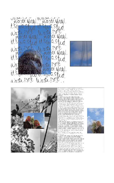
This outcome has a minimal approach using smaller scale images with large white space. The text and images are set out so they reflect each other keeping the design consistent throughout. This outcome has worked out the most successful incorporating influences from many areas of my research, looking at plastic waste specifically.

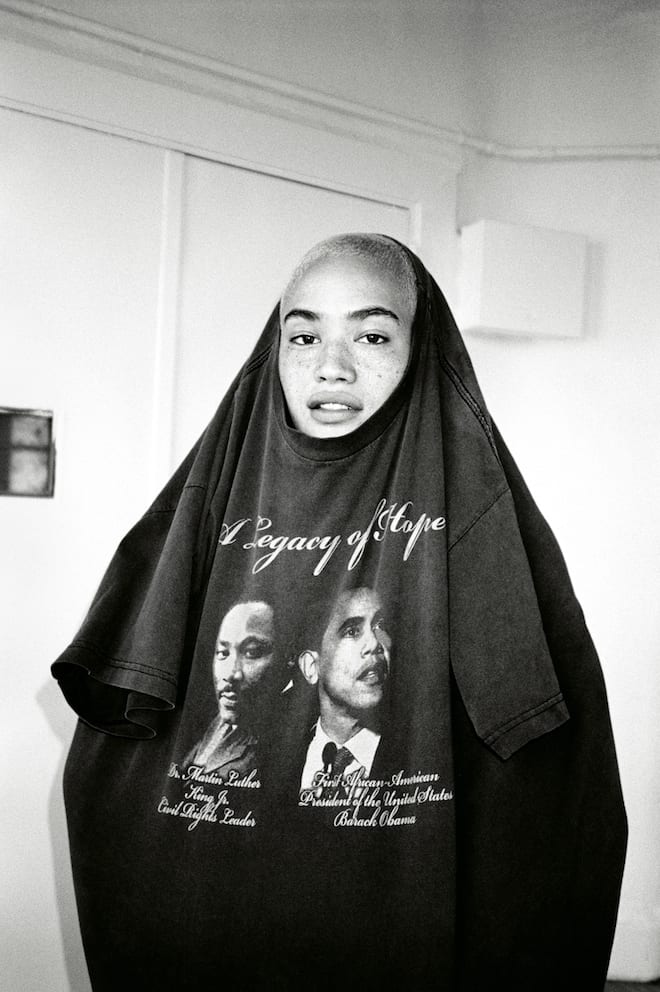
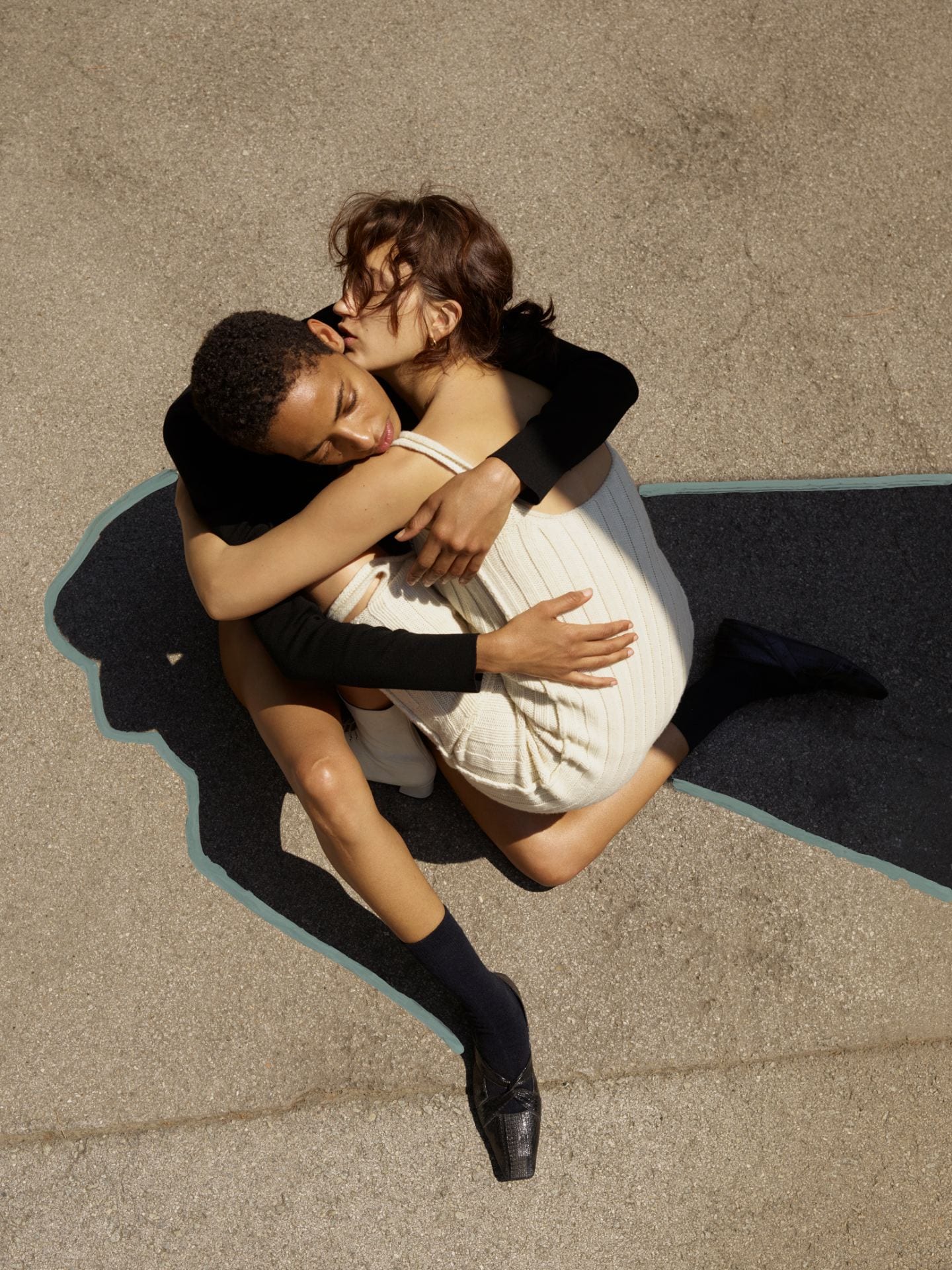
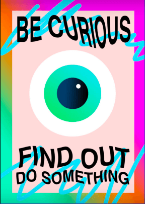
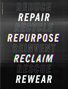
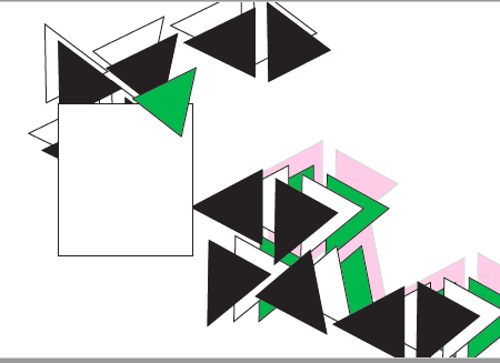
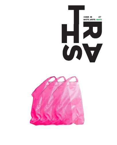
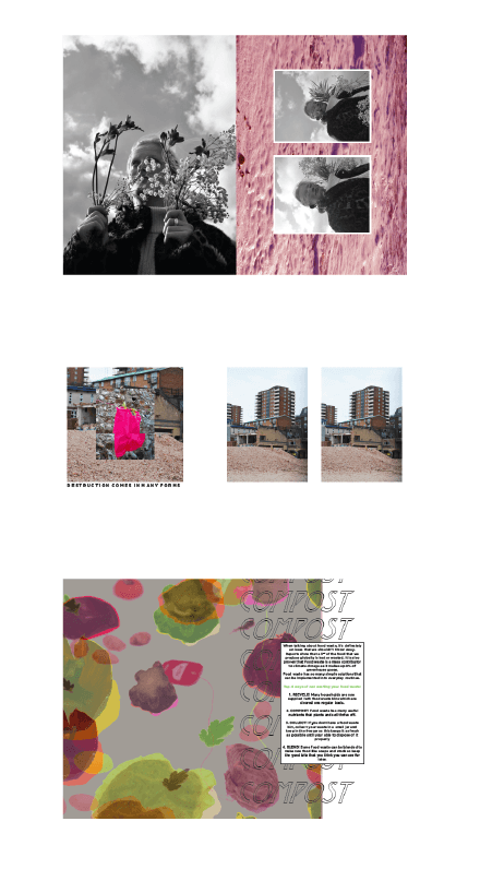
This outcome has a more graphic approach with large scale images covering majority of pages. The typography for this was more stylised as I feel It fit well with the rest of the content. Like the first outcome, there is a mixture of colour to ensure it is consistent, however there is a definitive exploration of font style and stylised layout.

Artist Research // Sarah Wallace


Sarah Wallace Scott is an America artist who creates minimal sculptures looking a nature. Figure 143 named ‘Turf 2014’ is a suspended installation piece that has been sculpted from cast handmade recycled paper, water colour and thread. Figure 144 ‘The Rescue 2011’ was constructed using cast handmade recycled paper, watercolour, handmade Kozo paper and pastel. I found these pieces the most relevant as they related well to the environmental aspect of my research in addition to how throughout her work Scott uses handmade and  recycled paper which I feel I can further into my research, looking how recycled items can be utilised into something new.

Artist Research// Marina DeBris


Marina DeBris is an Australian artist who creates ‘trashion’ pices using ocean pollution and beach debris that as been washed up to create eccentric pieces that further the discussion of our consumption of waste products. Figure 156 ‘Takeaway Queen’ was made from takeaway containers sourced from various oceans and beaches, whilst Figure 157 ‘Cuicdado’ which translates in ‘Be careful’ in Spanish was made from caution tape that was washed up on an LA beach.

Artist Research // Aurora Robson

Aurora Robson
The Great Indoors
18 September – 26 October 2008


Aurora Robson is an American artist that creates large scale installations using recycled plastic.  Figure 159 ‘Jetsam’ is made from plastic debris accompanied by other materials such as tinted polyacrylic and mica powder. Figure 161 ‘Accumulus’ 2010 was installed in a building in NY which was made utilising 5000 plastic bin bags that the building throws away. Although these pieces are too complex for me to adapt on in my own work, they are very intriguing with the use of scale whilst also looking at the diversity throughout each installation Robson creates.

Publication Layouts// Peppermint Magazine


Peppermint magazine is a printed sustainable publication which has an engaging design aesthetic. From the content and the creative direction of this magazine it is clear that their target their publication at the female consumer. It features DIY and textile style content which Is supported by clean and trendy illustrations. Although this magazine features a lot of relevant information, I like the way this magazine is designed however it is now how I see my magazine spreads constructed.

Publication Layouts// PussPuss Magazine


PussPuss magazine is a fashion magazine that ‘celebrates the spirit of independence’. It features very sleek and colour-based photography using basic but aesthetically pleasing layout ideas which reflect the ethos of the magazine well. The subtle implementation of the cats in the magazines provides a light-hearted approach to fashion making the magazine more approachable to customers. PussPuss also uses humorous graphics to develop their magazine which I want to incorporate into my own publication. The humour and fashion follows through into their social platforms which is beneficial to the growth of the magazine.

Publication Layout// Twin magazine


Whilst looking at direct competitors, I have looked at fashion/editorial magazines for layout ideas and photography/image composition. I decided to look at Twin Magazine as it is an a3 hardback publication which his quite unusual for a magazine. Linking back to work in the Hayward gallery and the Tate Modern, scale for a magazine is important as it can have an effect on how the image is portrayed. The visual content throughout Twin magazine is very modern and simplistic with a coherent style throughout. I like the subtle distortion in some of the images.

Publication Layouts// Fashion Revolution Zine


Fashion Revolution is an organisation that raises awareness on fast fashion and its impact in the industry. They produce fan zines annually which feature contributors globally creating media such as illustrations, articles, infographics, photography that is collated into a small publication. Fashion revolutions zines are so diverse with it being directed through the contributors, it means the layouts and aesthetic of each page is completely different. Each spread features a large quantity of content either solely imagery or text accompanied by photography or graphic. From this publication, I want to create something similar that is engaging through graphics but still features strong pieces of writing that educates the reader.  This zine plays with different fonts, use of photography and distorting which I am interested in including in my project.

Layout Experimentation


In the workshop, we experimented with layout using shapes shown in Figure 38 which allowed us to focus on the distribution of the shapes and how they accompany each other on each spread. This helped with our second task of laying out existing images.

These spreads were created in a workshop looking at layout and the importance of visually reflecting the content that you are displaying. I used images taken by Noah Sheldon as his photography captures how nature has been left to over take human structure of the biosphere. For these layouts I used fake text to show how the layout of this would work with the images and typography. I distorted some images to give a pixelated effect to represent the unpredictability of the plants within the biosphere.