Final business card and postcard


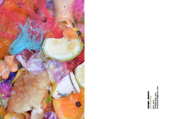
These are my final designs for my postcard and business cards. I deiced to go with the same image for the front of the postcard and business cards as it would make it more cohesive. The overall quality of them is good; i had them printed on recycled paper to keep the ethos of my FMP concept. The only issue i have is that the image for postcard is slightly blurry so if this was to be repeated a paper stock with more of shine would work better or to consider a different image.

Postcard mockups/ideas


To keep my promotional material consistent i have looked at using s similar of the same image for my postcard. i experimented with several different projects looking at colour and texture. in addition, i played around with the composition of the text on the other side of the postcard; using the same font and logo. Although i like the darker images like the bottom right however i think the bottom left is more effective with a more conceptual style.

Business card mock ups/ideas


I created various mockups for my potential business cards that all resonate with a similar aesthetic. After looking at examples i wanted to create a visual representation of my work as well as exuding vibrance in addition to minimalism. Although i had looked at various shape styles and techniques i decided that a traditional rectangular card would be the most effective to allow space for stylised logo and social details. I looked at having an image from my most recent work on the front which i think worked well but wanted to experiment further. I added my logo on the front which i though t would be effective with an embossing.


Social Platform Inspiration


For my professional website and instagram, i have visualised above a variety of styles that i think are appealing and would compliment my work well. As a my work is highly photographic, a more minimal, and spacious aesthetic would work best after looking at websites like Bimba Y Lola, whos both social platforms and website is graphics based (although liking this style). Similar to the aesthetic of my magazine, using statement typography to accompany a minimal style has worked well for sites like Bimba Y Lola and photography based sites like Berta Pfirsich.

For my social media, i have looked at following a more sporadic style similar to my magazine. With instagram being the primary social media i have its visual identity is accenting the different styles of work have created over the past 4 years.


http://williamfarr.com/

https://www.lazyoaf.com

bertapfirsich.com

https://www.bimbaylola.com/gb_en/

https://www.laurajanecoulson.com/


Portfolio Layout :: Visual Identity


Similar to my business cards i want to create an engaging portfolio that reflects my ability in art direction and imaging.

I have looked at displaying my work in a minimal aesthetic using varied size formats of images to create a dynamic visual representation of my most recent work. This will also allow for my work to be clear and will meet a diverse market in the industry. This would also trasblate well if i were to add a more diverse selection of work in the future; the design would cater for this. As my work is more photographical, it will help with the layout of multiple series on same pages.


https://www.instagram.com/drawdownbooks/

http://www.fabianbremer.com/

pastafrola.tumblr.com

https://kisa1986.tumblr.com/


Week 15 :: Business cards visual identity


For my promotional material I want to create playful and vivid cards that reflected my work over the four years of university. I have looked at typographical ideas and coloured papers as well as embossed texts and varied formats. For my initial research, i have looked into various companies to see what option they have in terms of shapes and styles. The company with the most appealing options at the minute is Moo who offer a wider range of sustainably sourced papers, such as cotton business cards and recycled paper postcards. I feel that keep sustainability at the forefront of all my projects is important so looking for the ethical options is key. However, the addition of aesthetic and professionalism is also important, so i have looked ta other companies such as Mixam who offer a wide range also.


http://byisabel.com/sva1/

https://www.instagram.com/gfsmithpapers/

http://www.peopleofprint.com

www.creativebloq.com