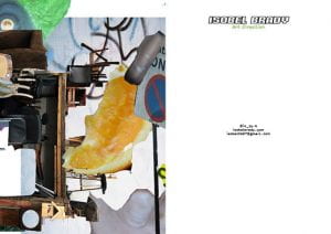
To keep my promotional material consistent i have looked at using s similar of the same image for my postcard. i experimented with several different projects looking at colour and texture. in addition, i played around with the composition of the text on the other side of the postcard; using the same font and logo. Although i like the darker images like the bottom right however i think the bottom left is more effective with a more conceptual style.


