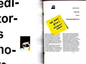
Social platforms & Postcard mockups

postcard_option 1

postcard_option 2 

postcard_option 3 

This i also looked at social media and promotional material.

As the publication is going to be solely on print, I wanted to keep the social platforms to a minimum, so the concept was as natural as possible and was manipulated by the nature of social media. The magazine will only have instagram where the majority of the selling will be to allow for simplistic retailing as well as using the platform to share instant content to keep the reader engaged in the concepts and using it as an outlet to engage with other creatives and communicate with other readers.


Week 17 :: Typography Experimentation

This week i followed on with the identity of my magazine. Through the start of my research I identified the pioneering work of the Swedish sustainability systems whilst also looking at the meaning of objects and their disposability. Looking at work that would symbolise this, meant the name Obsolete and Skräp were the most relative which is where I decided to title my magazine as ‘Skräp’ which translated to rubbish or debris in Swedish. Once I had decided on the name, I created various logo styles that would work well to symbolise the context of the publication, therefore the use of more sporadic and more distributed shaping was something that I explored.

Week 14 :: Draft Magazine edits


Coming back from easter i had my draft magazine delivery. I went through every page and made amendments but i had already started making them before i had the magazine back as i wasn’t happy with how it looked when i sent it off. Whilst looking through the magazine, i carried on making the media pack as-well as furthering my sketchbook. I also began to think about my portfolio and what work i want to show.

Week 13:: Shoots & Draft Magazine


Whilst shooting all the magazine content before easter i had been putting it into the indesign document temporarily laying it out so over easter was when i started to finalise the layout and making final edits. The first weeks in easter i shot one more ‘fashion’ shoot that was the redo of my trend shoot. i did this on location and found that it went better with the other content. The last weeks of easter is when i sent my draft copy of my magazine off and started creating the media pack.

Interview Transcripts

This week i focused on content, including interviews for the magazine. I wasn’t initially going to include interviews but felt it was important to build context in the magazine as well as have engaging information and facts from industry professionals about the topics in the magazine. I have never interviewed anyone before i was a little apprehensive however i found it really interesting to listen to these ladies talk about sustainability and waste.

Cat Fletcher

Orsola

mia

Week 12 :: food photography and interviews

My initial thoughts on my publications was to be more of a image book that was a almost like a diary of my waste experiences and findings however, whilst looking at my aesthetic and target audience i felt like making it into more of a magazine that might see more issues would be appropriate. I carried on with shooting moving further into waste by looking a food waste. I created a series of images inspired by Maisie Cousins that was made up of my own food waste.

I also decided to feature a couple of interviews in my publications so contacted several appropriate industry professional however found that only two came back; Orsola De Castro ( Fashion Revolution)  and Cat Fletcher(waste prevention)

Week 11 :: Test Shoots

I followed on into this week doing more shoots for the magazine alongside annotating my sketchbook. I wanted to work on the idea of trends and waste, so i looked at recreating trends out of household items or recycling. These images are from the shoot which i think came out nice however don’t the aesthetic of my magazine. This shoot will be reshot.