Lyric Typography


IMG_0288 IMG_0289 IMG_0290 IMG_0291 IMG_0292 IMG_0293 IMG_0294

I really enjoyed doing the typography classes so I knew it was something I wanted to include in my zine. I thought I would experiment different techniques to see what worked best for my zine. I tried water colours, ink, pen, pencil and photoshop/ illustrator. I found the most effect ones were the ones I wrote and then cleaned up on Photoshop and Illustrator. So I think I will be using this technique to do the typography for my final zine.

Kansai Yamamoto and Guy Peelaet

Another person who inspired David Bowie was the Japanese designer Kansai Yamamoto. It was Yamamoto who inspired David to give Ziggy Stardust bright red hair and also he inspired all the clothes that Ziggy wore. I didn’t know how I would try and experiment with this one so I just did some drawings of David Bowie wearing the clothes.

images-1IMG_0285

For my last inspiration I looked at the artist Guy Peelaet. He was the artist that created the cover for Diamond Dogs. He used bright colours and high saturation to create him images and I thought this would be perfect for a poster.

images-2Screen Shot 2016-03-01 at 12.34.58

Andy Warhol

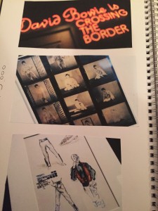
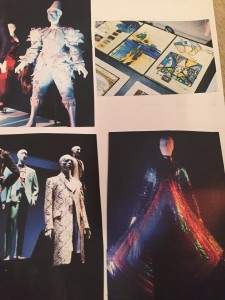
Andy Warhol was a huge influence on David Bowie as he wrote a song about him and even played him in a film. I looked the art that Andy Warhol had created and picked two to try and create a David Bowie/ Andy Warhol themed art work.

images
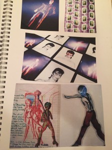
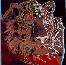
I picked this piece of art work as inspiration as I loved the black background in comparison with the bright colours in the tigers face. From this inspiration I used the song space oddity for my inspiration, I created two astronauts in a bright red and green and created to planets in the background with opposite colours in opposite positions. I then put a back background behind to make it more like Andy Warhol’s work. I really like it and love the effect it creates.
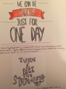
Untitled-1

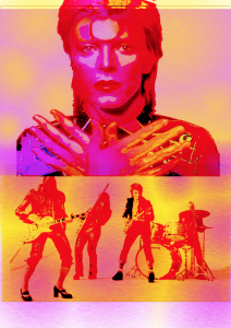
I also used the famous Maryilyn Monroe artwork as inspiration for a poster for my zine.

Unknown
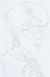
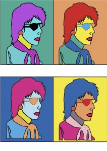
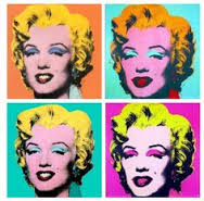
I used Halloween jack as inspiration for this piece, I first drew him out and then scanned him into the computer where I used photoshop to colour him in different colours so he looked like the Marylin Monroe print. I do quite like this piece but i don’t think its clean enough to go into my zine.

Halloween Jack ScanMUSIC WARHOLE jpeg

Inspirations

Loads and Loads of people say they have been inspired by David Bowie from Lady Gaga to Ricky Gervais. So I wanted to find out what artist and fashion designers inspired David Bowie himself. From this research I found loads of people that inspired Bowie but I decided to only focus on three: Andy Warhol, Kansai Yamamoto and Guy Peelaet. Andy Warhol is famously known for pop art and created commercial art. Kansai Yamamoto is a Japanese Designer famously known for creating the outfits for Ziggy Stardust and Guy Peelaet is comic/ animated artist known for creating the cover for David’s Diamond dogs. I’m going to use these artists and designers style to create some David Bowie themed artwork for my zine.

Masthead and Straplines


IMG_0266 IMG_0267 IMG_0268 IMG_0269 IMG_0270

As part of our new typography brief we were asked to create mastheads and straplines for our zine title. We were asked to create something that could be cut out by using a Laser cutter. I first made a spider diagram to try and come up with the name for my zine and strap line. I chose the name ‘ Dirty Boy, for my masthead as ‘Dirty Boys’ was the name of one of David Bowies songs that is less well known. I feel like the name of the zine is current and I can see it working very well. I also pick a quote that David Bowie has said for my strapline “Music is life” I really like this quote as music has a huge impact in my life and I thought that it makes the zine well rounded. I then drew a few designs out so I could decided what kind of font I wanted. I chose a simple line one for the Masthead because its easy to read and could stand out on a page. For the Strapline I chose something more decorative to contrast the masthead. I then created three designs that could be used for the Laser cutting machine. The first one is more simple with just straight lines, that could be quite effective on the page. The second one is a little more decorative with musical notes down the side. The third one is the most decorative with a heart filled with musical instruments as Bowie played a number of instruments himself. I quite happy with how they have turned out, but I think I am leaning more towards the third one as it stands out more and I think it would look effective on the front page of my Zine.

David Bowie IS …

IMG_0277 IMG_0278 IMG_0279 IMG_0280 IMG_0281 IMG_0282

In 2013 I was lucky enough to visit the V and A to see the exhibition ‘ David Bowie IS’ in London. It was one of my favourite exhibition I have ever seen, which is why I had to include it in my blog and sketchbook! I spent a good 2 and half to 3 hours in the exhibition and could of quite happy spent longer, if i’d of had the time. I learnt so much in the exhibition like how he processed his ideas with biro sketches and notes and cut up lyrics. I also found out who influenced Bowie to go into music and fashion. His main inspirations were Little Richard, Andy Warhol and Kansai Yamamoto. I will use this information to help me create my zine and even help me find ways to process my zine like him!

Zine Idea- David Bowie


IMG_0263 IMG_0264

I have finally decided what theme I am going to do for my zine. I have always been a huge music fan, so I felt that it was only fitting to use David Bowie as the theme for my zine, as he sadly died a few days ago. I want to create something that is a kind of tribute to Bowie but also is very artistic. I want to experiment with typography again and look into using it to illustrate his lyrics. I also want to look into his fashion and how it changed over the years. and also people that influenced him and created the David Bowie that we know today.

The first thing I have done is to get, loads of books about Bowie from the library and I also have watched documentaries and read academic papers on him as well. From all this research I have learnt so much about him and his life, and have created a timeline of David Bowie. This has helped me understand and gives me a snap shot of what his incredible life has consisted of. Next I am going to look at who has influenced David Bowie in his life and hopefully use that to create some art work that I can use in my zine.

Typography 3

IMG_0258 IMG_0259 IMG_0262

IMG_0261


IMG_0260


The final part of the typography brief was to pick a word from the list that we liked and to create 3 different typography versions using  the grid we had learnt. I chose the words; structure for alignment, equal for balance, consistency for repetition, rank for hierarchy and diversity for contrast. I then created three fonts for each word using a varieties of mixed media like paint, felt pens, ink and biro. I really enjoyed doing this and I really liked the way it all worked out.


Typography 2

IMG_0256 IMG_0257

As part of the typography workshop brief, we were asked to annotate the typeface, shown above. This helped me to become more familiar with how a letter is formed and provide me with more knowledge of typography. We were also asked to create lists of words which we felt described the 5 design principles, shown in the picture above. We were then asked to draw various fonts for each of the 5 design principles, I really liked doing this as it made me think different ways of explaining myself by  using typography.


Typography

IMG_0252 IMG_0253
IMG_0254

Today we had are first Typography workshop, during this workshop we were asked to create 3 magazine layouts using the templates provided. These were to do with the design principles: contrast, hierarchy and alignment. For the contrast layout I kept to using black and white to create a simple but obviously contrasting design. For the hierarchy page I picked a main image (The women) as the hero  and then used the text decreasing in size to represent the Hierarchy. For my final layout I had to create alignment.  again I made the girl the hero image, I then made sure there was a main title and there was        contrasts in colours and balance.

Also in the class we learnt the other two design principles balance and repetition. I enjoyed this task as It was something I hadn’t consciously known about so it has made me realise how important this design principles are!