Slogans and Phrases

I want to include Slogans and Phrases on my designs, I want the slogans I use to be positive and inspirational but I want to also include some film quotes and songs as I think this would make the clothing personal and would be a nice add on if it is a gift for someone. I drew out some slogans and phrases that I thought would be nice on clothing, I tried to pick phrases that went across all generations so there is something for everyone.

I then scanned them onto illustrator and redrew them, the reason I used bubble writing was that I thought it would be the easiest font to read on clothing. My positive phrases are ‘Girl Power, Positive Vibes Only, All you need is love and You got this’. For the film and song quotes I decided to pick ‘Zig – A -Zig -AH from the Spice Girls song not only are they going on tour this year they are also very popular with 30-year-olds which are the younger side of my target market’ For the older generations I chose ‘ Nobody Puts Baby In the Corner’ from the popular 80s film Dirty Dancing and ‘Frankly, my dear, I don’t give a damn’ and ‘Tomorrow is another day’ from the film gone with the wind and are probably the most famous quotes of all time.

Patterns

I wanted to start putting patters into my line drawn clothing, I started by putting patterns I found online that matched my mood boards of patterns but I had the idea to create my own patterns. I used watercolour paints, watercolour pencils to create my patterns that were from my chosen fall winter trends. I focused mainly on Hearts, Polka Dots, Tye- Dye and Floral I found a cool technique that if I put salt on the paint before it dried it creates a cool tye dye look which was fun they create. I really enjoyed doing this and think they turned out well, I didn’t want my designs to be all my own so I am going to use some that are already online as they will add different textures to my work.


Clothing Designs

Now that I know what fabric and the style of the pattern that I want to use on my designs I have started drawing what kinds of clothing my company would make. I have done this by drawing some clothing ideas along with how they will be adaptable. I have tried to draw clothing that is part of classic nightwear and loungewear and part modern and fresh. I am happy with my drawings and now will scan them onto Illustrator and redraw them. As there are over 200 different types of Cancer I have decided to focus on three Cancers in particular Oesophageal which is the one my mum had, Breast Cancer and Lung Cancer as they are the most common for women in the world.


Pattern Mood Boards

I want the clothing I create to not only be comfortable but fashionable so that it gives the wearers confidence and a sense of individuality. I think the most influential way to make the clothing fashionable is not so much the designs of the clothing themselves but the patterns that will be used on them. To help me create the most fashionable clothing I have been researching the Fall Winter 19 fashion houses runways shows at fashion week that has just passed. I have selected my top few that I feel could work in my own designs and created individual mood boards for them all so I can get inspiration from them when designing my clothing.

Florals 

Florals as a pattern trend is hardly a new concept but it is slightly more unusual to see them in the winter months as they are normally associated with spring and summer. The prints that were seen on the catwalk were small floral prints that covered the whole fabric, the florals used were also all different types of flowers and colours. I want to use florals in my designs as I think they are classic and appeal to all different age groups. They are also the perfect pattern for loungewear and nightwear as they are feminine and pretty.

Paisley Print 

Paisley print is a design that I have only just started getting into in the last few years and now love. Paisley prints made their way onto the runway of various designers such as Rokh and Altuzarra. The prints all varied in terms of size and colour and was seen on clothing and accessories. I want to use paisley on my designs as they are fun and can be used in many different ways either as a bigger print or a more subtle smaller one.

Polka Dots 

Polka Dots are a classic pattern that goes across generations, and it is still going strong in Winter 19. Both large dots and small dots were seen walking across the catwalk one of my favourites were by Shrimps who had a beautiful white and black polka dot ruffle dress. I love the idea of using a mixture of small dots and big dots or even both and playing with colour to create different fun designs.

Phrases and Slogans 

With politics having a very prominent place in the world at the moment with Brexit, Trump and the war on plastic it is not very surprising that it has also made its way onto the catwalks also in shows from Vivienne Westwood and Jeremy Scott. I, however, do not want to make a political statement I do like the idea of using phrases and slogans on my own designs. I would want to use uplifting phrases to make people feel empowered and some fun quotes also from peoples favourite films, songs etc as this could bring back happy memories and would be good if the clothing was a gift for someone.

Hearts 

Love was all over the catwalk for fall/ winter 19, similar to florals it was quite an unusual timing as hearts are usually hearts are associated with Valentines and spring. There were different types of heart prints on the catwalk some were big heart graphics and others were small and dainty. I like the look of the smaller dainty prints as they are less loud and in your face. I want to use hearts on my clothing as you can never spread enough love.

Jacquard + Brocade 

Jacquard and Brocade is an embroidery-like pattern fabric which is created with a loom rather than being printed on. I fell in love with the Oscar De La Renta dress the colours and the pattern is just amazing. I think this style and tone would be perfect for loungewear and nightwear as they are moody and slightly sexy.

Animal Print 

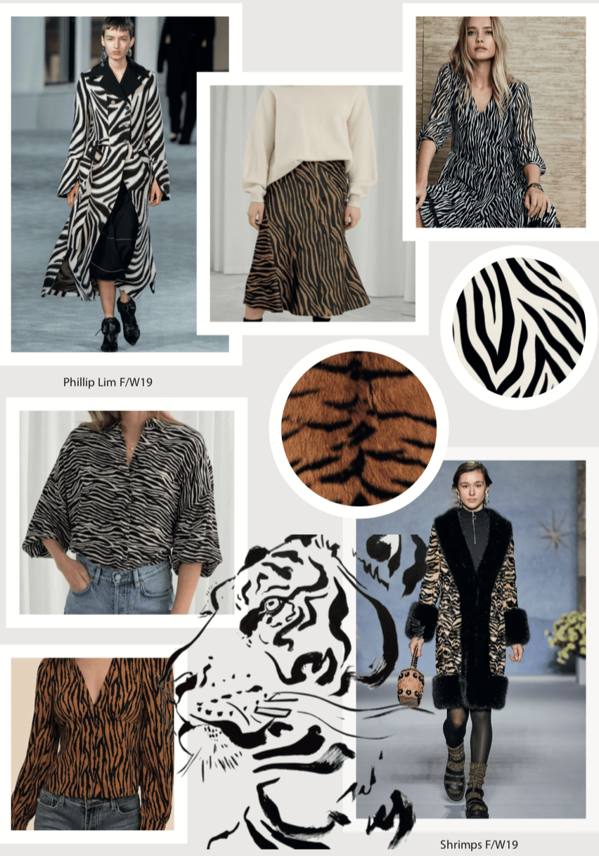
Animal Print is still going strong for Winter 19 with designers adding new animal prints and playing with colours and shape more. Leopard print is still a big favourite with designers along with snake print. But I am really liking the Zebra and Tiger prints that are coming through.

Zebra Print 

Philip Lim is one of my all-time favourite designers and when I saw his zebra print coast I loved it! I think animal print to some people can be quite scary and it has had a bad connotation in the past. But I think Zebra print would be perfect for those people as it’s not as loud.

Tiger Print 

Tiger print under leopard print was the second most popular animal print seen on the catwalk. Shrimps showcased a coat of dreams that was tiger print with a thick fur lining. I really want to include Tiger print in my designs as I think it is going to be all over the place in the next few months and it will allow people to stay on trend and have clothing that works for them.

Tie – Dye 

Tye – Dye is a trend that has followed over from spring/summer. Designers have made it more seasonal by layering t-shirts under dresses and creating hoodies. I want to use Tie-dye, as I think it’s a fun pattern and the beauty is that all tye – Dye is different so every bit of clothing would be unique even if the dress or top is the same.

Patchwork 

Patchwork is a huge trend with Topshop patchwork dress being the dress of the season. Patchwork patterns were also seen all over the catwalk. I found huge inspiration from a dressing gown from Anthropologie, which illustrates how patchwork could be used beautifully on nightwear.

Fabric

I want to start looking now at the clothing I want to design for my company. I thought the best place to start was what the clothing would be made of, as people receiving Chemotherapy Radiotherapy has extremely sensitive skin so have to be careful with what fabrics they put on their bodies.  I have done some research and have found the fabrics that I think is going to be best to use.

Bamboo 

I had never heard of Bamboo being used in fabric before, in the last few years, it has become popular for people to use Bamboo products as plastic substitutes such as Bamboo toothbrushes or face pads. Bamboo has many different benefits to not only the person wearing it but to the environment also. In comparison to Cotton Bamboo needs a lot less water to grow, Bamboo only needs rain water compared to cotton that requires a lot more. Bamboo also grows naturally and does not need pesticides or fertilizers. As well as it’s many environmental benefits Bamboo also has a number of good benefits to the person wearing it that would really benefit someone who is going through Cancer. Bamboo is super soft, moisture managing, thermo- controlled and has good UV protection. Bamboo is also antibacterial, anti-fungal and odour resistance meaning the fabric will help fight bacteria that could infect scars or infections which would decrease the time it would take if someone’s scar getting infected. I think this the best fabric for me to predominantly use, not only is it perfect for the problems people with cancer experience but it is also good for the environment with is something I also want my company to strive for.

Organic Cotton

Organic Cotton is grown using methods and materials that have a low impact on the environment. Cotton is good for people going through cancer as it is a naturally breathable fabric. Cotton can also be processed in many different ways, depending on how the fabric was handled, the Cotton could be soft, wrinkly, thin, thick etc. Meaning you could use cotton to create a lot of different feels of fabric. I will use Cotton also in my designs, but I will only use Organic Cotton as I want the environmental impact to be as low as possible.

Rayon 

Rayon is a natural based material that is made from cellulose from wood pulp or cotton. Rayon is low cost and can be used to imitate the look and texture of other natural fibres such as cotton, linen and silk. Rayon is a very breathable fabric it also drapes well as this it could be used as an alternative to silk. However, Rayon is harmful to the environment to make as it uses strong chemicals. I will use Rayon as a fabric option until I can find a more sustainable alternative.

Silk 

Silk is a natural protein fibre and comes from the cocoon of mulberry silkworm larvae. Silk is a highly renewable resource with less impact on the environment that many other fabrics. However, silk comes from silkworms which means it’s not a PETA approved the material, which is something very important to me. I will have silk as an option until I can find a vegan option.


Digital Watercolour Drawings

I wanted to create some more illustrations from the new coloured images that I shot. But I wanted to include watercolour as I really enjoyed using watercolour, I wanted to see if I could create watercolour illustrations without using watercolour! I found a tutorial on Lydia.com that showed me how to by using Photoshop and Vector Masks. I started by drawing some Beach Huts, before redrawing them on Illustrator and then moving it to Photoshop to create the watercolour style.


I also drew Duke Street and the Arches on Brighton Beach, I drew these straight onto Illustrator as it was easier than drawing them out by hand.


I really like Duke Street one but I’m not that keen on the Arches one, I like the line drawing but I think I overdid it with the colour and it just looks too much, I think it would be better if I redid it with less colour or less blending. I liked it so much that I went back and used the images from the black and white line drawing and drew them on Illustrator and then watercoloured on.


I think these illustrations are my favourite I like the two different blues in the West Pier, I really enjoyed this technique and found it much quicker and easier then watercolour in real life. It is definitely a technique I will be taking forward.

Colour Film Photography

After reflecting on the Black and White film, I realised that I didn’t want black and white images on my website as they don’t really fit with my theme or style so I decided to conduct a coloured film shoot of Brighton also. I really like shooting in the film as I think they look nicer when printed. For the black and white film, I printed them on glossy paper but for the colour, I chose to print them on matt and I much prefer this to the gloss images.


It was a really sunny day when I shot these so the light was really bright which made it difficult to get the exposer right and I had a few overexposed images that I couldn’t use. But I am happy with the images I have, I think I might also experiment with illustration and maybe even watercolour to see if I could make some more unique images.

Timed Line Drawings

I wanted to create some illustrations from my black and white Brighton shoot, so I picked my two favourite images from the shoot which was of the I360 and West Pier. I always find when drawing that I spend too long making sure the drawing is perfect that I waste a lot of time as well as often overcomplicating the drawing. I have done timed line drawings before, so thought it would be perfect to try it again.

I360


I first gave myself 10 seconds then 20, 35 and 40 seconds before going to 1 minute and 2 minutes. I used a mixture of pencil, Brush pen, Ink and Bio to create these illustrations. I am really happy with them the time went so fast I was unsure if they would look anything like the I360 but I’m happy that they do.

Next, I drew the West Pier, this was a challenge as there is so much detail in the photo but I tried but gave myself a bit longer as the image is more challenging.


I used Ink, Brush pen and pencil to create these drawings I used the timings of 10 sec, 20 sec, 30 sec, 1 min and then gave myself 30 mins for the bottom two drawings as I wanted to draw something more detailed. Overall I am happy with my drawings but I’m not liking working in black and white as Brighton isn’t a black and white sort of town and I want my company to be bright and uplifting. I have planned to do another shoot but in the coloured film to see if that makes a difference and if it gives me any ideas of where to go next.

Black and White Film Photography

I recently conducted black and white film photography of Brighton, as my company is based and centres around Brighton I thought it would be a good idea to get images of Brighton to use either on the website or for future reference. I wanted to take photos of places that would be recognisable of Brighton so people would know just by one image where the photo was taken from.


I am really happy with how they turned out, I really like the contrasts between the black and the white especially in images with buildings like the one above. I also really like the lines and shapes of the Pavilion and West Pier, I think I might try doing some line drawings of the images as I think that could look quite nice and could be used in Brand Book.