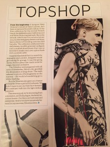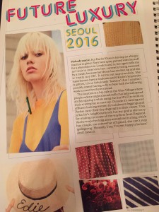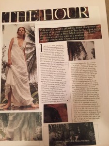


Today we had are first Typography workshop, during this workshop we were asked to create 3 magazine layouts using the templates provided. These were to do with the design principles: contrast, hierarchy and alignment. For the contrast layout I kept to using black and white to create a simple but obviously contrasting design. For the hierarchy page I picked a main image (The women) as the hero and then used the text decreasing in size to represent the Hierarchy. For my final layout I had to create alignment. again I made the girl the hero image, I then made sure there was a main title and there was contrasts in colours and balance.
Also in the class we learnt the other two design principles balance and repetition. I enjoyed this task as It was something I hadn’t consciously known about so it has made me realise how important this design principles are!