VOGUE ITALIA STEVEN KLEIN


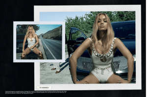
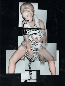
I also thought i should show these layouts from within the Vogue Italia polaroid issue because it could help guide me when actually creating my final piece. I have got a lot of polaroid shots anyway and wasnt sure on how to lay them out so using this as a template would make my final book look professional and creative.

VOGUE ITALIA STEVEN KLEIN

“THE POLAROID ISSUE”

I found this entire issue so aesthetically pleasing and loved how it was all made to be seen on polaroids – completing the overal idea of my final outcome which is ideally going to be a retro type archive. What interested me the most within this aesthetic was how Steven Klein had the models in every editorial showcased in really eccentric posing. Whether this was meant to reflect an 80’s type feel, for research for this project it really links. Relating back to this idea of posing again to define an 80’s period even more, i will take inspo from this entire issue and try and complete similar postures and expressions to these. This way i know they still look editorial, high end and quite eccentric when it comes to relating my original style of work to it.

HARPERS BAZAAR ARABIA 2018

“EIGHTIES DISCO”


Headshots similar to these would be really creative and would help me expand my skills in photography completely. Not only this, but itll allow the concept of beauty to be really filtered through for the viewer, especially if i have a make up artist that really creates a strong, bold look of which would be typical of the 80’s. I can imagine showing similar posing to this in my location through the use of the long mirrors located within the hairdressers where the model could be peering into. I also find how shes positioned almost religiously through this editorial in the same format but doing various posing within that sort of structure. Although i want to use the entire room for the shoot to depict the theme of beauty in the strongest way i can, using these quite expressional postures could be fun to also play around with.

VOGUE PARIS 1984


Coming across this 80’s Vogue cover and example of editorial, i realised i would need to make this shoot much more glamorous than i was expecting. I think hair and make up needs to be a key element wthin my styling so hopefully i can find a make up artist to help out. Especially as i want this to surround the concept of beauty again, i will really need to push the beauty looks within each set of styling. I am now completely aware of the type of accessories that would work to help create a luxury but 80’s feel for my looks. Long, overpowering diamante earrings and necklaces is what i should aim for which will also help exaggerate and highlight the areas of animal print that i am using to showcase pattern structure.


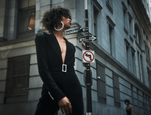
L’OFFICIEL TURKEY 2018


As my research develops through this path of 1980’s fashion in modern day editorials, it is becoming very obvious of the type of garments i will need to use to achieve a luxury, 80’s image. This use of large oval shaped arms, asymmetrical necklines and giant shoulder pads are just a few ideas that i could effectively adapt upon. I am interested in using evening wear for this shoot because i think it will best get across an image of high end fashion and could compliment the location of the retro hairdresser’s quite well, especially if the palette will be mostly monochrome. I also think itll be best because the previous shoot focused on beauty techniques – supposedly before an evening out – and pictured maybe more of a teenage hood theme. Using a more high end approach will enable me to give a different outlook of beauty standards that i want to show, because it could be seen as an older woman and the similarities that run throughout growing from a teen to a young woman. It will also make this shoot much more editorial instead of a more personal aesthetic like the previous shoot. I can also use this editorial as inspo for the sort of hair and make up that could work for the looks. I love this slicked back, glossy hair approach that enables viewers to easily see the focus point of the accessories. Having the oppurtunity to shoot in a hairdressers could also give me access to the equiptment there which i could use within the styling, especially within the hair to help me achieve a strong 80’s feel.

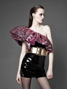
L’OFFICIEL USA


As i used a lot of colour for the previous shoot that gave of a complete retro feel, i thought that using a more darker palette could be a bit different for this shoot. Its interesting to see how a monochrome colour scheme here has been adapted upon to seem more luxury and almost more professional – which would give an entirely new dimension to my understanding of ‘teenage beauty’ and make it more of an overal topic. Again, accessories have been a key factor of styling here and i am keen to play around with oversized parts, such as the earrings and diamante belts. The monochrome palette could also be interesting to see how pattern could be placed on top and show various layers of block colour and pattern structure – like the painting.

VOGUE RUSSIA 2018


Again, just showing how various textures and patterns can come together to actually create a really strong look; instead of completely clashing and overpowering one another. My choice of shape of garments will be most important for this look because of how expressive the silhouettes were typically in the 80’s. It will need to be obvious of this era i think, but also sustain my own style throughout each look so it doesn’t become too ‘tacky’. Looking into luxury brands on Vogue Runway will be best for me to achieve this, especially the likes of Isabel Marant and YSL. These designers manage to filter through great aspects from the 1980’s and leave behind what wouldn’t be considered as ‘on trend’ now. This image on the left particularly interested me because of how different each garment is that is styled on the model but it all combines together to form a really smooth silhouette. The contrast between the blue bow heels with the lace material tights is the key influence i will take away as a strong aesthetic taken from the 80’s period. It shouldn’t really work together – in my opinion – but actually, it really does and is really obvious of this period’s fashion.

VOGUE PORTUGAL 2018


This editorial mainly attracted me because of how they have used such relevant examples of stereotypical 80’s clothing but ones that are so on trend in current fashion. I also loved the balance of colour within the garment, especially the use of subtle animal print on small parts of the body. Animal print could be a great way of involving pattern and also a way of pulling a retro era in the modern day, similar to how i am pulling elements of the Renaissance paintings into contemporary fashion.

VOGUE MEXICO 2018


This editorial showcases luxury, modern day wear but in a very obvious 80’s style. The way the styling has developed layers of luxury brands such as Cavalli i found inspiring because still, they manage to show every garment clearly. They have shown a great understanding of typical 80’s elements, that goes for the excessive patterns used, large accessories and almost a disco-like aesthetic. Following through with similar aesthetics could be effective in really showcasing an 80’s feel but it would ideally need to reflect beauty in someway. The pattern i need to achieve through terms of styling could be influenced from this editorial. I like how only subtle hints of it is shown, especially in this image on the left and i could try and get the same proportions of pattern in the looks as is it shown in the Renaissance painting. Im unsure of how this would work but i should definitely start playing around with patterns and working out what kind of colours or definite patterns i want.