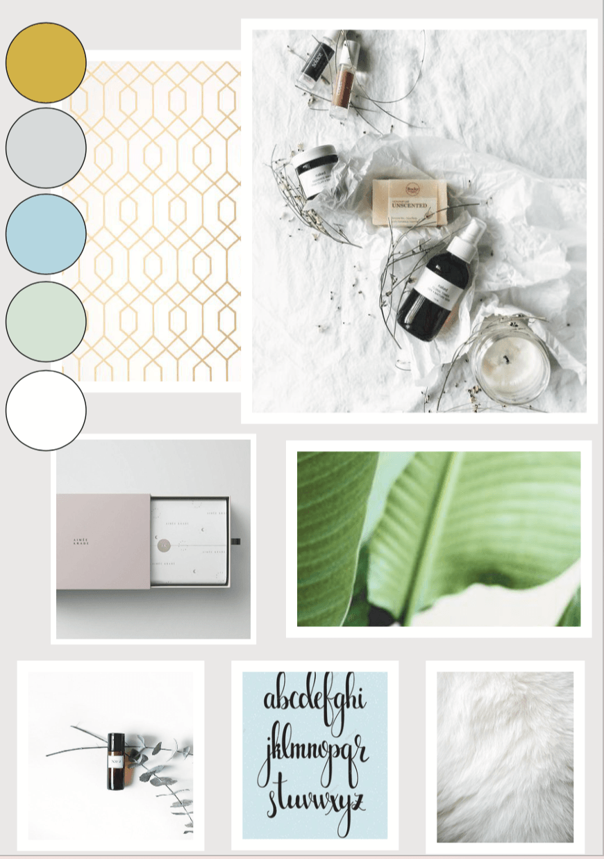
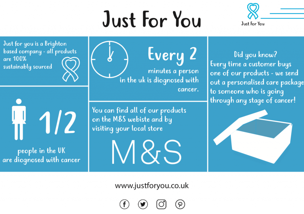
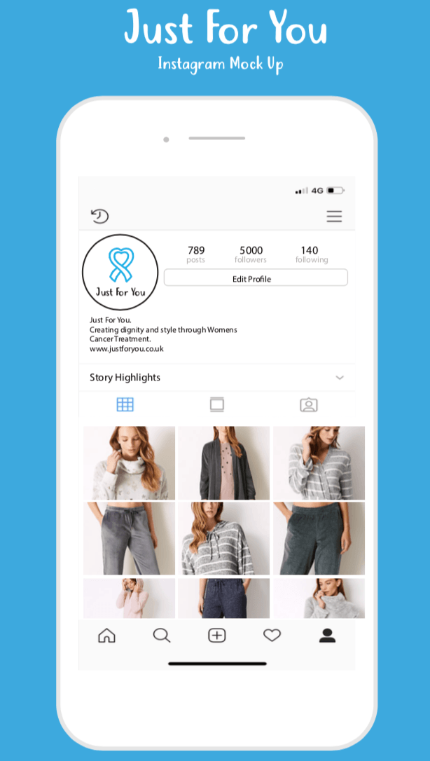
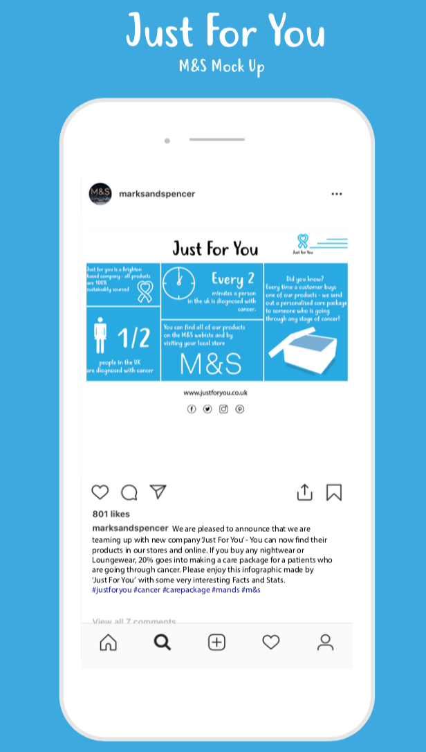
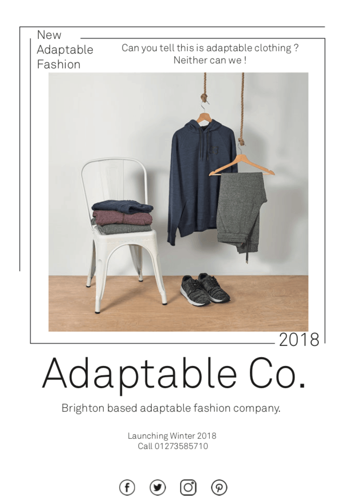
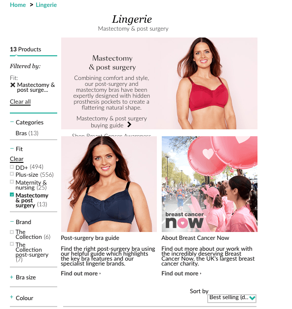
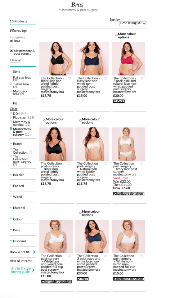
I have decided to go back to the beginning to create my brand identity for the Brand Book I want to produce as one of my final outcomes. I have started this process by creating four mood boards that encapsulate my brands look. I decided in the last module to use a light blue and white as brand colours. This was because light blue was my mum’s favourite colour and also it has connotations of being calming. But I have since decided my brands colour palette to be Light Blue, White, Light Green, Light Grey and Gold. The reason I want these colours are that:
Gold – Warm tone, Adds a hint of luxury and is a bright and happy colour.
Light Grey – Subtle, Good background colour or outline, gives connotations of comfort and softness.
Light Green – Linked with Health and Nature, Spring and life.
I think all these colours go well together and encapsulate the vibe of my brand completely.
These are the four mood boards that created that illustrate my brand. I have used images of pants that signify the natural resources of all my products and the health element. Typography styles that I want to aim for, inspirational packaging and shoot styles that I want to be doing in my own work. I’m happy with these mood boards and feel like they give me a good start of inspiration for how I want my brand to be and the vibe I’m aiming for.
