Brighton based companies – Accessories

I want to create a well-rounded care package with everything someone will want and need while going through Cancer. My packages will have Adaptable Clothing, Drink, Food and Beauty products in it, but I also want to include some Accessories products that can be used for the duration of the treatment. I also want to include some personalised elements as people love the personalisation and I want to stick to the idea and theme of ‘Just For You’.

One Gree Bottle


Water is such an important element in health, not only are our bodies made up of 60% water but it is also recommended that an adult drinks two litres of water a day. When my mum was ill it was always recommended that if she couldn’t eat anything that day or stomach a smoothie or juice she should drink water. So I wanted to include a water bottle in the packages, I found a local company called One Green Bottle that makes refillable water bottles. The bottles come with a built-in straw perfect for people that are finding it hard to drink. I think this would be a great addition to the parcels as they can be reused and carried around with the person.

Posh Totty


Posh Totty is a Brighton shop that specialises in personalised jewellery and gifts, I have shopped in Posh Totty for years and love it. When my mum was unwell she had a birthday and it was so hard to decide what gift to get someone who we all knew was the last birthday she would have. I came up with the idea of getting a personalised necklace with mine and my sibling’s names on and she loved it. I saw how getting a personal gift meant so much more than the body washes and candles. As well as having a personalised jewellery element, they also have toiletry bags, mugs and notebooks that can also be personalised. I want to give people the option to add these into the package as an option.

Brighton based companies – Beauty

As well as Food and Drink in my parcels I also wanted to include beauty products too. Cancer and Cancer treatments can cause some dramatic changes to the skin such as dryness and sensitivity and I wanted to include products that could help to relieve some of these issues. As even people who are unwell still want to be able to look their best.

Balmonds


Balmonds was originally created to help with server eczema, created to help soothe and repair the skin. The products became so popular with the inventor’s friends and family that she decided to start her own company. The company is based in Brighton but also are stocked in various health stores all over the country as well as online. As the products are made for highly sensitive and dry skin I think they would work perfectly for people who are going through Cancer and would be a great addition to the care packages.

Corinne Taylor 


Corinne Taylor is a Brighton based company led by Corrine Taylor a qualified aromatherapist. Corinne Taylor creates highly effective, all natural aromatherapy products made in small batches in their factory in Brighton. The ingredients are always ethically sourced and eco-friendly with packaging being recyclable when possible. I think the whole range looks amazing, with its modern packaging and unique style. I love the room sprays and the body powers as I think these would be incredibly useful for people who are going through Cancer who can’t wash very easily.

Rawgaia 


Rawgaia is a skin care company from Brighton, all their products are organic and plant-derived by using raw botanical ingredients. They are cruelty-free and vegan and perfect for sensitive skin. I love the packaging and the products as I have used them before, I think they could be a great add on to the packages.

WideEye 


WideEye was originally started in Spain but when the owners had to move back to the UK the company started in a town just outside Brighton. They opened their first shop in 2015 and later opened one in Brighton in 2018. All their products are natural and made for both Men and Women of all ages. I have used this brand for a while and love their products they have unusual sents and they are really affordable.

Brighton based companies – Food

Food is a very important element for people who are going through Cancer, as they often don’t eat or feel like eating very much like most people do if they are unwell. I wanted to include food in the packages as I thought if they do feel like a snack it would be nice to have it in there. I want the food to be quite high in calories as most cancer diets ask for quite a high-calorie intake but I wanted the food to still be good quality and healthy as possible. That is why most of my finds are chocolate, not only is chocolate everyone’s favourite treat, you can also get quite healthy chocolate that has good nutritional values.

Pag’s Treats 


I first found Pag’s Treats in Infinity Foods in Brighton, I love honeycomb and was looking for a sweet fix that wasn’t too unhealthy. The chocolates are handmade by Paige herself in a town just outside of Brighton. The chocolate is Dairy free and packaged in home compostable ‘plastic like’ packaging made from wood – pulp. Her chocolates are easy to eat and melt in the mouth making them perfect for people who are having trouble swallowing. They also come in a large number of flavours and can even be personalised to order.

Bill’s 


Bill’s has been one of my go-to restaurants in Brighton for years, originally started in Lewis Bill’s restaurant has gained huge popularity in the last few years and has since opened a large chain of restaurants. As well as restaurants Bills have also started to sell there own products such as Jam’s, Biscuits and Marmalades in there shops. I think including Bill’s Biscuits would be a nice touch as an alternative for chocolate.

Next Level 


Next Level is a relatively new company in Brighton, it opened in October 2018. The chocolates are handmade in Brighton and come in a large selection of flavours such as; Sour Cherry, Salted Caramel, Lovers Delight, Chilli, Orginal and CBD Tiffin. I love the packaging and look of these chocolates as they are really original and beautiful to look at.

Choc Chick 


Choc Chick is a company that is based in Hove, their chocolates are Dairy and Gluten Free and made from Raw Cacao. Raw Cacao has over 300 nutritional properties, it is high in antioxidants and low in sugar to name a few. Choc Chick is stocked all over the world including the USA! I love the fun packaging and that they come in snack sizes, that would be perfect for the care packages.

Brighton Based Companies – Drinks

I have started to look at what I want to put in my care packages, along with the clothing I want to also include food, drink, beauty products and Accessories to put in the packages. I think the best way to do this is by using other companies to help provide the products that I want. As part of my companies USP I want all the products to be Brighton based companies, this will promote Brighton as well as help local companies.

Drink

People who are going through Cancer tend to not eat very much as most people don’t when they are ill. However, people who have Cancer need as many nutrients as possible to help their body to not only help recover from treatments but also to help maintain energy and to survive. The easiest way for people to get all the nutrients they need are from juices and smoothies, my mum lived of juices as they were easy to eat and we could pack them with nutrients and energy powders. I want to include them in my care packages, for this reason, I have looked into Brighton based juice companies and there are quite a few.

Raw Health Bar 


The Raw Health Bar is located in Brighton’s open market and sells cold-pressed juices and smoothies. They only make three juices called Green, Orange and Red. They are made fresh every day and sold in glass bottles that come in two different sizes.


YouJuice 


YouJuice is cold-pressed juice company and cafe in Brighton. They produce Juices, Smoothies, Shots and Cleanses.They sell an array of different juices and you can even create your own, they are sold in various shops and cafes over Brighton and can also be brought online.

42 Juice & Co 


42 Juice & Co is a very popular juice cafe in Brighton, it is promoted by Brighton’s blogger community and has a big following on Instagram. They have an extremely large range of juices and smoothies. I love their packaging and their shop in Brighton was really cute and modern. They recently closed their shop in Brighton but still sell their juices online and in some Brighton restaurants.

As well as looking at juices I also want to give people the options to put other drinks in their packages, I have looked into two different Brighton companies.

Bird & Blend Tea Co 


Bird and Blend Tea Co is a Brighton based tea company. They sell all different types of unusual teas such as Birthday Cake and Rubab and Custard. The reason I want to include tea is that tea is a classic British drink that is loved by all. People use tea to relax, wake up and gossip with friends. The best thing about Bird and Blend Tea is that they do really interesting de-cafe flavours and tea’s designed to help you sleep and relax.

Brighton Gin  


I wanted to include an alcoholic option in packages as they may be brought as gifts for someone and they might want something special. I have researched and even though alcohol when receiving cancer treatments isn’t recommended it is said that people are allowed to have a few drinks if they wish to do so. Brighton Gin is a locally made Gin that has won awards for its great taste.

Magic Realism: Art in Weimar Germany 1919 – 1933

I recently went to London to see some exhibitions to gain inspiration for my Final Major Project. One of the exhibitions I went to was at The Tate, the display was called ‘Magic Realism: Art in Weimar Germany 1919- 1933’. Some of the artwork that was showcased at this exhibition had never been on public display before, and some pieces hadn’t even been in the UK before.

The main reason I wanted to see this exhibition as some of the feedback I got from my last project was that my style was always very similar so I wanted to get out of my comfort zone and see some artwork that is the complete opposite of my own style. I was shocked as I really enjoyed the artwork, some pieces were slightly darker than the kind of work I create, but I loved the style of the work. I really liked the use of colour in the artwork, especially in particular piece called ‘The Poet Daubler’ by Heinrich Maria Davringhausen.

It was a huge image that lit up the room with its bright colours, it really illustrated the impact of what bright colours can do.

But what I really took away from the exhibition was the use of watercolour and pencil drawings. I never normally keep my drawings as pencil, I always go over them with pen or paint, but some of the pieces in the collection were left as pencil drawings such as ‘International Riding Scene’ by Otto Dix.

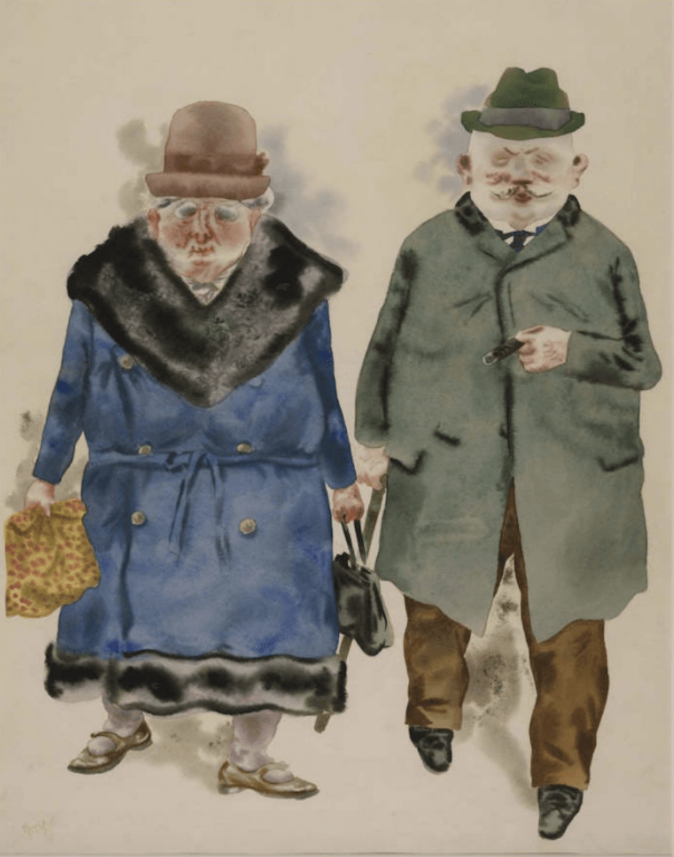
I really like how keeping the pencil makes the work look, and the effect it creates and I will definitely be looking into creating artwork like this myself in the future. A lot of the pieces that I really liked were created by using watercolour, and I really loved how this makes the images look, in particular in the ‘A Married Couple’ by George Grosz.

By using watercolour, it made the image look more fluid and softer, which is precisely how you would imagine old people are. Even though there is not much-drawn detail in work, you can picture what the couple was like just by the way the watercolour makes them look.

From this exhibition, I have definitely learned a new style of producing artwork that is less polished and clean. I am extremely interested in researching watercolour more and experimenting with in my own designs.

Logo – Redesign

I wanted to look at the logo, I created a logo in the last module but I made it quick and I wanted to see if I could improve on it. The original logo I had was a take on the Cancer ribbons repositioned into a heart shape, with the company name written underneath. I wanted to see if I could make it look better as I feel the logo looked unprofessional and a little cheap. I started by playing with the stroke thickness and the size of both the text and the heart.   

I then tried placing the objects in a circle either filled or just lined with the different colours that I chose from my mood boards. I really liked the look of these especially the filled ones, but I think they look more like designs that would be used on stickers or merchandise rather than the logo. I don’t think I’m going to use these as my logo but I might use them in the future in merchandise or packaging designs.

 I wanted to try and get away from the heart idea and try and think of a new one, so I thought that as we are making parcels I would try looking into that. I drew parcels and bows and tried to see what one looked best. I really didn’t like the bows as they were too much and I felt like there was nowhere to put them. I also didn’t like the parcels as it felt cheap and the parcels weren’t going to look like that so I didn’t feel like it made much sense.


I did however like the design of the outline of the parcel with a continuous line, I also experimented with different colours and I was really close to choosing this design as my final outcome.


Even though I really like this logo and was really close to picking it as my final outcome, I still felt like there was something missing the more I looked at the parcel the more it looked like a plant pot! My companies USP is the adaptable clothing so I thought it didn’t make much sense to have the parcel on the logo. So I decided to go back and try again. I knew all my favourite logo’s where in circles so I thought I would start with that idea but try and make the wording part of the circle, which I really liked. I also tried experimenting with the name of the company and thought of the idea of abbreviating it to J.F.Y, making it shorter and more fun. I really liked my outcomes and found it hard to chose which one I liked best.


I have found the new logo I incorporated the circle with text and the ribbon and abbreviation name. I chose to put the colours in blue and grey as I felt it fitted with the modern and minimal feel that I wanted my company to have. I really like it and think it encapsulates my company perfectly.

Font Forge

I have finally found an app that creates my font that looks professional! I downloaded an app called Font Forge onto my computer, it’s an app that creates fonts that can be downloaded onto your computer so it can be used as a real font. I first opened the fonts that I had already made from Calligraphr onto the app, it opens the font into boxes similar to the template that I filled out for Calligraphr.

Logo Font 


Text Font

It then gives you the option to click on each letter or symbol and either change it completely or move points to either make the letter sharper or more rounded. For every letter, I changed something either it was letter points in others I completely redrew the shape. As I illustrate below.


After you are happy with the fonts you can ‘Generate Font’ where it saves it onto your computer so it can be used on illustrator or photoshop. Below are the finished fonts both Text and Logo, I’m really happy with both fonts it’s taken what feels like forever but I have finally finished my own fonts. I think this will really make my company stand out and they fit my vision perfectly. I next want to look at the logo and see if I can change that.   

Calligraphr App

I have had quite a lot of difficulty making my fonts for the logo and text. I tried creating them on Illustrator to find that in order to make the fonts you have to download an add on app for 40 pounds! So I have been trying to find other ways to create the fonts. I have just found an App called Calligrapher it claims to turn drawn fonts into professional fonts on the computer. It asks you to download a template and write the letters and numbers in the boxes before scanning back onto the website.

Text Font 


Logo Font 

I was very easy to do as I had already written out the whole alphabet before, so I knew how all the letters were meant to look. You then scan the template back into the computer and refine the letters, so I cleaned up some pen marks and went over some letters as the app picked up every little thing about the letters. You then click build font and after a few seconds it’s done and the fonts are downloaded onto your computer so you can use them straight away!

Text Font 

 Logo Font 

I’m happy that I finally have a font that I can use! But I’m still not happy with it, it’s not clean enough to be used professionally and the sizing is a little all over the place. I’m going to try and find another place to try and make the fonts neater.

Typography

Next, I wanted to look at the font of the company. I started by looking at the font for the logo, I have decided to stick with the company name ‘Just for You’. I really like the name and I think it really suits my company as the parcels are tailored for the individual’s needs and concerns. I started by drawing out different variations of the names until I was happy with a few of them, I ended up with four outcomes that I quite liked.      

After some deliberation, I chose three designs to take forward, one was more a handwriting style font, one was a bolder font and the third was a creative font. I then scanned these fonts onto Illustrator and sketched the outline of them to make a sharper and professional font.

I really liked the creative font but felt it was just a bit too much for a logo but a possibility to be used on future products, such as labels. I then played with the thickness of strokes and filling the fonts to choose which font I liked to be used in the logo. I decided to go with the more handwritten style as it goes with the personalisation element of the product.

I really enjoyed creating the font for the logo so I decided to make the font for the text also and try and create two professional fonts that could be used on illustrator and other apps. I used the same prosses to create what I wanted the text font to look like as I did for the logo font. Again I ended up with three different variations of fonts that I could use. I wanted the text font to have more structure than the logo font and be more professional and easy to read.

I ended up choosing the font pictured below as my final text font, I think its clear, easy to read and clean cut as well as going well with the logo font.

In order to create the fonts, I drew out what the alphabet would be like in each font along with basic punctuation and numbers.

Logo Font Alphabet 


Text Font Alphabet 


This was incredibly difficult as all the letters had to look like they belonged to the same family. I am happy with the outcomes and I will next scan them into illustrator and see if I can make a font out of them!

Target Market

I’m working towards creating my Brand Book for my company Just For You. In order to do this, I need to work out the basics of the company such as Target Market. To help me to figure out who my target market is I found a load of Statistics on Cancer such as What are the most common types of Cancer and what ages get diagnosed with Cancer the most. I chose the stats that stood out the most to me and wrote them down in my sketchbook below. This allowed me to see easier who my Target Market was and what ages I wanted my company to the aimed at.

From my stats, I started writing up my target market, I have decided to aim for the age range of 22 – 49-year-olds. I have chosen this because from my stats I found that 0 -24-year-old Cancer diagnoses have risen by 24%  and 25 – 49-year-olds have risen by 20%. As my company is going to launch aiming at women only I will start my target market at 22-year-olds up to 49-year-olds. I want my target market to not only be the individuals themselves who are going through Cancer but also their family and friends who might want to buy them gifts to show their support. I have created three profiles of my target market that show how my company could help them and impact their lives.

I want to next look at what typography I am going to use in my company, looking at recreating the Logo and choosing what typeface I want my company to have.