Timed Line Drawings

I wanted to create some illustrations from my black and white Brighton shoot, so I picked my two favourite images from the shoot which was of the I360 and West Pier. I always find when drawing that I spend too long making sure the drawing is perfect that I waste a lot of time as well as often overcomplicating the drawing. I have done timed line drawings before, so thought it would be perfect to try it again.

I360


I first gave myself 10 seconds then 20, 35 and 40 seconds before going to 1 minute and 2 minutes. I used a mixture of pencil, Brush pen, Ink and Bio to create these illustrations. I am really happy with them the time went so fast I was unsure if they would look anything like the I360 but I’m happy that they do.

Next, I drew the West Pier, this was a challenge as there is so much detail in the photo but I tried but gave myself a bit longer as the image is more challenging.


I used Ink, Brush pen and pencil to create these drawings I used the timings of 10 sec, 20 sec, 30 sec, 1 min and then gave myself 30 mins for the bottom two drawings as I wanted to draw something more detailed. Overall I am happy with my drawings but I’m not liking working in black and white as Brighton isn’t a black and white sort of town and I want my company to be bright and uplifting. I have planned to do another shoot but in the coloured film to see if that makes a difference and if it gives me any ideas of where to go next.

Black and White Film Photography

I recently conducted black and white film photography of Brighton, as my company is based and centres around Brighton I thought it would be a good idea to get images of Brighton to use either on the website or for future reference. I wanted to take photos of places that would be recognisable of Brighton so people would know just by one image where the photo was taken from.


I am really happy with how they turned out, I really like the contrasts between the black and the white especially in images with buildings like the one above. I also really like the lines and shapes of the Pavilion and West Pier, I think I might try doing some line drawings of the images as I think that could look quite nice and could be used in Brand Book.

Hanna Moon & Joyce NG: English As A Second Language

I recently went to London to see English as a Second Language exhibition at Summerset House. The exhibition celebrated the work of Hanna Moon and Joyce Hg, two of the most in-demand fashion photographers of the time. The exhibition explores Moon’s reflection on her personal experiences of living in the UK and Ng’s explores street casted models in natural environments to create images which are both familiar yet surreal taking inspiration on a sixteenth-century Chinese novel ‘Journey to the West’. The exhibition also highlights both Moon’s and Ng’s fashion photography from the last few years where their work has featured in top publications such as Dazed and iD.  The exhibition explores the artists’ feelings of being ‘lost in translation’, a feeling which, as artists living in a foreign city navigating different languages and shifting landscapes, informs Moon and Ng’s search for capturing beauty in the often overlooked and unseen narratives in our everyday lives.


I found this exhibition really inspiring, the photography was amazing and the images were breathtaking. Moon and NG find beauty in places and objects that have often been overlooked by most that grew up around it. I will take inspiration from this exhibition as it has given me inspiration for when I conduct my shoots. I want to shoot round Brighton as my company and products are from here, but I have lived in Brighton my whole life. This exhibition has made me realise that I need to shoot as though I have never been to Brighton before so that I don’t overlook a place that I have become so familiar to me.


Jessica Durrant

After looking into Pelissero I wanted to find a watercolour artist that specialised in fashion illustration to see how they used watercolour. I came across freelance illustrator Jessica Durrant and really liked her style. Durrant mainly uses watercolour along with other materials to create her work. Durrant has featured in publications such as Marie Claire, Harper’s Bazaar Elle and even illustrated three books for L’Oreal Paris Kerastase. She was also named fashion illustrator to follow in 2014 and 2015 by Harpers Bazaar. I love the way she uses watercolour to add to her drawings rather than make them the sole focus of her art.


The main reason I was interested in Jessica Durrant’s work was her commercial work, the effect of watercolour on an advertisement is quite unusual so stands out when it’s on a page of normal text. This has given me inspiration for how I may use watercolour in my own work and how I could incorporate it into my brand book.

  I then tried out some of Jessica’s techniques in my own drawings, I first started to practice the techniques that Durrant uses such as the wet on wet technique and blending. I tried this out by practising and then creating a few practice pieces such as a leafs, lips and a Jellyfish. When I was happy with them I then moved on to my main drawings.


I then tried with fashion illustration, I first tried doing a side profile but with the background being the blue making the face, I then tried doing faces with the clothing using the watercolour which I really liked.

    
I then tried just doing the clothing, which I think was the best I really enjoyed doing it and think it would be interesting as I can’t make the adaptable clothing if I illustrated them by using watercolour. I think this would look really nice, on a website and a unique way of showing the clothing. It is something I definitely want to take forward and explore more.

Silvia Pelissero

After going to the Magic Realism exhibition I was inspired to look into watercolour, so I started looking into watercolour artists and found Silvia Pelissero otherwise known as Agnes Cecile. I really liked Pelissero’s work as she used watercolour to help convey emotions. Her normal style is to draw people and then to use bright watercolours over the top to illustrate emotion that may otherwise be hidden to the outside world.


I really think that this art style links to cancer very well as the colour to be used to highlight emotion and individuality, that what is on the outside doesn’t represent the person on the inside or take away their individuality. I felt inspired to try and see if I could create some inspired artwork based on Silvia Pelissero’s style with watercolour.

It took me a while to get used to watercolour as I haven’t used it for years, but after a few attempts, I was happy to start to try and create some art. I first took inspiration from Pelisero’s eyes and nose painting but as I’m awful at drawing noses I decided to add a mouth in to make it less horrific! I was pleased with the lip and eyebrow as I feel like it looks natural, but I wasn’t happy with the quality of the paints as they didn’t sit the way they were expected so I decided to go out and buy some better quality paints to see if that changed the outcome.

My second outcome was more similar to her face drawings, I drew a girl but then the back of her head turns into flowers. I first drew the drawing and then used bright colours over the flowers like Pelissero does. I then started to use a pen to outline the drawing but after starting to draw the flowers I started to not like the drawing so I stopped and left it, which I really like as I feel it really adds to the drawing.

Overall I really like this style and I really want to look at watercolour more to learn some more techniques and styles.

Brighton based companies – Accessories

I want to create a well-rounded care package with everything someone will want and need while going through Cancer. My packages will have Adaptable Clothing, Drink, Food and Beauty products in it, but I also want to include some Accessories products that can be used for the duration of the treatment. I also want to include some personalised elements as people love the personalisation and I want to stick to the idea and theme of ‘Just For You’.

One Gree Bottle


Water is such an important element in health, not only are our bodies made up of 60% water but it is also recommended that an adult drinks two litres of water a day. When my mum was ill it was always recommended that if she couldn’t eat anything that day or stomach a smoothie or juice she should drink water. So I wanted to include a water bottle in the packages, I found a local company called One Green Bottle that makes refillable water bottles. The bottles come with a built-in straw perfect for people that are finding it hard to drink. I think this would be a great addition to the parcels as they can be reused and carried around with the person.

Posh Totty


Posh Totty is a Brighton shop that specialises in personalised jewellery and gifts, I have shopped in Posh Totty for years and love it. When my mum was unwell she had a birthday and it was so hard to decide what gift to get someone who we all knew was the last birthday she would have. I came up with the idea of getting a personalised necklace with mine and my sibling’s names on and she loved it. I saw how getting a personal gift meant so much more than the body washes and candles. As well as having a personalised jewellery element, they also have toiletry bags, mugs and notebooks that can also be personalised. I want to give people the option to add these into the package as an option.

Brighton based companies – Beauty

As well as Food and Drink in my parcels I also wanted to include beauty products too. Cancer and Cancer treatments can cause some dramatic changes to the skin such as dryness and sensitivity and I wanted to include products that could help to relieve some of these issues. As even people who are unwell still want to be able to look their best.

Balmonds


Balmonds was originally created to help with server eczema, created to help soothe and repair the skin. The products became so popular with the inventor’s friends and family that she decided to start her own company. The company is based in Brighton but also are stocked in various health stores all over the country as well as online. As the products are made for highly sensitive and dry skin I think they would work perfectly for people who are going through Cancer and would be a great addition to the care packages.

Corinne Taylor 


Corinne Taylor is a Brighton based company led by Corrine Taylor a qualified aromatherapist. Corinne Taylor creates highly effective, all natural aromatherapy products made in small batches in their factory in Brighton. The ingredients are always ethically sourced and eco-friendly with packaging being recyclable when possible. I think the whole range looks amazing, with its modern packaging and unique style. I love the room sprays and the body powers as I think these would be incredibly useful for people who are going through Cancer who can’t wash very easily.

Rawgaia 


Rawgaia is a skin care company from Brighton, all their products are organic and plant-derived by using raw botanical ingredients. They are cruelty-free and vegan and perfect for sensitive skin. I love the packaging and the products as I have used them before, I think they could be a great add on to the packages.

WideEye 


WideEye was originally started in Spain but when the owners had to move back to the UK the company started in a town just outside Brighton. They opened their first shop in 2015 and later opened one in Brighton in 2018. All their products are natural and made for both Men and Women of all ages. I have used this brand for a while and love their products they have unusual sents and they are really affordable.

Brighton based companies – Food

Food is a very important element for people who are going through Cancer, as they often don’t eat or feel like eating very much like most people do if they are unwell. I wanted to include food in the packages as I thought if they do feel like a snack it would be nice to have it in there. I want the food to be quite high in calories as most cancer diets ask for quite a high-calorie intake but I wanted the food to still be good quality and healthy as possible. That is why most of my finds are chocolate, not only is chocolate everyone’s favourite treat, you can also get quite healthy chocolate that has good nutritional values.

Pag’s Treats 


I first found Pag’s Treats in Infinity Foods in Brighton, I love honeycomb and was looking for a sweet fix that wasn’t too unhealthy. The chocolates are handmade by Paige herself in a town just outside of Brighton. The chocolate is Dairy free and packaged in home compostable ‘plastic like’ packaging made from wood – pulp. Her chocolates are easy to eat and melt in the mouth making them perfect for people who are having trouble swallowing. They also come in a large number of flavours and can even be personalised to order.

Bill’s 


Bill’s has been one of my go-to restaurants in Brighton for years, originally started in Lewis Bill’s restaurant has gained huge popularity in the last few years and has since opened a large chain of restaurants. As well as restaurants Bills have also started to sell there own products such as Jam’s, Biscuits and Marmalades in there shops. I think including Bill’s Biscuits would be a nice touch as an alternative for chocolate.

Next Level 


Next Level is a relatively new company in Brighton, it opened in October 2018. The chocolates are handmade in Brighton and come in a large selection of flavours such as; Sour Cherry, Salted Caramel, Lovers Delight, Chilli, Orginal and CBD Tiffin. I love the packaging and look of these chocolates as they are really original and beautiful to look at.

Choc Chick 


Choc Chick is a company that is based in Hove, their chocolates are Dairy and Gluten Free and made from Raw Cacao. Raw Cacao has over 300 nutritional properties, it is high in antioxidants and low in sugar to name a few. Choc Chick is stocked all over the world including the USA! I love the fun packaging and that they come in snack sizes, that would be perfect for the care packages.

Brighton Based Companies – Drinks

I have started to look at what I want to put in my care packages, along with the clothing I want to also include food, drink, beauty products and Accessories to put in the packages. I think the best way to do this is by using other companies to help provide the products that I want. As part of my companies USP I want all the products to be Brighton based companies, this will promote Brighton as well as help local companies.

Drink

People who are going through Cancer tend to not eat very much as most people don’t when they are ill. However, people who have Cancer need as many nutrients as possible to help their body to not only help recover from treatments but also to help maintain energy and to survive. The easiest way for people to get all the nutrients they need are from juices and smoothies, my mum lived of juices as they were easy to eat and we could pack them with nutrients and energy powders. I want to include them in my care packages, for this reason, I have looked into Brighton based juice companies and there are quite a few.

Raw Health Bar 


The Raw Health Bar is located in Brighton’s open market and sells cold-pressed juices and smoothies. They only make three juices called Green, Orange and Red. They are made fresh every day and sold in glass bottles that come in two different sizes.


YouJuice 


YouJuice is cold-pressed juice company and cafe in Brighton. They produce Juices, Smoothies, Shots and Cleanses.They sell an array of different juices and you can even create your own, they are sold in various shops and cafes over Brighton and can also be brought online.

42 Juice & Co 


42 Juice & Co is a very popular juice cafe in Brighton, it is promoted by Brighton’s blogger community and has a big following on Instagram. They have an extremely large range of juices and smoothies. I love their packaging and their shop in Brighton was really cute and modern. They recently closed their shop in Brighton but still sell their juices online and in some Brighton restaurants.

As well as looking at juices I also want to give people the options to put other drinks in their packages, I have looked into two different Brighton companies.

Bird & Blend Tea Co 


Bird and Blend Tea Co is a Brighton based tea company. They sell all different types of unusual teas such as Birthday Cake and Rubab and Custard. The reason I want to include tea is that tea is a classic British drink that is loved by all. People use tea to relax, wake up and gossip with friends. The best thing about Bird and Blend Tea is that they do really interesting de-cafe flavours and tea’s designed to help you sleep and relax.

Brighton Gin  


I wanted to include an alcoholic option in packages as they may be brought as gifts for someone and they might want something special. I have researched and even though alcohol when receiving cancer treatments isn’t recommended it is said that people are allowed to have a few drinks if they wish to do so. Brighton Gin is a locally made Gin that has won awards for its great taste.

Magic Realism: Art in Weimar Germany 1919 – 1933

I recently went to London to see some exhibitions to gain inspiration for my Final Major Project. One of the exhibitions I went to was at The Tate, the display was called ‘Magic Realism: Art in Weimar Germany 1919- 1933’. Some of the artwork that was showcased at this exhibition had never been on public display before, and some pieces hadn’t even been in the UK before.

The main reason I wanted to see this exhibition as some of the feedback I got from my last project was that my style was always very similar so I wanted to get out of my comfort zone and see some artwork that is the complete opposite of my own style. I was shocked as I really enjoyed the artwork, some pieces were slightly darker than the kind of work I create, but I loved the style of the work. I really liked the use of colour in the artwork, especially in particular piece called ‘The Poet Daubler’ by Heinrich Maria Davringhausen.

It was a huge image that lit up the room with its bright colours, it really illustrated the impact of what bright colours can do.

But what I really took away from the exhibition was the use of watercolour and pencil drawings. I never normally keep my drawings as pencil, I always go over them with pen or paint, but some of the pieces in the collection were left as pencil drawings such as ‘International Riding Scene’ by Otto Dix.

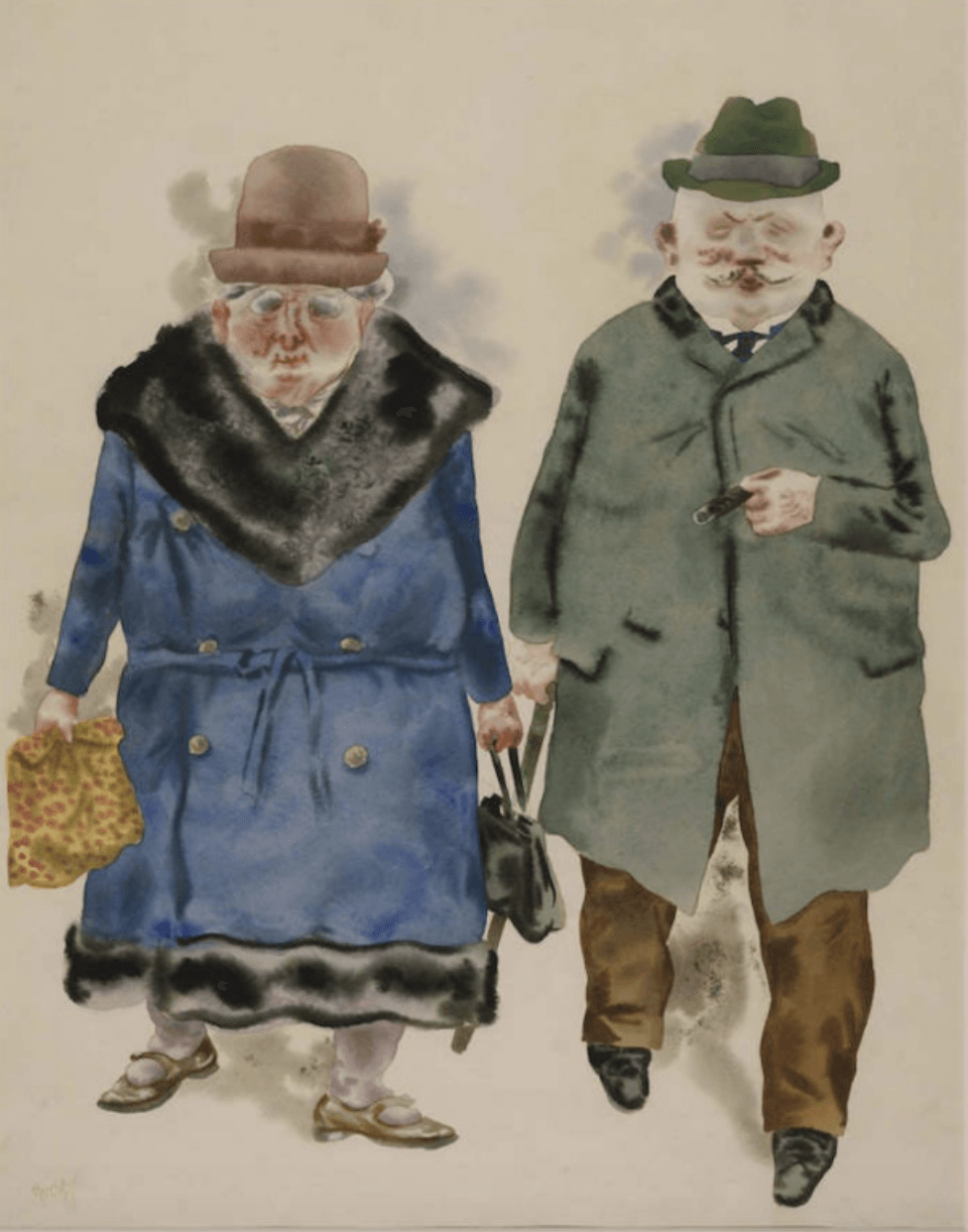
I really like how keeping the pencil makes the work look, and the effect it creates and I will definitely be looking into creating artwork like this myself in the future. A lot of the pieces that I really liked were created by using watercolour, and I really loved how this makes the images look, in particular in the ‘A Married Couple’ by George Grosz.

By using watercolour, it made the image look more fluid and softer, which is precisely how you would imagine old people are. Even though there is not much-drawn detail in work, you can picture what the couple was like just by the way the watercolour makes them look.

From this exhibition, I have definitely learned a new style of producing artwork that is less polished and clean. I am extremely interested in researching watercolour more and experimenting with in my own designs.