I next wanted to create Mockups for my Second Idea, I have decided to call the charity Just for You and the collaboration M&S X Just for you. The target market of the clothing that is sold in M & S is everyone would be between the ages of 21 – 39, but I think I could market it for all age ranges of people who have been affected by Cancer.
The idea aims to create an awareness campaign in partnership with M&S to launch a pyjama and loungewear range instore and online where 25% of the profits go towards building care packages for people who are going through Cancer. Each parcel will be personalised to the individual, specially selected based on what Cancer they have, what treatment they are having and what they like. This campaign aims to create awareness about cancer as well as supporting people that are going through treatment and helping them not only stay stylish but helping them keep their sense of individuality and dignity.
I have created Mockups of how I would want to brand ‘Just For you’ to look.
Logo
I really like the logo, I chose the colour of Blue because it has connotations with Calmness and Reliability. I used the Cancer Ribbons as inspiration but reimagined it in a heart shape with illustrates a love for the people that we would be sending packages to.
Website
I also created a mockup of the Just for you website ‘About us page’ I did this to partly see how I the brand might look online but also to help me explain what the brand is and to clarify it to myself without waffling. I’m not a huge fan of the website layout as I like it looks bland, I would definitely work on this in the future. But for helping me to clarify what my campaign is I found it incredibly use full.
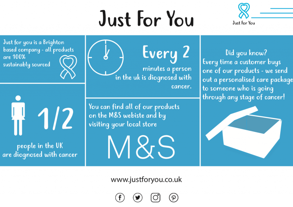
Poster
For the poster, I decided to create an infographic, as I wanted the poster to be informative as well as easy to read and appealing. I like the concept behind the poster but think If I do take this forward I would like to redo it and make the illustrations more detailed and use better facts.
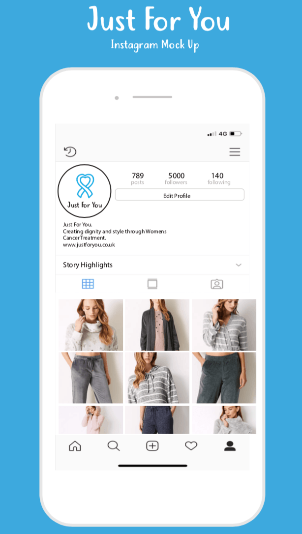
I really like my mock-up of the ‘Just for you’ Instagram page. my only note would be that I would use my own photography when I do it later on in the project.
M&S Branding
I also created the M&S branding that they would use to promote the brand as I wanted to try and create something that already has strict guidelines. I looked at another M&S branding from past collaborations to understand how the brand would illustrate and promote this collaboration.
Website
I really like my M&S website mockup, I think it really does look like something you would find on the M&S website. I only difference I would do is that I use my own photography in the future.
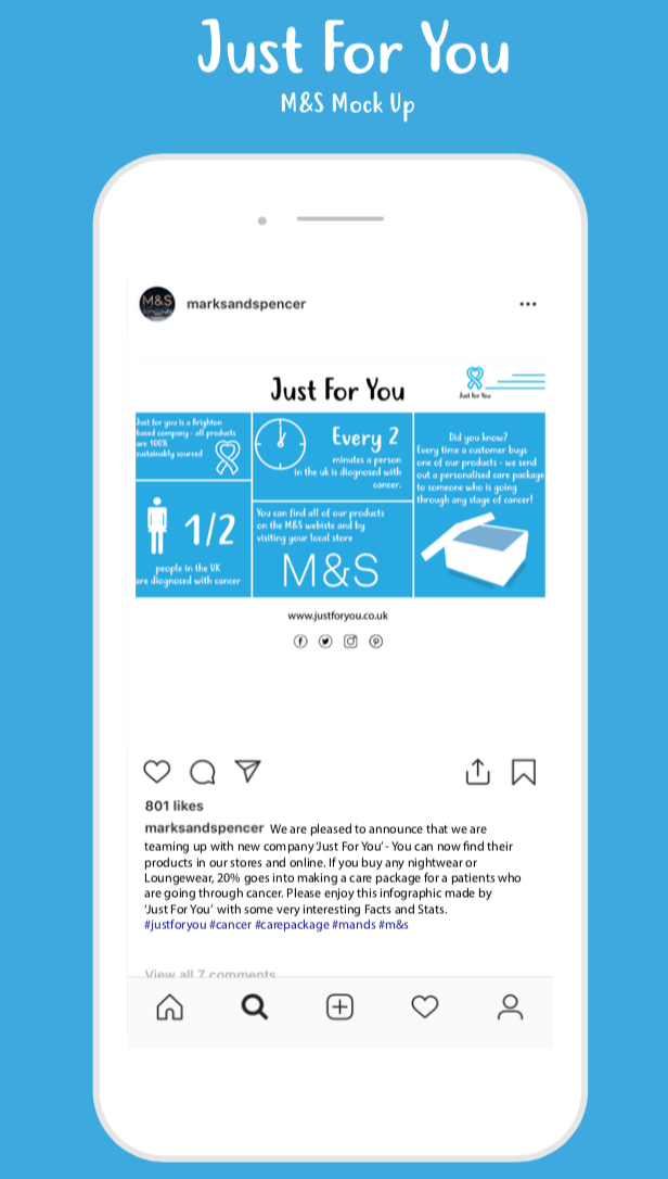
Social Media
I also created an M&S’s Instagram account to show how Marks and Spencers might post about it on its social media. It’s not my favourite mockup that I have created, and I would definitely redo this if I take this idea forward.


Dentistry encompasses a wide range of practices dedicated to maintaining oral health and hygiene. A prominent player in the field is Aspen Dental, known for its comprehensive services and patient-centered approach. aspen dental provides a variety of treatments, from routine cleanings to advanced procedures, ensuring that patients receive quality care tailored to their needs. The practice emphasizes preventive care and strives to make dental visits more accessible and comfortable. With its network of offices across the country, Aspen Dental plays a significant role in promoting oral health and addressing the diverse dental needs of communities.
Idea Jewelry” is a brand that embraces creativity and craftsmanship in the world of accessories. Known for its innovative designs, it focuses on sustainability by incorporating eco-friendly materials. One of its standout features is the use of tagua nut jewelry which is crafted from the seeds of the tagua palm tree, often referred to as “vegetable ivory.” This unique material is lightweight, durable, and can be shaped into intricate, colorful designs, making it a perfect choice for modern, ethical fashion. Idea Jewelry offers a stunning collection, blending nature’s beauty with contemporary style, all while supporting environmental conservation.