Statement Of Intent

As part of the requirements of the module as well as a Sketchbook and Press Release, I have to produce a Statement of Intent on what my chosen concept is for my Final Major Project. I have attached this document below.

Statement of Intent 

Statement Of Intent -2j2p3bt

I am happy with my idea and are looking forward to working on it in the future. I am now going to still focus on research for the time being and expanding my knowledge of cancer and campaigns more to make my work more rounded in the future. Overall I am happy with my work but did find that I ran out of time near the end of the mockups were not as good as I would have liked and I would have liked to research more on branding and typography more.

Final Idea and Press Release

After much deliberation, I have decided to choose the M&S X Just for you as my Final Project Proposal Idea. I feel very passionately about the concept and really think I could pull the idea off. I have made a list of the possible outcomes Ithink I could produce as part of my final piece.

The outcomes I want to achieve are:

  • Brand Pack Booklet
  • Campaign imagery for Collaboration with M&S
  • Launch Event Pack
  • Full operational website and social media for ‘Just for You’ and M&S Campaign
  • One fully produced Care Package

As part of my research Project, I have written a Press Release as if I was part of M&S to see how it would read I am quite happy with how it turned out and think it explains my concept well.

Press Release


Idea 2: M&S X Just for you

I next wanted to create Mockups for my Second Idea, I have decided to call the charity Just for You and the collaboration M&S X Just for you. The target market of the clothing that is sold in M & S is everyone would be between the ages of 21 – 39, but I think I could market it for all age ranges of people who have been affected by Cancer.

The idea aims to create an awareness campaign in partnership with M&S to launch a pyjama and loungewear range instore and online where 25% of the profits go towards building care packages for people who are going through Cancer. Each parcel will be personalised to the individual, specially selected based on what Cancer they have, what treatment they are having and what they like. This campaign aims to create awareness about cancer as well as supporting people that are going through treatment and helping them not only stay stylish but helping them keep their sense of individuality and dignity.

I have created Mockups of how I would want to brand ‘Just For you’ to look.

Logo 

I really like the logo, I chose the colour of Blue because it has connotations with Calmness and Reliability. I used the Cancer Ribbons as inspiration but reimagined it in a heart shape with illustrates a love for the people that we would be sending packages to.

Website 

I also created a mockup of the Just for you website ‘About us page’ I did this to partly see how I the brand might look online but also to help me explain what the brand is and to clarify it to myself without waffling. I’m not a huge fan of the website layout as I like it looks bland, I would definitely work on this in the future. But for helping me to clarify what my campaign is I found it incredibly use full.

Poster 

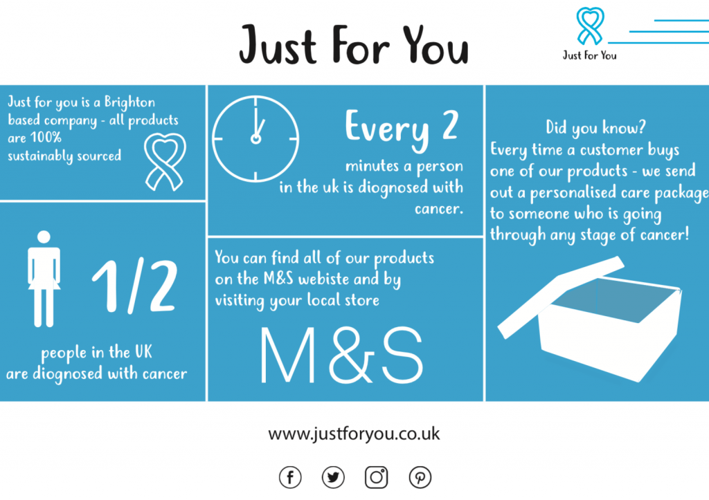
For the poster, I decided to create an infographic, as I wanted the poster to be informative as well as easy to read and appealing. I like the concept behind the poster but think If I do take this forward I would like to redo it and make the illustrations more detailed and use better facts.

Instagram 

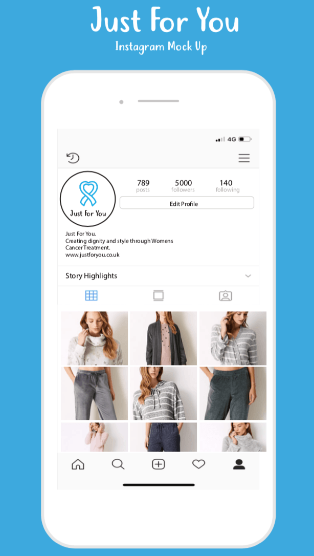
I really like my mock-up of the ‘Just for you’ Instagram page. my only note would be that I would use my own photography when I do it later on in the project.


M&S Branding 

I also created the M&S branding that they would use to promote the brand as I wanted to try and create something that already has strict guidelines. I looked at another M&S branding from past collaborations to understand how the brand would illustrate and promote this collaboration.

Website


I really like my M&S website mockup, I think it really does look like something you would find on the M&S website. I only difference I would do is that I use my own photography in the future.

Social Media  

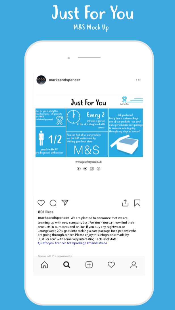
I also created an M&S’s Instagram account to show how Marks and Spencers might post about it on its social media. It’s not my favourite mockup that I have created, and I would definitely redo this if I take this idea forward.

Adaptable Co. MockUps

I have started creating mockups for what my adaptable clothing range for the elderly would be. I have decided to call the brand Adaptable Co. The target market for my brand would be men and women over the age of 70-75 who, who are having medical issues such as; Parkinson’s and Alzheimer’s. Also in my target market would be men and women who live in a care home, it could be either the care home themselves that get the clothing or the residents, the garment would allow them to dress themselves helping them to gain back their independence.

Poster

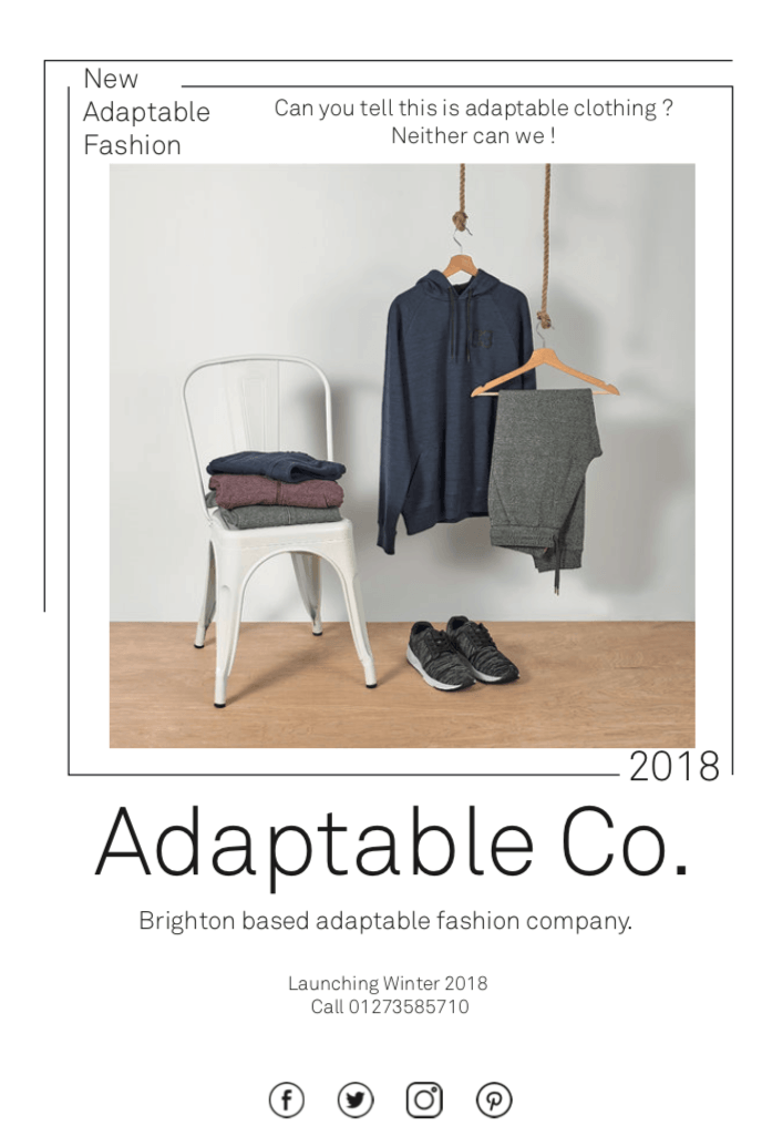
This is the mock up I have created for the poster, I really like the design I think it looks clean and straightforward as well as easy to read.

Website

I have also created a mockup website for Adaptable Co. I know that a lot of my clients won’t really use the internet, but their families do, and with an ageing population, I want my brand to last so in the future more old people will be computer literate, so the website is critical. The website is simple with just black and white imagery, if I take this forward I would want to work on the website more and make it more appealing and possibly add some colour.