RAF SIMONS .VS. GUCCI SHOOT

shoot3    shoot1    shoot2

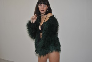
These are just a few examples of my final outcomes, unedited of course. Using various angles, which we didn’t get to see from the original designers – but we knew as a pair that outlining unique shapes and unusual poses, the images would be successful. As a pair, we are really proud of the outcomes. The clothing I had found all in my wardrobe so luckily, we were straight away motivated to start the shoot with a clear idea of the look we wanted. To improve this, I thought we could use some kind of backdrop from a Raf Simons shoot to project behind the model, and another improvement being – maybe showing the clothes in a different way, not just sitting on the body, perhaps hanging of the head or a shirt being worn on the foot.


TOM FORD 4 90S GUCCI .VS. RAF SIMONS 90S

I have now been told, for the first step of the project – I need to create an outcome from a photo shoot, which is adapted from two chosen designers/ stylists. I decided to use Raf Simons and Gucci in the 90’s – where Tom Ford was majorly involved. Raf simons seems to be a really good base to start for my styling project, his early menswear reflects my own style a lot now and I can personally revolve my look around his designs, especially for the shoot. 90’s Gucci is also a very similar style to my own, as I enjoy reflecting previous eras in my wardrobe trends as I think the 90s will always work in the cycle of fashion. The two designers seemed a like to me and I knew I could easily make them both connect through the eye of an camera, so to start linking the styles I made a mood board.


Consistently, I base my work on youth culture and the way adolescent hood works in the fashion industry. I noticed that both designers, whether at the time the clothing was showcased or not – seem to reflect was youth of today now, are really fond of – especially in bigger cities where youth culture is a major part of the social hood and environment.


LONDON DAY TRIP – FEMINIST AVANT GARDE & THE VULGAR

FEMINIST AVANT GARDE EXHIBITION @ PHOTOGRAPHERS GALLERY, LONDON

– I absolutely loved this exhibition, with every piece of work inspiring me and relating to a lot of my previous work. It showcased images from the 20th century, up until modern day – subtly highlighting the change or possible improvement (however you can personally take it), of the topic throughout the past years. Coming away with new artists that do seem to focus on personal issues that all women and teens my age face, and also leaving with iconic and famous pieces from artist’s such as Francessca Woodman and Cindy Sherman; Major influences in the photography industry. I felt really drawn to an artist called Renate Bertlmann, whom puts across a stereotypical world that is placed upon women in the 80s/90’s. This stands for typically a house wife – overall objectifying woman to be a carrier and a cleaner.


img-renate-bertlmann_151218600295_jpg_x_325x433_c


THE VULGAR, @ BARBICAN

– This exhibition focused on literal designs and clothing pieces from major designers throughout the past centuries. Ranging between Jean Paul, Alexander McQueen and Moschino, all the items were so influential and just amazing to see. Being able to physically examine the clothing that inspired me, meant my mind was constantly flowing with new ideas and themes for my final piece.

RICK OWENS LOOKBOOKS

rick-owens-lookbooks-layout-by-non-format-1b-600x398rick-owens-lookbooks-layout-by-non-format-2


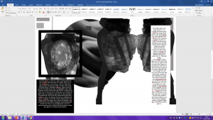
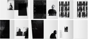
Somehow stumbled across the Rick Owen’s look books whilst searching for magazine influences and page layouts ect, where I immediately fell in love with the design. How precise and clean the pages are, really drawing you towards the main topic of every look. The colour pallet is also amazing – reflecting it in every dimension, relating every page to one another again. The whole concept of these look books are exactly what I aim to provide in the future, and especially has helped influence me into the direction of which look I want my magazine to portray. Hopefully, I will be able to reflect this into my own work but with my own originality and image.


FINAL OUTCOME DEVELOPMENT

img_4131-1 img_4137 img_4149

img_4154 img_4159

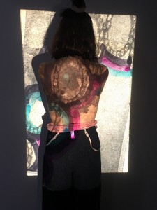
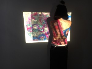
These are my photos from developing the original photographs of my chosen object, placing them onto acetate, adding my own addition of ink and repetitive colour pens and finally projecting them onto a body. I am happy with how they turned out, but really would prefer them in monotone, where the shades would be clearer and more apparent to the details. The next step will be to somehow edit these into my magazine – realistically in black and white, outlining a modern feel – like ID magazine.