Product Shoot

Now that I finally have all my products I want to start shooting them! I wanted to shoot all my products that would be going into my parcels separately, so then I could use them in my brand book. I shot my images in a lightbox, which I had never used before but after a while, I got the hang of it. Overall I am very happy with my outcomes and now want to start looking and shooting the parcels all together. As I shot a lot I have only put a few photos from the shoot on here.


Business Card Inspiration

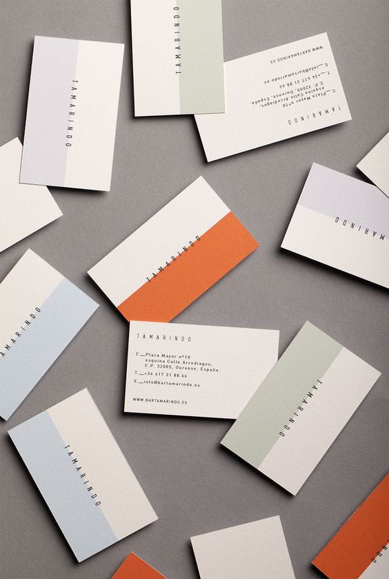
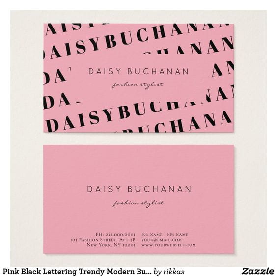
I have started thinking about my business cards I have looked online to try and get some inspiration. I have found myself drawn to business cards that are quite simple in terms of text but all use a lot of colours even if it’s only on one side or even half the card. I think it is important for the business cards to have as much information on me as possible, I want to include the links to my online portfolio, Instagram, email address and phone number so future employers have all the information they may need to contact me to hand. I have put the images below of the images that have inspired me the most. The next step is for me to experiment with my own designs.


Example Of Brand Books

I have been struggling to know what to put in my brand book, so I have been looking at some professional ones online to see what I should be including. My favourite ones are Skype, Coca Cola and Jamie Oliver.

Skype

I really liked the skype brand book as it was fun and bright, I especially liked their ‘Tone of Voice’ page and how they did a how not use there logo. I think doing this gives a clear example to people and also illustrates why those rules are there for a reason.

Coca Cola

I think the Coca Cola Brand Book was really professional, I liked the history of the logo’s and their typography pages. They also had a colour palette page with all the Hex codes and Pan colours which I think is a really important element to include in a brand book.

Jamie Oliver 

The Jamie Oliver brand book was probably my favourite one, I think the layout was really good and I really liked the logo do’s and don’t page, I definitely think I will be including this in my own Brand Book.

I’m happy I looked at example Brand Books as they have given me lots of ideas of how I want to lay out my own brand book.

Swot and Brand Positioning Map

I thought it would be important for me to create a SWOT of my company not only would this help me to get a better understanding of my company, but it would also make me aware of what I need to work on and how I could improve.

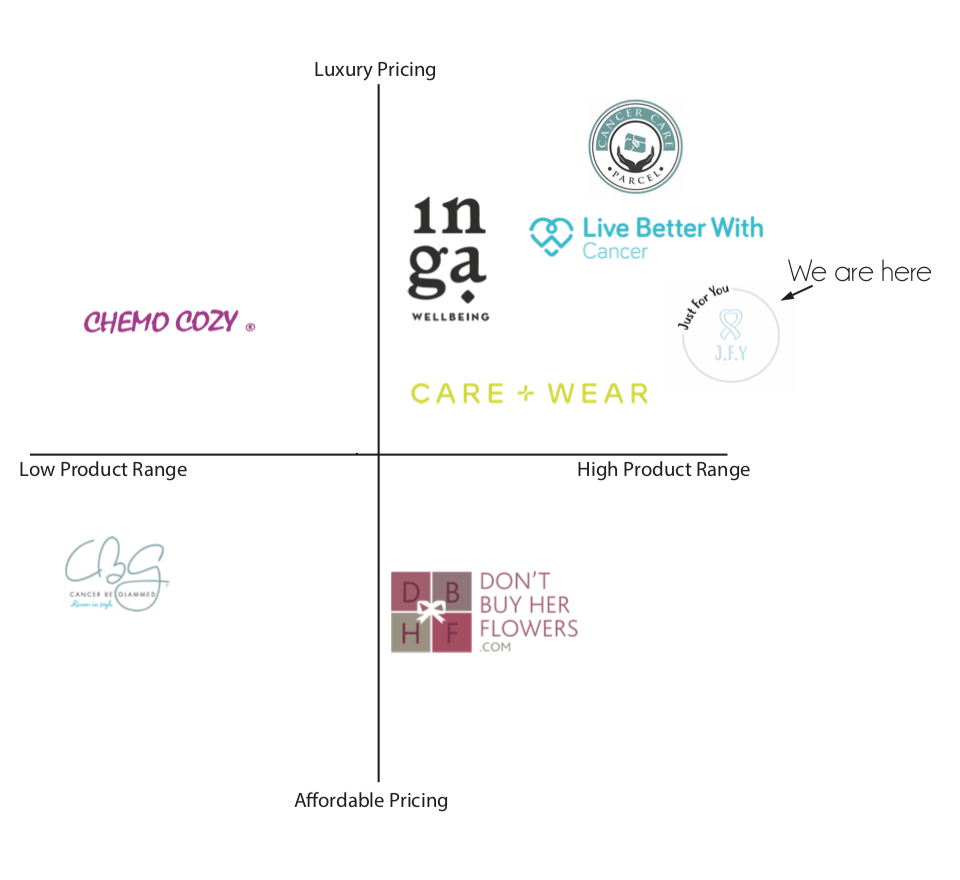
I wanted to do a brand positioning map as I wanted to see where I sat in relation to my competitors. As my concept is quite unique there is not really a company that does adaptable clothing and cancer parcels so I decided to put them both together. I am overall quite happy where I sit as I have a nice gap around me, I’m cheaper than most of my competitors and I would like to think my products are better than theirs as my clothing is fashionable and I offer more then a lot of them do.

Watercolour Clothing

I thought I would try and use the digital watercolour that I used for the Brighton illustrations. I used my patterns as inspiration for drawing the patterns used on these drawings, I made four illustrations but I don’t really like them, I don’t think they look professional enough to be on a website and don’t represent the clothing well enough. I do still like this technique but I just don’t think it works in this instance. I’m going to try and use the patterns I painted in my line drawings instead.


Slogans and Phrases

I want to include Slogans and Phrases on my designs, I want the slogans I use to be positive and inspirational but I want to also include some film quotes and songs as I think this would make the clothing personal and would be a nice add on if it is a gift for someone. I drew out some slogans and phrases that I thought would be nice on clothing, I tried to pick phrases that went across all generations so there is something for everyone.

I then scanned them onto illustrator and redrew them, the reason I used bubble writing was that I thought it would be the easiest font to read on clothing. My positive phrases are ‘Girl Power, Positive Vibes Only, All you need is love and You got this’. For the film and song quotes I decided to pick ‘Zig – A -Zig -AH from the Spice Girls song not only are they going on tour this year they are also very popular with 30-year-olds which are the younger side of my target market’ For the older generations I chose ‘ Nobody Puts Baby In the Corner’ from the popular 80s film Dirty Dancing and ‘Frankly, my dear, I don’t give a damn’ and ‘Tomorrow is another day’ from the film gone with the wind and are probably the most famous quotes of all time.

Patterns

I wanted to start putting patters into my line drawn clothing, I started by putting patterns I found online that matched my mood boards of patterns but I had the idea to create my own patterns. I used watercolour paints, watercolour pencils to create my patterns that were from my chosen fall winter trends. I focused mainly on Hearts, Polka Dots, Tye- Dye and Floral I found a cool technique that if I put salt on the paint before it dried it creates a cool tye dye look which was fun they create. I really enjoyed doing this and think they turned out well, I didn’t want my designs to be all my own so I am going to use some that are already online as they will add different textures to my work.