Advertising

I have recently been looking into advertising for Just For You, I know my main advertising route is going to be done online as I think that would be more successful. But I have made some posters for if we did do outside promoting, similar to our Instagram posts I would want our posters to be uplifting and positive as Cancer doesn’t have to be all sad and negative.

As my website had a subscriber element I have created Direct Marketing in the form of emails, I have created a few email mockups of what someone would get. I hope this helps to bring customers back if they have shopped with us before.


Social Media

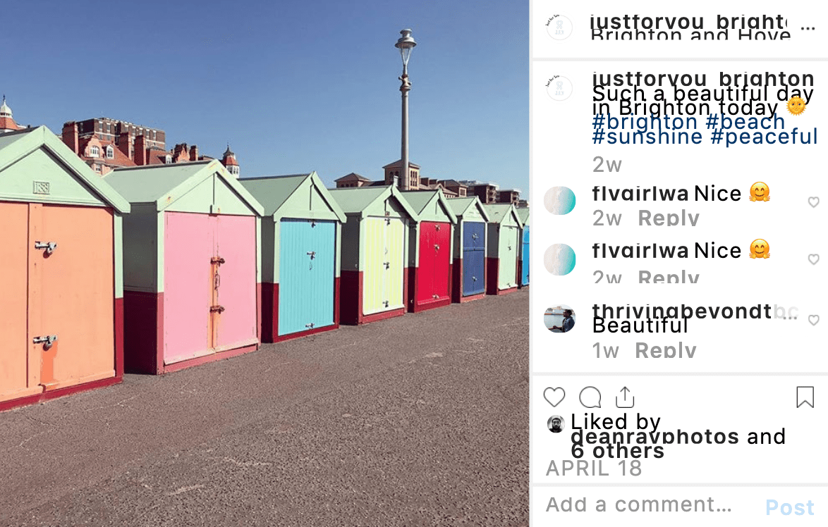
Social media is so important now for companies to have now, so I have created an Instagram account, Twitter Account and Facebook page for Just For You. Instagram will be the main platform that I will use as it’s a lot more popular than Facebook and Twitter. But I have created those accounts as I think it’s important to be in every social platform possible in order to reach as many people as possible. I want the content I post to be uplifting and positive as well as informative.


Website

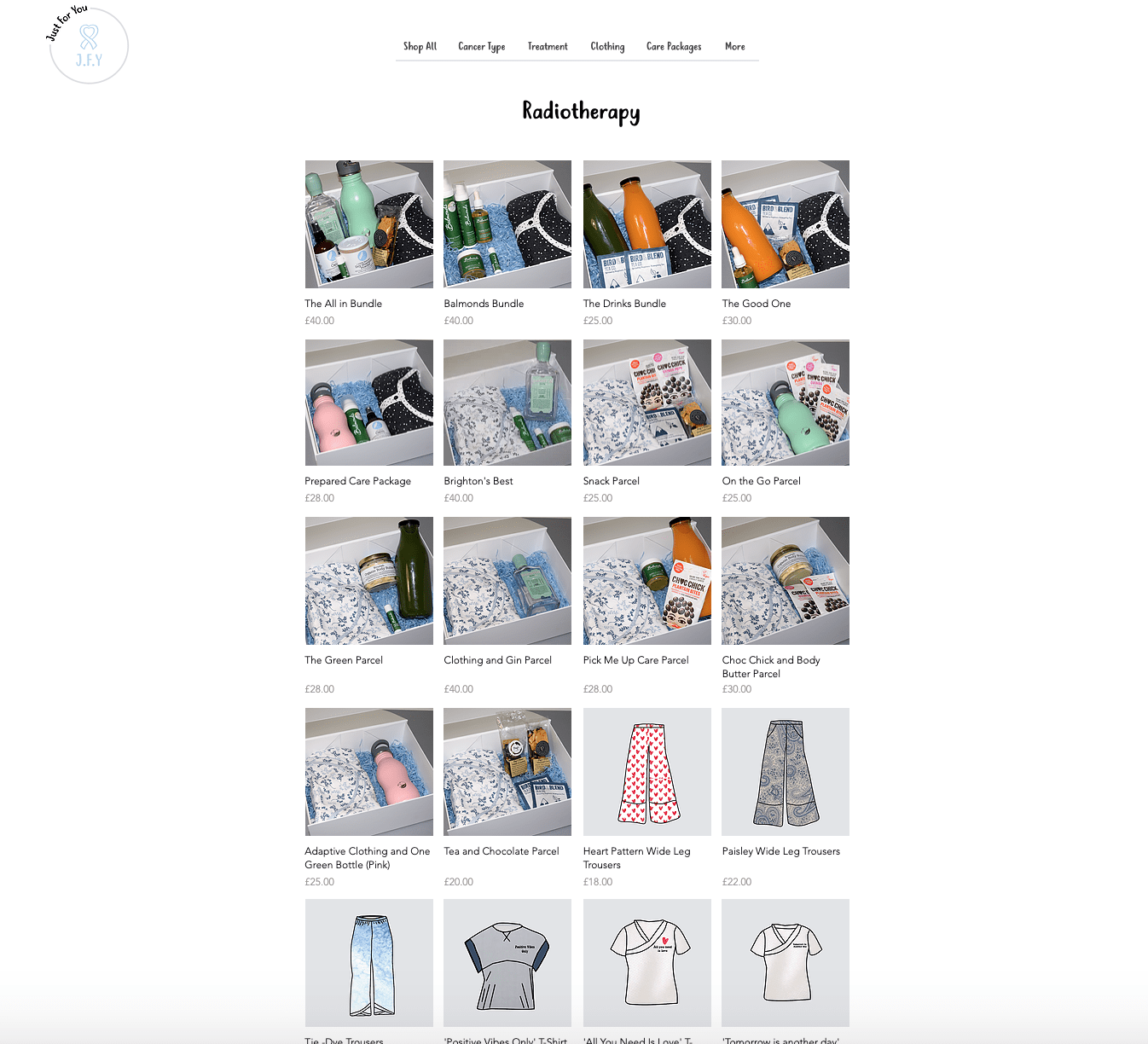
I have finally finished my website! I feel like it has taken ages, but it is finally done. I have created a fully working website from Wix and have brought the domain so it is officially on the internet. I wanted people to be able to search depending on what cancer they had and what treatment they were having so they could find what they needed quickly and with ease. I drew the Cancer ribbons for the most common cancers for women and drew out the symbols for Chemotherapy, Radiotherapy and Palliative Care for the treatment pages. Overall I am really happy with how it has all turned out and I’m happy that it is exactly how I imagined it to be.


Parcel Shoot

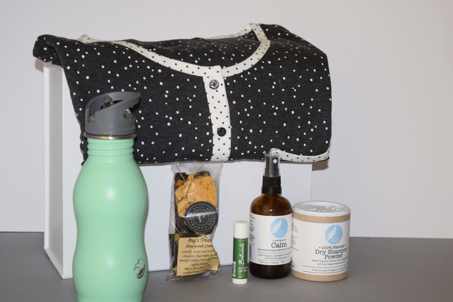
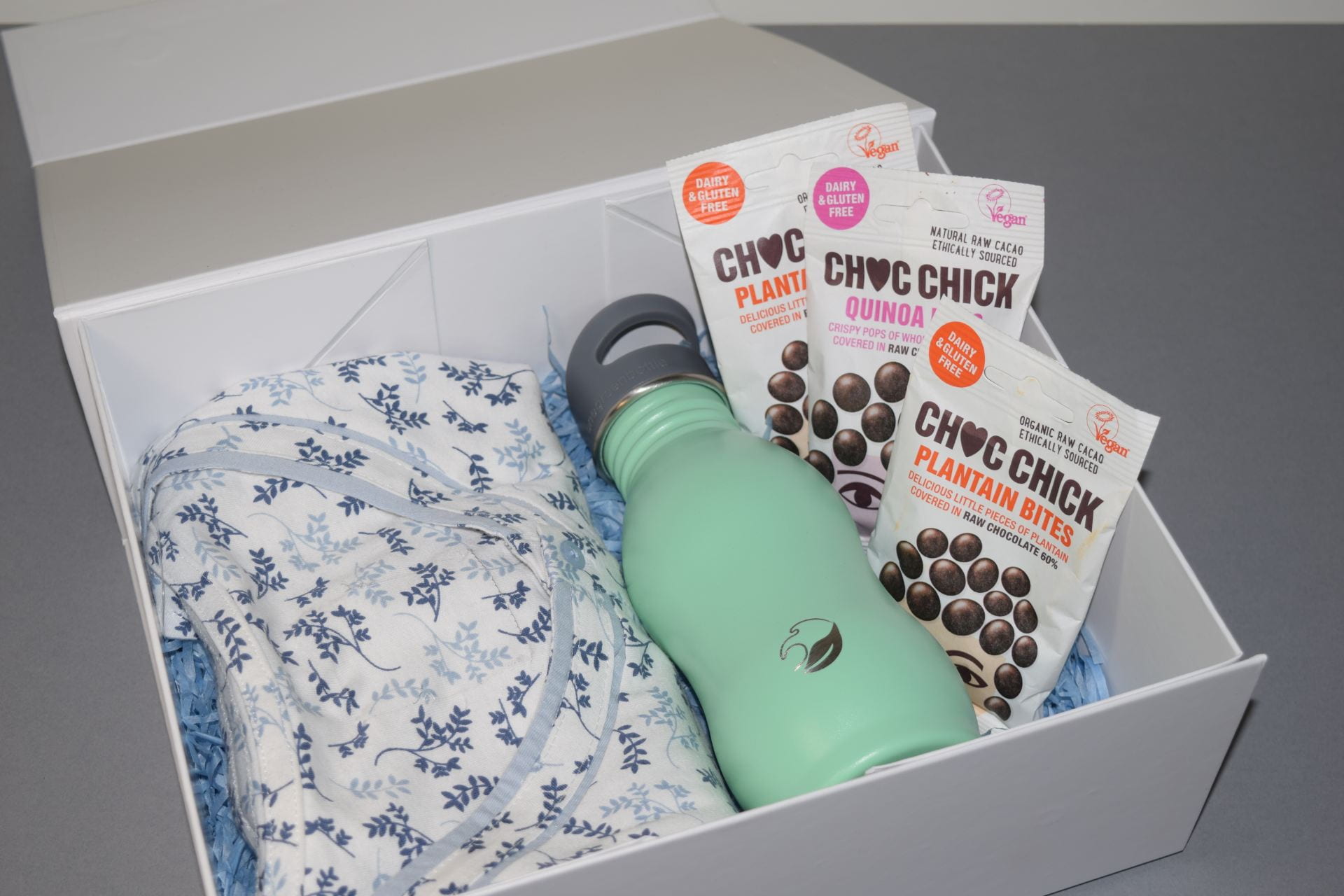
I also wanted to shoot the products in the parcel, as I think I need that to illustrate how the product will look. I brought a nightdress that was similar to my designs and has used that to illustrate where the clothing would be and how it would shoot. I also have chosen to use a white box as that is what I would want the parcels to come in. I took two shots one of them in the parcel and one with the contents out, I think I will need both the shots for the shop part of the website.

Product Shoot

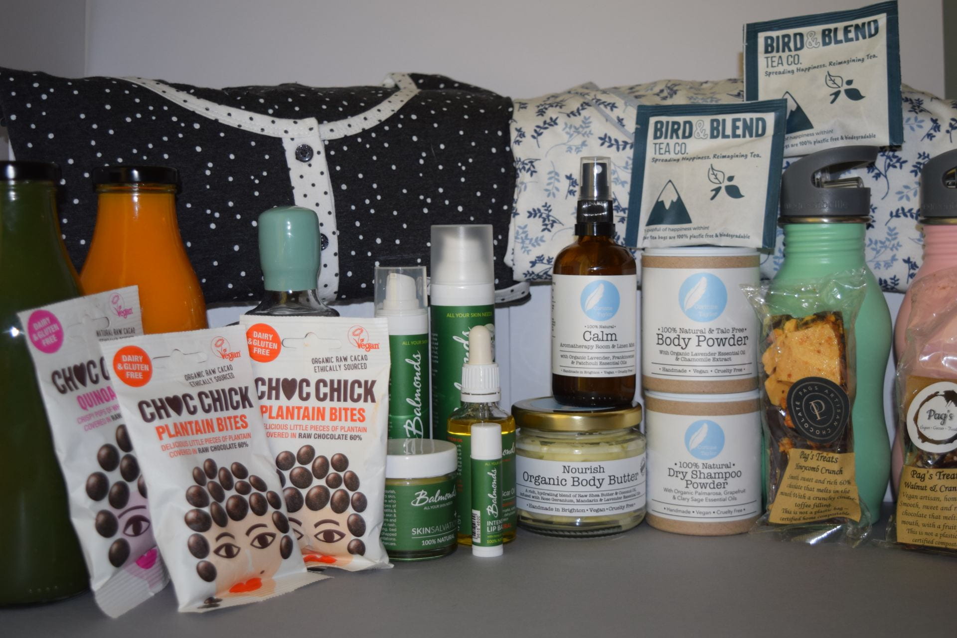
Now that I finally have all my products I want to start shooting them! I wanted to shoot all my products that would be going into my parcels separately, so then I could use them in my brand book. I shot my images in a lightbox, which I had never used before but after a while, I got the hang of it. Overall I am very happy with my outcomes and now want to start looking and shooting the parcels all together. As I shot a lot I have only put a few photos from the shoot on here.


Business Card Inspiration

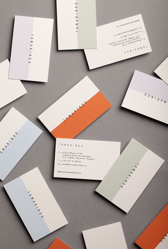
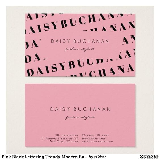
I have started thinking about my business cards I have looked online to try and get some inspiration. I have found myself drawn to business cards that are quite simple in terms of text but all use a lot of colours even if it’s only on one side or even half the card. I think it is important for the business cards to have as much information on me as possible, I want to include the links to my online portfolio, Instagram, email address and phone number so future employers have all the information they may need to contact me to hand. I have put the images below of the images that have inspired me the most. The next step is for me to experiment with my own designs.


Example Of Brand Books

I have been struggling to know what to put in my brand book, so I have been looking at some professional ones online to see what I should be including. My favourite ones are Skype, Coca Cola and Jamie Oliver.

Skype

I really liked the skype brand book as it was fun and bright, I especially liked their ‘Tone of Voice’ page and how they did a how not use there logo. I think doing this gives a clear example to people and also illustrates why those rules are there for a reason.

Coca Cola

I think the Coca Cola Brand Book was really professional, I liked the history of the logo’s and their typography pages. They also had a colour palette page with all the Hex codes and Pan colours which I think is a really important element to include in a brand book.

Jamie Oliver 

The Jamie Oliver brand book was probably my favourite one, I think the layout was really good and I really liked the logo do’s and don’t page, I definitely think I will be including this in my own Brand Book.

I’m happy I looked at example Brand Books as they have given me lots of ideas of how I want to lay out my own brand book.

Swot and Brand Positioning Map

I thought it would be important for me to create a SWOT of my company not only would this help me to get a better understanding of my company, but it would also make me aware of what I need to work on and how I could improve.

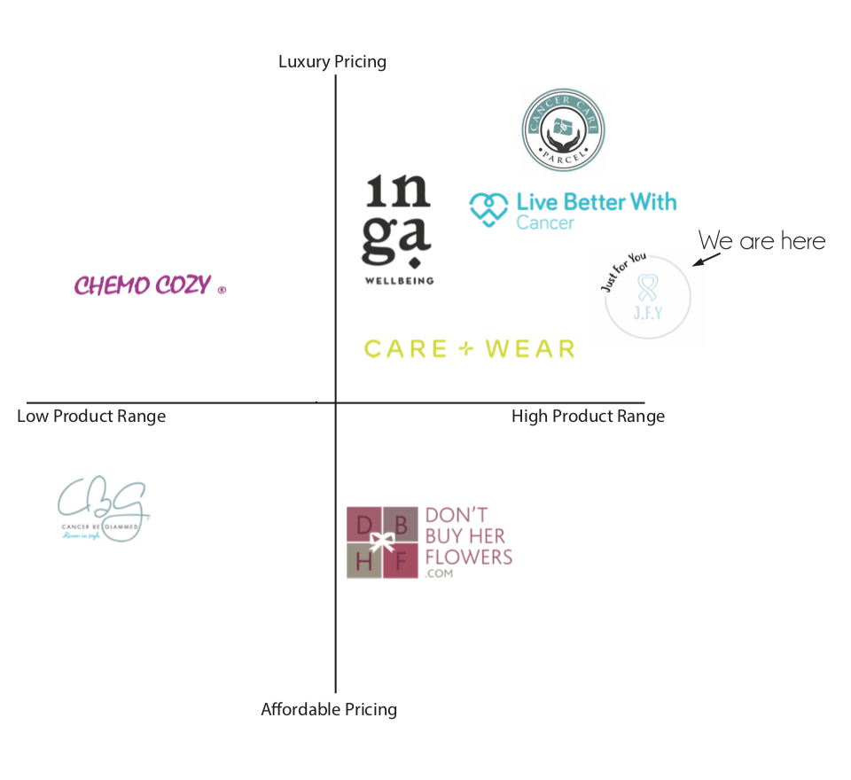
I wanted to do a brand positioning map as I wanted to see where I sat in relation to my competitors. As my concept is quite unique there is not really a company that does adaptable clothing and cancer parcels so I decided to put them both together. I am overall quite happy where I sit as I have a nice gap around me, I’m cheaper than most of my competitors and I would like to think my products are better than theirs as my clothing is fashionable and I offer more then a lot of them do.