LIGHTING & LOCATION WORKSHOP


WORKSHOP:

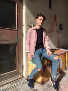
I simply used a white background and found black clothing to act as a contrast. We used natural lighting instead of involving studio fixed equipment and i think the images have a really nice, natural balance in them from doing so.

Also, location hunting – just playing around with various, appropriate angles that can possibly be used on an outdoor shoot and learning how to add dimension to a basic outfit through this.

LOOK BOOKS

FROM CHANEL, 90’s

FROM VERSACE, 90’s


FROM YOHJI YAMAMOTO, 2000’s


WHAT IS A LOOK BOOK?

A lookbook is a set of images from a designers new collection / range, assembled for advertising and marketing purposes.

Having never of actually worked on a look book or researched far into them, my initial and ideal approach to one would be to completely simplify and strip back the layout, focusing entirely on small, repetitive photographs which are taken from a designers  collection. To my knowledge, I’ve actually come across many more unique and playful ideas for a look book than i thought i would. I feel that there is a small line between the difference from a zine to a look book, so i will need to make sure I stay modernised in my approaches and also the photography involved.


BRAND DEVELOPMENT RESEARCH


Mac, founded in Canada, 1984 has now established a worldwide, multi-million make up brand – not only with their own ideas, but adapting upon themes such as comics or pop-stars, ones who are willing to promote themselves through the make up.

I think MAC could be a really interesting idea to develop and extend multiple branches from, specifically clothing. The specific campaigns and limited edition seasons I could focus on, as they all have so much background and stories behind them.

“Archie’s Girls” specifically, was the limited edition set in which the make up told the story of the typical ‘girl next door’, Betty, and her enemy, the colourful and outgoing, Veronica. I think this set could be perfect to adapt a possible clothing range on, with veronica in latex, leather and red and the other set possibly showing a more feminine side.

SAVE OUR QUEEN: HANNAH KUNKLE


I absolutely love the controversy based around these digital collages as the concept and style is completely what i look for with inspiration. Taking such an iconic figure to our generation, or at least a celebrity who’s life is nationally known due to 24/7 press coverage, and managing to obtain her in such a holy and certain way, I take as clever and knowledgable on how to interest the world today. I definitely want to use Kim Kardashian or a similar iconic figure within my zine now, possibly playing around on photoshop or illustrator as her as the queen.

YOHJI YAMAMOTO

A model on the runway at Yohji Yamamoto’s fall 2011 show at Palais de Tokyo.

Yohji Yamamoto appeared on my pinterest timeline when searching for inspiration for designs and styling for my shoot. I have seen little of his work before, but understand his iconic position in the fashion industry. What i thought i could take away from it, is the careless, oversized garments – with potentially the fun and evocative take on silk and lace.

ILLUSTRATION TECHNIQUE

Having a night in to practice and learn the basic skills on illustrator. I asked one of my tutors, Martha, today how you can create similar digital images to the ones that i have drawn up in my sketchbook. Playing around now with my graphic tab and little knowledge – i have created a few different designs from my original. The cherry is a playful take on the fruit, as to my generation this picture reminds me of my childhood and seems tacky and kitsch, perfect for my idea.

MASTERHEADS EXPERIMENTATION


Developing 3 main ideas for my final masterhead for the zine..

“Femme Forte” is a french word for ‘strong women’, which i thought would be perfect for highlighting my theme of hidden purity against hidden sexualisation. Relating a lot of my work to religion; virgin mary, nuns or the devil – I have always known i wanted similar, bold and basic text to the bible or another holy book. But I also liked the take on almost a french ‘romance’ font, reminding me of the moulin rouge film. Next I need to link my slogan to create a lock up.