
 Really happy with these outcomes. I think they all relate to one another, even in the subtle senses of styling and slight take on themes – and in particular, the lighting edit managed to come together well.. all thanks to photoshop! One improvement would be to add text to make it clearer of the album cover idea, which were my intentions initially. But, this proved quite a struggle due to our choice of compositions and locations for the images so i decided to finish them without, which i feel outlines a much more professional, magazine take on theme.
AD137
SHOOT 3
FINAL shoot completed!! Unfortunately, my final one doesn’t seem to look the best to me and I actually think it looks quite ‘cheesy’ now I have reflected back, and its not to my usual standard of work which is really a shame. But, a positive – I love the colour scheme and I think this in particular manages to pull together the theme of music, the theme of sexism and shows power of women through the compositions of each picture. Hopefully, editing the light balance and eventually adding our own take on the coloured lighting (we initially wanted to use inside the studio), each shoot will come together.
SHOOT 2
SHOOT 2 PREP
SHOOT 1

 These are a few examples of my first shoot – using location of the pier. This was the first, so didn’t show a theme of feminism or sexism within it obviously, but we simply aimed to firstly show the iconic style of the hip-hop industry. We wanted to use a non-evocative or sexual approach to the images to focus on this. We also knew that the future shoots we wanted to adapt to pink/ purple lighting, so used the bright pink lights of the theme park games to enhance this. I think this shoot went relatively well, but would rather keep my locational shoot focused on urban areas such as a basketball court or block of tower flats.
LOCATION HUNTING
Location wise, we wanted to show pink but also involve this urban theme. A basketball court we came across was perfect and really reflected the hip hop feel, but unfortunately lighting was so poor here and shadows were overtaking any image so we had to move on. What else we thought was typically the pier. Although we thought this seemed generic and knew a lot of others would have the same idea, the playful, theme park idea really did work. Also, by including subtle hints of money (used for wealth) in some pictures, it symbolises success for the women in the industry – again seeking irony of stereotypes.
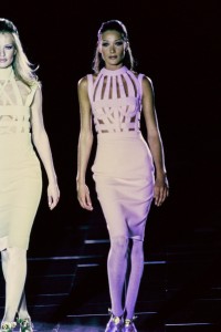
VERSACE S&M COLLECTION
I thought this collection could be useful just for enhancing my aim of showing the irony of objectifying women through the use of evocative style. Versace aimed to show all curves of the body through this collection, focusing on the beauty of women. The clothing provides a fetishes dream of leather, plastic and tassels – what else could a man dream of on a body? But whats unique about this, is the woman to seems to act proud of.
DAVID LACHAPELLE
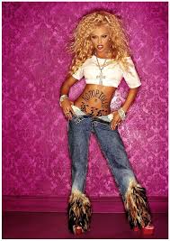
Following on from my initial starting of Lil Kim’s research, Ive come across photographer, David Lachapelle, who i know to be most famous for his images of iconic women throughout recent centuries. Little did i realise before, that Lil Kim was a major influential model for his photography and he helped to concentrate viewers on the rise of feminism through her pictures. I loved his colour palette and how he light-heartedly plays with the theme of feminism/sexism through this. He makes the issues in which women from this industry face, such as body / clothing problems, seem sophisticated and high-end – instead of the stereotypical evolvement. Im definitely going to try and achieve his style in my work so i can relate the hiphop industry between the two.
BITCH
Starting with my own depiction on youth and the culture it holds within each revolution, it has lead me to realise how many problems we face. Feminism, sexism and homophobia are major issues thats all generations of youth face, particularly in the 90s, and what better case to highlight for my work, than this hip hop music and the trends involved within it. Feminism and sexism are really effective topics and iconic cases within the industry, focusing on the term since the last 80s, the hip hop sectors have been accused of objectifying women and promoting abuse against their stereotype of the ‘Bitch’. But, even within these movements of the 21st century and the acceptance of many social groups, the industry hasn’t followed. Ive learnt that hip hop is entirely male orientated and females are exploited because of their clothing and confidence. I want to show the irony of these stereotypes for women in my finals, with the use of styling and playing on the theme of identity/hidden identity.
COOGI REVOLUTION SHOOT
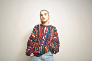
Leading on from Dapper Dan and the common fashion in 80/90s hip hop, I thought there would be nothing more appropriate than to make use of my own ‘COOGI’ jumper. Coogi was a brand established in Australia, which initially was made for golfers and high class men as such. But, throughout the rise of the hip hop industry – artists as big as Notorious B.I.G made the brand much more common and noticeable – (but still expensive at that matter). 