Year 1
GIF – click on image to show
PHOTOSHOOT
LIFE DRAWING SESSION 3
Developing skills on drawing correct facial structures and features, using a grid across the head. I found this so useful to my everyday drawing, especially as illustration is definitely a subject i want to look further into for year 2. The grid allows you to be correctly proportionate within the face, unlike my typical drawing where you base it on average and just your eye.
SAVE OUR QUEEN: HANNAH KUNKLE
I absolutely love the controversy based around these digital collages as the concept and style is completely what i look for with inspiration. Taking such an iconic figure to our generation, or at least a celebrity who’s life is nationally known due to 24/7 press coverage, and managing to obtain her in such a holy and certain way, I take as clever and knowledgable on how to interest the world today. I definitely want to use Kim Kardashian or a similar iconic figure within my zine now, possibly playing around on photoshop or illustrator as her as the queen.
NUN’S JUST WANNA HAVE FUN
YOHJI YAMAMOTO
Yohji Yamamoto appeared on my pinterest timeline when searching for inspiration for designs and styling for my shoot. I have seen little of his work before, but understand his iconic position in the fashion industry. What i thought i could take away from it, is the careless, oversized garments – with potentially the fun and evocative take on silk and lace.
LIFE DRAWING SESSION 2
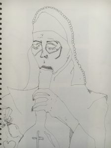
I have really noticed an improvement on my drawing skills throughout the past 2 lessons, also adapting a style for my drawing which at first I took as amateur and careless, is now a way that I really like to draw the body and clothing, including shapes instead of simple outlines. My faces are still not a strong achievement and hopefully, next lesson – I will understand how to simplify the features but also making them into my own, individual style.
LOCK UP IDEAS:
Looking into various slogans to place under my masterhead to create a lock up;
- Made by Satan
- She’s No Angel
- Revolution is Coming
- A Woman’s Nature
- Support Your Local Girl Gang
ILLUSTRATION TECHNIQUE
Having a night in to practice and learn the basic skills on illustrator. I asked one of my tutors, Martha, today how you can create similar digital images to the ones that i have drawn up in my sketchbook. Playing around now with my graphic tab and little knowledge – i have created a few different designs from my original. The cherry is a playful take on the fruit, as to my generation this picture reminds me of my childhood and seems tacky and kitsch, perfect for my idea.


