workshops
GIF – click on image to show
LIFE DRAWING SESSION 3
Developing skills on drawing correct facial structures and features, using a grid across the head. I found this so useful to my everyday drawing, especially as illustration is definitely a subject i want to look further into for year 2. The grid allows you to be correctly proportionate within the face, unlike my typical drawing where you base it on average and just your eye.
LIFE DRAWING SESSION 2
I have really noticed an improvement on my drawing skills throughout the past 2 lessons, also adapting a style for my drawing which at first I took as amateur and careless, is now a way that I really like to draw the body and clothing, including shapes instead of simple outlines. My faces are still not a strong achievement and hopefully, next lesson – I will understand how to simplify the features but also making them into my own, individual style.
LOCK UP IDEAS:
Looking into various slogans to place under my masterhead to create a lock up;
- Made by Satan
- She’s No Angel
- Revolution is Coming
- A Woman’s Nature
- Support Your Local Girl Gang
ILLUSTRATION TECHNIQUE
Having a night in to practice and learn the basic skills on illustrator. I asked one of my tutors, Martha, today how you can create similar digital images to the ones that i have drawn up in my sketchbook. Playing around now with my graphic tab and little knowledge – i have created a few different designs from my original. The cherry is a playful take on the fruit, as to my generation this picture reminds me of my childhood and seems tacky and kitsch, perfect for my idea.
MASTERHEADS EXPERIMENTATION
Developing 3 main ideas for my final masterhead for the zine..
“Femme Forte” is a french word for ‘strong women’, which i thought would be perfect for highlighting my theme of hidden purity against hidden sexualisation. Relating a lot of my work to religion; virgin mary, nuns or the devil – I have always known i wanted similar, bold and basic text to the bible or another holy book. But I also liked the take on almost a french ‘romance’ font, reminding me of the moulin rouge film. Next I need to link my slogan to create a lock up.
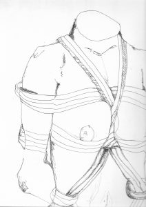
JOHN WILLIE INSPO DRAWINGS
STEPHANIE JOHN WORKSHOP
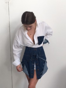
These are the most appropriate styling outfits I achieved to reflect the contemporary fashion of a white shirt. Thus workshop taught me to be creative and that to become noticed and successful in this hard working industry, the more unusual the better. The denim added to the outfits added a deeper dimension to the image, reflecting designers and brands like my previously mentioned ‘Commes Des Garcons’ or ‘Ashish Gupta’. By deconstructing each item, it allowed us to manipulate the norm and express what we, personally think should be seen in the modern day. 


