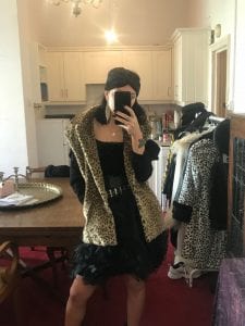
FINAL FILM COLLABORATION


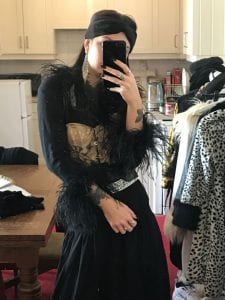
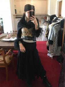
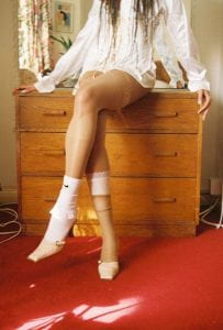
For the portfolio project, i have been collaborating with a graphic design student who had asked me to style for his final film. I was told to come up with 4 different outfits for 4 very avant-garden scenes. These are some shots i got of the outfits at the first fitting before the film was shot. I will post the link to the film also on here and i have created an entire sketchbook of research throughout the project which is on my USB hand in. Link :

  

PORTFOLIO IDEAS


After speaking to my tutors, we decided that the best way for a stylist to showcase their work, including my CV and business card, would be in the form of a box. I think that all my images should be blown up to a4 and then neatly wrapped in some kind of paper for a bit of protection. This would be good for me eventually, especially in my future career because i can easily access the images within the folder and change the order or take out / put in images.

MILAN


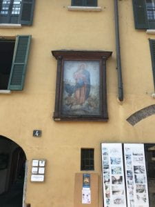
On my last day in Milan, I discovered a small town on the outskirts that was completely covered in old paintings, some resembling historic references and some i think just for fashion. This idea really stuck with me for portfolio and exhibition and i wondered if i could use this for inspiration for either one. The old frames is a main element i was really attracted to as i think they could effectively resemble a vintage feel, in particular, my theme of the Renaissance. This could be an idea for my exhibition especially where i hang my main images on a wall in various old, rustic frames.

ISABELA MARANT FALL 2017


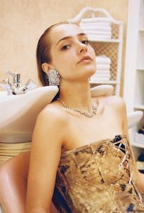
I found this runway to be most relevant to how i want my look outcomes to seem. The subtle blend of animal print with typical 80’s aesthetics is a favourite look of mine, particularly when adding this use of large shoulder pads within the suit jackets. The styling of each outfit prioritizes oversized accessories such as the large buckle belt and dangle diamante earrings which is an image i definitely aim to pursue. I think i should use the same animal print items throughout each look but in various functions or ways so that it looks like a running item that would be advertised in a magazine or editorial. Hopefully, this would make the images link to one another better and bring all the concepts together surrounding the idea of beauty standards growing.