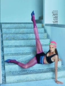
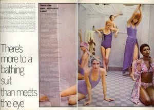
I am really interested in the styling used for this shoot which effectively depicts this idea of unconventional fashion and how it can be blended to upkeep a luxury image for an editorial. It showcases the elements i wanted to keep from the 1960s, of high cut swimwear and elasticated hats however using high end designers and evident current trends to modernise the theme. I believe that this style of fashion used against the style of photography resembles much of a futuristic sense especially with this sort of washed out, silver-toned background which isn’t something i actually want to be perceived from my photographs. Nonetheless, it can still contribute to helping me create this composition of specific layers and can be an idea on how to highlight each layer individually like the renaissance painting. There seems to be a running theme of contrasting colours for my research into swimwear ads and editorials, especially amongst the accessories. Maybe this could be filtered into my own styling techniques for the shoot, particularly with glasses, hats and shoes, although the contrast will have to be kept at a pastel scheme somehow. Additionally, the use of odd materials placed upon the body – specifically shown in the third picture – could be effective in highlighting this contrast and create barriers between the over use of pattern i am wanting to achieve and the block colour palette. This type of pvc or latex plastering wrapped round the ankle could be a great idea for re-building a standard sock or pair of tights too.
Month: January 2019
YO DONA MAGAZINE SPAIN 14
Again, these examples are needed to help me discover a strict style to the fashion i will use for the shoot. In particular, the effect of the high waisted swimwear and swimming caps used in a more modern light to fulfill maybe a sense of luxury instead of a common accessory that would have been worn conventionally in the 60s.
ELENA LV-SKAYA “DREAMER POOL PARTY”
Elena’s work is an obvious contemporary example of a luxury swimwear editorial. However, to be sure on the style of fashion that i want to maintain in my shoot i needed to look further into specific elements of the styling, including accessories. I am really interested in how she has styled the vintage swimming hats to match the outfits and is still able to fulfill this high end or luxury outcome by adding subtle accessories such as diamond earrings or vivid makeup. For the entire editorial, the colour scheme runs the same within each set of photographs and looks, where she sustains strong block colours in either the background, outfits or props. This idea could be fun to play around with in my own shoot to help link the photography to the renaissance painting but with a much more softer palette and could even highlight the element of pattern too as a contrast.
DAVID BAILEY VOGUE ITALIA
These are examples of Bailey’s 1960’s Vogue Italia editorials and reflect an image that i want to aim to portray in my own work in regard to his use of composition through photography and elements of the styling. Although the colour palette is a lot stronger and bolder than what i imagine my outcome to depict, looking at the actual styling and photography taken specifically from this era will be mostly effective in helping me to really pull through even the minor details into current day. From studying these images, i was immediately attracted to the contrast used within the swimwear and the tights, where the block colours actually tie together the entire image – creating evident layers within the photography. I have also looked closely at the style of swimwear used; which needs to be carefully thought about when choosing my clothing as there is a key difference in this trend and modern day bikinis. Underwired bra style tops matched with high waisted or high cut bottoms is a major trend from the 1960s and 70’s but possibly being paired with such extreme coloured tights, it might be able to jump into this idea of modernising these fashionable movements.
HELMUT LANG
SWIMWEAR
Further research for developing ideas surrounding the use of retro swimwear in my styling. Although Newton’s photography doesn’t show signs of the typical floral patterning i wanted to produce in my work, he is a photographer who has worked mainly with luxury fashion and these images showcase how he has handled swimwear in this spectrum. I thought it was best to look both into luxury and casual wear and how they are styled differently within the photography, particularly from the 1960s itself. I am really fond of clashing the vintage swimwear with completely unconventional and modern day approaches to relate the overall image to my personal style more and Newton shows examples of this by using swim hats with luxury jumpsuits and excessively long, pink hair. Portraying an unconventional image for my shoot will bring this concept and my final outcome of a magazine into the present day and complete the entire theme of the “modern renaissance”.
DEBORAH TURBEVILLE “SWIMWEAR”
This 1960’s swimwear shoot is the exact style i want to depict within my own work for replicating “The Birth of Venus”. How Turbeville has chosen locations of which really highlight this swimsuit style but creating them to seem much more high end instead of an everyday setting. The images caught my attention initially due to how many models were used for the shoot and additionally, how they were all positioned within the composition. I found how Deborah had used the models almost as layers within the picture to be mostly effective and something i want to consider when planning the shoot to enhance my use of posture, posing and positioning; taking reference from the Renaissance painting.
1960’s swimsuits have a very obvious style to them, along with use of coordinating cover-ups and swimming hats that typically have a floral or similar vibrant pattern to them. Using this era and the styling typically related to it will really help me pull through the theme of pattern balance and possibly, overly exaggerating the pattern. The swimsuits used in this shoot subtly match colourwise but also clash with shape and pattern and this is what i aim to depict in my work so my images are subtle in colour scheme but loud in design. I will also take the number of models showcased in each image to help create the characteristics from the figures shown in the original painting.
RINEKE DIJKSTRA “HILTON HEAD ISLAND”
The series of photographs are meant to depict the significance of heritage and nationality for young people so are taken where the female models are originally from. The relevance to Botticelli’s painting was actually accidental as the artist says, however, they are still relevant for my inspiration into how i can modernise the concept of the original Renaissance painting. The models pose in a certain way similar to Venus which accentuates their curves and overall feminine figures, with one model even holding her hair and leg exactly the same as Venus herself in the painting.
Obviously, the images also link to the painting through the location and use of water / sea, but i am particularly interested in the styling of swimwear. This is something i have never attempted before but could be a playful way of modernising the painting in my own style and incorporating ideas of the importance of the shell shown on the mystical sea. A typical style of mine is showing subtle sub-culture or specific eras within my styling and in this case, i could use links to a vintage trend and its take on swimwear- possibly 1960’s or 1970s – where extreme pattern is common and this way, respond to the character ‘Hora of Spring’ and Botticelli’s approach to pattern balance.
DAVID LACHAPELLE
BIRTH OF VENUS
David LaChapelle is worldly known for his use of a hyper-aesthetic within typically, luxury fashion and high fashion portraiture. Before creating this image, he decided to limit his style to fine art photography and less surrounding the world of commercial photography. ‘Rebirth of Venus’ is a perfect example of how a modern day photographer can recreate historic art, depicting the contemporary culture and fashion trends that surround us today – or at the time captured. Obviously, the composition and character like figures are re-invented to interpret possible modern-day subcultures, however, Venus’s posture and positioning in the middle of the composition remains the same. I am mainly attracted to the use of the conch shell and how it is being used as a horn. Maybe this is in replace of the shell that Venus originally is stood on in the Renaissance painting, but again, modernized and perceived in a unique way. Over exaggeration of the shell in a symbolic sense could be an interesting way to link the painting and my work together, so researching into the meaning of the different shells will be useful.
ORLAN “OCCASIONAL STRIP TEASE”
This series of images depicts a woman undressing herself from layers of fabrics to reveal her nude body in the same position as Venus from Botticelli’s painting. Orlan’s reasoning for the series is to challenge religious and social construction of the body and questions many similar characteristics from many other feminine figures in the history of art, not only Venus. It interests me because of how she has modernized and conceptualized such an iconic piece of historic art and replicated it within her own style of work. I should think that the materials that cover her body initially are then left around her on the floor to represent the shell Venus stands on in the ‘Birth of Venus’ and this idea could be blended with the role of the figure ‘Hora of Spring’ who holds a large throw to cover Venus’ naked body. The series is a good starting point for my research and development on posing and posture for my own models and how the artist has captured the movement in a series could be an interesting way for me to also show the curves and fluidity of Venus’ posture in a photographic sense.
VENUS
POSTURE, POSING AND COMPOSITION
Venus’ posture in the painting is the main element i feel would be most effective to adapt upon to help relate my own, original concepts to the initial image. From various artist reviews and websites, i have realized that how she is positioned is not only interesting to me but something many others have considered when analyzing the image as it is almost unbelievable. The characters and all meanings of the painting are fictional, however, it is interesting to challenge ideas of why Botticelli positioned Venus so improbable. I am really interested in how she so gracefully hides her nude body with her floating hair and hands but remaining in this unbalanced, disproportionate position upon the shell. Straight away, i knew i wanted to consider using this similar idea of posture and posing for my own models and alongside this factor, possibly incorporate ideas surrounding the shell and sea she stands on. Looking into similar posing to really take force of this idea would be most helpful going forward and possible editorials that use unconventional but relevant posing for their models should be a running theme for my research.


