STUDIO NEBO LOOKBOOK


Nebo is the designs of Oleysa Shipovskaya, who focuses the aim of the business to reflect modern trends and femininity, by providing oversized suits, large dresses and statement jewellery. I found this lookbook quite relevant to study because of the use of multiple models in a rainbow-like format that are showing off the new designs. The block colours of each two piece is then contrasted with a different block colour garment, allowing each outfit to bounce off one another. This helps create specific layers within the photography and allows the viewer to witness each outfit individually. In addition, how the location seems really stripped back and highlights the actual outfits for the lookbook is something i could consider – along with what i have discussed previously – to allow the 60s period to completely filter through.


COMPLICITE “EVERYTHING THAT RISES MUST DANCE”


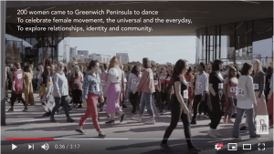
I felt that this was quite a nice example of performance art that was relevant to my idea. The idea was curated by Sasha Davies and shows various women meeting in one area to suddenly, one by one, dance in unusual yet stimulating positions. The overall concept was to celebrate women empowerment and their movement of relationship and identity daily. The posing they would place themselves in is useful to watch and understand for my concept as they play on this sense of exaggerated freedom and the expressions involved easily help promote this. The women’s’ bodies seem fluid and curvey from this which is exactly how i want my models to be to depict their femininity and gracefulness like Venus.

CORRINE DAY “LETS DANCE” 2004


Corrine Day has made full use of her composition in these images and again, relates back to Tillmans’ theme of freedom, carelessness and space. I really like how the choice of block colour on top of a black solid background emphasizes the contrast between each figure and helps create specific layers within the image. This is something i want to achieve for my shoot following the inspiration of The Birth of Venus as Botticelli also was able to create various layers and dimensions within the painting.

WOLFGANG TILLMANS FOR ID MAGA


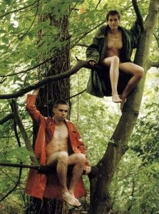
After my tutorial with Eloise, we thought this old photographic shoot by Tillmans for ID Magazine would be relevant in the discussion of positioning my models within my composition, because of how his created this sense of space and freedom within his images. Specifically, this image of the males sat in the tree – to me, it speaks of teenage freedom and carelessness and is really potrayed in Tillmans’ typical photographic style. After examining this, i have realised how freedom and space is a major theme in what i am trying to achieve so potentially looking into actual role play, film or theatre performances could be helpful in aiding me in an appropriate direction for type of mood i want to show.

MICHAL PUDEKLA PHOTOGRAPHY


Continuing to look into this form of film photography and photographic examples that could inspire me, Michal Pudelka’s editorial Numero became another priority. The styling and direction is obviously irrelevant, but the use of excessive models in a continuous form i felt linked to my idea and the previous example of Paloma Spain’s work. It has given me ideas on how i can use a layout for my models to make sure the composition shows the feature of styling, along with the period of the 60’s and then the link to the renaissance painting, being mainly Venus herself. I think that making story boards for the shoot could be most effective in making sure i develop this properly and so i can imagine how the layers within the photography will be. Not only this, but i can additionally play around with the positioning of the models and focus them on fulfilling a ‘Venus’ inspired role.


The merky and possible downtrodden background of which the editorial has been shot in somewhat reminds me of the Birth of Venus as it isn’t an entirely ‘sunny’ painting nor when you discover the meaning behind it too. Maybe quite a foggy backdrop – outside obviously – could work best in projecting the painting’s backdrop more into my modernised idea. This will also help highlight the soft colour palette that i want to be of a main focus, alongside the patterns that need to be prioritised through the styling.

ED FREEMAN “UNDERWATER” PHOTOGRAPHY


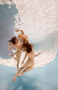
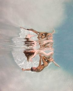
I came across Freeman’s work when developing research into how modern artists have taken influence from renaissance paintings in someway and cemented them into their own approach of work. Freeman’s approach here is meant to create and combine relationships and bodies in a gravity free environment to create shapes that would be impossible on dry land. The concept of his collection links to my idea because of his understanding of the impossible, however my work wants to attempt similar positions on dry land to meet the unconventional, as well as the femininity of Venus in the painting. You can immediately link many examples of Renaissance art with these photographs; the cherub like nature of the figures, the colour palettes and the sense of purity of which Venus depicts as a character. The sort of positions that are showcased in his images are much more exaggerated than what i would aim for as i need to focus mainly around Venus’ positioning and possibly the other characters in the painting; and neither have adapted posing like these. The colour palette is very useful to consider as it plays on this sense of romanticism or purity which is a theme i want to portray also. The variations of the skin and its texture is highlighted as a really beautiful form of photography because of his focus on colours.

CARLOTA GUERRERO


Carlota’s photographic work has a strict soft, pastel colour palette; which in someways showcases the stereotype of feminine or feminist photographic standards, where a religious glow effect is used throughout. Similar to photographer Petra Collins, Carlota plays on a sense of nostalgia and highlights this with her constant pastel palette which is a key factor i need to pursue within my own work. She shoots on film which i feel helps highlights the beautiful colours within her art direction, therefore film being a targeted style of photography for my shoot too. Not only this, but the way the models are positioned seems to highlight delicacy and romanticism – linking back to my perception of the Birth of Venus painting. I think the artist has actually taken a lot of inspiration from the painting itself, whether this be accidental, the obvious use of the open shell and feminine, nude body placed in it states this. The way the women are posed in each photo is something i want to take away from her style to help me portray Venus from the painting and place her in modern light. How they cover their nude body or show certain curves through the overlay of material seems so angelic and this is exactly how i want my models to be portrayed.


VOGUE JAPAN


The editorial here i found effective in portraying the 60’s through subtle styling, but mainly use of make up and accessories – an element of styling which i usually lack in. Make up can be a really influential technique for me in developing a strong 60’s aesthetic for my photography, whether the models are in swimwear or not. This will also allow my images to become much more editorial like and possibly more high end – aesthetically. Additionally, the make up and accessories of this period seem to be highly eccentric and bold, something that can bring out the outfits on the models much more and perfectly highlight typical trends of the era.

W MAGAZINE WITH STYLIST GIOVANNA BATTAGLIA


This example is an editorial taken from W magazine, really depicting the standard and obvious styles from the 1960s. The prints are wild and loud, somehow clashing with one another but acceptably matching at the same time which is definitely something i want my styling to focus around to recreate the pattern balance in the original painting. I feel that this style really gives off a typical english look and this could be fun to play around with to blend together Italian culture and my interpretation of the painting – being English myself. The actual colour scheme within the editorial is kept the same regardless of the pattern balance or clash, linking to the Birth of Venus as the patterns are different surrounding the ‘Hora of Spring’ figure but overlay various block pastel colours. The fourth picture additionally showcases typical 60’s swimwear with a subtle floral pattern, so going forward i need to start looking into swimwear that will be used for my shoot with possible overlayers or accessories to allow the style to become less of a basic swimwear ad and more conceptual or even just more unique to my styling technique.

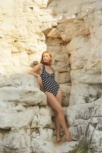
RIXO “ROMANCE IN REBELLION” LOOKBOOK


Rixo’s swimwear shows a perfect current trend that reinforces ideas of the 1960s period with designs of the underwired cup and highcut bottoms. It is also interesting to see the different patterns used for the swimwear as it showcases current pattern trends. To continue into my styling ideas, i should look into WGSN trends surrounding swimwear and even any subject revolving around vintage patterns to help me gain a stronger understanding on the style of swimwear or pattern type i will need to use in my styling.