FILIP Y KITO

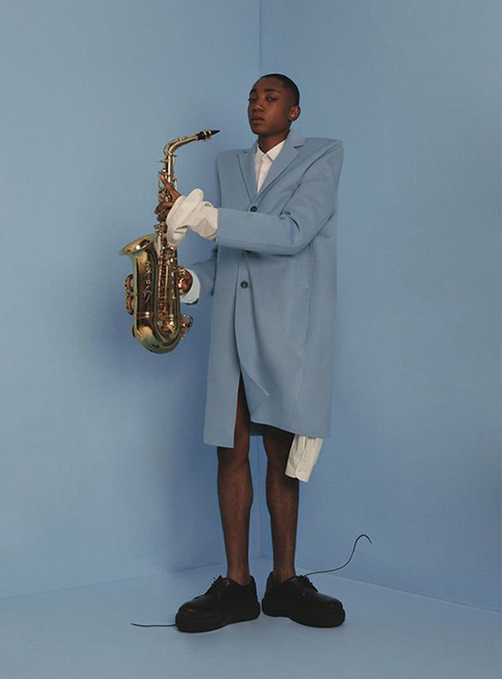
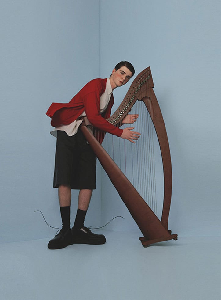
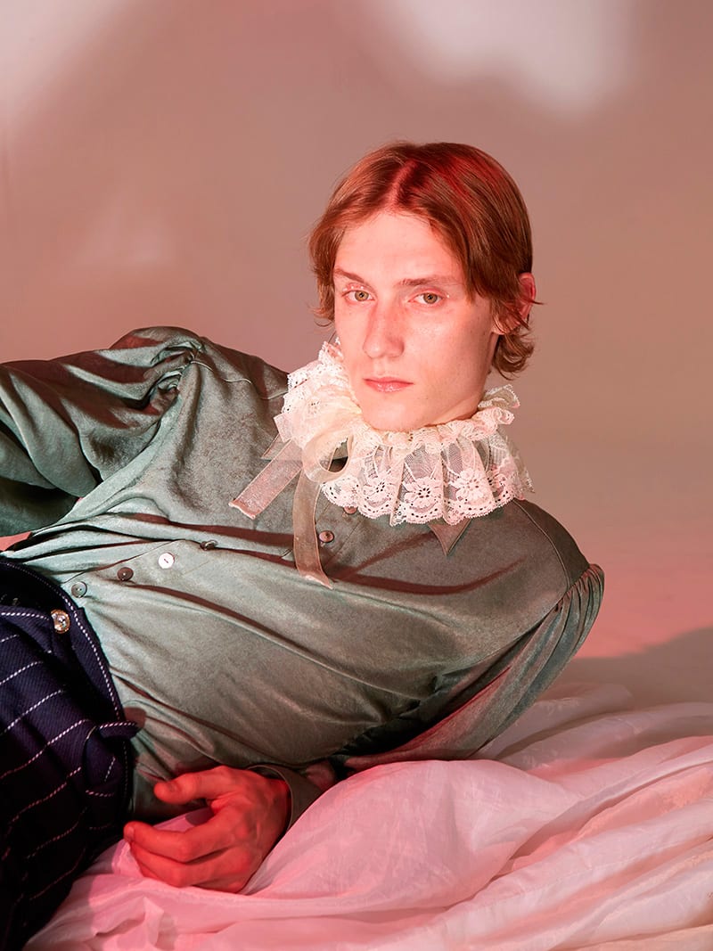
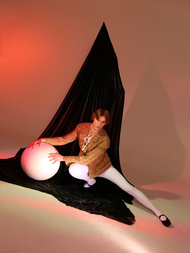
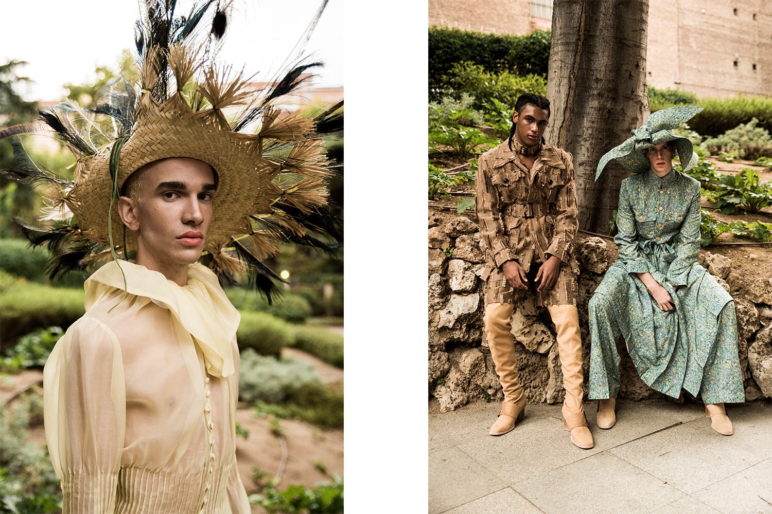
This shoot caught my eye with its use of prop and creativity towards direction; it almost looks like a cartoon-like or clay made figurine image to me. The props used link to this notion i have of symbolism and although they are a huge part of the actual composition of the painting, however do not over power the styling and actual story. Instruments could be a really useful tool to use within my photography similar to this to possible reinforce symbolistic items like still life renaissance paintings. I typically used various fruits and foods in my work last year to reinforce a concept for my styling, so adding different uses of props would be really effective.


This editorial interested me in the sense of its collaborative use of crop tops, chokers and over sized jackets. The styling is so subtle and really helps blend the fashion with the location / concept. However, it may be too “stereotypically modern” for my idea of the outcome for the shoot and could seem very forced; blend both male and female clothing but only using crop tops and choker necklaces?


GULLIVER’S TRAVELS – FXCKING YOUNG MAGAZINE

This is an editorial i found in ‘fucking young’ magazine which is meant to revolve around androgyny (which i disagree with anyway) but also shows many signs again of this sort of renaissance period styling. It is really subtle and completely compliments the rest of the outfit choices but still as a reader, it is very noticeable to me. I want to use this example throughout my project, not only the styling but i am really interested in the use of green screen and contrasting red lighting. I will only take from this shoot the sort of femininity and masculinity the model holds through his own features and through choice of styling. Genderless attributes is something i find myself becoming more and more passionate about and is an element of the fashion industry that i constantly take along with my own work. I am also going to look into the use of tights. It is rare to see a male in tights and as i know they are an accessory which is forcefully coming back into high trend, they could be effective in modernising the past era.


PALOMA SPAIN

Paloma Spain was an initial main research source for this advertorial. I knew i wanted to use a male model to run parallel with the renaissance painting, but with similar aspects of androgyny or gender neutral / non binary clothing as i feel in the painting, the clothing isn’t made apparent of male or female wear. Paloma Spain actually use very apparent cultural designs and similarly in these examples show signs of the renaissance or victorian looking wear, however completely modernising it with use of colour or fabric. Hopefully, i will be able to get hold of some Paloma Spain garments to use for this shoot, but if not, i will keep coming back to these examples to help me with the modernisation of the styling.       

KAREL DUJARDIN

BOY BLOWING SOAP BUBBLES

Before i further develop any research into this topic, it is best for me to state what painting i have chosen next to conceptualise and recreate in certain aspects. Boy Blowing Soap Bubbles is not only beautiful with its soft colour palette and clever use of colour balance, but it has a really interested meaning behind it which i feel could look amazing if done correctly. Allegory is the aimed meaning behind the painting, but if you wasn’t to look into the history, you would automatically assume it is just a happy boy floating on a perfectly drawn shell. It is made to represent transitoriness and human’s fragility; that our belief of what is around us is intangible and soon it will be gone. There are many  aspects of the painting of which is made to look “pretty” – the shell, the clouds, the waves – however these are all important factors showing how oblivious the boy is to his surroundings. The bubble he is standing on could pop at any moment therefore meaning he would fall into the sea. This isn’t so beautiful! There is also a lot of use of symbolism in the painting which is something i will further into – what do pearls or paintbrushes mean in the renaissance centuries?

GUCCI CAMPAIGN

Gucci has been quite an apparent source in my research so far and the brands current links to the renaissance or gothic-like sub cultures is really apparent for their clothing right now. I thought showing these as a researching point for my advertorial would benefit me later on as they are very constant and clever in how they market the brand. It is all very similar to the next or previous campaign but also completely different in the sense of location, styling, theme etc; but, it is always very Gucci. The choices of locations always fit effectively with the sub culture they are aiming to pass through making it even more relevant to the concept. Gucci is also a great example of how to introduce the past with the present through styling which is something very important to me when using my own styling techniques.


HELMUT LANG

I just wanted to show this to support my opinions on the previous Balenciaga post. Helmut lang again, uses a really unique concept to target the audience. Although it doesn’t focus on marketing the brands fashion, it portrays various individuals who all have a completely different identities, however linking to the brand in someway. To me, my immediate response to this campaign is that Lang is trying to show his audience; it doesn’t matter who you are, what you look like or what you do.. the brand can still be right for you.


ADVERTORIAL

BALENCIAGA ADS


I thought the best way to start researching into this shoot was to analyse and dip into other examples of advertorials that you could typically see in any magazine, high end or not. Balenciaga’s spring 18 campaign is always a favourite of mine; where they are made to be seen running from papparazi of some kind within the actual shoots. Brands like Balenciaga or Vetements i find really unique and inspiring when it comes to their marketing techniques and the direction is always really creative and personal to the brand. This is something that definitely needs to be considered when targeting a possible brand in my shoot because it needs to link with their concept, identity and audience.