

Based on the theme of bondage and purity placed together.
Based on the theme of bondage and purity placed together.

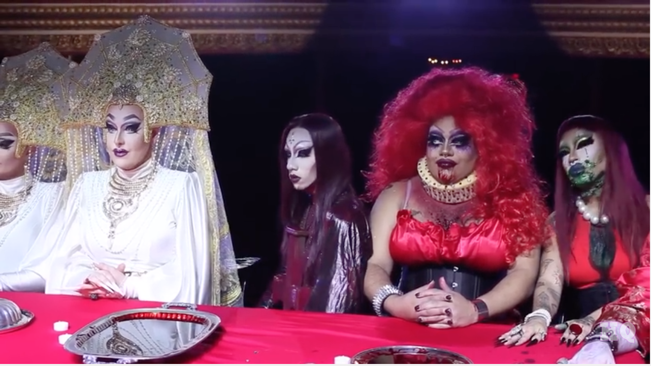
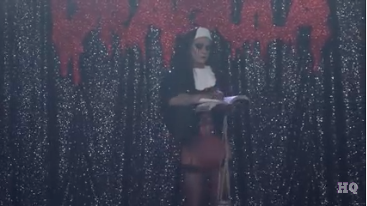
SCREENSHOTS FROM “DRAGULA / FINALE EP”
Wanting to look into the juxtaposition and contradictory of the theme of purity, i came across the TV Show ‘Dragula’, based on men in drag outfits which are typically based on a horrific theme. This one theme was ‘FILTH’ and encourage a drag in a nun’s outfit, carrying holy beads through the underwear and ripping pages out of the bible. I was really amused from this idea, completely contradicting the idea of a nun and the religion within. Adapting on my theme of purity, I will start to look into the contrdicatory elements – possibly bondage, or even based my illustrations on these nuns!
contrast:
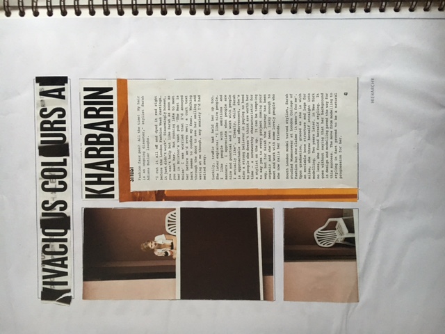
hierarchy:
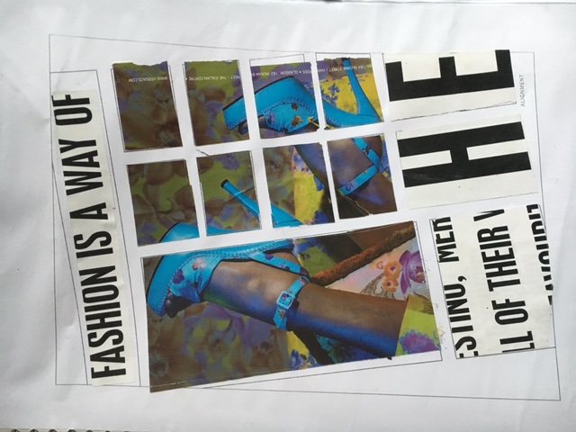
alignment:
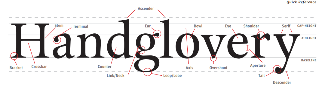
HANDGLOVERY – The correct anatomy for proportion of type!
Looking into typography and various titles for our zines; i discovered the 5 main elements to a magazine page, which actually involve the type of text used too. These being;