ZINE RESEARCH

A zine is typically a short magazine, in which is a visual use to subtly advertise a brand or even to simply express a theme of choice. Fan Zines are also a popular take on fashion communication for my generation and entire upbringing really; allowing a theme to be opened and spread across a specific target audience.

EXAMPLES OF ZINES AND THEIR LAYOUT:


VIDEO / FASHION INPSO

Furthering looking into the concept of Virgin Mary and how does modern day approach her and the religious beliefs for christianity / catholicism  – I found the singer ‘MO’s’ new chart hit and video which Virgin Mary appears in a very unique and VERY recognisable way for teens of my generation. Kim Kardashian painted as VM on the wall behind the singer brings a light-hearted but powerful take on the religious star, bringing two iconic people together as one (ones which are so very different!). I think this plays on the theme of feminism and showcases a question of ‘why does having a bad and opinionated background make you any less of a saint?’ (for Kim K that is if you understand her past in the media). Also, the VM is shown subtly constantly throughout the video through choice of clothing – the black head band / hat and the white, quilted over-coat acting similar to an angels outfit. The idea of black clothing contrasting to the white both within the video almost reflects my idea of opposites and how i would want to show innocence and purity against rebellions.

GUSTAV KLIMT


Gustav Klimt; who else better look at for when it comes down to feminism and the many stereotypes of women? I absolutely love his work, the colours and patterns mainly taking my interest, but – the themes of many of his female paintings relate strongly to my previous post of Soasig Chamaillard and her take on the Virgin Mary. What i have noticed about his work is that there is always a valid point and theme made within his paintings, whether it be sexuality (top right), prostitution (top left) or power of women (middle). But, the specific relation here is the Virgin Mary he captures in his own terms; this time called a Madonna, who he painted to resemble a prostitute. The idea may be harsh upon women, but the controversial theme of modernising and changing the role of someone superior to something much more relatable to our generation is clear. This also influences my next steps on choosing the theme for the project, so perhaps Klimt’s work could lead me into the direction of the theme of purity and its opposite.

INITIAL RESEARCH FOR THEME OF AD138

SOASIG CHAMAILLARD


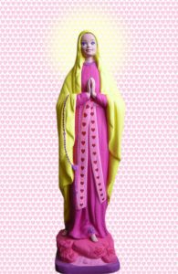
Coming across Soasig’s work a while back now on pinterest when starting my development research for themes within feminism and I have just remembered how interesting and almost relevant these sculptures were to me. I have always been so fascinated by religion, and most importantly, Virgin Mary herself (even having a tattoo of her on my arm). This artist plays with old, broken statues in which she has found in garbage sales, car boot sales and even her own parents unwanted belongings. Soasig re-interprets the original design, to reflect much more of a contemporary look for the Virgin Mary, obviously causing much uproar throughout religions and their beliefs. What i mainly love about these pieces, is that she manages to relate something that a younger generation at this time may no little about, especially if they are not from a religious heritage and they show open and new ideas for what the real belief for a Virgin Mary could differ to be. I really feel like the concept of this artist’s designs can lead me far in developing a theme for my project; possibly basing it on;

  • Religion, as a whole
  • Feminism (maybe quite typical and predictable)
  • Innocence.. ; like this idea a lot as I can play on the idea of purity and the opposites
  • Deceiving (not all is what it seems) – played through the role of feminism

FINAL OUTCOMES

           Really happy with these outcomes. I think they all relate to one another, even in the subtle senses of styling and slight take on themes – and in particular, the lighting edit managed to come together well.. all thanks to photoshop! One improvement would be to add text to make it clearer of the album cover idea, which were my intentions initially. But, this proved quite a struggle due to our choice of compositions and locations for the images so i decided to finish them without, which i feel outlines a much more professional, magazine take on theme.

SHOOT 3

FINAL shoot completed!! Unfortunately, my final one doesn’t seem to look the best to me and I actually think it looks quite ‘cheesy’ now I have reflected back, and its not to my usual standard of work which is really a shame. But, a positive – I love the colour scheme and I think this in particular manages to pull together the theme of music, the theme of sexism and shows power of women through the compositions of each picture. Hopefully, editing the light balance and eventually adding our own take on the coloured lighting (we initially wanted to use inside the studio), each shoot will come together.

SHOOT 2

Really in love with this shoot and so happy on how it turned out! I think the lighting could be improved but despite the constant technical problems we had with different cameras and the entire studio within our time, i feel we made it work.

SHOOT 1

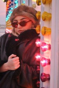
unspecified-29    unspecified-41 These are a few examples of my first shoot – using location of the pier. This was the first, so didn’t show a theme of feminism or sexism within it obviously, but we simply aimed to firstly show the iconic style of the hip-hop industry. We wanted to use a non-evocative or sexual approach to the images to focus on this. We also knew that the future shoots we wanted to adapt to pink/ purple lighting, so used the bright pink lights of the theme park games to enhance this. I think this shoot went relatively well, but would rather keep my locational shoot focused on urban areas such as a basketball court or block of tower flats.

LOCATION HUNTING

img_4686       img_4699

Location wise, we wanted to show pink but also involve this urban theme. A basketball court we came across was perfect and really reflected the hip hop feel, but unfortunately lighting was so poor here and shadows were overtaking any image so we had to move on. What else we thought was typically the pier. Although we thought this seemed generic and knew a lot of others would have the same idea, the playful, theme park idea really did work. Also, by including subtle hints of money (used for wealth) in some pictures, it symbolises success for the women in the industry – again seeking irony of stereotypes.