Lithography, Session 7: 20/03/18

After being inspired by our trip to the Tate Britain last Tuesday, I was excited to finish my print off and see how I could further improve it.

The first challenge of the day was figuring out how to register my paper in line with my second print, this was a challenge but was easily overcome. I used acetate to print the second print over, next without moving the acetate (through placing masking tape) line up the already printed first layer print against the acetate print layer. Even with one print on acetate you could tell that the blue and yellow layer were going to overlay into a green which I was really pleased with.

I mixed a blue ink with ease, and although it took a couple of overprints it came out well and was transparent enough to let the yellow shine through. I’m really pleased with how the planned main print came out, the blue layer really completes the whole thing and makes the story come together. However, with inspiration from Rauschenberg’s prints I couldn’t help but think that another layer of predominately mark making over the top of the prints as an experiment would be a way to push my practice further.

Lithography, Session 6: 13/03/18

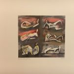
To broaden our understanding of lithography and help the growth of our personal prints, we investigated a selection of prints from the private print rooms at the Tate Britain. These prints spanned across many different process methods, time periods and styles, it was interesting seeing them all together and making comparisons. Earlier lithographs, especially those created during the war, were more realistic and accurate using the dramatic quality of a lithograph to achieve stunning portrayals of planes catapulting through the air. These captured the atmosphere and narrative of wartime which appealed to British propaganda.

However, as the time periods moved on the lithographs utilised colour to present sprawling landscapes, and later still employed textural mark making and simplicity to create abstract work. Lithography became less of a method to record and more a method to express in which way the artist felt fit.

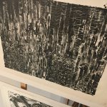
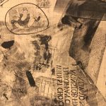
My favourite piece from the private exhibition was by Robert Rauschenberg, it was a monochrome collage using photographs, drawn graphic symbols, text and many other pieces of reclaimed imagery composed on top of graph paper. The effect is curious, its reminiscent of a newspaper but without rational. Similar photomontage pieces by Rauschenberg are described as having “a loose, poetic manner, creating an impression of visual flux that allows the viewer to free-associate” (Tate Text Panel on Almanac 2004). I think this is a fitting description of the lithograph as its use of printing medium allows layers of memorabilia and memories to be caked on creating confusion and wonderment in the viewer. This method has inspired me to create a third layer on my print and to experiment with my prints further.

Lithography, Session 5: 06/03/18

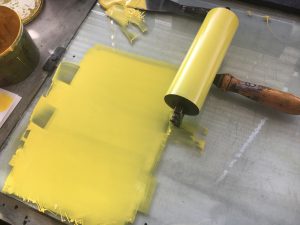
For this session I had the opportunity to begin inking my first colour onto the plate, this was a step I was really looking forward to as I was growing conscious that my plate would print differently to how I imagined. However, I stuck with my plan to use contrasting colours which would create a colour in the overlays. Therefore, I mixed a pale yellow up – the mixing process was easier than I imagined. I used an opaque white to create a strong base which would contrast the white paper.

The printing method was a quick progress, the plate must remain wet while inking up the plate on the bed of the roller. I found that watching the ink settle into the green photolitho plate was satisfying. The yellow ink came out how I imagined but didn’t have the impact I wanted. I hope that once I eventually put on the second layer of blue it will have more depth to it and compliment the composition.

As part of the session we swapped colours with the partner we were working with on the roller, so I got the chance to use a pinkie red colour which really showed the detail better. I enjoyed the look of this colour more in many ways.

Also, as part of the session we were encouraged to investigate printing with photocopies, I’m looking forward to trying this method as I think it will create a more haphazard print which has an authentic quality. I’m hoping that I will be able to work over my planned print with one of these to create a contrast between the rational and irrational.  Furthermore, these work well with using collage and building an image which I think would work well to make a looser and busier print.


Lithography, Session 4: 27/02/18

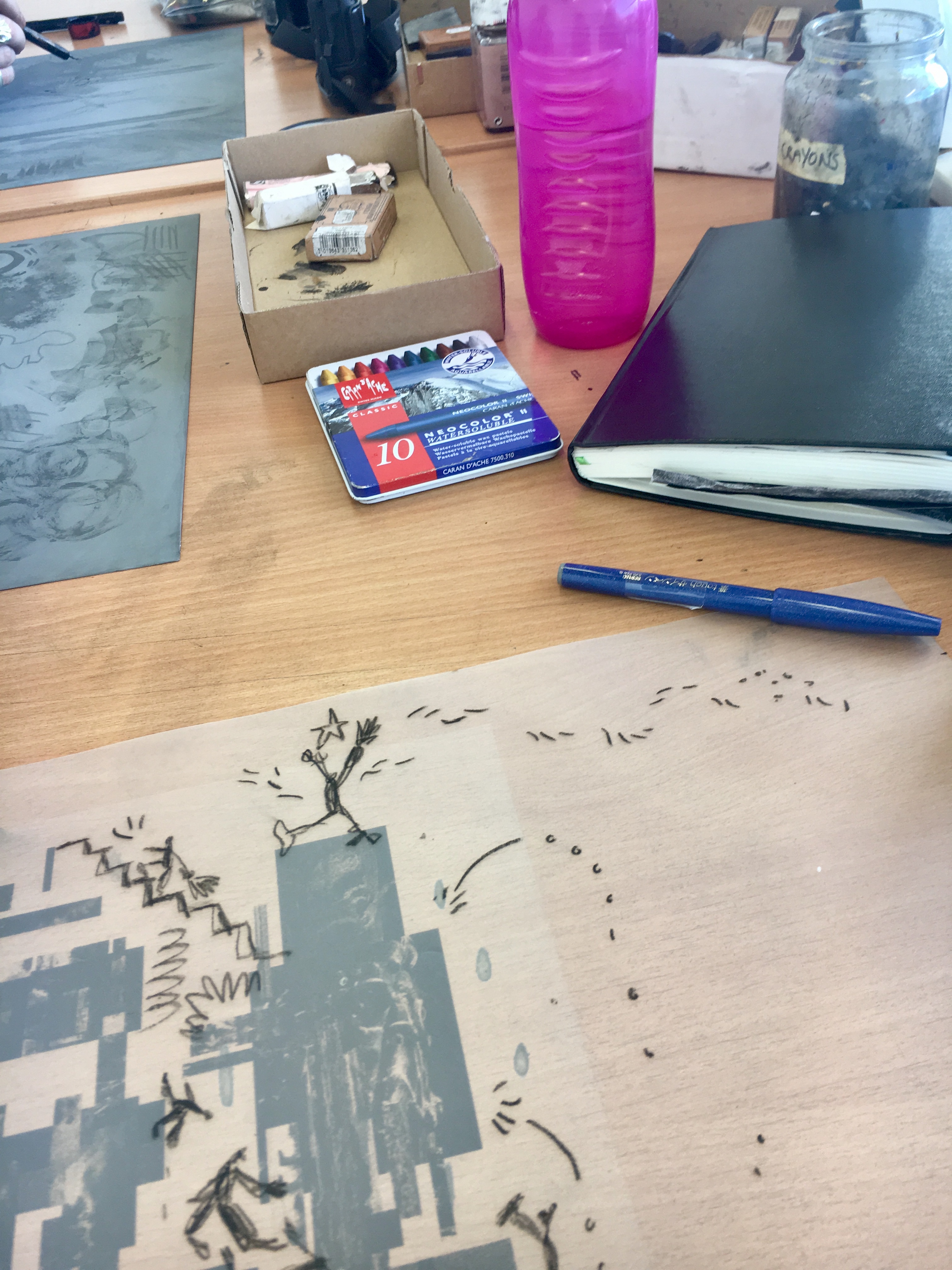
As planned in the previous session I wanted to finish planning my plates ready for printing next Tuesday. I decided to stop working on my bottom layer as it was already busy, and I didn’t want to overwork it. So, I started the top layer, for this one I wanted it to be more illustrative and evoke something like my Cuckmere Haven landscape print made in the second session. Therefore, I moved back to stick and ink which I felt worked well previously, it gives an opaque thick line, while also having movement and unpredictability.  I drew directly onto the tracing paper to work with urgency and to not overwork it, as I find personally when ink is overworked it loses its integrity.

My plan for this layer was a blame game between people (shown physically by pointing fingers and smirks), over who’s job it is to look after the environment and planet. The composition ends abruptly with a crying child, who is eventually going to suffer the most under the strain of global warming. As part of the plate I consider adding areas which would change colour when printed on top of the bottom layer. For instance, I planned the bottom layer to be yellow and the top blue, this would make any overlaps green. So, I added some textual sections to the collage which would create these overlaps.

We then learnt how to expose the plate using UV light, this was a new process which I feel will be beneficial to the progress of my practice. Next, we washed, dried and gummed the plates ready to be used in the next session.

After this session, I feel accomplished in my achievements and am looking forward to choosing colours which will work in the overlaying process I envision.

Lithography, Session 3: 20/02/18

After the last session using the Zinc Oxide plate I was eager to have some time to plan my print better and identify my aims. As a group we discussed what can be achieved through using layers in a print, also we learnt how colours can combine and create different colours despite being on different layers. This is something that appeals to me, I like the thought of utilising the process of lithography to create something that I would normally be able to make, say through screen print for example.

To begin the process, I planned a simple collage which could be used on the photolitho plate. The collage is loosely based around my Manifesto project, as I felt this was a great opportunity to combine the two. With the Manifesto project revolving around protest and the print medium used prevalently for protest, I felt there was a strong connection between the two. Therefore, the collage is digitally made using images of environment damage and destruction. I thought this would be a great starting point to build my image from. This layer was printed on acetate, I then worked further on the layer on tracing paper; using similar drawing mediums to the first plate we created. On the tracing paper layer, I drew around the digital collage, I composed people, ladders and graphic symbols to imply that we are using our world as a playground without consequence and waiting for future generations to solve our problems.

I feel like this is a strong start to the planning of my print, I would have liked to get further with this today. However, it is not something to be rushed and I feel confident that with the extra time I can focused myself in the next session on finishing the plate design.

Lithography, Session 2 13/02/18

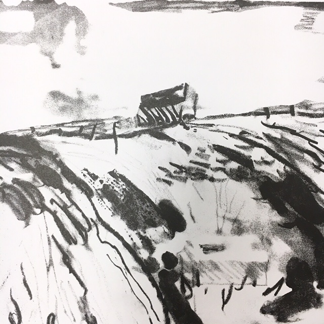
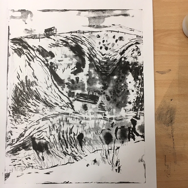
Our second lesson in Lithography was a fast-paced, practical introduction into using a Zinc Oxide plate. Although, I tried not to meticulously plan my print, as I knew it was a new process that I had never attempted before, I couldn’t help but have some expectations of myself. I had already determined from the last session that I wanted to utilise the quality of mark making that the Zinc Oxide plate creates. However, I didn’t know what I wanted my subject to be – on a whim I decided to use a recent landscape drawing I had drawn of Cuckmere Haven. Landscape drawing doesn’t come naturally so I didn’t feel precious over how I would recreate the drawing, it also had the opportunity for depth and texture to be worked into it using a variety of drawing materials.

The first part of the session was dedicated to creating the plate itself, this was slightly daunting as some of the drawing materials can’t be mixed with certain others. Also, I had to keep in mind that the plate cannot be touched as grease can make a mark which will transfer to the print. Despite, the difficulty overcoming new drawing techniques I enjoyed the plate I had made and felt that I had utilised many of the drawing mediums.

Inking the plate brought confusion for myself, I had trouble understanding how water could be continually applied to the plate while inking it. Now I realise that this is because the ink is oil-based and cannot be washed away with water. This was an important step to overcome early on and the same method is used to ink all plates. During the process, I had let the plate dry and inked over the top which had led to an excess of ink on the right-hand side. Luckily, it gave a nice effect to the print, also I asked my peers what they thought of the print and many saw images in the misprint that weren’t there but added to the image such as trees and people.

For an afternoon’s work I was impressed with my efforts and overwhelmed with the outcome. I had achieved in making it textural and graphic, while creating a sense of depth and perspective. I think the composition had some harmony which was improved by the ‘happy accident’ that happened during inking the plate. Also, I think it is the details in the mark making that make this piece interesting I’m looking forward to scanning the piece and using the details as larger pieces in my work.

Process:

  1. Draw and compose zinc plate, remembering not to touch the plate to ensure no grease marks are left.
  2. Make sure to dry plate.
  3. Dab over resin, delicately.
  4. Tap off resin.
  5. Dab on french chalk, brush off chalk.
  6. Brush on balm, with sponge, do not directly pour on plate.
  7. Wipe off balm with blue paper towel.
  8. Dry plate.
  9. Wash plate in white spirit.
  10. Wash with water.
  11. Brush off excess water with sponge, but leave it damp.
  12. Roll on ink (two charges of roller)
  13. Put on press.
  14. Up to four proofs.


Below is the print that I made in the session.

Module Option: Lithography

Upon choosing Lithography as my module option for the term I had many hopes and expectations. I’m looking forward to devoting time to printmaking, which I enjoy thoroughly already, but haven’t had the opportunity to submerse myself in to. I’m curious to learn about the printmaking process and how to utilise it in my current Illustration practice.

During our first session we were given an induction in using the Zinc plate, the Zinc plate is a useful tool as it utilises mark making and therefore tone, texture and depth. While watching the induction I was considering how this would work in my practice, we are always encouraged to use mark making, the lithography process highlights the quality of marks and brings them to the forefront of image making. The printed quality gives a great heightened contrast but also has room for subtle and gentle marks, this has been an opportunity to consider marks and methods to include in my own print.

Also, we were introduced to how the module will run, I am eager to create a body of work which acutely responds to a process. Furthermore, it will be an opportunity to design a print and consider composition, space and depth to work with and against the process of lithography.