Text and Context 5: Collecting Archive Material

Below are PDFs of scanned images from Collins Guide to the Insects of Britain and Western Europe by Michael Chinery and The Insects by Peter Farb and The Editors of LIFE.

SKM_C364e18022818420-u2mikw

SKM_C364e18022818440-28icdqd

I’m also considering having a montage of Metamorphosis for the title sequence below are some clips I’m thinking about using.

Below is archive footage of The Beatles fans at the height of Beatlemania.

Text and Context 4

As part of my research for Text and Context I am looking into different animation styles, to hopefully help me determine what would work for my own animation.

Firstly, The Metamorphosis of Mr Samsa by Caroline Leaf. Honestly, when I first watched this video I struggled to identify what Leaf was using to create the pastel/chalk like appearance of the movement in narrative. I researched further and realised it was sand. She proclaims that she focuses on using a simple image because one can make an image so intricate that it is then impossible to animate; this rings true as I often push my drawing abilities to then realise much of it is lost in the animation process.

An example of how Caroline Leaf creates her work.

Text and Context 3: Group Tutorial

I was unsure as to what to expect when I went to my group tutorial on Text and Context because I still felt that I was in the beginning idea stages of my project and was feeling slightly uninspired. I had formulated my idea for the project while deliberately having a stupid conversation with my boyfriend – I remember saying you’re good at coming up with silly ideas lets talk about The Metamorphosis until we come across one. We did come across one, and I think the joint revelation of the idea is what makes it very like and unlike me at the same time.

I decided to make Gregor Samsa a beetle (as in the story he is just an insect, its not a huge leap to consider him as a beetle), I am going to carry out the story in a fairly similar way to the original particularly focusing on the apple hitting Gregor’s back, however the main change will be that Gregor won’t die he will run away just in time. This is where the story takes a turn for the absurd and utilises word play. Upon leaving the house Gregor in his desperate panic bumps into someone, this someone happens to be Ringo Starr of the Beatles, he believes that Gregor is exactly what they’re looking for in their new direction. He later becomes the manager of the Beatles and they create Apple Records (a nod to the apple in his back).

This story was all chance and humor, which I really enjoyed but I had no idea how it would go down in a tutorial because it isn’t the type of stuff I am usually interested in.

The tutorial really helped me get out of my inspiration rut and was suggested the following videos:

I had seen Diary of Edward the Hamster before, however had never thought of it in the context of my own work. I really love this video and I think what makes it is the voice over. When making voice overs in the past they’ve been more of an after thought however, with this in mind I think they need to be in the forefront of my thinking. As a voice over can help present a mood or a characterisation which it does so well in this video.

Jeremy suggested The Paper Cinema as a method to retain a hand drawn element in animation. It also plays with perspective, therefore one drawing can become many frames. I took it as example of how to work smart not just work hard. As animation is notoriously laborious, so saving time while creating an interesting and original technique is something to consider.

This last one is a funny one The Rutles, a spoof of The Beatles, their use of found film to create the ambiance of The Beatles is something I might replicate.

Lithography, Session 4: 27/02/18

As planned in the previous session I wanted to finish planning my plates ready for printing next Tuesday. I decided to stop working on my bottom layer as it was already busy, and I didn’t want to overwork it. So, I started the top layer, for this one I wanted it to be more illustrative and evoke something like my Cuckmere Haven landscape print made in the second session. Therefore, I moved back to stick and ink which I felt worked well previously, it gives an opaque thick line, while also having movement and unpredictability.  I drew directly onto the tracing paper to work with urgency and to not overwork it, as I find personally when ink is overworked it loses its integrity.

My plan for this layer was a blame game between people (shown physically by pointing fingers and smirks), over who’s job it is to look after the environment and planet. The composition ends abruptly with a crying child, who is eventually going to suffer the most under the strain of global warming. As part of the plate I consider adding areas which would change colour when printed on top of the bottom layer. For instance, I planned the bottom layer to be yellow and the top blue, this would make any overlaps green. So, I added some textual sections to the collage which would create these overlaps.

We then learnt how to expose the plate using UV light, this was a new process which I feel will be beneficial to the progress of my practice. Next, we washed, dried and gummed the plates ready to be used in the next session.

After this session, I feel accomplished in my achievements and am looking forward to choosing colours which will work in the overlaying process I envision.

Manifesto: Evaluating the project

To evaluate this project thoroughly I have to talk through the problems that also occurred with it. Firstly, I jumped into the project head first with creating visual content with the view of making it into a print, this was exciting for me but it meant that I missed out on a lot of the research which was very important to this project, as if my facts weren’t right then I was still creating a misconduct of facts.

It felt like I was going around in circles trying to get my print to incorporate into new work, and knowing that the services for that type of print wouldn’t be available for the rest of the semester I was feeling a bit stumped. In some ways it was as though I had made a final outcome before a project. It was an awkward start to the project and I was left feeling unsatisfied.

So, I started working from the beginning I researched my topic, had some fears that a climate change denier was an outdated term and that people had fully learned from their mistakes. But, found some more recent evidence that now people aren’t denying so much that climate change is a thing but more they are denying that it’s happening to avoid having to think about it. This made me consider what type of format would appropriately present this concept.

As talked about in my previous post I had been considering making a calendar. However, I also had my eye on possible creating another animation, yet I felt this may be slightly overwhelming with two other animation projects for myself (Rap ‘n’ Rhymers and Text and Context). I also considered that I could possibly make a clock and record it working and going through the motions of scare tactics towards climate change deniers. But, this felt a bit too abstract for something which is supposed to be a clear communication of a topic.

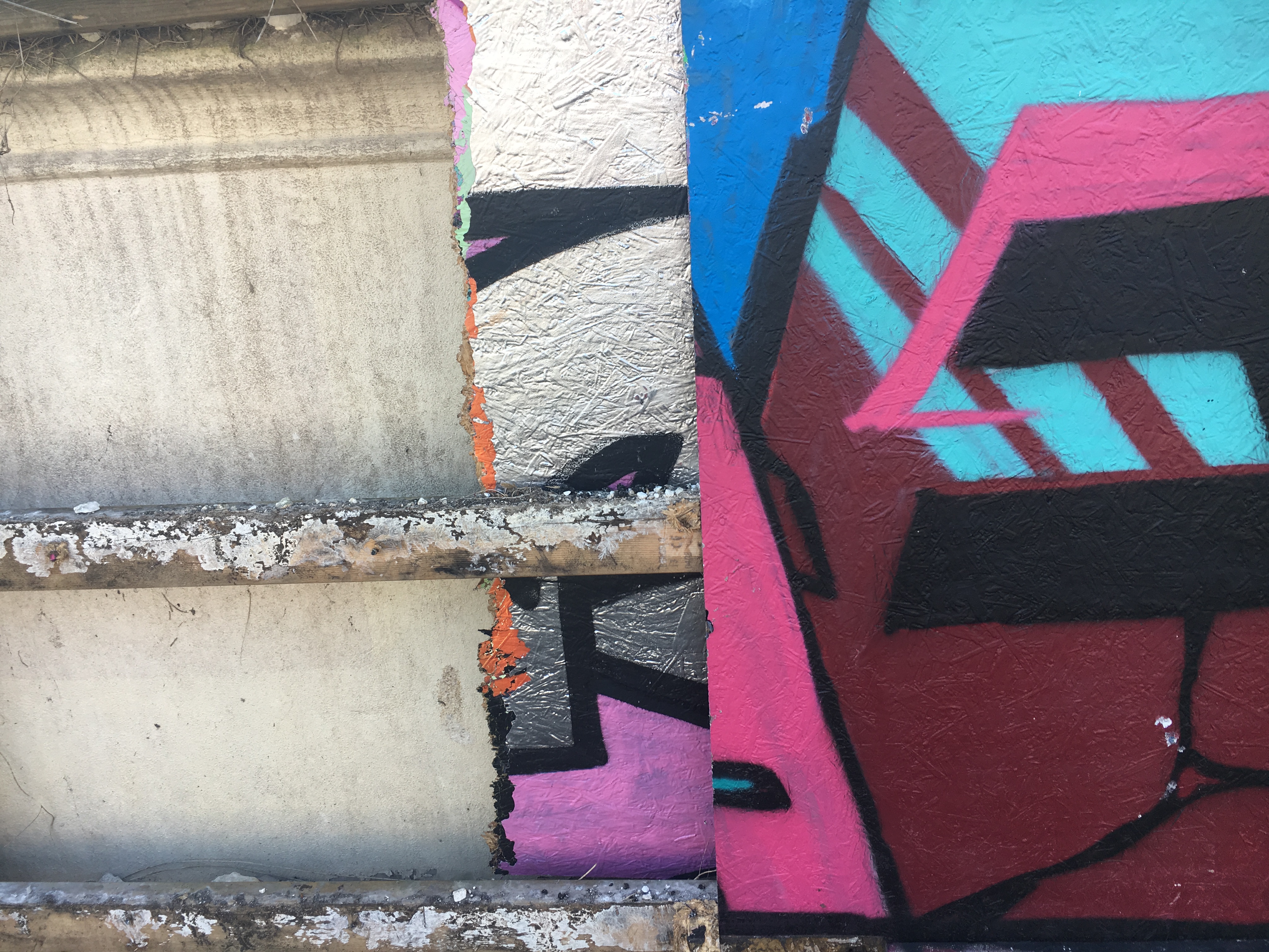
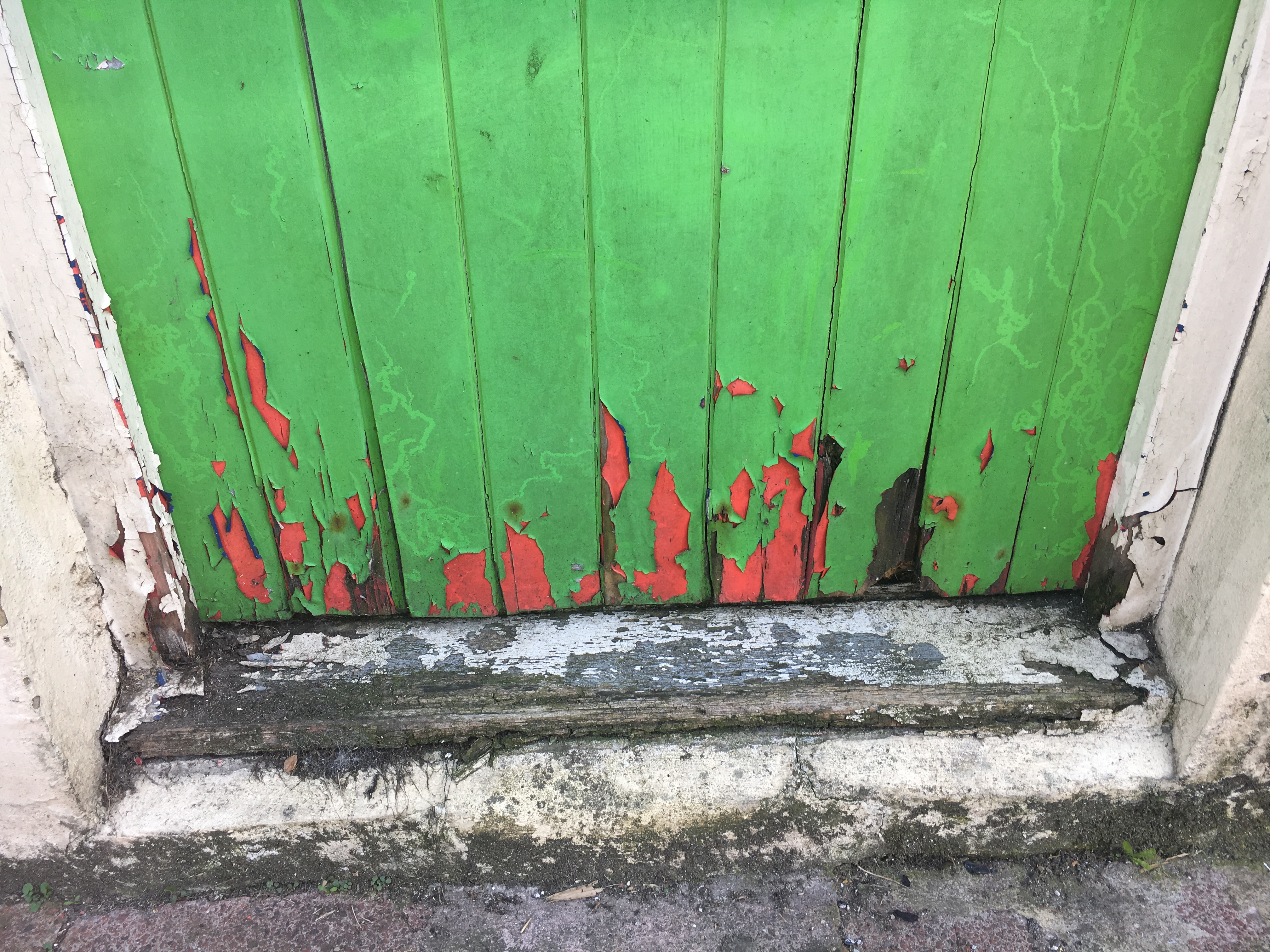
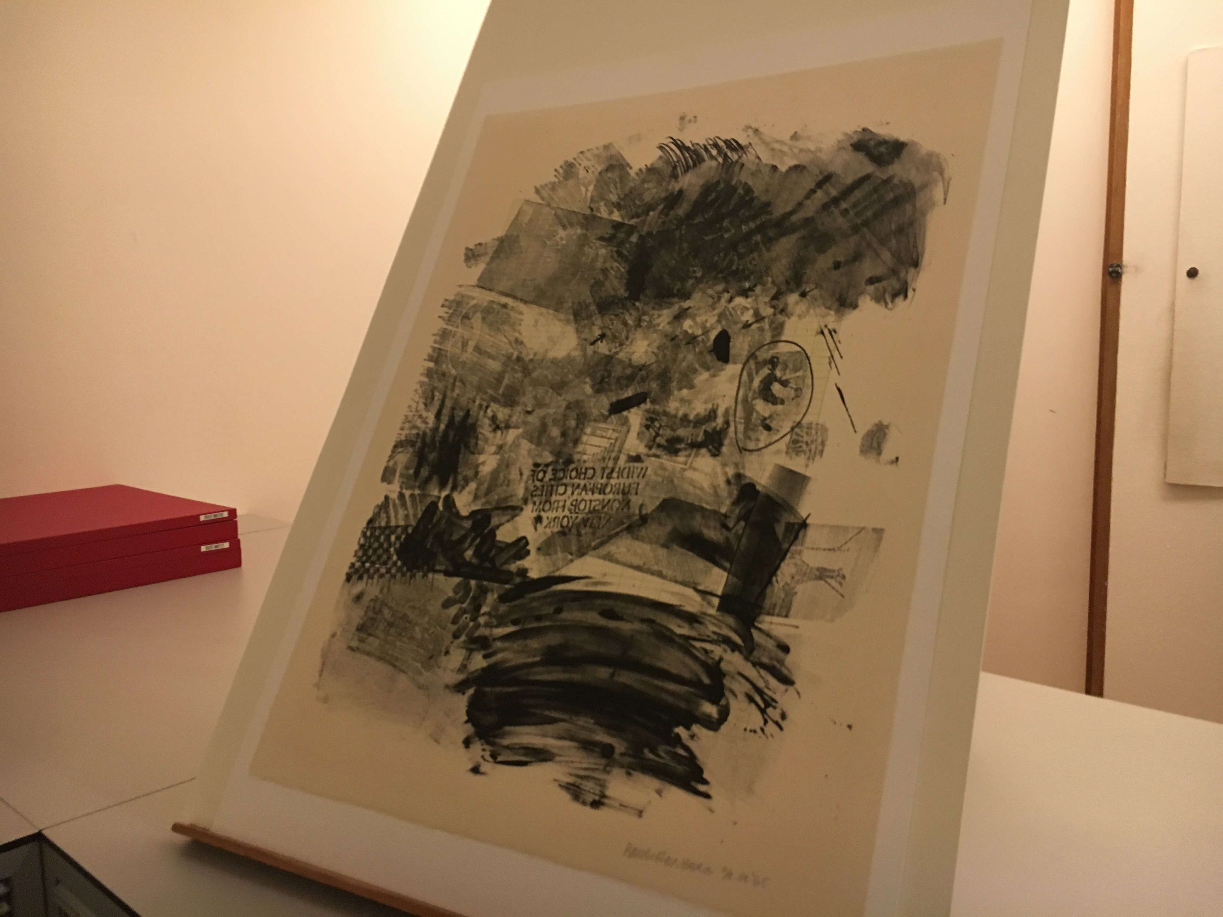
So I stuck with the calendar idea and ran with it. Through researching first hand around Brighton and at the Tate Britain (previous blog posts) I identified that I wanted to make something with transfer techniques to create a degrading quality to the images. This I felt would show the fleeting nature of how our earth is being treated and how nothing is permanent no matter how hard someone can try and believe so.

Also through the mark making that is naturally created through the technique it presents a struggle and strength of something trying to break through and create its mark.

Overall, I am pleased with how this project has gone – I would have like it to include more initial drawings and thoughts how the technique I was using prompts immediacy and trial and error on the page. I’m proud with how this project has gone because I wasn’t looking forward to it. However, I overcame my fears and created a practical, functional final piece.

Some downfalls of the final outcome is that to print it successfully I needed to have it imposed and therefore it needed 28 pages, however due to the fixed nature of the calendar format I had to add in extra pages where they were unnecessary. This has ruined the affect of the calendar, however I have tried to DIY fix it. With some extra time and thought I could have possibly overcome this.

Manifesto: Trying out new techniques

Over the days I’ve had some trials and tribulations with finding the right technique for this project, I wanted to do something with collage and found images. But, I felt like simple collage was too basic and something I’ve done before, I wanted to push myself.

Tetra-Pak printing

Tetra-Pak printing appealed to me because it was reusing juice bottles made of Tetra-Pak this material is versatile. I like how it included recycling as this project would benefit from a positive portrayal of how to use recycling in everyday life. However, it was difficult to create, first you cut into or mark the shiny side of Tetra-Pak with a scapel or pencil, ink it and wipe off the excess. Then, after putting this through a printing press it should come out successfully. But, mine just didn’t they were light and blurred and unidentifiable. It was annoying but I was more into the actually Tetra-Pak (or the “plate”) after it was inked up. They looked cool and have a distressed look – I think I will more likely use this them than the actual prints.

Acetone printing

Now, acetone printing was a complete experiment for me and I was so glad that I attempted it. I used a cheap nail polish remover (which actually didn’t have any acetone in it? Confusing) with print outs you could create a strong print with mark making over the top. I was inspired to do this techniques after seeing Robert Rauschenberg prints in the Tate Britain I like the overlay technique and it personally I think it instantly says that the artwork is a social commentary as it’s direct photos of people, also it has a newspaper quality to it which already reuses a sense of the mundane which people respect and listen to. It in many ways demands attention.

Rubbings

I quickly did some rubbings of trees and urban spaces, interestingly you can barely tell the difference between them. I wanted to make them so that I had the opportunity to create some texture in my pieces. But, upon doing them I think they will be left unused, they look too similar and aren’t fully identifiable as anything.

Manifesto: Deciding on making a calendar

I have been considering making a calendar as a final piece for a while as the format intrigues me. For this particular project I thought it would be a good way to show the aspect of time on climate change. Many climate change deniers can hide away from the responsibilities of climate change by alluding to fact that it won’t happen in their lifetime. However, many changes have already occurred in the landscape, environment and animals species.

By having a calendar its saying that you can’t avoid this its a circumstance which keeps happening day after day, although the impact is slight daily it still occurs. The calendar would have an ironic purpose as nobody would actually want a calendar which was so depressing and foreboding – therefore its a practical item without a use. This is quite an interesting concept and I think relates to the fact that we have so much information of climate change and don’t really understand what to do with it. I want to suggest that we should comb through the information ourselves and actually investigate what we think is true and how reliable our sources are.

I’m trying to encourage people to stay curious and question everything, the media feeds us and we without realising take it in. This calendar is supposed to everyday make us consider actually that “fact” that I’ve been telling everyone is it actually true? Where did I hear it from? Why have I been telling people?

Manifesto: First person inspiration


I have been looking for inspiration in everyday life. I’ve been trying to stay open minded and look for inspiration everywhere and anywhere. I found some amazing pasted posters in the lanes which have a powerful and clear identity, the block images appear like woodcuts or lino and have a similarity to French protest banners.

While I’ve also been looking in unlikely places such as deterioration of paint and peeling walls, also the contrast of graffiti and against environmental backdrops. I’m not normally attracted to images like this I find them slightly mundane but for this project they seem to have given me a light bulb moment.


Manifesto: Finding inspiration in artist research

I have been wanting to create a more textural, worn down and deteriorated style for this project to mimic how climate change is slowly wearing the earth out.

For this I took inspiration from my trip to the Tate Britain and Robert Rauschenberg, I loved his acetone prints against lithography. I think its such a great layering of techniques and I’m keen to try out the acetone printing. Its the rubbings I love, the aggressive mark making. I took so many pictures of them at the gallery as the more you look at them the more you can see, I’d really like to create a similar feeling of all is not what it seems.


Another artist who I’ve been interested in is Chris Ashworth, I love his textural collage and the use of type in his work. He has an eye for composition that I would like to learn from, I think this is the type of degradation through collage that I’m looking for. Where you can see what the thing is but it has a layer of mystery. 


Manifesto: Evaluating prints and changing topics

I recently completed a photo lithography plate print for the Manifesto project. Below is what I wrote in lithography diary entry:

“To begin the process, I planned a simple collage which could be used on the photolitho plate. The collage is based around my Manifesto project, as I felt this was a great opportunity to combine the two. With the Manifesto project revolving around protest and the print medium prevalent for protest, I felt there was a strong connection between the two. Therefore, the collage is digitally made using images of environment damage and destruction. I thought this would be a great starting point to build my image from. This layer was printed on acetate, I then worked further on the layer on tracing paper; using similar drawing mediums to the first plate we created. On the tracing paper layer, I drew around the digital collage, I composed people, ladders and graphic symbols to imply that we are using our world as a playground without consequence and waiting for future generations to solve our problems.”

I really like my print however, I feel like it has a long way to go. I think that what I’m trying to communicate just isn’t coming through visually. I want to go in a different direction and maybe look into collage and photo montage. I think collage works well for protest art because it has an affinity with the posters and banners used for protest marches. It has a homemade aspect which gives a power to the people vibe.