If you use an external print-on-demand service, such as Blurb.com to create a book, here are some useful tips for preparing your files for print (in no particular order).
For the purposes of this post, we’ll be assuming you are using InDesign to create your book. But many of the tips will apply to many of the software programmes you decide to use.
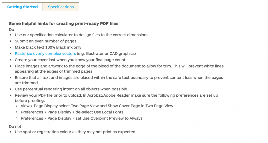
1. Read the Blurb
Before you do anything, always read your printers specification for preparing your files for print.
Some print-on-demand services also use their own online software or offer InDesign plugins that help you set the correct specs for your book document, which are worth considering.

2. Include a Bleed
A bleed is an extra space around your layout, extending past the edge of the page(s). You should always include a bleed if any elements such as images or coloured backgrounds, on your layout will cross the trimmed edge of the page.
Once your book is printed and trimmed, a bleed will minimise the visibility of any slight errors in trimming. For example, making sure that the image extends beyond the edge of the page for example.
3. Consider How The Book Will Be Bound
Think about how the pages will be bound together once printed. The number of pages, paperweight you choose, as well as your desired ‘look’ will affect how your book will be bound.
There’s a huge range of different binding options available such as: saddle-stitch, Wir-O, side-stitch, case, sewn-and-glued, and lay-flat. For advice talk to your printer.
4. Know Thy Colour
Repeat The Mantra: CMYK Not RGB
(unless otherwise stated by your printer.)
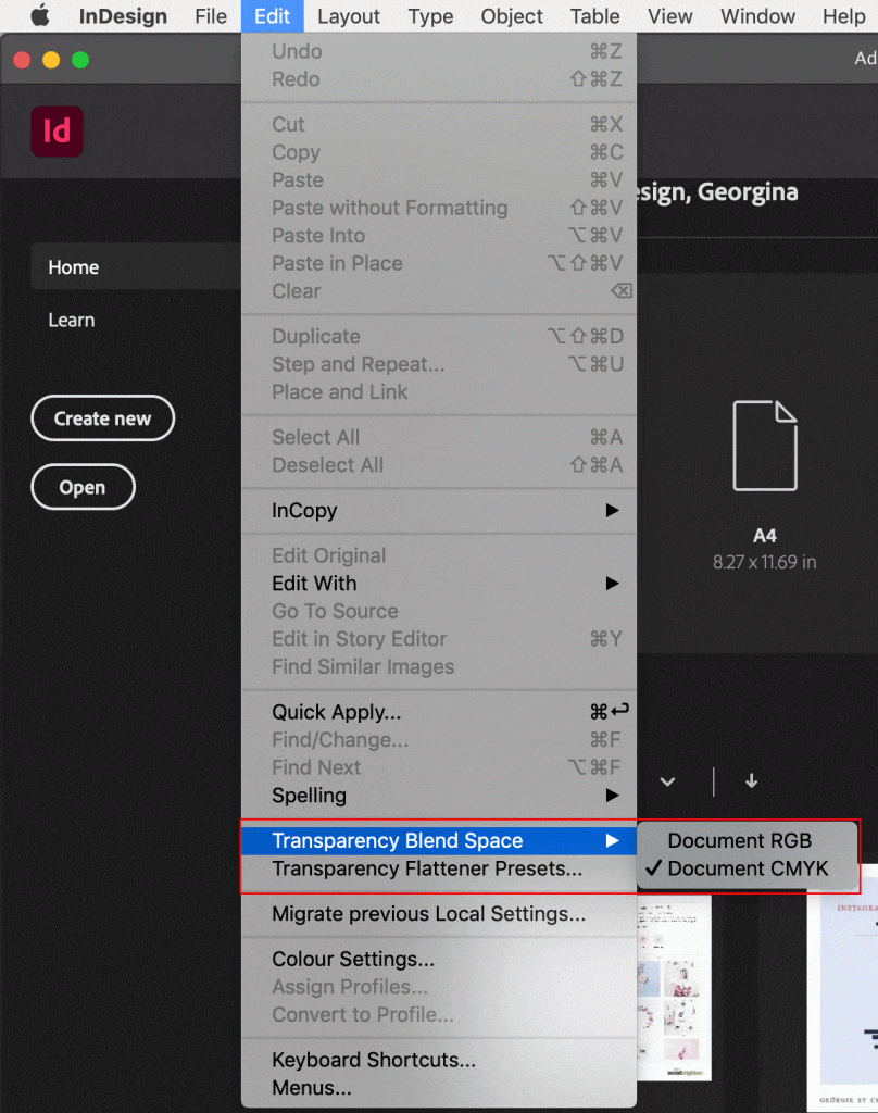
Set the colour in your print layouts to CMYK colour mode.
CMYK refers to the four inks that are used in four-colour printing, Cyan, Magenta, Yellow and Key (Black). Each color in your print design will be created through a combination of these four inks.
If you have set your colour space to RGB colour mode, be sure to export the final print-ready file as CMYK.
RGB is rendered as Red, Green and Blue, suitable for layouts viewed online or in digital format on a screen for example as an interactive PDF or e-book.
5. Get to Know Your Spots from Your Tints & Transparency
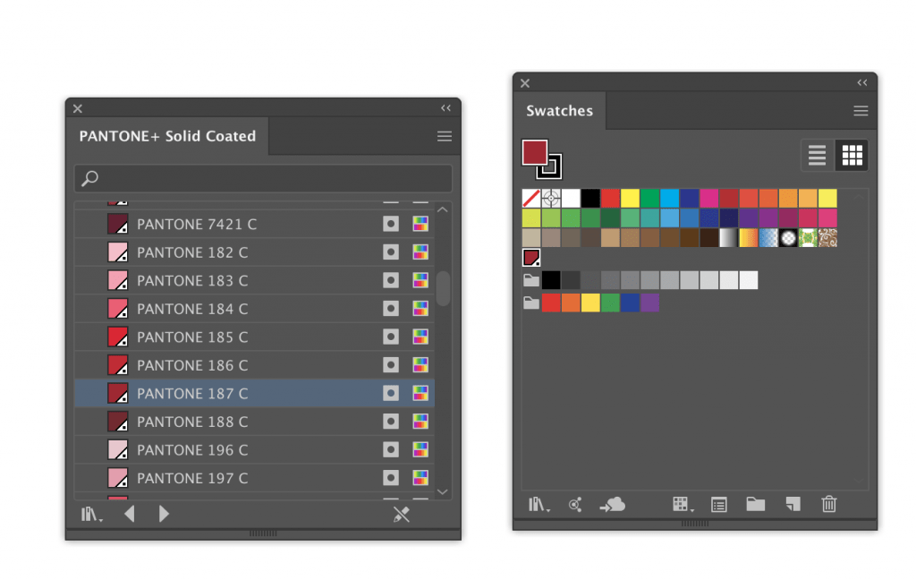
Spot Colour – sometimes termed as ‘Solid’ colours, for example, a Pantone colour. If your document uses spot colours, the printer will have to prepare a completely separate plate for the spot colour to be printed. The advantage is more accurate colour reproduction. The disadvantage is it’s more expensive to print.
Tints are a percentage of a colour mixed with white to achieve a paler, but still opaque) shade.
Transparency reduces the opacity of a coloured element allowing other elements sitting below the transparent element to become more visible.
5. Go Max with Image Resolution
Forgo the misery of bad images. Make sure your bitmap images/graphics are at least 300dpi (dots per inch) when printing.
Bitmap graphics – JPEG, TIFF, PNG – are made up of a number of tiny pixels. When you resize a bitmap graphic and resave it, some of the quality of the original image can be lost, resulting in a pixelated image.
DPI (dots per inch) describes the resolution or number of dots per inch that make up the colours and tones of an image.
Vector graphics, like Illustrator and EPS file formats, are made up of scalable objects and will not lose their quality if resized. However, some printers will require you to rasterise your vector images – make them into bitmaps images. Therefore the same principles of resolution and dpi will apply.
6. Deciding on Paper
Like binding, the paperweight and finish will affect the look of your finished book.
Paper comes in a variety of different ‘weights’, measured in GSM (Grams per Square Meter), which will affect how thick the paper feels. For example:
35 to 55 GSM, like Newspaper, is a low GSM.
110 to 160 GSM, is used for things like standard Flyers.
Magazine covers use heavier paper, from around 180 GSM for a mid-market mag, moving up to over 250 GSM for a high-end glossy title.
For a business card, a 350 GSM gives cards a more luxurious, sturdy feel.
Finish
When choosing paper you will be given the choice of uncoated and coated.
Uncoated paper is a suitable choice for printing letterhead, stationery or lower-quality leaflets and flyers.
Coated paper falls into two sub-groups: Matte-coated and Gloss-coated:
Matte-coated gives a smooth, non-glossy finish and can give your print documents a modern, pared-back look.
Gloss-coated paper is smooth and with a slightly reflective finish, giving your documents a glossy, high-end look. Because the ink sits on the surface of the coating, rather than absorbing into the paper, colours appear more vibrant and rich.
Ask your printer to send you paper samples – they will often supply them free of charge.
7. Design for Your Audience
Sounds obvious right, but what looks good on screen may not look so great in practice. Where possible, print out a proof of your book or a just few pages. This could be done on a home computer.
Are your fonts legible? Is the text big enough to read? Are the margins suitable? Is there lots of nice white space around your text or images or is everything cramped and confusing? Is it a pleasant reading experience?
These are just a few considerations when designing books to be created by a 3rd-party printer.
Once you have created your book and it’s printed, our Books Arts Demonstrator, Helen, has written a great tutorial on how to create a Custom Bind for Your Published Book here.
Any questions or specific issues you’re having with InDesign drop Mark an email


