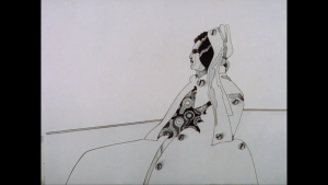
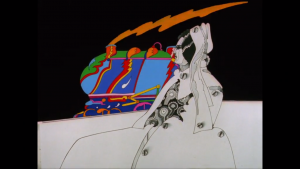
Currently, due to technical difficulties this is the portion of my video that I can export. I’m thinking about it positively in the sense that when I look at this portion I can see which bits I need to change. Also, watching it like this I can identify which bits are slightly to long. This can be difficult to figure out when actually making the video I find. So I will be cutting some of this down and editing some sections to hopefully give them a bit better quality.
Category Archives: Text and Context
Text and Context: Storyboards
I normally make story boards with no intention of actually following them, however, because I had a musician working with me he needed to have some timings for the animation. So I took story boarding seriously for once, and it actually really benefited me as it gave me a basis for the story telling. Without it I’m convinced I would have forgotten an important part of the story line.
Below is a video that I made of the story line with its timings, this has been a helpful guide for myself and Jesse to work by:
Text and Context: Finding the right music
I recently reached out to my boyfriend (Jesse) who makes music, to see if he could collaborate with me on my animation. I had been thinking over what to use as music for a while and I was concerned as to what music to use because music was such a pivotal characteristic of the Sixties. I wanted to do it justice and I thought having an original piece of music would be perfect.
Below is a conversation discussing what I want for the piece of music and his replies:
Text and Context: Finding animation inspiration
 As part of my research for Text and Context I have been considering different animation techniques from the 60s to include in my own rendition. Below is ‘Two Faces’ (1968) by Alison De Vere, a four minute animation of painted faces going through a series of emotions. It is a simple animation but has impact and the viewer can follow the story. I enjoy the ink technique and think I could use this in my own work.


 If you can read a face like a book, then here it is a book of poetry. Loose brushstrokes sketch a series of portraits of two faces, one male and one female, whilst the verse on the soundtrack tells the tale of both one and a thousand relationships. Alison de Vere was responsible for both the text and images, and the film was released in the same year she worked as a designer on the animated Beatles feature, Yellow Submarine (1968).

Next is a cut and paste collaged animation of ‘Little Tom Thumb’ by Joy Batchelor. This animation is more suited to children but it has a great colour palette and consistently good character design.
Finally, ‘Transformer’ by Charlie Jenkins is a short promo for the Yellow Submarine, this animation is very simple only being two minutes long however it solidifies elements of the psychedelic scene in the absurdity and colours. Its a slow burner starting small and getting bigger and better.
Text and Context 7: Designing accompanying material
As discussed in my previous post, I have gathered a lot of visual material for this project and want to utilise it. Throughout my animation I have had it dotted around, however, I want the pieces to be seen as their own piece. For this I am thinking a poster zine comprised of a poster advertising the animation on the one side and on the other screen-grabs from the animation. I have a few variations of ideas that I would like to try out for this –
- Design and print it out in one go, computer to print.
- Design the screen-grabs and the type on the Photoshop and over print the poster using a photocopy lithograph.
- Design one side of the poster (screen- grabs) and leave the front to be overprinted using a photocopy lithograph and letterpress the title.
In a perfect world having time to experiment with the third option would be most satisfying. Yet, it is the most time consuming – I think the most likely would be the second option but time will tell.
To help with designing the poster I have been looking at sixties posters and album cover for inspiration on what defines sixties design. Also, I have been looking
Text and Context 6: Happy Accidents
For my module option Lithography, I have been making photocopy litho prints – to design them I needed some inspiration and thought about my Text and Context brief. I have been making and collecting a lot of visual material for this project and was unsure if I would have the opportunity to use it all (monoprints, found material etc.) as I was making an animation. So I thought this would be a great opportunity, here is my account of the day in my Lithography diary and the original photocopies…

“As I had finished my main double layer photo-litho plate in the previous session, today I worked on a photocopy litho print. I particularly enjoyed today’s session, the time flew by as I printed page after page. The photocopy print is created by spray mounting a photocopy on a piece of acetate, this is then pressed in the printing press to achieve a perfectly flat base to work with. Next, the photocopy is gummed and inked over gently, it is then put in the press. I was impressed by how quick and simple the process was I will be doing in again for other projects.
The outcome of the photocopy prints has a different feel to the photolitho prints, they’re not as sharp and clean; instead their beauty is in how the photocopy degrades use after use which gives it an imperfect tone and depth. I planned to make my photocopy print in response to my Text and Context project, in which I am making a video inspired by Franz Kafka’s Metamorphosis. I created my image on Photoshop using: abstract monoprints, scanned and edited imagery from an insect encyclopaedia, and found imagery of a sixties model. I enjoy re-introducing processes within processes and I feel that mixing the mono with the litho print gave a painterly look.
Mainly, I liked how easy it was to experiment with the photocopy print due to its ease of creation you could be haphazard with it without fear. I chose to cut it up and collage with it on the printing press, this gave an excellent embossing effect which was unexpected. I loved the prints that were made using this process and am considering making one for next week to overprint my photolitho prints.”
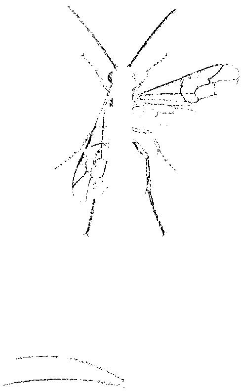
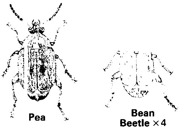
For the unpredictable litho prints I utilised another unpredictable method that I had come across by accident. I made a mistake while trying to export images from a PDF and accidentally exported all individual images found per page, this gave me snippets of words, diagrams and images. It gave a jigsaw of each page and some of the images are really interesting. Below are a few of my faves.
Text and Context 5: Collecting Archive Material
Below are PDFs of scanned images from Collins Guide to the Insects of Britain and Western Europe by Michael Chinery and The Insects by Peter Farb and The Editors of LIFE.
I’m also considering having a montage of Metamorphosis for the title sequence below are some clips I’m thinking about using.
Below is archive footage of The Beatles fans at the height of Beatlemania.
Text and Context 4
As part of my research for Text and Context I am looking into different animation styles, to hopefully help me determine what would work for my own animation.
Firstly, The Metamorphosis of Mr Samsa by Caroline Leaf. Honestly, when I first watched this video I struggled to identify what Leaf was using to create the pastel/chalk like appearance of the movement in narrative. I researched further and realised it was sand. She proclaims that she focuses on using a simple image because one can make an image so intricate that it is then impossible to animate; this rings true as I often push my drawing abilities to then realise much of it is lost in the animation process.
An example of how Caroline Leaf creates her work.
Text and Context 3: Group Tutorial
I was unsure as to what to expect when I went to my group tutorial on Text and Context because I still felt that I was in the beginning idea stages of my project and was feeling slightly uninspired. I had formulated my idea for the project while deliberately having a stupid conversation with my boyfriend – I remember saying you’re good at coming up with silly ideas lets talk about The Metamorphosis until we come across one. We did come across one, and I think the joint revelation of the idea is what makes it very like and unlike me at the same time.
I decided to make Gregor Samsa a beetle (as in the story he is just an insect, its not a huge leap to consider him as a beetle), I am going to carry out the story in a fairly similar way to the original particularly focusing on the apple hitting Gregor’s back, however the main change will be that Gregor won’t die he will run away just in time. This is where the story takes a turn for the absurd and utilises word play. Upon leaving the house Gregor in his desperate panic bumps into someone, this someone happens to be Ringo Starr of the Beatles, he believes that Gregor is exactly what they’re looking for in their new direction. He later becomes the manager of the Beatles and they create Apple Records (a nod to the apple in his back).
This story was all chance and humor, which I really enjoyed but I had no idea how it would go down in a tutorial because it isn’t the type of stuff I am usually interested in.
The tutorial really helped me get out of my inspiration rut and was suggested the following videos:
I had seen Diary of Edward the Hamster before, however had never thought of it in the context of my own work. I really love this video and I think what makes it is the voice over. When making voice overs in the past they’ve been more of an after thought however, with this in mind I think they need to be in the forefront of my thinking. As a voice over can help present a mood or a characterisation which it does so well in this video.
https://www.youtube.com/watch?v=Sfh1PaSRq3k
Jeremy suggested The Paper Cinema as a method to retain a hand drawn element in animation. It also plays with perspective, therefore one drawing can become many frames. I took it as example of how to work smart not just work hard. As animation is notoriously laborious, so saving time while creating an interesting and original technique is something to consider.
This last one is a funny one The Rutles, a spoof of The Beatles, their use of found film to create the ambiance of The Beatles is something I might replicate.
Text and Content 2
Although I enjoyed looking into Frankenstein as a story, I felt stumped when it came to changing the story as I have never read the full story. I am one for keeping things authentic and I felt without fully understanding the original story I would be at a disadvantage.
So I considered looking into one of the other stories – The Metamorphosis by Frank Kafka. Due to this being a short story I felt confident I could read and finish it, needless to say I did. I found the story confusing and shocking but also funny and ironic. The story has many levels to it and therefore room to maneuver, some people may see the story as even funny. I wouldn’t go that far but I could see the appeal.
PDF of the text: The-Metamorphosis-1h4cuxs
I researched other material which is used to illustrate The Metamorphosis .
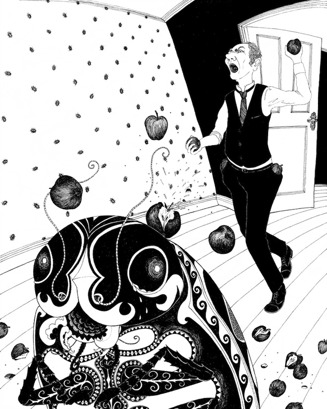
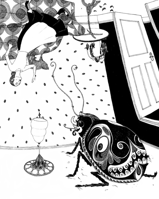
Below are images from My First Kafka, a children’s book by Matthue Roth.
I really like the point of view of these illustrations, straight from the bug’s level – which suggests that he does have a sense of humanity. Also, the black and white works so well as it is a dark and morbid story, it sets the feel. Admittedly, I imagined the bug as more of a cockroach? But, that is obviously left to interpretation as Kafka deliberately leaves it open.


