The Archive of Willy de Majo Pt III

As a third addition to the de Majo archive’s story, I thought I would write a post about the more non-conventional items the archive holds. In my previous post I mentioned some of these items that did not go through the freezer process but I wanted to show you some more of the kinds of things which do not exactly fall under the ‘usual’ finds – at least not here in the Design Archives!

One of these is this collections of matchbooks. One of de Majo’s various commercial clients was Cronmatch. We have samples, documents and original designs from his work with the company, but presumably he collected these various matchbook samples for his own research purposes, as this particular collection consists of items not designed by him. The sorting process for these was interesting… Various copies of each matchbook were found and they needed to be joined up (I wanted to say matched…!) before cleaning and boxing them. Three copies of each matchbook design were kept. A lot of these particular matchbooks in the photo below did not have actual matchsticks attached to them, but I also came across various that do. This proposes the question of how to deal with this type of object, as they present a fire hazard. After discussions with our archivist Sue Breakell, our approach to them is to cut the igniting match ends off, but not before photographically documenting the item as it was found originally.

Another challenge was within some of the work de Majo did with the confectionary company Millar. The materials I came across while sorting varied from original artwork for designs for Millar vans to individual sweet wraps, of which there were many! The sorting process for the sweet wraps stepped up a gear and was rather more challenging than for the matchbooks, as there appeared to be what felt like hundreds of them in various packets and pockets.

It was one thing dealing with the wrappers as they were, empty and flat, but quite another when the wrappers actually contained the sweets within them! Obviously these could not be kept in the archive as they could raise the risk of pests and contamination of other items. After yet another discussion with our Archivist, I cut out the Millar Super Mints from their original packaging, disposed of the sweets and kept the original wrapper with the paperwork the packet came with.

While the mints actually looked like they could potentially be edible after all these years, the next example I wanted to share with you really did not. I came across this rather beautiful winter-themed gift box for Millar Chocolate Eclairs – again with original sweets still inside.

With this one, we obviously wanted to keep the gift box in the archive. As for the sweets, we carefully unwrapped and kept three of the wrappers while disposing of the rather hard and not-at-all-what-a-chocolate-eclair-should-be -looking sweets inside….

Another, and to me the most surprising, item to show you as an example is from the work Willy de Majo did with and for the drinks company Clayton. Obviously liquids in any archive is a no-no, so what can you do with archive objects which hold liquid within them?

Glass in itself is not a problem when packaged properly, but obviously the liquids had to go. It was a rather interesting experience to open these bottles. Amazingly the Peppermint Cordial still smelt very much of peppermint, but I can report to you that the lemonade had lost all of its lemon smell over the decades, despite being in a sealed, unopened bottle. Amazingly though, the lemonade still had a little bit of life left in it as it let out a little fizzy sigh when opened. The liquids were decanted and the bottles washed and dried thoroughly. As Sue and I were contemplating the process, the thought did cross our minds whether these liquids could have perhaps been of interest to someone in science and I still ponder on what these might have tasted like had someone dared to try them…

Last but not least, I mentioned before about the various photographic materials within the archive. These were separated from the papers and sorted by client and/or kept in the original packets in which de Majo had them. I wanted to share with you one of the more deteriorated (but strangely beautiful) items I came across. This was within the materials in relation to Biro – one of de Majo’s clients for which we have a lot of related photographic material. It is a 5×4 black and white negative of a Biro pen pack (we also have a print version). Not having much knowledge of photographic conservation and the various issues relating to it, I do not have a clue about what has caused the negative to deteriorate in this manner. If anyone can shed any light on this, I would very much appreciate it!

The verso of the negative has this ‘bobbly effect’ to it when looked at closely:

While the recto looks like this:

One of the reasons I wanted to share with you this deteriorated negative was that at the time I came across this photograph of the frozen sea outside Helsinki. The effect looks remarkably similar to the surface of the negative – wouldn’t you agree?

On that note, I will just let you know that the fourth and final part of the de Majo story should be coming along soon, so do look out for the conclusive ‘chapter’!

The Archive of Willy de Majo Pt. II

After the initial sort out of the de Majo archive in our external storage unit, the next step in the process was for all of the materials to be transported to The Keep for conservation. We have a good, collaborative working relationship with The Keep’s conservation department, which is an invaluable resource for us. Personally, after I finished my PgDip at Camberwell in 2011, I volunteered for quite a while in the conservation studio with The Keep’s Paper Conservator Melissa Williams when her conservation studio was housed at The Maltings in Lewes. But I digress.

After transportation, the first step was to place all of the materials in the quarantine room. This is to ensure any possible mould and other issues materials may have are contained within one enclosed space. From here, fellow paper conservator Kristy Woodruffe and I began the process by taking one box at a time as we tried our best to not become overwhelmed by the sheer volume of materials.

We went through the materials in this manner, sorting them in an order discussed with our Archivist Sue Breakell as we went along. Every single item was surface cleaned using a museum vacuum – I dread to think how many individual pieces we ended up vacuuming in the end! Documentation records listing contents of the boxes and bundles were filled in for all batches of materials to ensure we were keeping tabs on everything at all times.

During this initial sorting and cleaning process, we also had to make sure we were thorough in separating photographic materias, foils, paper with fugitive inks and other ‘non-standard’ materials unsuitable for the freezer from everything else. Items falling under those categories were packaged separately with clear labels to enable them to be reunited with the packets from which they were originally taken. I thought I would show you some of the delightful/strange/beautiful things that could not be put through the freezer as we found some treasures! Like these beautiful pieces with watercolour vegetables on the left and fugitive inks on the right:

And these wonderful pieces from materials relating to Letts. They are a company responsible for inventing the world’s first commercial diary over 200 years ago. We came across, amongst many other materials, a watercolour skater for their Skateboard Diary 1980 and sheets of transfer images which originally came with a diary.

One of my favourite pieces has got to be this simple piece on the left of Willy de Majo practising his signature. We also came across a signed card from the movers and shakers of Icograda from the 1980s within the wealth of Icograda material also present in de Majo’s archive. He was, after all, a founding member of the organisation, which we hold the archive of here in the Design Archives. Both of these items had fugitive inks present and were therefore not suitable for freezing.

There were also some other more unusual materials we had to keep an eye out, like these mirrored squares and a strip of metallized Mylar within the stacks of correspondence materials.

Amongst the correspondence we also have letters from Saul Bass to Willy de Majo, which have Bass’ rather brilliant signature stamp – this also popped up as an embossed version on his letter-headed papers. I personally adore it!

In the client papers, there are various beautiful original pieces of artwork for the various commercial clients de Majo had, like this one for Ronson. It is drawn with ink and painted with watercolours with various collage elements adhered on. Again, not one for the freezer, this!

I could show you an endless stream of visually striking items from the archive, but I will stop here! There is obviously a lot more depth to these materials than just ‘beautiful things’, but I simply couldn’t stop myself from taking some photographs along the way of the most scrumptious pieces.

Once all the materials unsuitable for the freezer were separated and packaged, the freezer-friendly paper-based and bound materials were placed in vacuum-bags in clearly labelled batches.

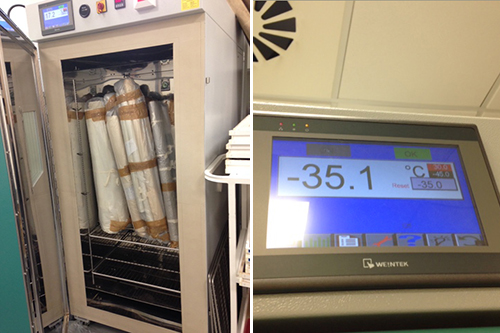
The freezing process takes place in special conservation freezers which take the temperature down to -35c very quickly – I have mentioned the Keep’s freezers ‘Jen’ and ‘Brian’ in a previous post about Gardner’s rolled up plans. The purpose of this process is to dry the materials and prevent mould growth, which it does very efficiently. Mould growth can already occur within 2 to 3 days of being exposed to moisture, which is a terrifying thought when dealing with big volumes of materials. The papers were left in the freezer for seven days, after which the packs were opened, materials were taken out and laid out vertically to air-thaw for a week.

After this, we were able to lay the materials out in the conservation studio, as opposed to working within the quarantine area. We were able to perform a further sort for the materials that needed to be together for boxing purposes. The boxes were clearly labelled and numbered for transportation back to the Design Archives HQ, where we made space for the large volumes of materials descending upon us.

To get to this point, the process for the de Majo archive already took several months of hard work with a work-schedule of two days a week. Sometimes it amazes me what you can achieve when a team of people works together like a well-oiled machine – makes everything so much more enjoyable despite it looking like a daunting task when you start!

I will be adding to this story as and when time allows, so do keep your eyes peeled for Part III…

The archive of Willy de Majo Pt. I

I’ve decided to take a trip back in time. This time last year I was in the middle of an undertaking to start planning the long term care of the Willy de Majo archive. Up to that point, some the materials were kept in our external store, making this rich collection inaccessible for researchers. Because the materials had been stored externally, they could not be brought back to us here at Grand Parade without going through a strict quarantine process in order to prevent any contamination issues. Since we don’t have those facilities here, this project was a natural continuation of our collaboration with the conservation department at The Keep, after we had finished with James Gardner’s plans.

I thought the process of sorting and cataloguing a large collection of duplicate materials would make an interesting three-or-four -part blog post. Being able to show and talk about a collection of materials and the journey it takes from its original state to one which is more structured and clear for researchers is something that forces us to take an overview. Conserving individual items in collections requires me to look at the detail this was a fantastic opportunity to gain an understanding of a larger picture and I have (secretly) loved the process – well, most of the time anyway! The project gave me a chance to work in close collaboration and pick the brains of our Archivist Sue Breakell. It has been a great learning curve for me by being an eye-opener into ‘the other side’ of archives – seeing them as entities instead of as individual items.

So… I am going to start the story with a Part I of this blog ‘series’!
In the beginning, there was the order in which things were placed by Mr de Majo himself in, what I believe to have been his London office. I found two colour photographs (below) amongst his archive as I was sorting through it, and couldn’t help scanning them right away!

The archive was transferred to us in 2009 by the de Majo family after our Curatorial Director Catherine Moriarty had worked in collaboration with them for some time. It comprises Willy de Majo’s work with design organisations (for example, he was the founder of ICOGRADA), design materials and related papers, as well as photographs, in connection with his various clients. The materials date from the late 1930s all the way up to the early 1990s.

The process of getting the materials in store in an order which made some kind of sense meant Catherine Moriarty, Sue Breakell and I spent several days in our external store to begin the process of getting the materials ready for the next step of taking them through the quarantine process. This started with a plan for disposal of duplicate materials. Willy de Majo was a man of meticulous record keeping which often meant he kept multiple copies of everything. Even though work with the de Majo family had identified extensive duplication and material for disposal, this next step required further sorting – the decision was made that we were to keep three copies of items we had various copies of. And so it began!

Above you can see the way in which the archive was housed for some time. Items were kept in various boxes but they were in no particular order. The volume of the materials felt overwhelming at first glance, but we soon adopted a mind-set of ‘one box at a time’. I know archivists go through these emotions all the time, but bear with me!

The process ended up being very satisfying to go through once I had personally gotten over the nervousness about throwing items away, repeating the mantra of ‘we have multiples, we have multiples’ as I went through. We marked for disposal through confidential waste whole stacks of duplicate materials and the load started to slowly but surely feel lighter and much more manageable.

Below is a good example of the extent to which the materials were duplicated. These labels were also found in several locations within various boxes of miscellaneous materials, which made the process of matching and making sure you had enough of everything very, very complex at times – especially with limited space to spread things out in.

My absolute favourite things from the process were the Millar jar seals (below). There were several designs and the text on all of them reads ‘This seal should be unbroken’. Genius.

The collection also has various photographic formats within it. Some of these were in the form of 35mm colour slides stored in slide ‘canisters’, others black and white photographic prints in various files and folders. We also had this mini chest of drawers (below), which housed boxes of loose slides and hundreds of stereo slides. Obviously this kind of housing for photographic materials is not ideal, so the chest of drawers had to be disposed of while the slides were organised in their original groupings and boxed separately, ready for the next stage.

It was fantastic to be given the opportunity to go through this initial process with Sue. It was fascinating to already note at this stage how differently we can view things: Sue looks at the content of the materials, reading pieces of paper while sorting, when I have been wired to mainly focus on their condition. Opening my mind to an archivists’ way of seeing has been massively valued and helped me immensely as I continued with the project.

To be continued… Look out for Part II coming soon.

Archives and Exhibitions Pt. II

Where has all the time gone (she said for the 100th time since starting to write this blog)? Autumn is here, and what a beautiful autumn it has been so far too! I would go as far as saying that this is easily my favourite time of year… But this is completely beside the point, so I will crack on.

We are (again!) involved with an exhibition of some of our materials. Often with exhibitions, people do not always think about all of the processes and challenges taking place behind the scenes to enable a display of archival materials to take place safely. To bust the myth a little, I thought I would write a post the steps involved to get to the ‘end product’.

For this particular ‘case’, the wheels started turning when designer Margaret Howell visited the Design Archives over the summer with a desire to put up an exhibition in Howell’s Wigmore Street shop in London. Margaret and her colleague Jo Barber spent a day or two with us and became very excited about the posters in the Design Council Archive. There are 228 of these in total, and I must mention at this point that the selection process was done by going through the original posters and not by means of electronic selection – there is still nothing that beats looking at the originals! After ironing out some ideas, the end product was to publish a 2017 wall calendar and to exhibit 25 of the posters. It has been wonderful to see some of these gems coming out from a spell of hibernation and creating an opportunity for other audiences to see the real thing.

insecol-sm

All of the Design Council posters were digitised back in 2008, are fully catalogued and can be found on the Archives Hub. Providing the 12 images requested for the calendar was therefore straightforward, which meant I could concentrate on getting the 25 posters ready for framing.

documentation-sm

In these instances, the very first thing to do is to take time to assess the condition of the original materials requested for loan. There is always the possibility of an item not being in good enough condition to go on loan, in which case the whole ‘deal’ would have to be completely reconsidered. In regards to the Design Council posters selected, the condition was generally good, with only a few minor and easily-dealt-with issues.

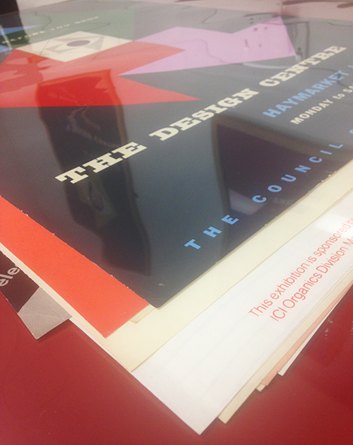
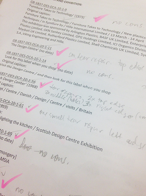
The next step in the process was to fill in condition reports for each individual poster. This involves checking them to make note any tears and/or other issues which will require attention to make them ready for exhibiting. Procedures like surface cleaning and repairing tears are very time-consuming at the best of times, but due to the size of the posters, this took even longer.

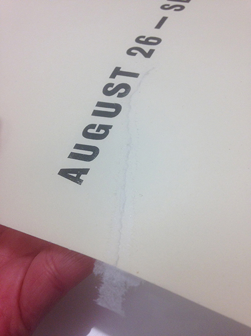
When it comes to individual tear repairs, one always tries to mend tears from the verso of an item to make the repair as ‘invisible’ as possible. As an example of an exception to this rule, one of the posters had this rather large tear starting from its edge.

tear1-sm

The way the paper had ripped made it an awkward tear to mend. After making a repair on the verso, the tear was still very much an issue when the poster was handled.

tear4-sm

This meant that mending the poster on the recto was also necessary. The repair tissue gets shaped over a lightbox to follow along as close to the edges of the tear as possible. The aim of this is to minimise its visibility.

rectorepair-sm

The edges of the heat-set tissue repair get cut by feathering them with a scalpel. This maximises the repair’s ‘staying power’ by allowing the fibres to attach themselves onto the surface of the paper much more efficiently than they would if this was done by cutting a straight line. This increases the longevity of the repair and looks less intrusive.

tear6-sm

For entire missing areas – like ripped corners – I created infills, again using heat-set tissue. Because of the nature of heat-set repair tissue, it has to be doubled up and fixed on both sides of the poster so as to not have any sticky areas exposed. This is the process we have adapted for the mid 20th-century collections here the Design Archives, but infills can also be done by matching and/or dyeing existing repair papers to the colour on the recto of an original piece, fixing it in place by an entirely different method.

infillsdouble-sm

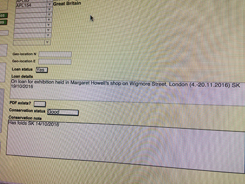
Once the posters were conserved, notes on their condition on departure and loan status are made on our internal database. When they return, they will be taken out of their frames and their condition will be re-checked and compared with the notes taken before they left the Design Archives. Once this has been done, the loan status gets changed to showing the item is back in the collection.

database-sm

We happen to have a healthy stock of frames from past exhibitions belonging to the Design Archives. For exhibiting the Design Council poster selection, we were happy to reduce the client’s cost of framing by lending them some of our existing frames. We negotiated the process with our local framers The Frame Factory, who are always very accommodating, friendly and helpful – and who had made the frames for us in the first place. Alongside the original posters, we organised a courier to take the frames to the shop for mounting.

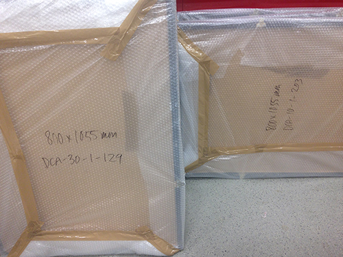
The posters selected for the exhibition had very specific sizes of frames assigned from our existing frames. This was done in accordance with the number of identically sized frames we happen to have and where they were going to be hung in the shop. The posters were packed for transportation by wrapping them in acid-free tissue and placing them in our specially made transportation portfolio.

packedtogo-sm

The posters have their catalogue numbers written in pencil on the verso, and these numbers were matched up with the different sizes of the frame selection I packed up to make the mounting process run smoothly.

packing3-sm

We then organised the transportation of the 25 frames and the original posters from us to Frame Factory. An exit form gets filled and signed on departure from the Archives and signed again at the receiving end of the loan once delivered to the appropriate person. When materials get returned back to us after an exhibition finishes, it gets signed for the third time stating materials have returned back safely.

screenshot-sm

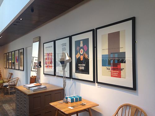
The framers took about a week to mount and frame the posters for us, using conservation mounting methods and acid-free, archival quality mount board. We then organised the art movers to pick the materials up, delivering them to their final destination on Wigmore Street. A day was then reserved for hanging the exhibition before it was officially advertised via the Design Archives’ and Margaret Howell’s website and social media.

exhibition1sm

exhibition-2-sm

exhibition-3sm

The exhibition is now open at 34 Wigmore Street, London, W1U 2RS and runs until the 20th November, 2016. The art movers will then deliver the posters in their frames back to their home here in the Design Archives, where they will be taken out of their mounts by yours truly, and put back to bed… Until the next outing!

PS. As I mentioned at the beginning of this blog post, there is also an accompanying wall calendar for 2017 created from the digitised images of 12 of the posters. I wanted to test out putting a video on this blog, so here is a little ‘live’ taster of what the calendar looks like.

Archives and exhibitions

Now felt like a good time to write a little post about some very recent goings on. The Design Archives’ Deputy Curator Dr Lesley Whitworth has curated an exhibition at the University’s Grand Parade Gallery. The exhibition is entitled ‘Design Research & Its Participants’ and has been complied to sit alongside the fiftieth anniversary conference of the Design Reserach Society, taking place at Grand Parade next week. My colleague Barbara Taylor and I, as well as our brilliant volunteer and this year’s graduate Nika Narkeviciute, have helped Lesley to put together the exhibition, which runs until the 1st July.

image5sm

My main involvement in helping with the putting together of the exhibition, alongside digitising materials, was to do with how the materials for the exhibition were going to be displayed. They have been compiled from across six of the collections at the Design Archives, with some materials borrowed from Design Research Society members and the Royal College of Arts. When it comes to ‘hands on’ conservation and preservation, this has meant not only surface cleaning and mending, but sorting out the safest way for the items to be displayed. The selection of items in the exhibition vary from photographs to posters, volumes of books, audio and individual sheets of paper.

Lesley and I also had a fun trip to the Royal College of Arts to collect the loan of two posters and two Christmas cards for the exhibition. For the Icograda 50th Anniversary exhibition, we had a special poster transporting contraption made for us for two different sizes of posters. We have struggled to find the space to store them, but the smaller of the two came in very handy as we used public transport to get from the Design Archives to the RCA and back, with the posters completely unharmed and oblivious to the journey they had just made. We were told they had not ‘seen the light of day’ for a good while, so it is great that they are now being seen.

image7sm

From an eye-catching point-of-view, my favourite thing in the exhibition is the giant book standing at the entrance of the gallery. I absolutely love it – the execution of the idea is great, and it also serenades my current anything-in-lime-green -state-of-mind. But I digress.

image2sm

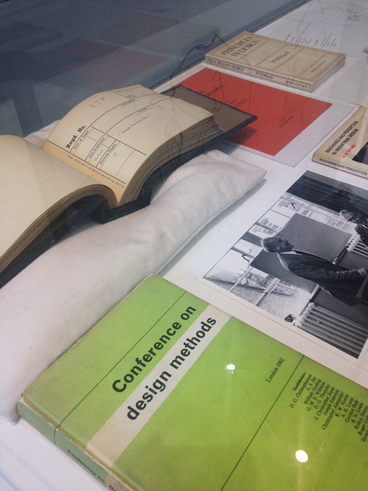
The original book consists of the papers presented at the conference around ‘systematic and intuitive mehods in engineering, industrial design, architecture and communications’, held at the Imperial College in London in September, 1962. There are two ‘normal-sized’ copies of the volume in the exhibition too – one of them is from the Design Archives (Design Council Collection), and the other borrowed from St Peter’s House Library. One copy is displayed open and the other closed.

image6sm

To create the magnificent giant replica of the book, it obviously needed to be digitised; the scanning was not done in-house in this instance. Prior to digitising anything, the condition of the original needs to be assessed. As the book is in relatively good condition, the only thing for me to do prior to its digitisation was to clean the covers with my trusted Mars Staedler in hand and wish her well!

IMG_5689sm

There are several factors that always need to be considered before an exhibition of archival (or any other, in fact) materials takes place. In a nutshell the light levels, humidity, temperature, VOC’s from paints and mounting – to name a few – have to be taken into account. This particular exhibition runs for a two-week period and consists of materials in robust condition, so these issues were not of grave concern. However, sheets of acid-free paper were placed underneath all items displayed in cases and books were given supports to protect their spines if displayed open. Pages were given polyester strip ‘holds’ to keep them in place where opened, and documents were cleaned and mended where needed. Photographs were mounted using acid free corners and posters hinge-mounted.

image8sm