GIRLS (photoshoot editing)
(AD138: FASHION ILLUSTRATION AND IMAGING – IDENTITY AND THE BODY)
So after having edited down all the images, (contact sheet in previous blog post) I decided to choose from those which I thought would work best together and which I wanted to turn into illustrations.
First, I chose a few images to create a series of photographs. The style of these photographs were inspired by some of Petra Collins photographs:
I wanted to edit these in a way to follow this Petra Collins aesthetic that I mentioned in my previous blog post (The Petra Collins Aesthetic).
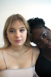
The originals:

(Figure 1)

(Figure 2)

(Figure 3)
I first used photoshop, and made sure the images were cropped to the perfect composition and then I played with Colour Lookups, the levels and the hues within the images, to give them a lovely pink tone to them.

(Figure 4)

(Figure 5)
The colour Lookup that I used for these edits was called ‘2strip.look’. Although I wanted a pink tone to the images, I wanted it to look more like light flares and I wanted them to look a lot more natural and soft. Therefore I wasn’t 100% happy with these images.
After having done this, I decided that my edits were not good enough and I wanted them to fit the imagined aesthetic I had when I took the images. Therefore, I resorted back to an app I used to use when I wanted to edit photographs. This app, ‘Afterlight’, lets you add light flares and adjust them to look more natural. I decided to do this and alter the colours to have pinker tones and I adjusted the light flares to be coming from the light source I used for my shoot so that it didn’t look too manufactured.

(Figure 6)

(Figure 7)

(Figure 8)
I am much happier with the turn out of these photographs because these follow the aesthetic I wanted and they don’t look too processed, in my opinion. I am really glad that these photographs turned out well because it is getting closer to the deadline, and things like this shouldn’t be taking up my time, because what I find hardest are the illustrations and they are what matters most to me because they are what I am not experienced with.
Then I decided to edit my images of the pomegranate photographs.
The originals:

(Figure 9)

(Figure 10)
The way in which I decided to edit these photographs is lower the saturation, brighten the images and also play around with the levels.

(Figure 11)

(Figure 12)
I am really happy with the way these images turned out post edit. I really like the airy feel they give and the way they are really soft images.

(Figure 13)
I had strange things and issues happen in Photoshop when I was editing them though, as you can see above. Grids were appearing in strange places that I didn’t know how to get rid of. It was very time consuming and trying to find solutions took time, and it showed me that you cannot think that editing images is fast and easy even if the editing you are planning on doing it minimal.
After doing my editing, I decided to choose which images I was going to illustrate:

(Figure 14)
(Figure 15)

(Figure 16)

(Figure 17)
I was really happy with the way these images turned out and I am excited to start illustrating them in different styles.
Figures
All figures, photography and editing my Kynza Kendall-Jones