Work Experience with Corgi Hosiery

This summer I was lucky enough to get some work experience for a couple weeks in Corgi Hosiery factory which based in Ammanford, Carmarthenshire, conveniently my home town. Corgi is a family-run business, established in 1892. Corgi specialises in producing top-quality, fine gauge cashmere and cotton socks featuring eye-catching colourways and quirky patterns and motifs. They also make knitwear such as cardigans, jumpers, scarfs and hats.

I learnt many skills whilst being at Corgi, from the financial side of the business to the manufacturing of the products.

Final Lookbook & Manifesto

I am very pleased with how my final lookbook came out. I kept the pages white and minimal keeping the focus on the images. I loved creating the different looks for each trend and choosing the locations to represent each photograph. The photography aspect of the lookbook was something I haven’t got much experience in, I really enjoyed it and i’m looking forward to learning more in the future.

Manifesto

Founded in 1968 Jill Sander is a high end luxury brand, known for our classic style and elegant touch we have successfully created a respectful, recognizable label. Our latest fall 2016 womenswear collection is filled with monochrome, minimal and pure pieces that designer Rodolfo Paglialunga interpreted the house founder’s style. The collection also includes a look best described as artificial surfaces, with glossy metallic raincoats and beautiful silk fabrics. Fashion is an ever changing industry, new trends come and go with different influences that emerge from anything imaginable. Designers and brands take ideas from each other but always manage to give their brands their own unique style that keeps them recognizable. We have managed as a brand to keep the house founder’s look for the label but also managed to keep up with the new and turn around trends that come and go from season to season.


The anti-fashion campaign for Jill Sander is to take risks, break the rules of the brands classic look. Create looks that people wouldn’t usually associate as a Jill Sander collection. Maybe this is what the brand needs, to send a big message through this campaign showing that we are ready to try different things and take the brand in new direction. This campaign includes a look book with my new ideas for the brands new image. As Jill Sanders clothing includes many neutral colours and materials that aren’t too bold to create the collections I have decided to add texture and a louder more vibrant colour palette into brand. We want to achieve a fresh image for the brand and a variety of pieces that stand out as being a rule breaker for the company by doing something completely different to its original recognizable style. The brand is a known, recognized label but not so popular with the younger generation due to its minimalistic, classic style and with the fashion industry testing all limits the competition between brands are fierce, I thought the brand as whole needed to try something new and hopefully create a larger target market and relate to all generations.


With the four trends researched and collected for the look book I have created a collection of images that relates to the trends. The four trends were Iridescent/Reflection, Dystopia, Tweaky Punks and Geometric Structure. These four trends each have their own colour palette which is bold and will be clearly seen in the images. I represented texture and colour in the images by using different methods of showing texture and pattern through clothing, fabric and the location of the photographs. Colours being presented in rusted old furniture, modern glass structures and bright, vibrant fabrics. The purpose of this campaign is to re-brand Jill Sander by creating an anti-fashion look book to attract a wider audience and test the limits the brand could potentially take.

Anti-Fashion Lookbook

Photography and Styling Shoot (Anti-Fashion)

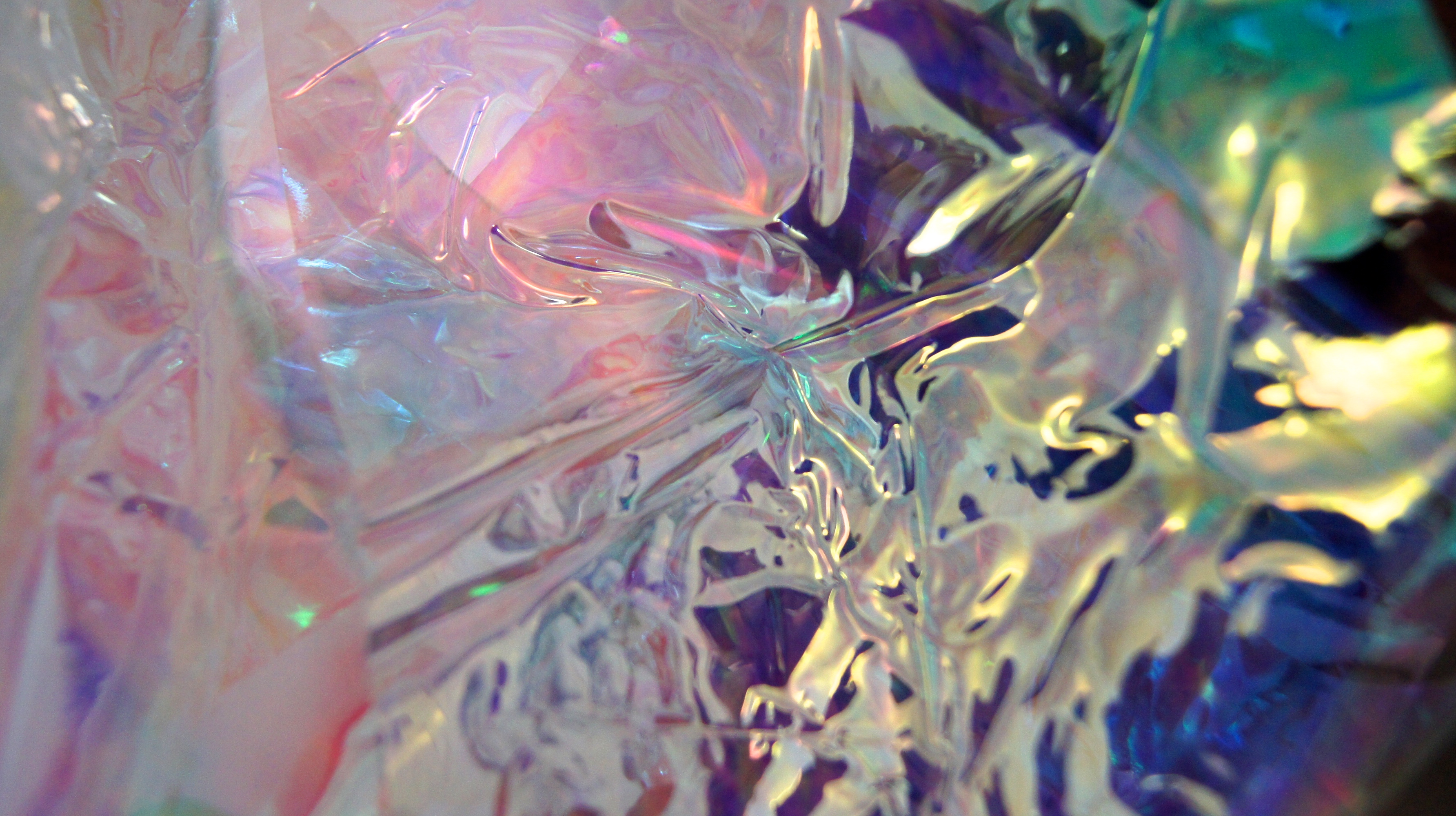
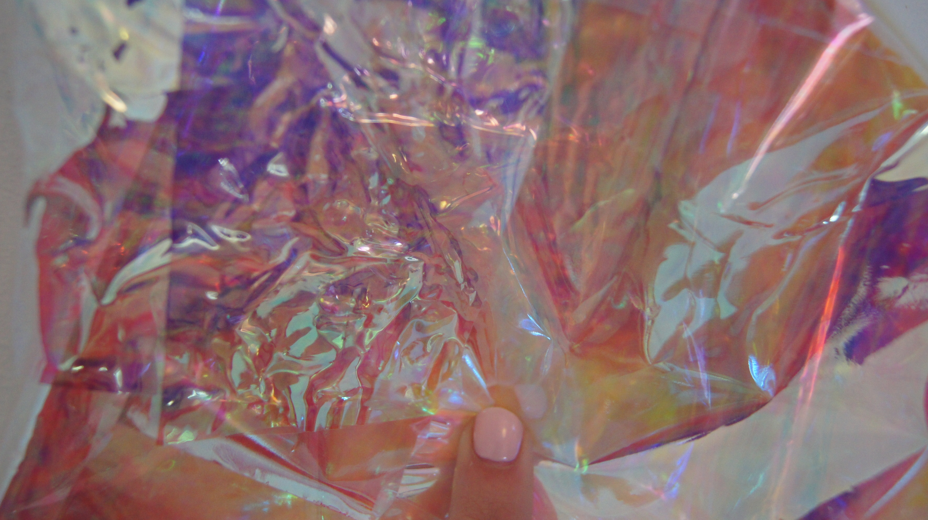
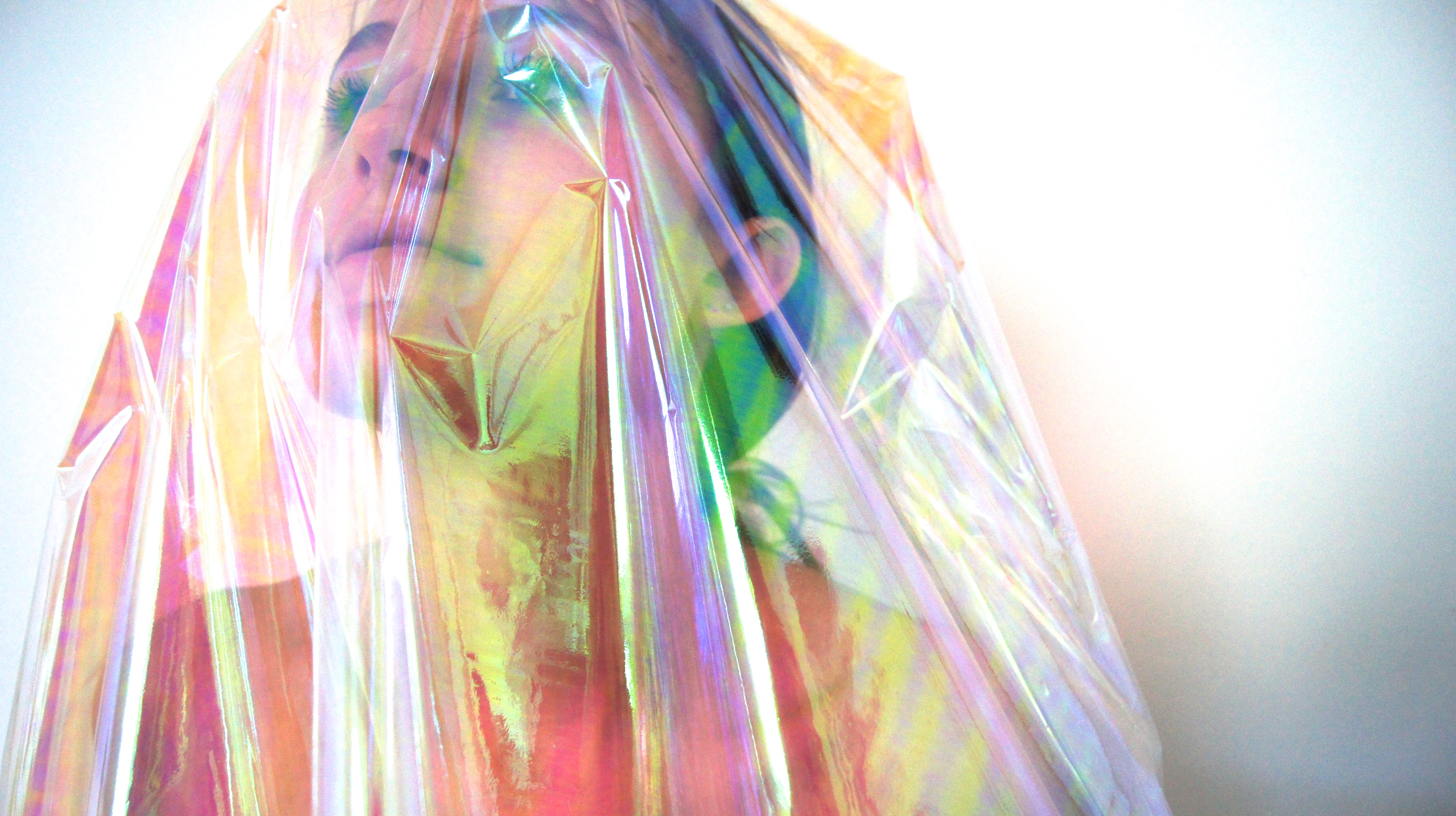
Using all the trends made by individuals in my group I had to create different looks for my campaign referring back to the trends. The two trends made by myself are translucent/iridescent and modern architecture, focusing on modern materials and blue/silver tones. The other two trends are dystopia which focuses on dark colours and distressed pieces, the last trend is tweaky punks.

For the location of my shoot I decided to shoot every trend in different location so that every trend was clearly presented. After the iridescent shoot that you saw in my last post I focused on the punk trend, after brainstorming different ideas for the location I decided to go with two simple urban backdrops and bringing the influences of punk into the clothing and the attitude of the model.

SONY DSC

SONY DSC

SONY DSC

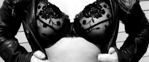
Using leather, lace and ripped denim to incorporate the punk attitude, showing a glimpse of a piercing and a cigarette to give the images that subtle punk behaviour. I decided to make the photographs black and white to concentrate on the textures in the images.

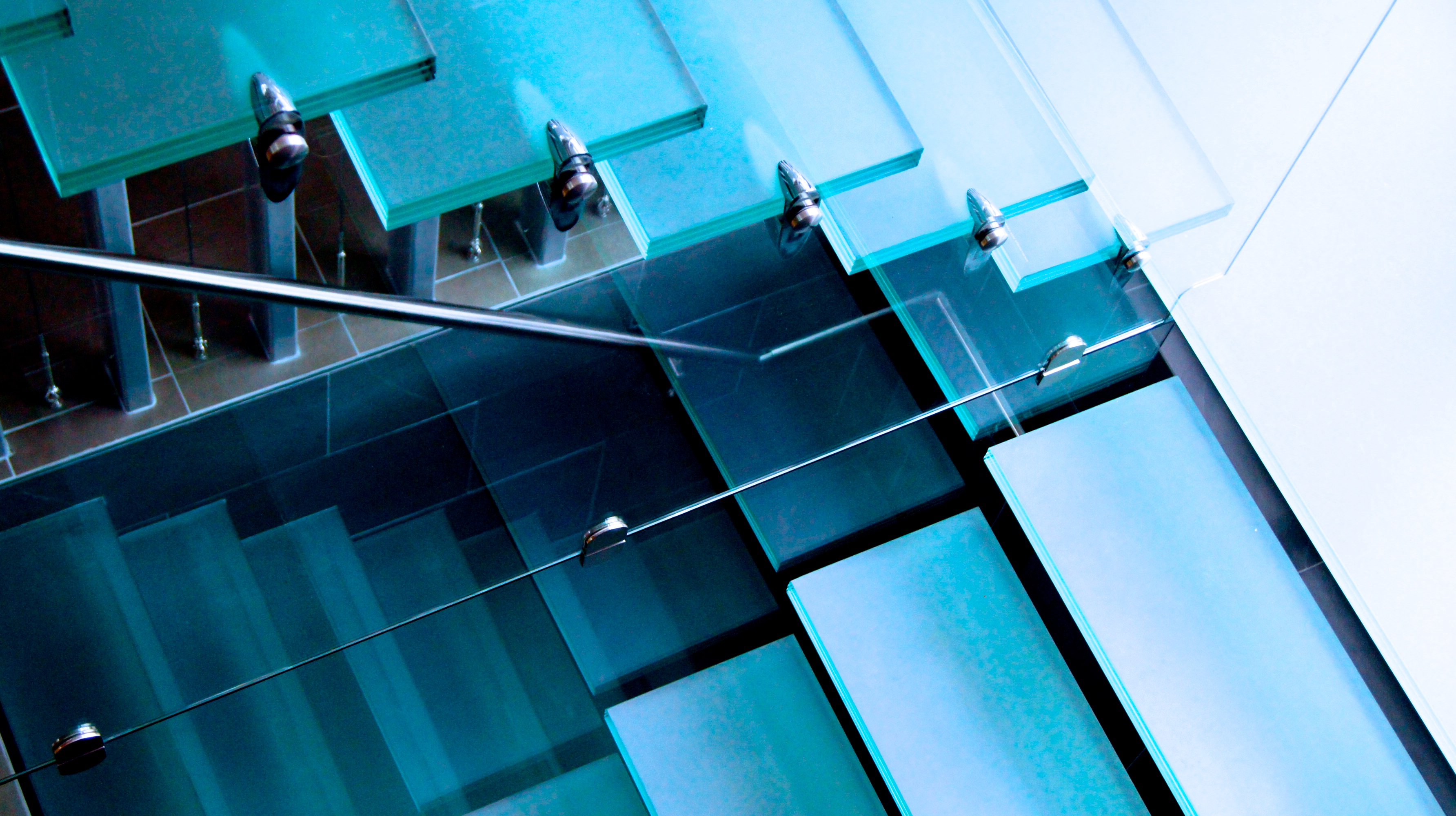
The next shoot focused on the modern trend. I found these glass stairs which I thought would be a perfect location to shoot the modern trend, with the sharp edged architecture and light blue tones. The model is wearing a blue leather jacket paired white skinny jeans and a sleek ponytail.

SONY DSC

SONY DSC

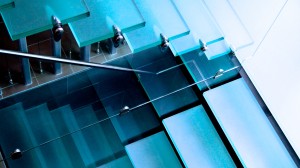
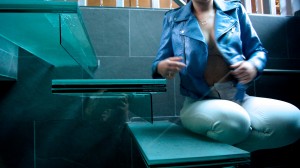
I manipulated the images, adding extra brightness and strengthening the blue colours.

The last trend is the dystopian trend. With this trend I decided to only take little idea’s from the mood board, I used the colour palette (dark browns and black) but also added some brighter colours that were present in the backdrop of the photographs. I found this pile of wasted metals, old radiators and gates that had rusted leaving a burnt orange colours, I thought this was perfect for this trend.

SONY DSC

SONY DSC

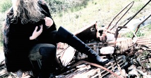
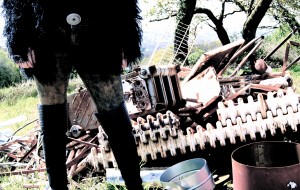
I styled the model in a feathered  black jacket, knee high leather boots and a pair of black jeans that I dyed to create this destroyed/distressed look. The backdrop reflects the destroyed aspect of the trend.

Anti-Fashion Campaign

After researching different brands and creating a brand analysis and a swot chart for each to find out which was best suited for this project I came to the conclusion that the brand Jil Sander was the best choice. The brand is known for its minimalistic, classic look. My anti-fashion idea was to create a new look for the brand, adding texture, pattern and vibrant colours to the brand. Creating looks that the label wouldn’t normally be recognized for. I began focusing on my trend, taking photographs of different textures and colours created by a iridescent plastic film.

SONY DSC

SONY DSC

SONY DSC

I then began to brainstorm ideas for the lookbook photographs and how I could use this material to create an image that represents the texture and colour re-brand I want for the label.

I took photographs of this fabric wrapped around a nude body. This represents a whole new market for the brand, showing texture and colour in a different, unusual way rather than only on clothing.


SONY DSC

SONY DSC

SONY DSC


Trend Board

For our next task we have been told to create an anti-fashion campaign for a brand of our choice. First we are placed into groups and we each have to create a trend, these trends will then help us create our looks in the anti-fashion lookbooks. I decided to create a trend that revolves mostly around colour, iridescent. My trend is full of vibrant colours and reflection. This gives me a wide range of possible ideas for the inspiration of my looks.

Creating two trend boards and also a colour board.

trend board 2-Recovered

trend colour board

trend board 4 copy copy

GIFS

For this project we were also asked to create gifs relating to our zines. I’ve never created a gif before but after I had a lesson on how to create a gif i started to experiment to see what outcomes I could create.

Here was my first attempt, a slightly funny gif relating to the verse ‘Locusts came’.

lena-gif

After some more practise I decided to work with different filters and oppacities to create interesting outcomes. Using different styles e.g flashing images, fading, blur etc. Here are two that I created to relate to the death in the poem, using a skull as a simbol of this.

me-gif-

Skull-gif

I also wanted to create a gif using hand drawn sketches. Showing how a few simple drawings can create a moving image. Here I sketched around 5 images of the eye at different stages whilst blinking, and after putting them all together it created a moving image of a blinking eye.

eye-gif

The poem often refers to hands therefore i’ve created a gif that rotates and has flashing images in the background of photographs i’ve taken of different places ive visted.

gif-hand

Harper & Blake


I recently visted Harper & Blake’s Autuim Winter 2016 collection of fashoin scarves titles ‘Predators’. Inspired by nature and its strongest inhabitants, the collection is made up of eight hand drawn designs and bring to life Harper & Blake’s key foundation, strength and ambition.

FullSizeRender

Half of the collection are designed in order to reflect Harper’s minimalistic and classic personality. Where as the other half represents the experimental and adevnturous Blake style that is more fluid. This was clearly shown throughout the collection with cetrain pieces that were simple but also very effective whilst the others were bold and eye catching.

For the collection Harper and Blake have worked exclusively with emerging print designer, Alina Zamanova who as previously worked alongside the Print Design team at Alexander MQueen. They spoke about how they aimed the collection at the urban professional woman looking to make a statement with her own unique personality and style.

FullSizeRender-4

FullSizeRender-3

I liked that the venue was small and only a few poeple were aloowed in at a time as it gave us viewers a chance to see the collection clearly with plenty of room to walk around the display and take a closer look.

Zine Photography

For this module I’ve been taking some photographs to relate to the poem. I happen to take this photograph at the perfect time where the sun shone through the cloud which I thought was the perfect image to represent ‘heaven’. Photography isn’t my strong point so i’ve decided to try and practice to expand my capabilities whithin this project.

heaven image

Another line in the poem I chose to use imagery to represent is ‘hands have to tears to flow’. Thinking of different ways to portray this in an image, first I thought of drawing an eye crying into a hand but after experimenting further I came up with the idea of photography water running through closed hands. I thought this would clearly represnt the verse and portray the meaning.

image2-1

water-hands-finished

I will be editing the photographs to create the very best outcome. For example with this image which  I have already edited I have used a filter over the image called “plasitc wrap’ which highlights the water to give it a glossy effect. I then dublicated the layer and added a mask onto the new layer, adding a motion blur to the mask. Then using a brush tool (black) I carefully brushed the areas in which I wanted to be seen clearly. This method worked really well as the image is much stronger and focuses on the running water through the hands.

Introduction to Fashion Drawing and Interaction

For this module we have been assigned to create a Fanzine of our own. Beginning our research from a song, poem, story, image etc, and to create a visiual zine made from illustration or photography. I decided to begin my research on a poem called ‘the hand that signed the paper’ by Dylan Thomas. I chose this poem as it tells a story with a meaning to each line, which I think could be very interesting to explore and create my own take on it using the mixed media of drawing and photography. Hopefully this gives me the chance to expand my photography and drawing capabilities.

‘The hand that signed the paper felled a city;
Five sovereign fingers taxed the breath,
Doubled the globe of dead and halved a country;
These five kings did a king to death.

The mighty hand leads to a sloping shoulder,
The fingers’ joints are cramped with chalk;
A goose’s quill has put an end to murder
That put an end to talk.

The hand that signed the treaty bred a fever,
And famine grew, and locusts came;
Great is the hand that holds dominion over
Man by a scribbled name.

The five kings count the dead but do not soften
The crusted wound nor stroke the brow;
A hand rules pity as a hand rules heaven;
Hands have no tears to flow.’

Final Images

After playing around with photoshop trying out different methods and techiniques on the images I created the final outcomes. Using the laso tool to cut out the model I could place anywhere I wanted to create  the unrealistic effect on the images, using size and proportion as the main focus.

done 2

Using the shard as the preception of size, and also recflection. I think it’s clever how you can create the preception that she is as tall as the buliding but realisticly she is much smaller. I used the exposure and saturation to change the colour of her skin so that it has the glossy, pale, ‘glass like’ look as the shard to tie them together.

In the next image I used symmetric lines to create a geometric effect. Placing the lines over the model whilst she’s standing in a powerfull position looking over the buiding.

final 1

In this image the woman has the power over the building, with the thick, sharp eyebrows making her look some what dangerous. added the faint light blue box around the woman to tie the three images together and I find it adds slight character to the background which helps you focus on the model as she is small in comparison to the architecture.

Here I focused on the face, capturing the make-up and hair styles in it’s best light. I encouporated all three aspects into the image.

double face final

I cut out pieces of the achitecture into geometric shapes and added them onto the model. The image on the right is soft with elements of the gherkin which worked well with the diamond eyebrows and simple hair bun. On the right the image is much sharper with the heavy eye make up and the structured building with the added lines layering the left image.