GIFS

For this project we were also asked to create gifs relating to our zines. I’ve never created a gif before but after I had a lesson on how to create a gif i started to experiment to see what outcomes I could create.

Here was my first attempt, a slightly funny gif relating to the verse ‘Locusts came’.

lena-gif

After some more practise I decided to work with different filters and oppacities to create interesting outcomes. Using different styles e.g flashing images, fading, blur etc. Here are two that I created to relate to the death in the poem, using a skull as a simbol of this.

me-gif-

Skull-gif

I also wanted to create a gif using hand drawn sketches. Showing how a few simple drawings can create a moving image. Here I sketched around 5 images of the eye at different stages whilst blinking, and after putting them all together it created a moving image of a blinking eye.

eye-gif

The poem often refers to hands therefore i’ve created a gif that rotates and has flashing images in the background of photographs i’ve taken of different places ive visted.

gif-hand

Harper & Blake


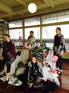
I recently visted Harper & Blake’s Autuim Winter 2016 collection of fashoin scarves titles ‘Predators’. Inspired by nature and its strongest inhabitants, the collection is made up of eight hand drawn designs and bring to life Harper & Blake’s key foundation, strength and ambition.

FullSizeRender

Half of the collection are designed in order to reflect Harper’s minimalistic and classic personality. Where as the other half represents the experimental and adevnturous Blake style that is more fluid. This was clearly shown throughout the collection with cetrain pieces that were simple but also very effective whilst the others were bold and eye catching.

For the collection Harper and Blake have worked exclusively with emerging print designer, Alina Zamanova who as previously worked alongside the Print Design team at Alexander MQueen. They spoke about how they aimed the collection at the urban professional woman looking to make a statement with her own unique personality and style.

FullSizeRender-4

FullSizeRender-3

I liked that the venue was small and only a few poeple were aloowed in at a time as it gave us viewers a chance to see the collection clearly with plenty of room to walk around the display and take a closer look.

Zine Photography

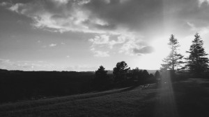
For this module I’ve been taking some photographs to relate to the poem. I happen to take this photograph at the perfect time where the sun shone through the cloud which I thought was the perfect image to represent ‘heaven’. Photography isn’t my strong point so i’ve decided to try and practice to expand my capabilities whithin this project.

heaven image

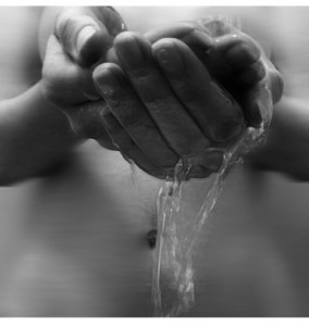
Another line in the poem I chose to use imagery to represent is ‘hands have to tears to flow’. Thinking of different ways to portray this in an image, first I thought of drawing an eye crying into a hand but after experimenting further I came up with the idea of photography water running through closed hands. I thought this would clearly represnt the verse and portray the meaning.

image2-1

water-hands-finished

I will be editing the photographs to create the very best outcome. For example with this image which  I have already edited I have used a filter over the image called “plasitc wrap’ which highlights the water to give it a glossy effect. I then dublicated the layer and added a mask onto the new layer, adding a motion blur to the mask. Then using a brush tool (black) I carefully brushed the areas in which I wanted to be seen clearly. This method worked really well as the image is much stronger and focuses on the running water through the hands.