Using the Timeline tool in Photoshop I have created these GIFs to be used on the magazine instagram @decademaguk.
They are quick paced and bring a new technique to my work.
Using the Timeline tool in Photoshop I have created these GIFs to be used on the magazine instagram @decademaguk.
They are quick paced and bring a new technique to my work.


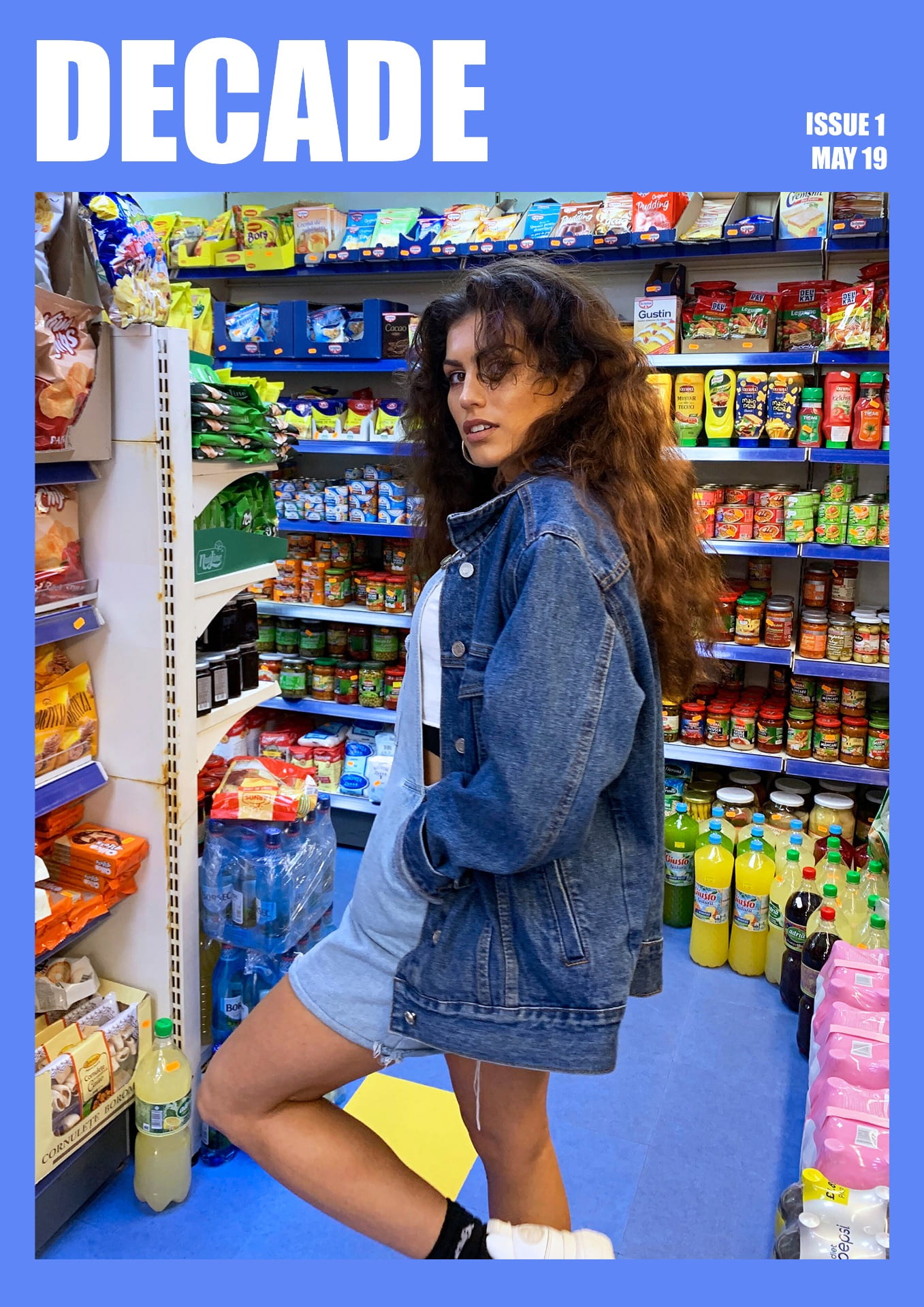
Having experimented with different layouts for my magazine I have chosen this to be my final outcome. I have chosen the blue background as I feel that the white does not represent the brand well, and the pink gives of girl only connotations when in fact the magazine is unisex targeted.
I have also changed the name of the magazine from Eternal to Decade. I have done this because Eternal sounded more high end and better suited to a older audience, where as Decade sounds more youthful. Decade can also be interpreted for the meaning of ten years, or decading material. Both relevant to sustainable fashion.


Upon reflection, I have decided to redesign the Stitch It Bitch spread as the spring coloured buttons were too much of a ‘pretty’ aesthetic, when I want the magazine to have more of a street style look. I have created the redesign by focusing on the word ‘bitch’ and the connotations which come with it.
Inspired by Anna Kozdon, I created flat design illustrations recreated from three photographs of female models which I have taken throughout the project. Having experimented with illustration in my first Swap not Shop feature, which I was not completely satisfied with, I thoroughly enjoyed this digital technique and outcome.

I have refined the final layout by:
– Using two of the three illustrations to create more space
– Adding highlight colour to red dress to create depth to illustration
– Adding dashed stroke around typography to reflect imagery to word ‘stitch’
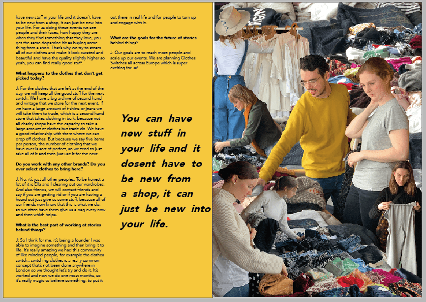
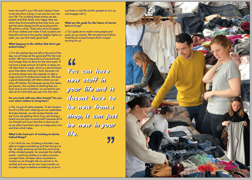
Now I have developed my magazine further I am not sure if the illustration which I created for the ‘Stories Behind Things’ feature is of the same tone to the rest of my magazine. Once taking out the collage, I created these experimental spreads, consisting of one collage, the interview and a pull out quote.


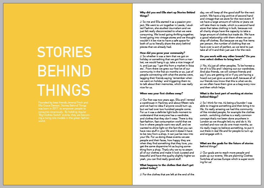

I began to create a page of typography as another way of illustrating the feature. I took these photographs of my clothes and created an alphabet previously yet had no use for them in the magazine as of yet. I am keen to use the phrase ‘Swap Not Shop’ as the previous title, ‘Stories Behind Things’ was the name of the company running the event, yet it did not easily communicate to the reader what the feature is about. I developed the alphabet into upper case letters, as it is clearer to read and more eye catching.


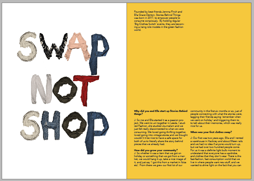
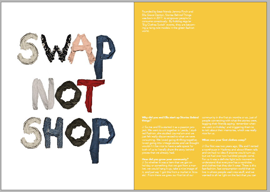
In order to experiment with different textured backgrounds I scanned a cotton t-shirt, and a creased piece of paper. Due to the letters in the typography being of a range of colours and patterns, I want to keep the background plain and of a white/grey scale.


After deciding that the typography looks best in this format and background, I developed further by changing the repeating letters S and P, from other items of clothing. I increased the saturation and brightness of all layers so that there is a higher contrast against the paper.

FINAL PAGES:

In the magazine I would like to include the HP Reveal App feature, where when scanned a video guide on ‘How to Sew a Button’ plays.
Layout Experiments:


Due to the scanned buttons not being very clear, I refined the development by taking a photograph of them instead so that they are more vibrant and of a better quality. I also changed the title of the feature from ‘How to Sew a Button’ to ‘Stitch It Bitch’, which targets the slang language which my target audience would use.


How to Sew on a Button video:


Inspired by Guillame Chiron, Jungle City I have scanned in a processed material such as a black bin bag and a juxtaposing object of yellow flowers and green leaves. I have chosen to use these as I hope that the audience begin to ask questions on sustainability as soon as they begin the magazine. It also creates a effective contrast in textures. Also likewise in Chiron’s collages, the model and flowers are not in proportion of each other.
At first I envisioned this design to just be on a single page, however decided it looked better over a double as all the images are large, the light space created by the graph paper creates balance.
ADD FINAL CONTENTS AND COLOUR SCHEME **********

Upon reflection, the typography SWAP NOT SHOP looks a little rigid. I have refined this further by altering the placement of the letters to be more jumbled up and range in size. This looks much more fun and playful. I have also layered it over a plain white background instead of the crumpled paper texture, as it is less distracting.


Anon. Think Pink #AltuzzaraPS18. Revolving Style. [n.d]. Pinterest
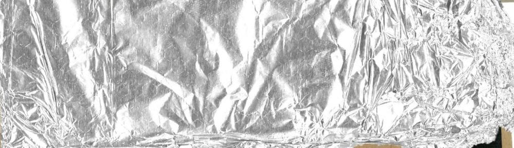
Inspired by the above image sourced from Pinterest, I have created line vectors around one of the photographs from my denim shoot. Using the clipping mask tool in Photoshop I then filled the shapes with scanned in textures and materials. The foil is in particular eye catching and gives contrast to the black woolen material which surrounds it.
Upon reflection, the material background of this collage would be better suited to the magazine in a brighter colour, therefore I have experimented with the following:


I have chosen to use the blue ribbed background, as feel the red pulka dot takes too much attention away from the subject. I have then refined this further by adding in shadow to the model and on the floor, so that the image is brought more to life.
Denim. One of the few materials which has stayed a fashion staple to all wardrobes around the world since we can remember. You know you can always rely on your favourite high waisted jeans to suck you in for your date on Friday, and that your baggy ripped pair is waiting for you to do your hungover errands in on Saturday.
We find ourselves wearing the same mom jeans which your Aunty Sue is wearing in that old photograph where she is holding you as a baby. Yet still wanting to get in on come back around flared jeans trend, you know the ones which replicate those worn by the one and only Regina George.
Denim is now used to make every item of clothing you can think of, and in every style and shape imagened. Available to buy from fast fashion and high street shops from as little as a few pounds, it’s a battle to refrain from being a rainbow of different shades of the trusty material.
But at what cost does the production of our denim come at to our environment? Classic denim, is woven from dyed yarn of the natural resource of cotton. According to Fashion Revolution, it takes approximately 7,000 litres of water to produce enough cotton used to make a pair of jeans. The pair is then also washed at least twice before being sold to soften the fabric and remove the dye. In addition to excessive water consumption, the production of denim also involves the use of harmful chemicals.
More and more brands are becoming aware and taking action against their manufacturing process, by sourcing their cotton using sustainable initiatives. Therefore we believe it is important for you to invest in your favourite sustainably sourced denim pieces, after all, they will last you a lifetime of service.